2, since these quantities are related to the training error. Instead, we wish to choose a model with a low test error. As is evident here, and as we show in Chapter 2, the training error can be a poor estimate of the test error. Therefore, RSS and *R*2 are not suitable for selecting the best model among a collection of models with diferent numbers of predictors.
In order to select the best model with respect to test error, we need to estimate this test error. There are two common approaches:
- 1. We can indirectly estimate test error by making an *adjustment* to the training error to account for the bias due to overftting.
- 2. We can *directly* estimate the test error, using either a validation set approach or a cross-validation approach, as discussed in Chapter 5.
We consider both of these approaches below.
3Like forward stepwise selection, backward stepwise selection performs a *guided* search over model space, and so efectively considers substantially more than 1 + *p*(*p* + 1)*/*2 models.
6.1 Subset Selection 233
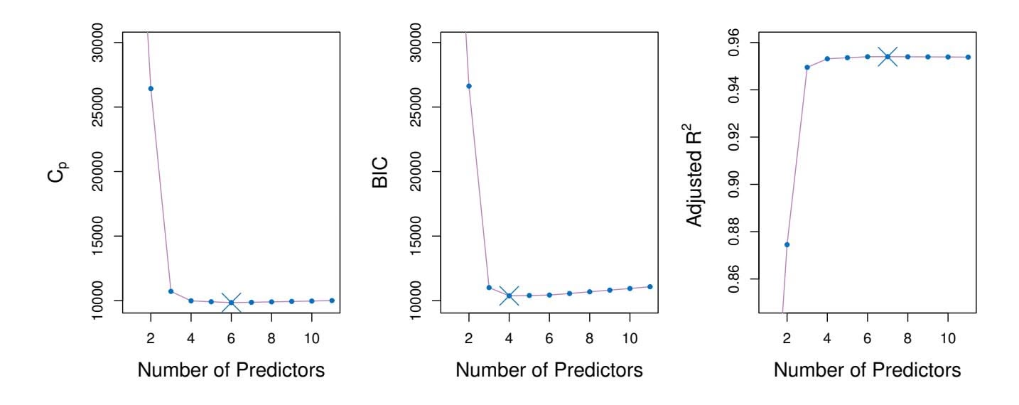
**FIGURE 6.2.** *Cp, BIC, and adjusted R*2 *are shown for the best models of each size for the* Credit *data set (the lower frontier in Figure 6.1). Cp and BIC are estimates of test MSE. In the middle plot we see that the BIC estimate of test error shows an increase after four variables are selected. The other two plots are rather fat after four variables are included.*
# *Cp*, AIC, BIC, and Adjusted *R*2
We show in Chapter 2 that the training set $MSE$ is generally an underestimate of the test $MSE$ . (Recall that $MSE = RSS/n$ .) This is because when we fit a model to the training data using least squares, we specifically estimate the regression coefficients such that the training $RSS$ (but not the test $RSS$ ) is as small as possible. In particular, the training error will decrease as more variables are included in the model, but the test error may not. Therefore, training set $RSS$ and training set $R^2$ cannot be used to select from among a set of models with different numbers of variables.
However, a number of techniques for *adjusting* the training error for the model size are available. These approaches can be used to select among a set of models with diferent numbers of variables. We now consider four such approaches: *Cp*, *Akaike information criterion* (AIC), *Bayesian information Cp criterion* (BIC), and *adjusted R*2. Figure 6.2 displays *Cp*, BIC, and adjusted *R*2 for the best model of each size produced by best subset selection on the Credit data set.
For a ftted least squares model containing *d* predictors, the *Cp* estimate of test MSE is computed using the equation
Akaike information criterion Bayesian information criterion adjusted *R*2
$$
C_p = \frac{1}{n} \left( \text{RSS} + 2d\hat{\sigma}^2 \right) \quad (6.2)
$$
where σˆ2 is an estimate of the variance of the error ϵ associated with each response measurement in (6.1).4 Typically σˆ2 is estimated using the full
4Mallow's $C_p$ is sometimes defined as $C'_p = RSS/\hat{\sigma}^2 + 2d - n$ . This is equivalent to the definition given above in the sense that $C_p = \frac{1}{n} \hat{\sigma}^2(C'_p + n)$ , and so the model with smallest $C_p$ also has smallest $C'_p$ .
# 234 6. Linear Model Selection and Regularization
model containing all predictors. Essentially, the $C_p$ statistic adds a penalty of $2d\hat{\sigma}^2$ to the training RSS in order to adjust for the fact that the training error tends to underestimate the test error. Clearly, the penalty increases as the number of predictors in the model increases; this is intended to adjust for the corresponding decrease in training RSS. Though it is beyond the scope of this book, one can show that if $\hat{\sigma}^2$ is an unbiased estimate of $\sigma^2$ in (6.2), then $C_p$ is an unbiased estimate of test MSE. As a consequence, the $C_p$ statistic tends to take on a small value for models with a low test error, so when determining which of a set of models is best, we choose the model with the lowest $C_p$ value. In Figure 6.2, $C_p$ selects the six-variable model containing the predictors income, limit, rating, cards, age and student.
The AIC criterion is defned for a large class of models ft by maximum likelihood. In the case of the model (6.1) with Gaussian errors, maximum likelihood and least squares are the same thing. In this case AIC is given by
$$
AIC = \frac{1}{n} (RSS + 2d\hat{\sigma}^2),
$$
where, for simplicity, we have omitted irrelevant constants.5 Hence for least squares models, *Cp* and AIC are proportional to each other, and so only *Cp* is displayed in Figure 6.2.
BIC is derived from a Bayesian point of view, but ends up looking similar to $C_p$ (and AIC) as well. For the least squares model with $d$ predictors, the BIC is, up to irrelevant constants, given by
$$
\text{BIC} = \frac{1}{n} \left( \text{RSS} + \log(n) d\hat{\sigma}^2 \right). \quad (6.3)
$$
Like $C_p$ , the BIC will tend to take on a small value for a model with a low test error, and so generally we select the model that has the lowest BIC value. Notice that BIC replaces the $2d\hat{\sigma}^2$ used by $C_p$ with a $\log(n)d\hat{\sigma}^2$ term, where $n$ is the number of observations. Since $\log n > 2$ for any $n > 7$ , the BIC statistic generally places a heavier penalty on models with many variables, and hence results in the selection of smaller models than $C_p$ . In Figure 6.2, we see that this is indeed the case for the Credit data set; BIC chooses a model that contains only the four predictors income, limit, cards, and student. In this case the curves are very flat and so there does not appear to be much difference in accuracy between the four-variable and six-variable models.
The adjusted *R*2 statistic is another popular approach for selecting among a set of models that contain diferent numbers of variables. Recall from
5There are two formulas for AIC for least squares regression. The formula that we provide here requires an expression for σ2, which we obtain using the full model containing all predictors. The second formula is appropriate when σ2 is unknown and we do not want to explicitly estimate it; that formula has a log(RSS) term instead of an RSS term. Detailed derivations of these two formulas are outside of the scope of this book.
6.1 Subset Selection 235
Recall from Chapter 3 that the usual $R^2$ is defined as $1 - RSS/TSS$ , where $TSS = \sum(y_i - \bar{y})^2$ is the *total sum of squares* for the response. Since RSS always decreases as more variables are added to the model, the $R^2$ always increases as more variables are added. For a least squares model with $d$ variables, the adjusted $R^2$ statistic is calculated as
$$
\text{Adjusted } R^2 = 1 - \frac{\text{RSS}/(n - d - 1)}{\text{TSS}/(n - 1)} \quad (6.4)
$$
Unlike $C_p$ , AIC, and BIC, for which a *small* value indicates a model with a low test error, a *large* value of adjusted $R^2$ indicates a model with a small test error. Maximizing the adjusted $R^2$ is equivalent to minimizing $\frac{RSS}{n-d-1}$ . While RSS always decreases as the number of variables in the model increases, $\frac{RSS}{n-d-1}$ may increase or decrease, due to the presence of *d* in the denominator.The intuition behind the adjusted *R*2 is that once all of the correct variables have been included in the model, adding additional *noise* variables will lead to only a very small decrease in RSS. Since adding noise variables leads to an increase in *d*, such variables will lead to an increase in $\frac{RSS}{n-d-1}$ , and consequently a decrease in the adjusted *R*2. Therefore, in theory, the model with the largest adjusted *R*2 will have only correct variables and no noise variables. Unlike the *R*2 statistic, the adjusted *R*2 statistic *pays a price* for the inclusion of unnecessary variables in the model. Figure 6.2 displays the adjusted *R*2 for the Credit data set. Using this statistic results in the selection of a model that contains seven variables, adding one to the model selected by *C**p* and AIC.
$C_p$ , AIC, and BIC all have rigorous theoretical justifications that are beyond the scope of this book. These justifications rely on asymptotic arguments (scenarios where the sample size $n$ is very large). Despite its popularity, and even though it is quite intuitive, the adjusted $R^2$ is not as well motivated in statistical theory as AIC, BIC, and $C_p$ . All of these measures are simple to use and compute. Here we have presented their formulas in the case of a linear model fit using least squares; however, AIC and BIC can also be defined for more general types of models.
### Validation and Cross-Validation
As an alternative to the approaches just discussed, we can directly estimate the test error using the validation set and cross-validation methods discussed in Chapter 5. We can compute the validation set error or the cross-validation error for each model under consideration, and then select the model for which the resulting estimated test error is smallest. This procedure has an advantage relative to AIC, BIC, $C_p$ , and adjusted $R^2$ , in that it provides a direct estimate of the test error, and makes fewer assumptions about the true underlying model. It can also be used in a wider range of model selection tasks, even in cases where it is hard to pinpoint the model
236 6. Linear Model Selection and Regularization
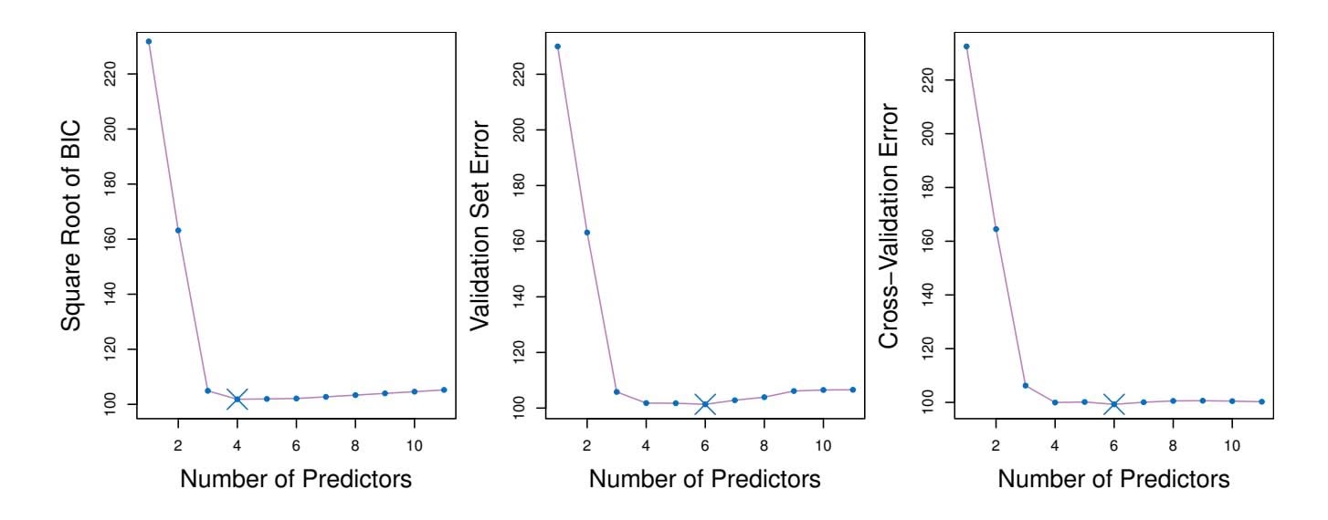
**FIGURE 6.3.** *For the* Credit *data set, three quantities are displayed for the best model containing d predictors, for d ranging from* 1 *to* 11*. The overall* best *model, based on each of these quantities, is shown as a blue cross.* Left: *Square root of BIC.* Center: *Validation set errors.* Right: *Cross-validation errors.*
degrees of freedom (e.g. the number of predictors in the model) or hard to estimate the error variance σ2. Note that when cross-validation is used, the sequence of models *Mk* in Algorithms 6.1–6.3 is determined separately for each training fold, and the validation errors are averaged over all folds for each model size *k*. This means, for example with best-subset regression, that *Mk*, the best subset of size *k*, can difer across the folds. Once the best size *k* is chosen, we fnd the best model of that size on the full data set.
In the past, performing cross-validation was computationally prohibitive for many problems with large *p* and/or large *n*, and so AIC, BIC, *Cp*, and adjusted *R*2 were more attractive approaches for choosing among a set of models. However, nowadays with fast computers, the computations required to perform cross-validation are hardly ever an issue. Thus, crossvalidation is a very attractive approach for selecting from among a number of models under consideration.
Figure 6.3 displays, as a function of *d*, the BIC, validation set errors, and cross-validation errors on the Credit data, for the best *d*-variable model. The validation errors were calculated by randomly selecting three-quarters of the observations as the training set, and the remainder as the validation set. The cross-validation errors were computed using *k* = 10 folds. In this case, the validation and cross-validation methods both result in a six-variable model. However, all three approaches suggest that the four-, fve-, and six-variable models are roughly equivalent in terms of their test errors.
In fact, the estimated test error curves displayed in the center and righthand panels of Figure 6.3 are quite fat. While a three-variable model clearly has lower estimated test error than a two-variable model, the estimated test errors of the 3- to 11-variable models are quite similar. Furthermore, if we 6.2 Shrinkage Methods 237
repeated the validation set approach using a diferent split of the data into a training set and a validation set, or if we repeated cross-validation using a diferent set of cross-validation folds, then the precise model with the lowest estimated test error would surely change. In this setting, we can select a model using the *one-standard-error rule*. We frst calculate the onestandard error of the estimated test MSE for each model size, and then select the smallest model for which the estimated test error is within one standard error of the lowest point on the curve. The rationale here is that if a set of models appear to be more or less equally good, then we might as well choose the simplest model—that is, the model with the smallest number of predictors. In this case, applying the one-standard-error rule to the validation set or cross-validation approach leads to selection of the three-variable model.
standarderror rule
# 6.2 Shrinkage Methods
The subset selection methods described in Section 6.1 involve using least squares to ft a linear model that contains a subset of the predictors. As an alternative, we can ft a model containing all *p* predictors using a technique that *constrains* or *regularizes* the coeffcient estimates, or equivalently, that *shrinks* the coeffcient estimates towards zero. It may not be immediately obvious why such a constraint should improve the ft, but it turns out that shrinking the coeffcient estimates can signifcantly reduce their variance. The two best-known techniques for shrinking the regression coeffcients towards zero are *ridge regression* and the *lasso*.
# *6.2.1 Ridge Regression*
Recall from Chapter 3 that the least squares fitting procedure estimates $\beta_0, \beta_1, \dots, \beta_p$ using the values that minimize
$$
RSS = \sum_{i=1}^{n} \left( y_i - \beta_0 - \sum_{j=1}^{p} \beta_j x_{ij} \right)^2.
$$
*Ridge regression* is very similar to least squares, except that the coeffcients ridge regression are estimated by minimizing a slightly diferent quantity. In particular, the ridge regression coeffcient estimates βˆ*R* are the values that minimize
ridge regression
$$
\sum_{i=1}^{n} \left( y_i - \beta_0 - \sum_{j=1}^{p} \beta_j x_{ij} \right)^2 + \lambda \sum_{j=1}^{p} \beta_j^2 = \text{RSS} + \lambda \sum_{j=1}^{p} \beta_j^2 \quad (6.5)
$$
where λ ≥ 0 is a *tuning parameter*, to be determined separately. Equa- tuning
parameter
238 6. Linear Model Selection and Regularization
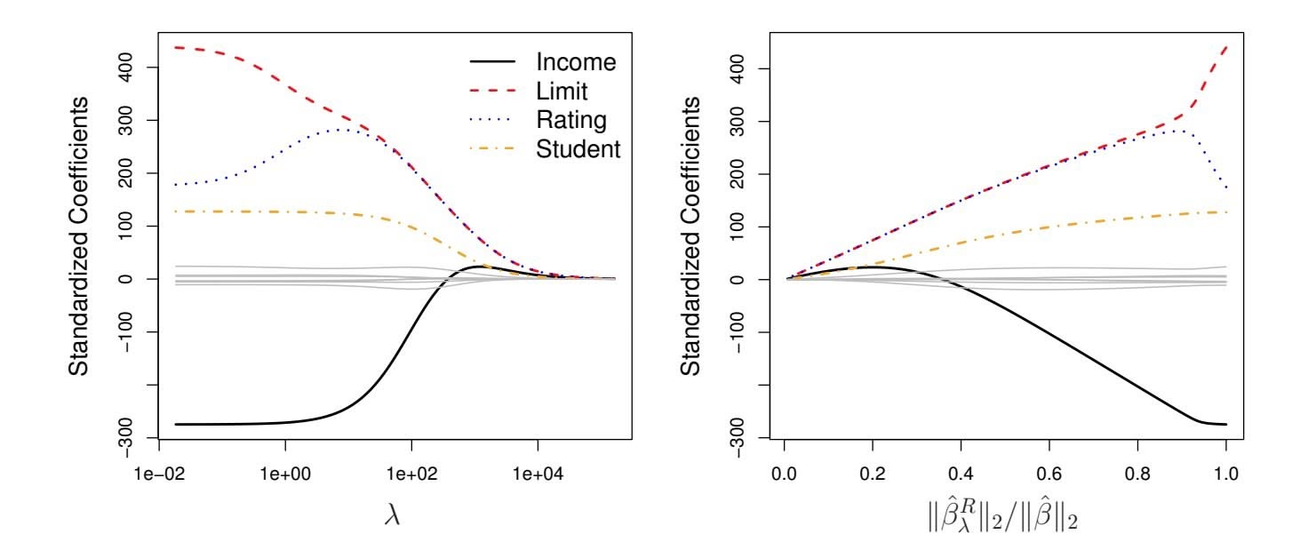
**FIGURE 6.4.** *The standardized ridge regression coefficients are displayed for the* Credit *data set, as a function of* $\lambda$ *and* $\|\hat{\beta}_{\lambda}^{R}\|_2 / \|\hat{\beta}\|_2$ .tion 6.5 trades off two different criteria. As with least squares, ridge regression seeks coefficient estimates that fit the data well, by making the RSS small. However, the second term, $\lambda \sum_{j} \beta_{j}^{2}$ , called a *shrinkage penalty*, is small when $\beta_{1}, \dots, \beta_{p}$ are close to zero, and so it has the effect of *shrinking* the estimates of $\beta_{j}$ towards zero. The tuning parameter $\lambda$ serves to control the relative impact of these two terms on the regression coefficient estimates. When $\lambda = 0$ , the penalty term has no effect, and ridge regression will produce the least squares estimates. However, as $\lambda \to \infty$ , the impact of the shrinkage penalty grows, and the ridge regression coefficient estimates will approach zero. Unlike least squares, which generates only one set of coefficient estimates, ridge regression will produce a different set of coefficient estimates, $\hat{\beta}_{\lambda}^{R}$ , for each value of $\lambda$ . Selecting a good value for $\lambda$ is critical; we defer this discussion to Section 6.2.3, where we use cross-validation.
Note that in (6.5), the shrinkage penalty is applied to $\beta_1, \dots, \beta_p$ , but not to the intercept $\beta_0$ . We want to shrink the estimated association of each variable with the response; however, we do not want to shrink the intercept, which is simply a measure of the mean value of the response when $x_{i1} = x_{i2} = \dots = x_{ip} = 0$ . If we assume that the variables—that is, the columns of the data matrix $\mathbf{X}$ —have been centered to have mean zero before ridge regression is performed, then the estimated intercept will take the form $\hat{\beta}_0 = \bar{y} = \sum_{i=1}^n y_i/n$ .
### An Application to the Credit Data
In Figure 6.4, the ridge regression coefficient estimates for the Credit data set are displayed. In the left-hand panel, each curve corresponds to the ridge regression coefficient estimate for one of the ten variables, plotted as a function of $\lambda$ . For example, the black solid line represents the ridge regression estimate for the income coefficient, as $\lambda$ is varied. At the extreme
6.2 Shrinkage Methods 239
left-hand side of the plot, $λ$ is essentially zero, and so the corresponding ridge coefficient estimates are the same as the usual least squares estimates. But as $λ$ increases, the ridge coefficient estimates shrink towards zero. When $λ$ is extremely large, then all of the ridge coefficient estimates are basically zero; this corresponds to the *null model* that contains no predictors. In this plot, the income, limit, rating, and student variables are displayed in distinct colors, since these variables tend to have by far the largest coefficient estimates. While the ridge coefficient estimates tend to decrease in aggregate as $λ$ increases, individual coefficients, such as rating and income, may occasionally increase as $λ$ increases.
The right-hand panel of Figure 6.4 displays the same ridge coefficient estimates as the left-hand panel, but instead of displaying $\lambda$ on the *x*-axis, we now display $||\hat{\beta}_\lambda^R||_2 / ||\hat{\beta}||_2$ , where $\hat{\beta}$ denotes the vector of least squares coefficient estimates. The notation $||\beta||_2$ denotes the $\ell_2$ *norm* (pronounced “ell 2”) of a vector, and is defined as $||\beta||_2 = \sqrt{\sum_{j=1}^p \beta_j^2}$ . It measures the distance of $\beta$ from zero. As $\lambda$ increases, the $\ell_2$ norm of $\hat{\beta}_\lambda^R$ will *always* decrease, and so will $||\hat{\beta}_\lambda^R||_2 / ||\hat{\beta}||_2$ . The latter quantity ranges from 1 (when $\lambda = 0$ , in which case the ridge regression coefficient estimate is the same as the least squares estimate, and so their $\ell_2$ norms are the same) to 0 (when $\lambda = \infty$ , in which case the ridge regression coefficient estimate is a vector of zeros, with $\ell_2$ norm equal to zero). Therefore, we can think of the *x*-axis in the right-hand panel of Figure 6.4 as the amount that the ridge regression coefficient estimates have been shrunken towards zero; a small value indicates that they have been shrunken very close to zero.
The standard least squares coefficient estimates discussed in Chapter 3 are *scale equivariant*: multiplying $X_j$ by a constant $c$ simply leads to a scaling of the least squares coefficient estimates by a factor of $1/c$ . In other words, regardless of how the *j*th predictor is scaled, $X_j \hat{\beta}_j$ will remain the same. In contrast, the ridge regression coefficient estimates can change *substantially* when multiplying a given predictor by a constant. For instance, consider the income variable, which is measured in dollars. One could reasonably have measured income in thousands of dollars, which would result in a reduction in the observed values of income by a factor of 1,000. Now due to the sum of squared coefficients term in the ridge regression formulation (6.5), such a change in scale will not simply cause the ridge regression coefficient estimate for income to change by a factor of 1,000. In other words, $X_j \hat{\beta}_{j, \lambda}^R$ will depend not only on the value of $\lambda$ , but also on the scaling of the *j*th predictor. In fact, the value of $X_j \hat{\beta}_{j, \lambda}^R$ may even depend on the scaling of the *other* predictors! Therefore, it is best to apply ridge regression after *standardizing the predictors*, using the formula
$$
\tilde{x}_{ij} = \frac{x_{ij}}{\sqrt{\frac{1}{n} \sum_{i=1}^{n} (x_{ij} - \overline{x}_j)^2}}, \quad (6.6)
$$
240 6. Linear Model Selection and Regularization
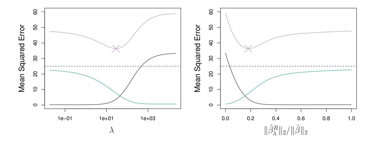
**FIGURE 6.5.** *Squared bias (black), variance (green), and test mean squared error (purple) for the ridge regression predictions on a simulated data set, as a function of $\lambda$ and $\|\hat{\beta}_{\lambda}^{R}\|_2 / \|\hat{\beta}\|_2$ . The horizontal dashed lines indicate the minimum possible MSE. The purple crosses indicate the ridge regression models for which the MSE is smallest.*
so that they are all on the same scale. In (6.6), the denominator is the estimated standard deviation of the $j$ th predictor. Consequently, all of the standardized predictors will have a standard deviation of one. As a result the final fit will not depend on the scale on which the predictors are measured. In Figure 6.4, the $y$ -axis displays the standardized ridge regression coefficient estimates—that is, the coefficient estimates that result from performing ridge regression using standardized predictors.
### Why Does Ridge Regression Improve Over Least Squares?
Ridge regression's advantage over least squares is rooted in the *bias-variance trade-off*. As $\lambda$ increases, the flexibility of the ridge regression fit decreases, leading to decreased variance but increased bias. This is illustrated in the left-hand panel of Figure 6.5, using a simulated data set containing $p = 45$ predictors and $n = 50$ observations. The green curve in the left-hand panel of Figure 6.5 displays the variance of the ridge regression predictions as a function of $\lambda$ . At the least squares coefficient estimates, which correspond to ridge regression with $\lambda = 0$ , the variance is high but there is no bias. But as $\lambda$ increases, the shrinkage of the ridge coefficient estimates leads to a substantial reduction in the variance of the predictions, at the expense of a slight increase in bias. Recall that the test mean squared error (MSE), plotted in purple, is closely related to the variance plus the squared bias. For values of $\lambda$ up to about 10, the variance decreases rapidly, with very little increase in bias, plotted in black. Consequently, the MSE drops considerably as $\lambda$ increases from 0 to 10. Beyond this point, the decrease in variance due to increasing $\lambda$ slows, and the shrinkage on the coefficients causes them to be significantly underestimated, resulting in a large increase in the bias. The minimum MSE is achieved at approximately $\lambda = 30$ . Interestingly,6.2 Shrinkage Methods 241
because of its high variance, the MSE associated with the least squares ft, when λ = 0, is almost as high as that of the null model for which all coeffcient estimates are zero, when λ = ∞. However, for an intermediate value of λ, the MSE is considerably lower.
The right-hand panel of Figure 6.5 displays the same curves as the lefthand panel, this time plotted against the ℓ2 norm of the ridge regression coeffcient estimates divided by the ℓ2 norm of the least squares estimates. Now as we move from left to right, the fts become more fexible, and so the bias decreases and the variance increases.
In general, in situations where the relationship between the response and the predictors is close to linear, the least squares estimates will have low bias but may have high variance. This means that a small change in the training data can cause a large change in the least squares coeffcient estimates. In particular, when the number of variables *p* is almost as large as the number of observations *n*, as in the example in Figure 6.5, the least squares estimates will be extremely variable. And if *p>n*, then the least squares estimates do not even have a unique solution, whereas ridge regression can still perform well by trading of a small increase in bias for a large decrease in variance. Hence, ridge regression works best in situations where the least squares estimates have high variance.
Ridge regression also has substantial computational advantages over best subset selection, which requires searching through 2*p* models. As we discussed previously, even for moderate values of *p*, such a search can be computationally infeasible. In contrast, for any fxed value of λ, ridge regression only fts a single model, and the model-ftting procedure can be performed quite quickly. In fact, one can show that the computations required to solve (6.5), *simultaneously for all values of* λ, are almost identical to those for ftting a model using least squares.
# *6.2.2 The Lasso*
Ridge regression does have one obvious disadvantage. Unlike best subset, forward stepwise, and backward stepwise selection, which will generally select models that involve just a subset of the variables, ridge regression will include all *p* predictors in the final model. The penalty $λ Σ β_j^2$ in (6.5) will shrink all of the coefficients towards zero, but it will not set any of them exactly to zero (unless $λ = ∞$ ). This may not be a problem for prediction accuracy, but it can create a challenge in model interpretation in settings in which the number of variables *p* is quite large. For example, in the Credit data set, it appears that the most important variables are income, limit, rating, and student. So we might wish to build a model including just these predictors. However, ridge regression will always generate a model involving all ten predictors. Increasing the value of $λ$ will tend to reduce the magnitudes of the coefficients, but will not result in exclusion of any of the variables.
# 242 6. Linear Model Selection and Regularization
The *lasso* is a relatively recent alternative to ridge regression that overcomes this disadvantage. The lasso coefficients, $\hat{\beta}_{\lambda}^{L}$ , minimize the quantity
$$
\sum_{i=1}^{n} \left( y_i - \beta_0 - \sum_{j=1}^{p} \beta_j x_{ij} \right)^2 + \lambda \sum_{j=1}^{p} |\beta_j| = \text{RSS} + \lambda \sum_{j=1}^{p} |\beta_j| \quad (6.7)
$$
Comparing (6.7) to (6.5), we see that the lasso and ridge regression have similar formulations. The only difference is that the $\beta_j^2$ term in the ridge regression penalty (6.5) has been replaced by $|\beta_j|$ in the lasso penalty (6.7). In statistical parlance, the lasso uses an $\ell_1$ (pronounced "ell 1") penalty instead of an $\ell_2$ penalty. The $\ell_1$ norm of a coefficient vector $\beta$ is given by $||\beta||_1 = \sum |\beta_j|$ .
As with ridge regression, the lasso shrinks the coeffcient estimates towards zero. However, in the case of the lasso, the ℓ1 penalty has the efect of forcing some of the coeffcient estimates to be exactly equal to zero when the tuning parameter λ is suffciently large. Hence, much like best subset selection, the lasso performs *variable selection*. As a result, models generated from the lasso are generally much easier to interpret than those produced by ridge regression. We say that the lasso yields *sparse* models—that is, sparse models that involve only a subset of the variables. As in ridge regression, selecting a good value of λ for the lasso is critical; we defer this discussion to Section 6.2.3, where we use cross-validation.
sparse
As an example, consider the coeffcient plots in Figure 6.6, which are generated from applying the lasso to the Credit data set. When λ = 0, then the lasso simply gives the least squares ft, and when λ becomes suffciently large, the lasso gives the null model in which all coeffcient estimates equal zero. However, in between these two extremes, the ridge regression and lasso models are quite diferent from each other. Moving from left to right in the right-hand panel of Figure 6.6, we observe that at frst the lasso results in a model that contains only the rating predictor. Then student and limit enter the model almost simultaneously, shortly followed by income. Eventually, the remaining variables enter the model. Hence, depending on the value of λ, the lasso can produce a model involving any number of variables. In contrast, ridge regression will always include all of the variables in the model, although the magnitude of the coeffcient estimates will depend on λ.
6.2 Shrinkage Methods 243
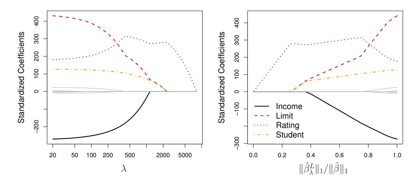
**FIGURE 6.6.** *The standardized lasso coeffcients on the* Credit *data set are shown as a function of* λ *and* ∥βˆ*L* λ ∥1*/*∥βˆ∥1*.*
### Another Formulation for Ridge Regression and the Lasso
One can show that the lasso and ridge regression coeffcient estimates solve the problems
$$
\underset{\beta}{\text{minimize}} \left\{ \sum_{i=1}^{n} \left( y_i - \beta_0 - \sum_{j=1}^{p} \beta_j x_{ij} \right)^2 \right\} \quad \text{subject to} \quad \sum_{j=1}^{p} |\beta_j| \le s \quad (6.8)
$$
and
minimizeβ
$$
\left\{ \sum_{i=1}^{n} \left( y_i - \beta_0 - \sum_{j=1}^{p} \beta_j x_{ij} \right)^2 \right\} \text{ subject to } \sum_{j=1}^{p} \beta_j^2 \leq s, \tag{6.9}
$$
respectively. In other words, for every value of $\lambda$ , there is some *s* such that the Equations (6.7) and (6.8) will give the same lasso coefficient estimates. Similarly, for every value of $\lambda$ there is a corresponding *s* such that Equations (6.5) and (6.9) will give the same ridge regression coefficient estimates. When $p = 2$ , then (6.8) indicates that the lasso coefficient estimates have the smallest RSS out of all points that lie within the diamond defined by $|\beta_1| + |\beta_2| \le s$ . Similarly, the ridge regression estimates have the smallest RSS out of all points that lie within the circle defined by $\beta_1^2 + \beta_2^2 \le s$ .
We can think of (6.8) as follows. When we perform the lasso we are trying to find the set of coefficient estimates that lead to the smallest RSS, subject to the constraint that there is a *budget s* for how large $\sum_{j=1}^{p} |\beta_j|$ can be. When *s* is extremely large, then this budget is not very restrictive, and so the coefficient estimates can be large. In fact, if *s* is large enough that the least squares solution falls within the budget, then (6.8) will simply yield the least squares solution. In contrast, if *s* is small, then $\sum_{j=1}^{p} |\beta_j|$ must be
# 244 6. Linear Model Selection and Regularization
small in order to avoid violating the budget. Similarly, (6.9) indicates that when we perform ridge regression, we seek a set of coefficient estimates such that the RSS is as small as possible, subject to the requirement that $\sum_{j=1}^{p} \beta_{j}^{2}$ not exceed the budget *s*.The formulations $(6.8)$ and $(6.9)$ reveal a close connection between the lasso, ridge regression, and best subset selection. Consider the problem
$$
\underset{\beta}{\text{minimize}} \left\{ \sum_{i=1}^{n} \left( y_i - \beta_0 - \sum_{j=1}^{p} \beta_j x_{ij} \right)^2 \right\} \quad \text{subject to} \quad \sum_{j=1}^{p} I(\beta_j \neq 0) \leq s. \tag{6.10}
$$
Here $I(\beta_j \neq 0)$ is an indicator variable: it takes on a value of 1 if $\beta_j \neq 0$ , and equals zero otherwise. Then (6.10) amounts to finding a set of coefficient estimates such that RSS is as small as possible, subject to the constraint that no more than *s* coefficients can be nonzero. The problem (6.10) is equivalent to best subset selection. Unfortunately, solving (6.10) is computationally infeasible when *p* is large, since it requires considering all $\binom{p}{s}$ models containing *s* predictors. Therefore, we can interpret ridge regression and the lasso as computationally feasible alternatives to best subset selection that replace the intractable form of the budget in (6.10) with forms that are much easier to solve. Of course, the lasso is much more closely related to best subset selection, since the lasso performs feature selection for *s* sufficiently small in (6.8), while ridge regression does not.
### The Variable Selection Property of the Lasso
Why is it that the lasso, unlike ridge regression, results in coefficient estimates that are exactly equal to zero? The formulations (6.8) and (6.9) can be used to shed light on the issue. Figure 6.7 illustrates the situation. The least squares solution is marked as $\hat{\beta}$ , while the blue diamond and circle represent the lasso and ridge regression constraints in (6.8) and (6.9), respectively. If *s* is sufficiently large, then the constraint regions will contain $\hat{\beta}$ , and so the ridge regression and lasso estimates will be the same as the least squares estimates. (Such a large value of *s* corresponds to $\lambda = 0$ in (6.5) and (6.7).) However, in Figure 6.7 the least squares estimates lie outside of the diamond and the circle, and so the least squares estimates are not the same as the lasso and ridge regression estimates.
Each of the ellipses centered around $\hat{\beta}$ represents a *contour*: this means that all of the points on a particular ellipse have the same RSS value. As the ellipses expand away from the least squares coefficient estimates, the RSS increases. Equations (6.8) and (6.9) indicate that the lasso and ridge regression coefficient estimates are given by the first point at which an ellipse contacts the constraint region. Since ridge regression has a circular constraint with no sharp points, this intersection will not generally occur on an axis, and so the ridge regression coefficient estimates will be exclusively
6.2 Shrinkage Methods 245
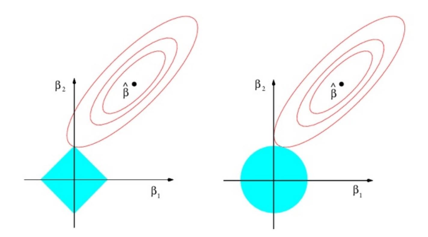
**FIGURE 6.7.** *Contours of the error and constraint functions for the lasso* (left) *and ridge regression* (right)*. The solid blue areas are the constraint regions,* $|\beta_1| + |\beta_2| \le s$ *and* $\beta_1^2 + \beta_2^2 \le s$ *, while the red ellipses are the contours of the RSS.*
non-zero. However, the lasso constraint has *corners* at each of the axes, and so the ellipse will often intersect the constraint region at an axis. When this occurs, one of the coefficients will equal zero. In higher dimensions, many of the coefficient estimates may equal zero simultaneously. In Figure 6.7, the intersection occurs at $β_1 = 0$ , and so the resulting model will only include $β_2$ .In Figure 6.7, we considered the simple case of $p = 2$ . When $p = 3$ , then the constraint region for ridge regression becomes a sphere, and the constraint region for the lasso becomes a polyhedron. When $p > 3$ , the constraint for ridge regression becomes a hypersphere, and the constraint for the lasso becomes a polytope. However, the key ideas depicted in Figure 6.7 still hold. In particular, the lasso leads to feature selection when $p > 2$ due to the sharp corners of the polyhedron or polytope.
### Comparing the Lasso and Ridge Regression
It is clear that the lasso has a major advantage over ridge regression, in that it produces simpler and more interpretable models that involve only a subset of the predictors. However, which method leads to better prediction accuracy? Figure 6.8 displays the variance, squared bias, and test MSE of the lasso applied to the same simulated data as in Figure 6.5. Clearly the lasso leads to qualitatively similar behavior to ridge regression, in that as $\lambda$ increases, the variance decreases and the bias increases. In the right-hand panel of Figure 6.8, the dotted lines represent the ridge regression fits. Here we plot both against their $R^2$ on the training data. This is another
246 6. Linear Model Selection and Regularization
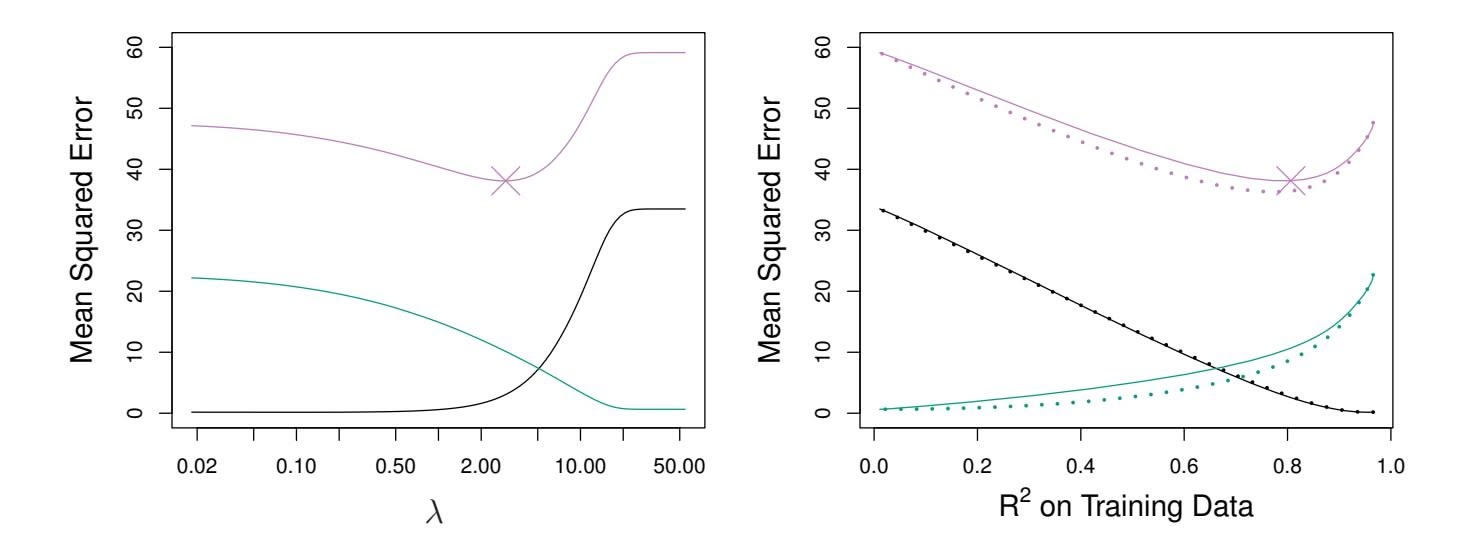
**FIGURE 6.8.** Left: *Plots of squared bias (black), variance (green), and test MSE (purple) for the lasso on a simulated data set.* Right: *Comparison of squared bias, variance, and test MSE between lasso (solid) and ridge (dotted). Both are plotted against their R*2 *on the training data, as a common form of indexing. The crosses in both plots indicate the lasso model for which the MSE is smallest.*
useful way to index models, and can be used to compare models with diferent types of regularization, as is the case here. In this example, the lasso and ridge regression result in almost identical biases. However, the variance of ridge regression is slightly lower than the variance of the lasso. Consequently, the minimum MSE of ridge regression is slightly smaller than that of the lasso.
However, the data in Figure 6.8 were generated in such a way that all 45 predictors were related to the response—that is, none of the true coeffcients β1*,...,* β45 equaled zero. The lasso implicitly assumes that a number of the coeffcients truly equal zero. Consequently, it is not surprising that ridge regression outperforms the lasso in terms of prediction error in this setting. Figure 6.9 illustrates a similar situation, except that now the response is a function of only 2 out of 45 predictors. Now the lasso tends to outperform ridge regression in terms of bias, variance, and MSE.
These two examples illustrate that neither ridge regression nor the lasso will universally dominate the other. In general, one might expect the lasso to perform better in a setting where a relatively small number of predictors have substantial coeffcients, and the remaining predictors have coeffcients that are very small or that equal zero. Ridge regression will perform better when the response is a function of many predictors, all with coeffcients of roughly equal size. However, the number of predictors that is related to the response is never known *a priori* for real data sets. A technique such as cross-validation can be used in order to determine which approach is better on a particular data set.
As with ridge regression, when the least squares estimates have excessively high variance, the lasso solution can yield a reduction in variance at the expense of a small increase in bias, and consequently can gener-
6.2 Shrinkage Methods 247
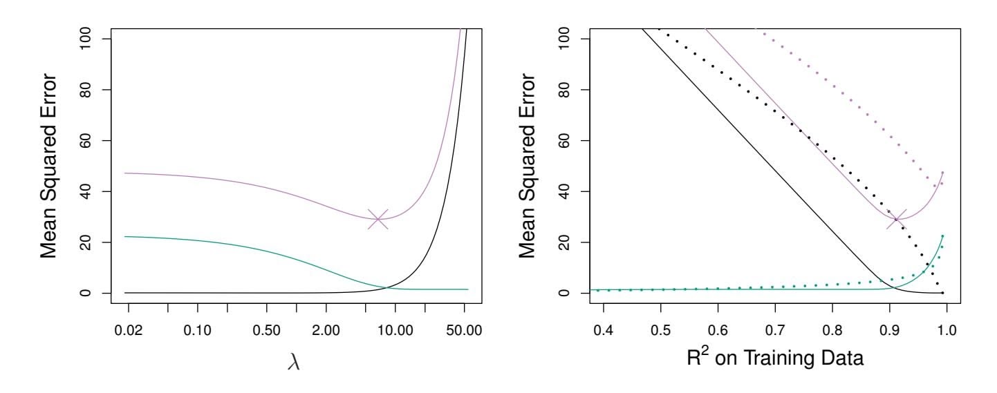
**FIGURE 6.9.** Left: *Plots of squared bias (black), variance (green), and test MSE (purple) for the lasso. The simulated data is similar to that in Figure 6.8, except that now only two predictors are related to the response.* Right: *Comparison of squared bias, variance, and test MSE between lasso (solid) and ridge (dotted). Both are plotted against their R*2 *on the training data, as a common form of indexing. The crosses in both plots indicate the lasso model for which the MSE is smallest.*
ate more accurate predictions. Unlike ridge regression, the lasso performs variable selection, and hence results in models that are easier to interpret.
There are very effcient algorithms for ftting both ridge and lasso models; in both cases the entire coeffcient paths can be computed with about the same amount of work as a single least squares ft. We will explore this further in the lab at the end of this chapter.
### A Simple Special Case for Ridge Regression and the Lasso
In order to obtain a better intuition about the behavior of ridge regression and the lasso, consider a simple special case with $n = p$ , and $X$ a diagonal matrix with 1's on the diagonal and 0's in all off-diagonal elements. To simplify the problem further, assume also that we are performing regression without an intercept. With these assumptions, the usual least squares problem simplifies to finding $β_1, ..., β_p$ that minimize
$$
\sum_{j=1}^{p} (y_j - \beta_j)^2 \quad (6.11)
$$
In this case, the least squares solution is given by
$$
\hat{\beta}_j = y_j.
$$
And in this setting, ridge regression amounts to fnding β1*,...,* β*p* such that
$$
\sum_{j=1}^{p} (y_j - \beta_j)^2 + \lambda \sum_{j=1}^{p} \beta_j^2 \quad (6.12)
$$
248 6. Linear Model Selection and Regularization
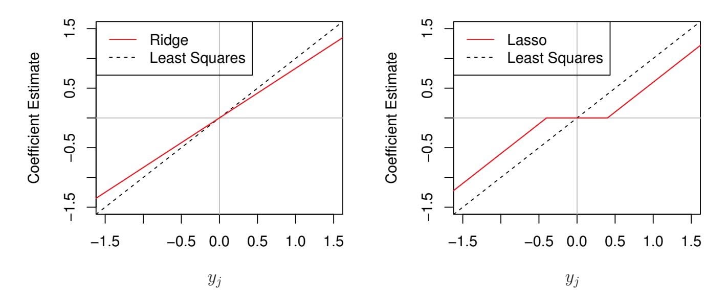
**FIGURE 6.10.** *The ridge regression and lasso coeffcient estimates for a simple setting with n* = *p and* X *a diagonal matrix with* 1*'s on the diagonal.* Left: *The ridge regression coeffcient estimates are shrunken proportionally towards zero, relative to the least squares estimates.* Right: *The lasso coeffcient estimates are soft-thresholded towards zero.*
is minimized, and the lasso amounts to fnding the coeffcients such that
$$
\sum_{j=1}^{p} (y_j - \beta_j)^2 + \lambda \sum_{j=1}^{p} |\beta_j| \quad (6.13)
$$
is minimized. One can show that in this setting, the ridge regression estimates take the form
$$
\hat{\beta}_j^R = \frac{y_j}{1 + \lambda}, \tag{6.14}
$$
and the lasso estimates take the form
$$
\hat{\beta}_j^L = \begin{cases} y_j - \lambda/2 & \text{if } y_j > \lambda/2; \\ y_j + \lambda/2 & \text{if } y_j < -\lambda/2; \\ 0 & \text{if } |y_j| \le \lambda/2. \end{cases} \tag{6.15}
$$
Figure 6.10 displays the situation. We can see that ridge regression and the lasso perform two very diferent types of shrinkage. In ridge regression, each least squares coeffcient estimate is shrunken by the same proportion. In contrast, the lasso shrinks each least squares coeffcient towards zero by a constant amount, λ*/*2; the least squares coeffcients that are less than λ*/*2 in absolute value are shrunken entirely to zero. The type of shrinkage performed by the lasso in this simple setting (6.15) is known as *softthresholding*. The fact that some lasso coeffcients are shrunken entirely to softthresholding zero explains why the lasso performs feature selection.
soft-
thresholding
In the case of a more general data matrix X, the story is a little more complicated than what is depicted in Figure 6.10, but the main ideas still hold approximately: ridge regression more or less shrinks every dimension of the data by the same proportion, whereas the lasso more or less shrinks
6.2 Shrinkage Methods 249
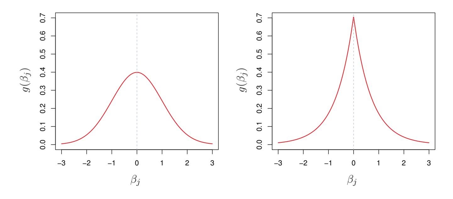
**FIGURE 6.11.** Left: *Ridge regression is the posterior mode for* β *under a Gaussian prior.* Right: *The lasso is the posterior mode for* β *under a double-exponential prior.*
all coeffcients toward zero by a similar amount, and suffciently small coeffcients are shrunken all the way to zero.
### Bayesian Interpretation of Ridge Regression and the Lasso
We now show that one can view ridge regression and the lasso through a Bayesian lens. A Bayesian viewpoint for regression assumes that the coefficient vector $\beta$ has some *prior* distribution, say $p(\beta)$ , where $\beta = (\beta_0, \beta_1, \dots, \beta_p)^T$ . The likelihood of the data can be written as $f(Y|X, \beta)$ , where $X = (X_1, \dots, X_p)$ . Multiplying the prior distribution by the likelihood gives us (up to a proportionality constant) the *posterior distribution*, which takes the form
posterior
distribution
$$
p(\beta|X, Y) \propto f(Y|X, \beta)p(\beta|X) = f(Y|X, \beta)p(\beta),
$$
where the proportionality above follows from Bayes' theorem, and the equality above follows from the assumption that *X* is fxed.
We assume the usual linear model,
$$
Y = \beta_0 + X_1 \beta_1 + \dots + X_p \beta_p + \epsilon,
$$
and suppose that the errors are independent and drawn from a normal distribution. Furthermore, assume that $p(\beta) = \prod_{j=1}^{p} g(\beta_j)$ , for some density function $g$ . It turns out that ridge regression and the lasso follow naturally from two special cases of $g$ :
• If *g* is a Gaussian distribution with mean zero and standard deviation a function of λ, then it follows that the *posterior mode* for β—that posterior mode is, the most likely value for β, given the data—is given by the ridge
posterior
mode
250 6. Linear Model Selection and Regularization
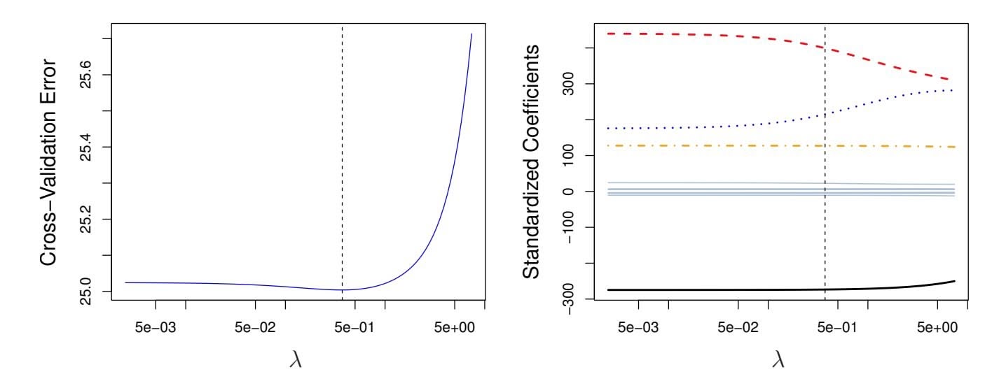
**FIGURE 6.12.** Left: *Cross-validation errors that result from applying ridge regression to the* Credit *data set with various values of* λ*.* Right: *The coeffcient estimates as a function of* λ*. The vertical dashed lines indicate the value of* λ *selected by cross-validation.*
regression solution. (In fact, the ridge regression solution is also the posterior mean.)
• If *g* is a double-exponential (Laplace) distribution with mean zero and scale parameter a function of λ, then it follows that the posterior mode for β is the lasso solution. (However, the lasso solution is *not* the posterior mean, and in fact, the posterior mean does not yield a sparse coeffcient vector.)
The Gaussian and double-exponential priors are displayed in Figure 6.11. Therefore, from a Bayesian viewpoint, ridge regression and the lasso follow directly from assuming the usual linear model with normal errors, together with a simple prior distribution for β. Notice that the lasso prior is steeply peaked at zero, while the Gaussian is fatter and fatter at zero. Hence, the lasso expects a priori that many of the coeffcients are (exactly) zero, while ridge assumes the coeffcients are randomly distributed about zero.
# *6.2.3 Selecting the Tuning Parameter*
Just as the subset selection approaches considered in Section 6.1 require a method to determine which of the models under consideration is best, implementing ridge regression and the lasso requires a method for selecting a value for the tuning parameter λ in (6.5) and (6.7), or equivalently, the value of the constraint *s* in (6.9) and (6.8). Cross-validation provides a simple way to tackle this problem. We choose a grid of λ values, and compute the cross-validation error for each value of λ, as described in Chapter 5. We then select the tuning parameter value for which the cross-validation error is smallest. Finally, the model is re-ft using all of the available observations and the selected value of the tuning parameter.
6.2 Shrinkage Methods 251
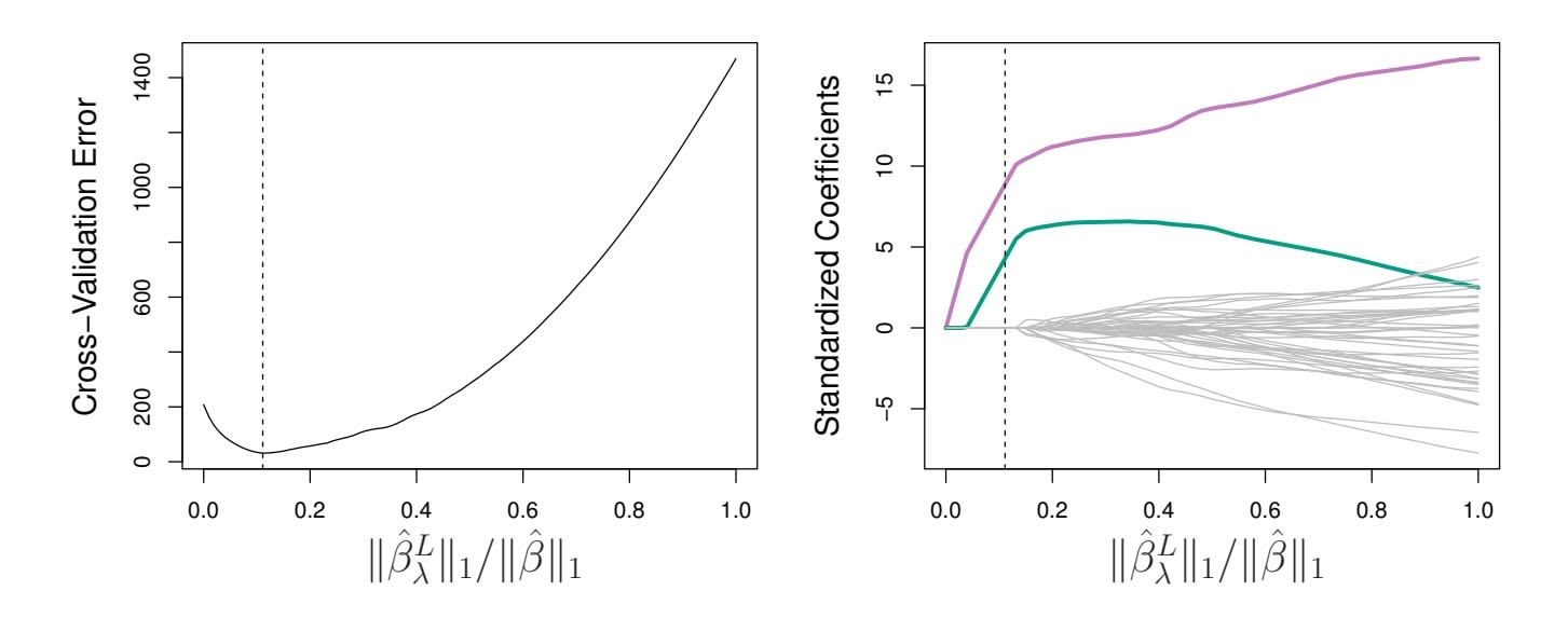
**FIGURE 6.13.** Left*: Ten-fold cross-validation MSE for the lasso, applied to the sparse simulated data set from Figure 6.9.* Right: *The corresponding lasso coeffcient estimates are displayed. The two signal variables are shown in color, and the noise variables are in gray. The vertical dashed lines indicate the lasso ft for which the cross-validation error is smallest.*
Figure 6.12 displays the choice of λ that results from performing leaveone-out cross-validation on the ridge regression fts from the Credit data set. The dashed vertical lines indicate the selected value of λ. In this case the value is relatively small, indicating that the optimal ft only involves a small amount of shrinkage relative to the least squares solution. In addition, the dip is not very pronounced, so there is rather a wide range of values that would give a very similar error. In a case like this we might simply use the least squares solution.
Figure 6.13 provides an illustration of ten-fold cross-validation applied to the lasso fts on the sparse simulated data from Figure 6.9. The left-hand panel of Figure 6.13 displays the cross-validation error, while the right-hand panel displays the coeffcient estimates. The vertical dashed lines indicate the point at which the cross-validation error is smallest. The two colored lines in the right-hand panel of Figure 6.13 represent the two predictors that are related to the response, while the grey lines represent the unrelated predictors; these are often referred to as *signal* and *noise* variables, signal respectively. Not only has the lasso correctly given much larger coeffcient estimates to the two signal predictors, but also the minimum crossvalidation error corresponds to a set of coeffcient estimates for which only the signal variables are non-zero. Hence cross-validation together with the lasso has correctly identifed the two signal variables in the model, even though this is a challenging setting, with *p* = 45 variables and only *n* = 50 observations. In contrast, the least squares solution—displayed on the far right of the right-hand panel of Figure 6.13—assigns a large coeffcient estimate to only one of the two signal variables.
252 6. Linear Model Selection and Regularization
# 6.3 Dimension Reduction Methods
The methods that we have discussed so far in this chapter have controlled variance in two diferent ways, either by using a subset of the original variables, or by shrinking their coeffcients toward zero. All of these methods are defned using the original predictors, *X*1*, X*2*,...,Xp*. We now explore a class of approaches that *transform* the predictors and then ft a least squares model using the transformed variables. We will refer to these techniques as *dimension reduction* methods. dimension
reduction Let *Z*1*, Z*2*,...,ZM* represent *Mm* are linearly independent, then (6.18) poses no constraints. In this case, no dimension reduction occurs, and so ftting (6.17) is equivalent to performing least squares on the original *p* predictors.
All dimension reduction methods work in two steps. First, the transformed predictors *Z*1*, Z*2*,...,ZM* are obtained. Second, the model is ft using these *M* predictors. However, the choice of *Z*1*, Z*2*,...,ZM*, or equivalently, the selection of the φ*jm*'s, can be achieved in diferent ways. In this chapter, we will consider two approaches for this task: *principal components* and *partial least squares*.
# *6.3.1 Principal Components Regression*
*Principal components analysis* (PCA) is a popular approach for deriving principal a low-dimensional set of features from a large set of variables. PCA is discussed in greater detail as a tool for *unsupervised learning* in Chapter 12. Here we describe its use as a dimension reduction technique for regression.
components analysis
### An Overview of Principal Components Analysis
PCA is a technique for reducing the dimension of an $n \times p$ data matrix $\mathbf{X}$ . The *first principal component* direction of the data is that along which the observations *vary the most*. For instance, consider Figure 6.14, which shows population size (pop) in tens of thousands of people, and ad spending for a
# 254 6. Linear Model Selection and Regularization
particular company (ad) in thousands of dollars, for 100 cities.6 The green solid line represents the frst principal component direction of the data. We can see by eye that this is the direction along which there is the greatest variability in the data. That is, if we *projected* the 100 observations onto this line (as shown in the left-hand panel of Figure 6.15), then the resulting projected observations would have the largest possible variance; projecting the observations onto any other line would yield projected observations with lower variance. Projecting a point onto a line simply involves fnding the location on the line which is closest to the point.
The frst principal component is displayed graphically in Figure 6.14, but how can it be summarized mathematically? It is given by the formula
$$
Z_{1} = 0.839 \times (\text{pop} - \overline{\text{pop}}) + 0.544 \times (\text{ad} - \overline{\text{ad}}) \quad (6.19)
$$
Here $\phi_{11} = 0.839$ and $\phi_{21} = 0.544$ are the principal component loadings, which define the direction referred to above. In (6.19), $\overline{\text{pop}}$ indicates the mean of all pop values in this data set, and $\overline{\text{ad}}$ indicates the mean of all advertising spending. The idea is that out of every possible *linear combination* of pop and ad such that $\phi_{11}^2 + \phi_{21}^2 = 1$ , this particular linear combination yields the highest variance: i.e. this is the linear combination for which $\text{Var}(\phi_{11} \times (\text{pop} - \overline{\text{pop}}) + \phi_{21} \times (\text{ad} - \overline{\text{ad}}))$ is maximized. It is necessary to consider only linear combinations of the form $\phi_{11}^2 + \phi_{21}^2 = 1$ , since otherwise we could increase $\phi_{11}$ and $\phi_{21}$ arbitrarily in order to blow up the variance. In (6.19), the two loadings are both positive and have similar size, and so $Z_1$ is almost an *average* of the two variables.
Since *n* = 100, pop and ad are vectors of length 100, and so is *Z*1 in (6.19). For instance,
$$
z_{i1} = 0.839 \times (\text{pop}_{i} - \overline{\text{pop}}) + 0.544 \times (\text{ad}_{i} - \overline{\text{ad}}).
$$
(6.20)
The values of *z*11*,...,zn*1 are known as the *principal component scores*, and can be seen in the right-hand panel of Figure 6.15.
There is also another interpretation of PCA: the frst principal component vector defnes the line that is *as close as possible* to the data. For instance, in Figure 6.14, the frst principal component line minimizes the sum of the squared perpendicular distances between each point and the line. These distances are plotted as dashed line segments in the left-hand panel of Figure 6.15, in which the crosses represent the *projection* of each point onto the frst principal component line. The frst principal component has been chosen so that the projected observations are *as close as possible* to the original observations.
In the right-hand panel of Figure 6.15, the left-hand panel has been rotated so that the frst principal component direction coincides with the *x*-axis. It is possible to show that the *frst principal component score* for
6This dataset is distinct from the Advertising data discussed in Chapter 3.
6.3 Dimension Reduction Methods 255
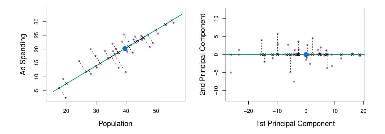
**FIGURE 6.15.** *A subset of the advertising data. The mean* pop *and* ad *budgets are indicated with a blue circle.* Left: *The first principal component direction is shown in green. It is the dimension along which the data vary the most, and it also defines the line that is closest to all* $n$ *of the observations. The distances from each observation to the principal component are represented using the black dashed line segments. The blue dot represents* $(\overline{\text{pop}}, \overline{\text{ad}})$ *.* Right: *The left-hand panel has been rotated so that the first principal component direction coincides with the x-axis.*
the *i*th observation, given in (6.20), is the distance in the *x*-direction of the *i*th cross from zero. So for example, the point in the bottom-left corner of the left-hand panel of Figure 6.15 has a large negative principal component score, $z_{i1} = -26.1$ , while the point in the top-right corner has a large positive score, $z_{i1} = 18.7$ . These scores can be computed directly using (6.20).We can think of the values of the principal component $Z_1$ as single-number summaries of the joint pop and ad budgets for each location. In this example, if $z_{i1} = 0.839 \times (\text{pop}_i - \overline{\text{pop}}) + 0.544 \times (\text{ad}_i - \overline{\text{ad}}) < 0$ , then this indicates a city with below-average population size and below-average ad spending. A positive score suggests the opposite. How well can a single number represent both pop and ad? In this case, Figure 6.14 indicates that pop and ad have approximately a linear relationship, and so we might expect that a single-number summary will work well. Figure 6.16 displays $z_{i1}$ versus both pop and ad.[7](#7) The plots show a strong relationship between the first principal component and the two features. In other words, the first principal component appears to capture most of the information contained in the pop and ad predictors.
So far we have concentrated on the first principal component. In general, one can construct up to $p$ distinct principal components. The second principal component $Z_2$ is a linear combination of the variables that is uncorrelated with $Z_1$ , and has largest variance subject to this constraint. The
7The principal components were calculated after first standardizing both pop and ad, a common approach. Hence, the x-axes on Figures 6.15 and 6.16 are not on the same scale.256 6. Linear Model Selection and Regularization
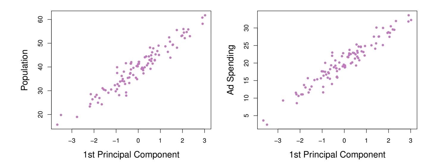
**FIGURE 6.16.** *Plots of the frst principal component scores zi*1 *versus* pop *and* ad*. The relationships are strong.*
second principal component direction is illustrated as a dashed blue line in Figure 6.14. It turns out that the zero correlation condition of *Z*1 with *Z*2 is equivalent to the condition that the direction must be *perpendicular*, or perpen*orthogonal*, to the frst principal component direction. The second principal dicular component is given by the formula orthogonal
perpen-
dicular
orthogonal
$$
Z_2 = 0.544 \times (pop - \overline{pop}) - 0.839 \times (ad - \overline{ad}).
$$
Since the advertising data has two predictors, the frst two principal components contain all of the information that is in pop and ad. However, by construction, the frst component will contain the most information. Consider, for example, the much larger variability of *zi*1 (the *x*-axis) versus *zi*2 (the *y*-axis) in the right-hand panel of Figure 6.15. The fact that the second principal component scores are much closer to zero indicates that this component captures far less information. As another illustration, Figure 6.17 displays *zi*2 versus pop and ad. There is little relationship between the second principal component and these two predictors, again suggesting that in this case, one only needs the frst principal component in order to accurately represent the pop and ad budgets.
With two-dimensional data, such as in our advertising example, we can construct at most two principal components. However, if we had other predictors, such as population age, income level, education, and so forth, then additional components could be constructed. They would successively maximize variance, subject to the constraint of being uncorrelated with the preceding components.
### The Principal Components Regression Approach
The *principal components regression* (PCR) approach involves construct- principal ing the frst *M* principal components, *Z*1*,...,ZM*, and then using these components as the predictors in a linear regression model that is ft using least squares. The key idea is that often a small number of principal
components regression
6.3 Dimension Reduction Methods 257
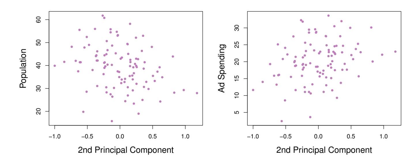
**FIGURE 6.17.** *Plots of the second principal component scores zi*2 *versus* pop *and* ad*. The relationships are weak.*
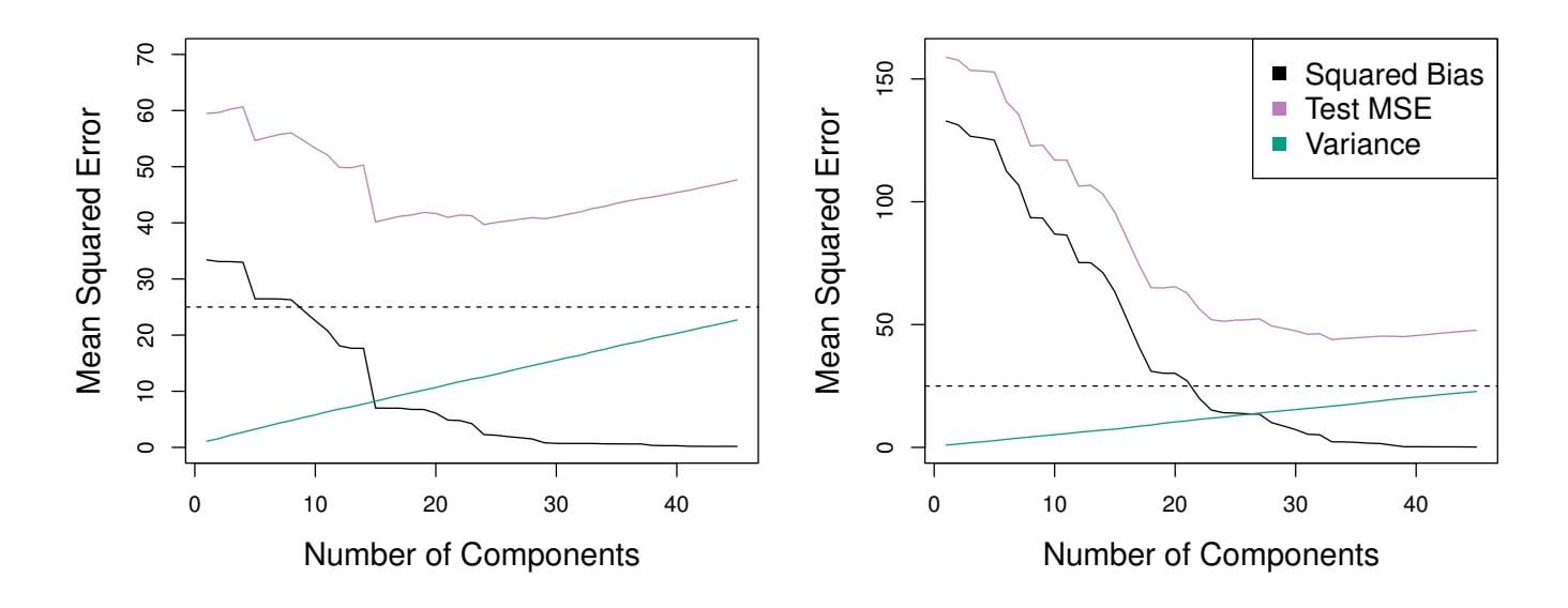
**FIGURE 6.18.** *PCR was applied to two simulated data sets. In each panel, the horizontal dashed line represents the irreducible error.* Left: *Simulated data from Figure 6.8.* Right: *Simulated data from Figure 6.9.*
components suffce to explain most of the variability in the data, as well as the relationship with the response. In other words, we assume that *the directions in which X*1*,...,Xp show the most variation are the directions that are associated with Y* . While this assumption is not guaranteed to be true, it often turns out to be a reasonable enough approximation to give good results.
If the assumption underlying PCR holds, then fitting a least squares model to $Z_1, \dots, Z_M$ will lead to better results than fitting a least squares model to $X_1, \dots, X_p$ , since most or all of the information in the data that relates to the response is contained in $Z_1, \dots, Z_M$ , and by estimating only $M \ll p$ coefficients we can mitigate overfitting. In the advertising data, the first principal component explains most of the variance in both pop and ad, so a principal component regression that uses this single variable to predict some response of interest, such as sales, will likely perform quite well.
258 6. Linear Model Selection and Regularization
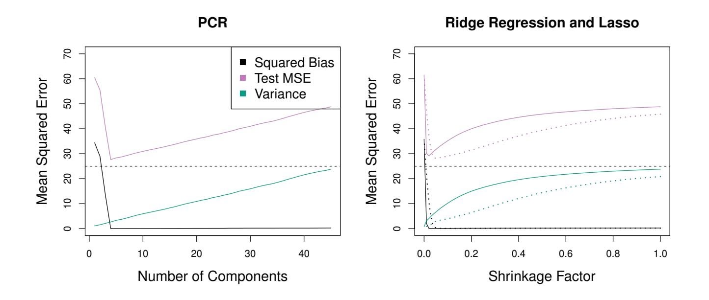
**FIGURE 6.19.** *PCR, ridge regression, and the lasso were applied to a simulated data set in which the frst fve principal components of X contain all the information about the response Y . In each panel, the irreducible error* Var(ϵ) *is shown as a horizontal dashed line.* Left: *Results for PCR.* Right: *Results for lasso (solid) and ridge regression (dotted). The x-axis displays the shrinkage factor of the coeffcient estimates, defned as the* ℓ2 *norm of the shrunken coeffcient estimates divided by the* ℓ2 *norm of the least squares estimate.*
Figure 6.18 displays the PCR $fits$ on the simulated data sets from Figures 6.8 and 6.9. Recall that both data sets were generated using $n = 50$ observations and $p = 45$ predictors. However, while the response in the first data set was a function of all the predictors, the response in the second data set was generated using only two of the predictors. The curves are plotted as a function of $M$ , the number of principal components used as predictors in the regression model. As more principal components are used in the regression model, the bias decreases, but the variance increases. This results in a typical U-shape for the mean squared error. When $M = p = 45$ , then PCR amounts simply to a least squares fit using all of the original predictors. The figure indicates that performing PCR with an appropriate choice of $M$ can result in a substantial improvement over least squares, especially in the left-hand panel. However, by examining the ridge regression and lasso results in Figures 6.5, 6.8, and 6.9, we see that PCR does not perform as well as the two shrinkage methods in this example.
The relatively worse performance of PCR in Figure 6.18 is a consequence of the fact that the data were generated in such a way that many principal components are required in order to adequately model the response. In contrast, PCR will tend to do well in cases when the frst few principal components are suffcient to capture most of the variation in the predictors as well as the relationship with the response. The left-hand panel of Figure 6.19 illustrates the results from another simulated data set designed to be more favorable to PCR. Here the response was generated in such a way that it depends exclusively on the frst fve principal components. Now the
6.3 Dimension Reduction Methods 259
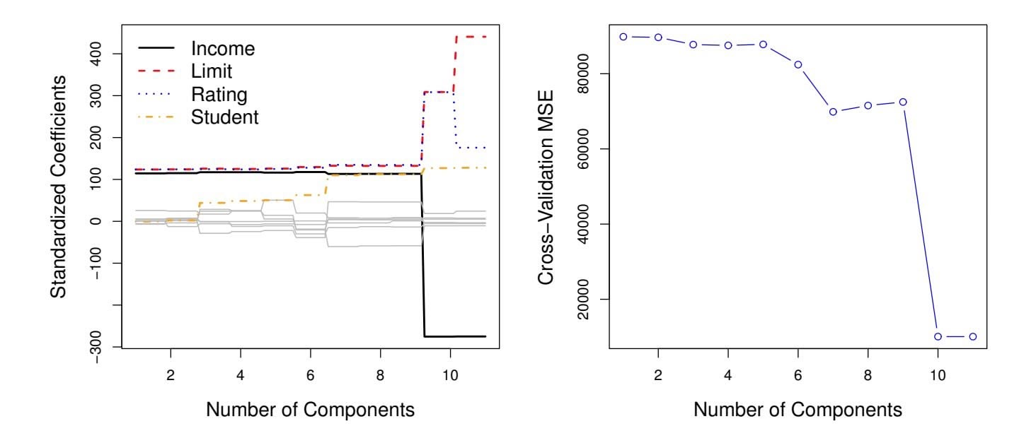
**FIGURE 6.20.** Left: *PCR standardized coeffcient estimates on the* Credit *data set for diferent values of M.* Right: *The ten-fold cross-validation* MSE *obtained using PCR, as a function of M.*
bias drops to zero rapidly as *M*, the number of principal components used in PCR, increases. The mean squared error displays a clear minimum at *M* = 5. The right-hand panel of Figure 6.19 displays the results on these data using ridge regression and the lasso. All three methods ofer a significant improvement over least squares. However, PCR and ridge regression slightly outperform the lasso.
We note that even though PCR provides a simple way to perform regression using *M1 was a linear combination of both pop and ad. Therefore, while PCR often performs quite well in many practical settings, it does not result in the development of a model that relies upon a small set of the original features. In this sense, PCR is more closely related to ridge regression than to the lasso. In fact, one can show that PCR and ridge regression are very closely related. One can even think of ridge regression as a continuous version of PCR!8
In PCR, the number of principal components, *M*, is typically chosen by cross-validation. The results of applying PCR to the Credit data set are shown in Figure 6.20; the right-hand panel displays the cross-validation errors obtained, as a function of *M*. On these data, the lowest cross-validation error occurs when there are *M* = 10 components; this corresponds to almost no dimension reduction at all, since PCR with *M* = 11 is equivalent to simply performing least squares.
8More details can be found in Section 3.5 of *The Elements of Statistical Learning* by Hastie, Tibshirani, and Friedman.
260 6. Linear Model Selection and Regularization
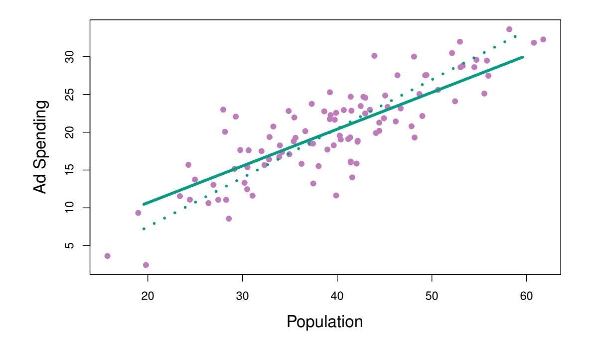
**FIGURE 6.21.** *For the advertising data, the frst PLS direction (solid line) and frst PCR direction (dotted line) are shown.*
When performing PCR, we generally recommend *standardizing* each predictor, using (6.6), prior to generating the principal components. This standardization ensures that all variables are on the same scale. In the absence of standardization, the high-variance variables will tend to play a larger role in the principal components obtained, and the scale on which the variables are measured will ultimately have an efect on the fnal PCR model. However, if the variables are all measured in the same units (say, kilograms, or inches), then one might choose not to standardize them.
# *6.3.2 Partial Least Squares*
The PCR approach that we just described involves identifying linear combinations, or *directions*, that best represent the predictors *X*1*,...,Xp*. These directions are identifed in an *unsupervised* way, since the response *Y* is not used to help determine the principal component directions. That is, the response does not *supervise* the identifcation of the principal components. Consequently, PCR sufers from a drawback: there is no guarantee that the directions that best explain the predictors will also be the best directions to use for predicting the response. Unsupervised methods are discussed further in Chapter 12.
We now present *partial least squares* (PLS), a *supervised* alternative to partial least squares PCR. Like PCR, PLS is a dimension reduction method, which frst identifes a new set of features *Z*1*,...,ZM* that are linear combinations of the original features, and then fts a linear model via least squares using these *M* new features. But unlike PCR, PLS identifes these new features in a supervised way—that is, it makes use of the response *Y* in order to identify new features that not only approximate the old features well, but also that *are*
partial least
squares
6.4 Considerations in High Dimensions 261
*related to the response*. Roughly speaking, the PLS approach attempts to fnd directions that help explain both the response and the predictors.
We now describe how the first PLS direction is computed. After standardizing the $p$ predictors, PLS computes the first direction $Z_1$ by setting each $\phi_{j1}$ in (6.16) equal to the coefficient from the simple linear regression of $Y$ onto $X_j$ . One can show that this coefficient is proportional to the correlation between $Y$ and $X_j$ . Hence, in computing $Z_1 = \sum_{j=1}^p \phi_{j1}X_j$ , PLS places the highest weight on the variables that are most strongly related to the response.
Figure 6.21 displays an example of PLS on a synthetic dataset with Sales in each of 100 regions as the response, and two predictors; Population Size and Advertising Spending. The solid green line indicates the frst PLS direction, while the dotted line shows the frst principal component direction. PLS has chosen a direction that has less change in the ad dimension per unit change in the pop dimension, relative to PCA. This suggests that pop is more highly correlated with the response than is ad. The PLS direction does not ft the predictors as closely as does PCA, but it does a better job explaining the response.
To identify the second PLS direction we first *adjust* each of the variables for $Z_1$ , by regressing each variable on $Z_1$ and taking *residuals*. These residuals can be interpreted as the remaining information that has not been explained by the first PLS direction. We then compute $Z_2$ using this *orthogonalized* data in exactly the same fashion as $Z_1$ was computed based on the original data. This iterative approach can be repeated $M$ times to identify multiple PLS components $Z_1, \dots, Z_M$ . Finally, at the end of this procedure, we use least squares to fit a linear model to predict $Y$ using $Z_1, \dots, Z_M$ in exactly the same fashion as for PCR.
As with PCR, the number *M* of partial least squares directions used in PLS is a tuning parameter that is typically chosen by cross-validation. We generally standardize the predictors and response before performing PLS.
PLS is popular in the feld of chemometrics, where many variables arise from digitized spectrometry signals. In practice it often performs no better than ridge regression or PCR. While the supervised dimension reduction of PLS can reduce bias, it also has the potential to increase variance, so that the overall beneft of PLS relative to PCR is a wash.
# 6.4 Considerations in High Dimensions
# *6.4.1 High-Dimensional Data*
Most traditional statistical techniques for regression and classifcation are intended for the *low-dimensional* setting in which *n*, the number of ob- lowdimensional servations, is much greater than *p*, the number of features. This is due in part to the fact that throughout most of the feld's history, the bulk of sci-
low-
dimensiona
262 6. Linear Model Selection and Regularization
entifc problems requiring the use of statistics have been low-dimensional. For instance, consider the task of developing a model to predict a patient's blood pressure on the basis of his or her age, sex, and body mass index (BMI). There are three predictors, or four if an intercept is included in the model, and perhaps several thousand patients for whom blood pressure and age, sex, and BMI are available. Hence *n* ≫ *p*, and so the problem is low-dimensional. (By dimension here we are referring to the size of *p*.)
In the past 20 years, new technologies have changed the way that data are collected in felds as diverse as fnance, marketing, and medicine. It is now commonplace to collect an almost unlimited number of feature measurements (*p* very large). While *p* can be extremely large, the number of observations *n* is often limited due to cost, sample availability, or other considerations. Two examples are as follows:
- 1. Rather than predicting blood pressure on the basis of just age, sex, and BMI, one might also collect measurements for half a million *single nucleotide polymorphisms* (SNPs; these are individual DNA mutations that are relatively common in the population) for inclusion in the predictive model. Then *n* ≈ 200 and *p* ≈ 500*,*000.
- 2. A marketing analyst interested in understanding people's online shopping patterns could treat as features all of the search terms entered by users of a search engine. This is sometimes known as the "bag-ofwords" model. The same researcher might have access to the search histories of only a few hundred or a few thousand search engine users who have consented to share their information with the researcher. For a given user, each of the *p* search terms is scored present (0) or absent (1), creating a large binary feature vector. Then *n* ≈ 1*,*000 and *p* is much larger.
Data sets containing more features than observations are often referred to as *high-dimensional*. Classical approaches such as least squares linear highdimensional regression are not appropriate in this setting. Many of the issues that arise in the analysis of high-dimensional data were discussed earlier in this book, since they apply also when *n>p*: these include the role of the bias-variance trade-of and the danger of overftting. Though these issues are always relevant, they can become particularly important when the number of features is very large relative to the number of observations.
We have defned the *high-dimensional setting* as the case where the number of features *p* is larger than the number of observations *n*. But the considerations that we will now discuss certainly also apply if *p* is slightly smaller than *n*, and are best always kept in mind when performing supervised learning.
high-dimensional
6.4 Considerations in High Dimensions 263
# *6.4.2 What Goes Wrong in High Dimensions?*
In order to illustrate the need for extra care and specialized techniques for regression and classifcation when *p>n*, we begin by examining what can go wrong if we apply a statistical technique not intended for the highdimensional setting. For this purpose, we examine least squares regression. But the same concepts apply to logistic regression, linear discriminant analysis, and other classical statistical approaches.
When the number of features *p* is as large as, or larger than, the number of observations *n*, least squares as described in Chapter 3 cannot (or rather, *should not*) be performed. The reason is simple: regardless of whether or not there truly is a relationship between the features and the response, least squares will yield a set of coeffcient estimates that result in a perfect ft to the data, such that the residuals are zero.
An example is shown in Figure 6.22 with $p = 1$ feature (plus an intercept) in two cases: when there are 20 observations, and when there are only two observations. When there are 20 observations, $n > p$ and the least squares regression line does not perfectly fit the data; instead, the regression line seeks to approximate the 20 observations as well as possible. On the other hand, when there are only two observations, then regardless of the values of those observations, the regression line will fit the data exactly. This is problematic because this perfect fit will almost certainly lead to overfitting of the data. In other words, though it is possible to perfectly fit the training data in the high-dimensional setting, the resulting linear model will perform extremely poorly on an independent test set, and therefore does not constitute a useful model. In fact, we can see that this happened in Figure 6.22: the least squares line obtained in the right-hand panel will perform very poorly on a test set comprised of the observations in the left-hand panel. The problem is simple: when $p > n$ or $p \approx n$ , a simple least squares regression line is too *flexible* and hence overfits the data.
Figure 6.23 further illustrates the risk of carelessly applying least squares when the number of features *p* is large. Data were simulated with *n* = 20 observations, and regression was performed with between 1 and 20 features, each of which was completely unrelated to the response. As shown in the fgure, the model *R*2 increases to 1 as the number of features included in the model increases, and correspondingly the training set MSE decreases to 0 as the number of features increases, *even though the features are completely unrelated to the response*. On the other hand, the MSE on an *independent test set* becomes extremely large as the number of features included in the model increases, because including the additional predictors leads to a vast increase in the variance of the coeffcient estimates. Looking at the test set MSE, it is clear that the best model contains at most a few variables. However, someone who carelessly examines only the *R*2 or the training set MSE might erroneously conclude that the model with the greatest number of variables is best. This indicates the importance of applying extra care
264 6. Linear Model Selection and Regularization
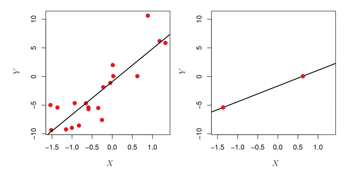
**FIGURE 6.22.** Left: *Least squares regression in the low-dimensional setting.* Right: *Least squares regression with n* = 2 *observations and two parameters to be estimated (an intercept and a coeffcient).*
when analyzing data sets with a large number of variables, and of always evaluating model performance on an independent test set.
In Section 6.1.3, we saw a number of approaches for adjusting the training set RSS or $R^2$ in order to account for the number of variables used to fit a least squares model. Unfortunately, the $C_p$ , AIC, and BIC approaches are not appropriate in the high-dimensional setting, because estimating $\hat{\sigma}^2$ is problematic. (For instance, the formula for $\hat{\sigma}^2$ from Chapter 3 yields an estimate $\hat{\sigma}^2 = 0$ in this setting.) Similarly, problems arise in the application of adjusted $R^2$ in the high-dimensional setting, since one can easily obtain a model with an adjusted $R^2$ value of 1. Clearly, alternative approaches that are better-suited to the high-dimensional setting are required.
# *6.4.3 Regression in High Dimensions*
It turns out that many of the methods seen in this chapter for ftting *less fexible* least squares models, such as forward stepwise selection, ridge regression, the lasso, and principal components regression, are particularly useful for performing regression in the high-dimensional setting. Essentially, these approaches avoid overftting by using a less fexible ftting approach than least squares.
Figure 6.24 illustrates the performance of the lasso in a simple simulated example. There are $p = 20$ , $50$ , or $2,000$ features, of which 20 are truly associated with the outcome. The lasso was performed on $n = 100$ training observations, and the mean squared error was evaluated on an independent test set. As the number of features increases, the test set error increases. When $p = 20$ , the lowest validation set error was achieved when $λ$ in (6.7) was small; however, when $p$ was larger than the lowest validation
6.4 Considerations in High Dimensions 265
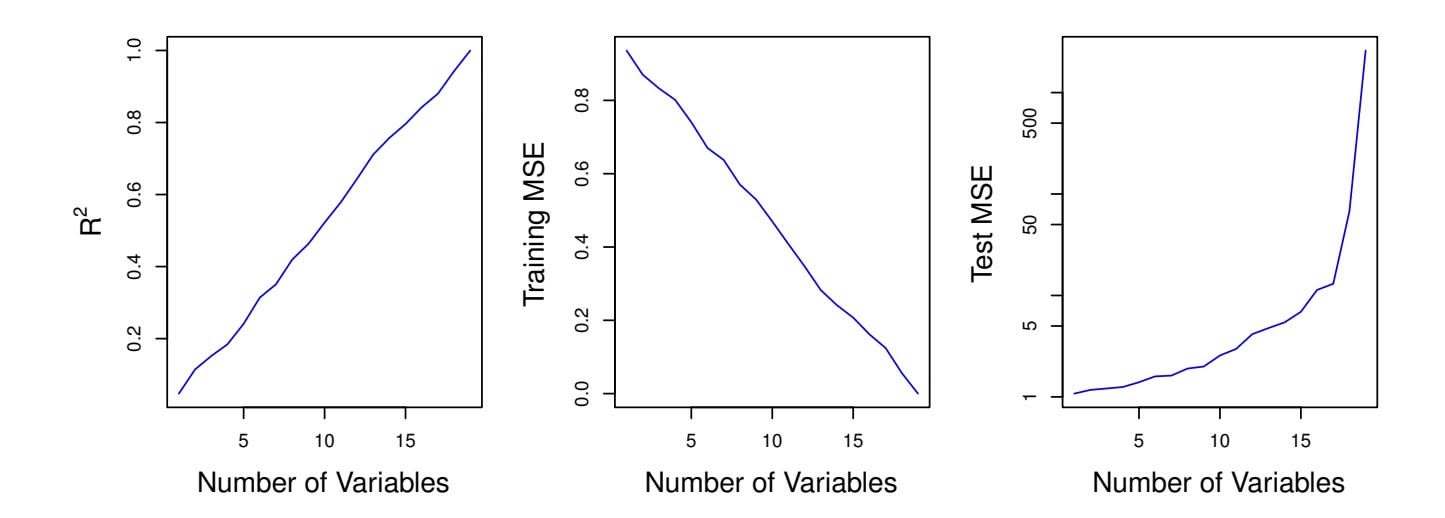
**FIGURE 6.23.** *On a simulated example with n* = 20 *training observations, features that are completely unrelated to the outcome are added to the model.* Left: *The R*2 *increases to 1 as more features are included.* Center: *The training set MSE decreases to 0 as more features are included.* Right: *The test set MSE increases as more features are included.*
set error was achieved using a larger value of λ. In each boxplot, rather than reporting the values of λ used, the *degrees of freedom* of the resulting lasso solution is displayed; this is simply the number of non-zero coeffcient estimates in the lasso solution, and is a measure of the fexibility of the lasso ft. Figure 6.24 highlights three important points: (1) regularization or shrinkage plays a key role in high-dimensional problems, (2) appropriate tuning parameter selection is crucial for good predictive performance, and (3) the test error tends to increase as the dimensionality of the problem (i.e. the number of features or predictors) increases, unless the additional features are truly associated with the response.
The third point above is in fact a key principle in the analysis of highdimensional data, which is known as the *curse of dimensionality*. One might curse of dimensionality think that as the number of features used to ft a model increases, the quality of the ftted model will increase as well. However, comparing the left-hand and right-hand panels in Figure 6.24, we see that this is not necessarily the case: in this example, the test set MSE almost doubles as *p* increases from 20 to 2,000. In general, *adding additional signal features that are truly associated with the response will improve the ftted model*, in the sense of leading to a reduction in test set error. However, adding noise features that are not truly associated with the response will lead to a deterioration in the ftted model, and consequently an increased test set error. This is because noise features increase the dimensionality of the problem, exacerbating the risk of overftting (since noise features may be assigned nonzero coeffcients due to chance associations with the response on the training set) without any potential upside in terms of improved test set error. Thus, we see that new technologies that allow for the collection of measurements for thousands or millions of features are a double-edged sword: they can lead to improved predictive models if these features are in
curse of dimensionality
266 6. Linear Model Selection and Regularization
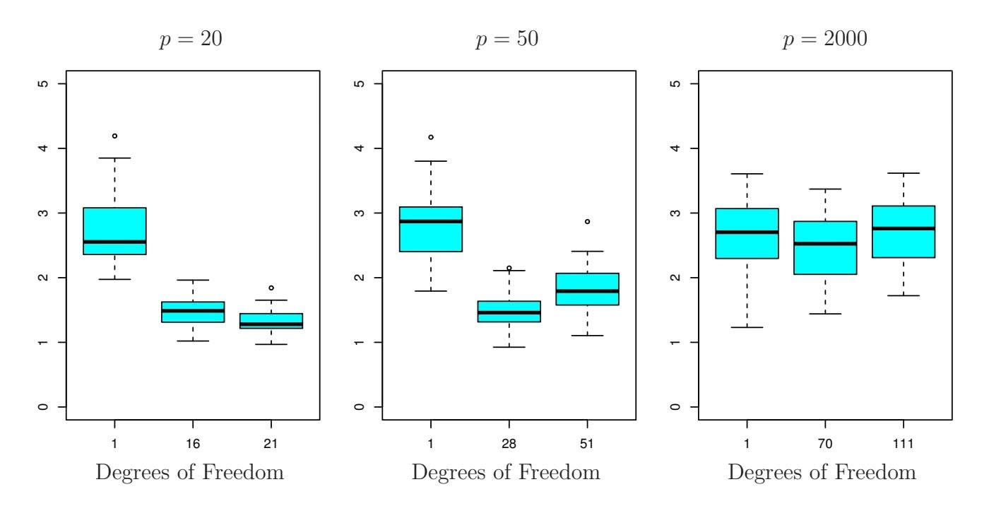
**FIGURE 6.24.** *The lasso was performed with n* = 100 *observations and three values of p, the number of features. Of the p features, 20 were associated with the response. The boxplots show the test MSEs that result using three diferent values of the tuning parameter* λ *in (6.7). For ease of interpretation, rather than reporting* λ*, the* degrees of freedom *are reported; for the lasso this turns out to be simply the number of estimated non-zero coeffcients. When p* = 20*, the lowest test MSE was obtained with the smallest amount of regularization. When p* = 50*, the lowest test MSE was achieved when there is a substantial amount of regularization. When p* = 2*,*000 *the lasso performed poorly regardless of the amount of regularization, due to the fact that only 20 of the 2,000 features truly are associated with the outcome.*
fact relevant to the problem at hand, but will lead to worse results if the features are not relevant. Even if they are relevant, the variance incurred in ftting their coeffcients may outweigh the reduction in bias that they bring.
# *6.4.4 Interpreting Results in High Dimensions*
When we perform the lasso, ridge regression, or other regression procedures in the high-dimensional setting, we must be quite cautious in the way that we report the results obtained. In Chapter 3, we learned about *multicollinearity*, the concept that the variables in a regression might be correlated with each other. In the high-dimensional setting, the multicollinearity problem is extreme: any variable in the model can be written as a linear combination of all of the other variables in the model. Essentially, this means that we can never know exactly which variables (if any) truly are predictive of the outcome, and we can never identify the *best* coeffcients for use in the regression. At most, we can hope to assign large regression coeffcients to variables that are correlated with the variables that truly are predictive of the outcome.
6.5 Lab: Linear Models and Regularization Methods 267
For instance, suppose that we are trying to predict blood pressure on the basis of half a million SNPs, and that forward stepwise selection indicates that 17 of those SNPs lead to a good predictive model on the training data. It would be incorrect to conclude that these 17 SNPs predict blood pressure more efectively than the other SNPs not included in the model. There are likely to be many sets of 17 SNPs that would predict blood pressure just as well as the selected model. If we were to obtain an independent data set and perform forward stepwise selection on that data set, we would likely obtain a model containing a diferent, and perhaps even non-overlapping, set of SNPs. This does not detract from the value of the model obtained for instance, the model might turn out to be very efective in predicting blood pressure on an independent set of patients, and might be clinically useful for physicians. But we must be careful not to overstate the results obtained, and to make it clear that what we have identifed is simply *one of many possible models* for predicting blood pressure, and that it must be further validated on independent data sets.
It is also important to be particularly careful in reporting errors and measures of model fit in the high-dimensional setting. We have seen that when $p > n$ , it is easy to obtain a useless model that has zero residuals. Therefore, one should *never* use sum of squared errors, p-values, $R^2$ statistics, or other traditional measures of model fit on the training data as evidence of a good model fit in the high-dimensional setting. For instance, as we saw in Figure 6.23, one can easily obtain a model with $R^2 = 1$ when $p > n$ . Reporting this fact might mislead others into thinking that a statistically valid and useful model has been obtained, whereas in fact this provides absolutely no evidence of a compelling model. It is important to instead report results on an independent test set, or cross-validation errors. For instance, the MSE or $R^2$ on an independent test set is a valid measure of model fit, but the MSE on the training set certainly is not.
# 6.5 Lab: Linear Models and Regularization Methods
# *6.5.1 Subset Selection Methods*
### Best Subset Selection
Here we apply the best subset selection approach to the Hitters data. We wish to predict a baseball player's Salary on the basis of various statistics associated with performance in the previous year.
First of all, we note that the Salary variable is missing for some of the players. The $is.na()$ function can be used to identify the missing observations. It returns a vector of the same length as the input vector, with a TRUE
is.na()
# 268 6. Linear Model Selection and Regularization
for any elements that are missing, and a FALSE for non-missing elements. The sum() function can then be used to count all of the missing elements. sum()
```
> library(ISLR2)
> names(Hitters)
[1] "AtBat" "Hits" "HmRun" "Runs" "RBI"
[6] "Walks" "Years" "CAtBat" "CHits" "CHmRun"
[11] "CRuns" "CRBI" "CWalks" "League" "Division"
[16] "PutOuts" "Assists" "Errors" "Salary" "NewLeague"
> dim(Hitters)
[1] 322 20
> sum(is.na(Hitters$Salary))
[1] 59
```
Hence we see that Salary is missing for 59 players. The na.omit() function removes all of the rows that have missing values in any variable.
```
> Hitters <- na.omit(Hitters)
> dim(Hitters)
[1] 263 20
> sum(is.na(Hitters))
[1] 0
```
The regsubsets() function (part of the leaps library) performs best sub- regsubsets() set selection by identifying the best model that contains a given number of predictors, where *best* is quantifed using RSS. The syntax is the same as for lm(). The summary() command outputs the best set of variables for each model size.
```
> library(leaps)
> regfit.full <- regsubsets(Salary ∼ ., Hitters)
> summary(regfit.full)
Subset selection object
Call: regsubsets.formula(Salary ∼ ., Hitters)
19 Variables (and intercept)
...
1 subsets of each size up to 8
Selection Algorithm: exhaustive
AtBat Hits HmRun Runs RBI Walks Years CAtBat CHits
1 (1)"" "" "" "" """" "" "" ""
2 ( 1 ) " " "*" " " " " " " " " " " " " " "
3 ( 1 ) " " "*" " " " " " " " " " " " " " "
4 ( 1 ) " " "*" " " " " " " " " " " " " " "
5 ( 1 ) "*" "*" " " " " " " " " " " " " " "
6 ( 1 ) "*" "*" " " " " " " "*" " " " " " "
7 ( 1 ) " " "*" " " " " " " "*" " " "*" "*"
8 ( 1 ) "*" "*" " " " " " " "*" " " " " " "
CHmRun CRuns CRBI CWalks LeagueN DivisionW PutOuts
1 ( 1 ) " " " " "*" " " " " " " " "
2 ( 1 ) " " " " "*" " " " " " " " "
3 ( 1 ) " " " " "*" " " " " " " "*"
4 ( 1 ) " " " " "*" " " " " "*" "*"
5 ( 1 ) " " " " "*" " " " " "*" "*"
6 ( 1 ) " " " " "*" " " " " "*" "*"
```
6.5 Lab: Linear Models and Regularization Methods 269
| | | Assists | Errors | NewLeagueN |
|---|-------|---------|--------|------------|
| 7 | ( 1 ) | "*" | " " | " " |
| 8 | ( 1 ) | "*" | "*" | " " |
| 1 | ( 1 ) | " " | " " | " " |
| 2 | ( 1 ) | " " | " " | " " |
| 3 | ( 1 ) | " " | " " | " " |
| 4 | ( 1 ) | " " | " " | " " |
| 5 | ( 1 ) | " " | " " | " " |
| 6 | ( 1 ) | " " | " " | " " |
| 7 | ( 1 ) | " " | " " | " " |
| 8 | ( 1 ) | " " | " " | " " |
An asterisk indicates that a given variable is included in the corresponding model. For instance, this output indicates that the best two-variable model contains only Hits and CRBI. By default, regsubsets() only reports results up to the best eight-variable model. But the nvmax option can be used in order to return as many variables as are desired. Here we ft up to a 19-variable model.
```
> regfit.full <- regsubsets(Salary ∼ ., data = Hitters,
nvmax = 19)
> reg.summary <- summary(regfit.full)
```
The summary() function also returns *R*2, RSS, adjusted *R*2, *Cp*, and BIC. We can examine these to try to select the *best* overall model.
```
> names(reg.summary)
[1] "which" "rsq" "rss" "adjr2" "cp" "bic"
[7] "outmat" "obj"
```
For instance, we see that the *R*2 statistic increases from 32 %, when only one variable is included in the model, to almost 55 %, when all variables are included. As expected, the *R*2 statistic increases monotonically as more variables are included.
```
> reg.summary$rsq
[1] 0.321 0.425 0.451 0.475 0.491 0.509 0.514 0.529 0.535
[10] 0.540 0.543 0.544 0.544 0.545 0.545 0.546 0.546 0.546
[19] 0.546
```
Plotting RSS, adjusted *R*2, *Cp*, and BIC for all of the models at once will help us decide which model to select. Note the type = "l" option tells R to connect the plotted points with lines.
```
> par(mfrow = c(2, 2))
> plot(reg.summary$rss, xlab = "Number of Variables",
ylab = "RSS", type = "l")
> plot(reg.summary$adjr2, xlab = "Number of Variables",
ylab = "Adjusted RSq", type = "l")
```
The points() command works like the plot() command, except that it points() puts points on a plot that has already been created, instead of creating a new plot. The which.max() function can be used to identify the location of
270 6. Linear Model Selection and Regularization
the maximum point of a vector. We will now plot a red dot to indicate the model with the largest adjusted *R*2 statistic.
```
> which.max(reg.summary$adjr2)
[1] 11
> plot(reg.summary$adjr2, xlab = "Number of Variables",
ylab = "Adjusted RSq", type = "l")
> points(11, reg.summary$adjr2[11], col = "red", cex = 2,
pch = 20)
```
In a similar fashion we can plot the *Cp* and BIC statistics, and indicate the models with the smallest statistic using which.min(). which.min()
```
> plot(reg.summary$cp, xlab = "Number of Variables",
ylab = "Cp", type = "l")
> which.min(reg.summary$cp)
[1] 10
> points(10, reg.summary$cp[10], col = "red", cex = 2,
pch = 20)
> which.min(reg.summary$bic)
[1] 6
> plot(reg.summary$bic, xlab = "Number of Variables",
ylab = "BIC", type = "l")
> points(6, reg.summary$bic[6], col = "red", cex = 2,
pch = 20)
```
The `regsubsets()` function has a built-in `plot()` command which can be used to display the selected variables for the best model with a given number of predictors, ranked according to the BIC, $C_p$ , adjusted $R^2$ , or AIC. To find out more about this function, type `?plot.regsubsets`.
```
> plot(regfit.full, scale = "r2")
> plot(regfit.full, scale = "adjr2")
> plot(regfit.full, scale = "Cp")
> plot(regfit.full, scale = "bic")
```
The top row of each plot contains a black square for each variable selected according to the optimal model associated with that statistic. For instance, we see that several models share a BIC close to −150. However, the model with the lowest BIC is the six-variable model that contains only AtBat, Hits, Walks, CRBI, DivisionW, and PutOuts. We can use the coef() function to see the coeffcient estimates associated with this model.
| (Intercept) | AtBat | Hits | Walks | CRBI |
|-------------|---------|-------|-------|-------|
| 91.512 | -1.869 | 7.604 | 3.698 | 0.643 |
| DivisionW | PutOuts | | | |
| -122.952 | 0.264 | | | |
### Forward and Backward Stepwise Selection
We can also use the regsubsets() function to perform forward stepwise or backward stepwise selection, using the argument method = "forward" or method = "backward".
6.5 Lab: Linear Models and Regularization Methods 271
```
> regfit.fwd <- regsubsets(Salary ∼ ., data = Hitters,
nvmax = 19, method = "forward")
> summary(regfit.fwd)
> regfit.bwd <- regsubsets(Salary ∼ ., data = Hitters,
nvmax = 19, method = "backward")
> summary(regfit.bwd)
```
For instance, we see that using forward stepwise selection, the best onevariable model contains only CRBI, and the best two-variable model additionally includes Hits. For this data, the best one-variable through sixvariable models are each identical for best subset and forward selection. However, the best seven-variable models identifed by forward stepwise selection, backward stepwise selection, and best subset selection are diferent.
| > coef(regfit.full, 7) | | | | |
|------------------------|-----------|---------|--------|-------|
| (Intercept) | Hits | Walks | CAtBat | CHits |
| 79.451 | 1.283 | 3.227 | -0.375 | 1.496 |
| CHmRun | DivisionW | PutOuts | | |
| 1.442 | -129.987 | 0.237 | | |
|
| | | | |
| > coef(regfit.fwd, 7) | | | | |
| (Intercept) | AtBat | Hits | Walks | CRBI |
| 109.787 | -1.959 | 7.450 | 4.913 | 0.854 |
| CWalks | DivisionW | PutOuts | | |
| -0.305 | -127.122 | 0.253 | | |
|
| | | | |
| > coef(regfit.bwd, 7) | | | | |
| (Intercept) | AtBat | Hits | Walks | CRuns |
| 105.649 | -1.976 | 6.757 | 6.056 | 1.129 |
| CWalks | DivisionW | PutOuts | | |
| -0.716 | -116.169 | 0.303 | | |
### Choosing Among Models Using the Validation-Set Approach and Cross-Validation
We just saw that it is possible to choose among a set of models of diferent sizes using *Cp*, BIC, and adjusted *R*2. We will now consider how to do this using the validation set and cross-validation approaches.
In order for these approaches to yield accurate estimates of the test error, we must use *only the training observations* to perform all aspects of model-ftting—including variable selection. Therefore, the determination of which model of a given size is best must be made using *only the training observations*. This point is subtle but important. If the full data set is used to perform the best subset selection step, the validation set errors and cross-validation errors that we obtain will not be accurate estimates of the test error.
In order to use the validation set approach, we begin by splitting the observations into a training set and a test set. We do this by creating a random vector, train, of elements equal to TRUE if the corresponding observation is in the training set, and FALSE otherwise. The vector test has a TRUE if the observation is in the test set, and a FALSE otherwise. Note the 272 6. Linear Model Selection and Regularization
! in the command to create test causes TRUEs to be switched to FALSEs and vice versa. We also set a random seed so that the user will obtain the same training set/test set split.
```
> set.seed(1)
> train <- sample(c(TRUE, FALSE), nrow(Hitters),
replace = TRUE)
> test <- (!train)
```
Now, we apply regsubsets() to the training set in order to perform best subset selection.
```
> regfit.best <- regsubsets(Salary ∼ .,
data = Hitters[train, ], nvmax = 19)
```
Notice that we subset the Hitters data frame directly in the call in order to access only the training subset of the data, using the expression Hitters[train, ]. We now compute the validation set error for the best model of each model size. We frst make a model matrix from the test data.
```
> test.mat <- model.matrix(Salary ∼ ., data = Hitters[test, ])
```
The model.matrix() function is used in many regression packages for build- model.matrix() ing an "X" matrix from data. Now we run a loop, and for each size i, we extract the coeffcients from regfit.best for the best model of that size, multiply them into the appropriate columns of the test model matrix to form the predictions, and compute the test MSE.
el.matrix()
```
> val.errors <- rep(NA, 19)
> for (i in 1:19) {
+ coefi <- coef(regfit.best, id = i)
+ pred <- test.mat[, names(coefi)] %*% coefi
+ val.errors[i] <- mean((Hitters$Salary[test] - pred)^2)
}
```
We fnd that the best model is the one that contains seven variables.
```
> val.errors
[1] 164377 144405 152176 145198 137902 139176 126849 136191
[9] 132890 135435 136963 140695 140691 141951 141508 142164
[17] 141767 142340 142238
> which.min(val.errors)
[1] 7
> coef(regfit.best, 7)
(Intercept) AtBat Hits Walks CRuns
67.109 -2.146 7.015 8.072 1.243
CWalks DivisionW PutOuts
-0.834 -118.436 0.253
```
This was a little tedious, partly because there is no predict() method for regsubsets(). Since we will be using this function again, we can capture our steps above and write our own predict method.
6.5 Lab: Linear Models and Regularization Methods 273
```
> predict.regsubsets <- function(object, newdata , id, ...) {
+ form <- as.formula(object$call[[2]])
+ mat <- model.matrix(form, newdata)
+ coefi <- coef(object, id = id)
+ xvars <- names(coefi)
+ mat[, xvars] %*% coefi
+ }
```
Our function pretty much mimics what we did above. The only complex part is how we extracted the formula used in the call to regsubsets(). We demonstrate how we use this function below, when we do cross-validation.
Finally, we perform best subset selection on the full data set, and select the best seven-variable model. It is important that we make use of the full data set in order to obtain more accurate coeffcient estimates. Note that we perform best subset selection on the full data set and select the best seven-variable model, rather than simply using the variables that were obtained from the training set, because the best seven-variable model on the full data set may difer from the corresponding model on the training set.
```
> regfit.best <- regsubsets(Salary ∼ ., data = Hitters,
nvmax = 19)
> coef(regfit.best, 7)
(Intercept) Hits Walks CAtBat CHits
79.451 1.283 3.227 -0.375 1.496
CHmRun DivisionW PutOuts
1.442 -129.987 0.237
```
In fact, we see that the best seven-variable model on the full data set has a diferent set of variables than the best seven-variable model on the training set.
We now try to choose among the models of diferent sizes using crossvalidation. This approach is somewhat involved, as we must perform best subset selection *within each of the k training sets*. Despite this, we see that with its clever subsetting syntax, R makes this job quite easy. First, we create a vector that allocates each observation to one of *k* = 10 folds, and we create a matrix in which we will store the results.
```
> k <- 10
> n <- nrow(Hitters)
> set.seed(1)
> folds <- sample(rep(1:k, length = n))
> cv.errors <- matrix(NA, k, 19,
dimnames = list(NULL, paste(1:19)))
```
Now we write a for loop that performs cross-validation. In the *j*th fold, the elements of folds that equal j are in the test set, and the remainder are in the training set. We make our predictions for each model size (using our new predict() method), compute the test errors on the appropriate subset, and store them in the appropriate slot in the matrix cv.errors. Note that in the 274 6. Linear Model Selection and Regularization
following code R will automatically use our predict.regsubsets() function when we call predict() because the best.fit object has class regsubsets.
```
> for (j in 1:k) {
+ best.fit <- regsubsets(Salary ∼ .,
data = Hitters[folds != j, ],
nvmax = 19)
+ for (i in 1:19) {
+ pred <- predict(best.fit, Hitters[folds == j, ], id = i)
+ cv.errors[j, i] <-
mean((Hitters$Salary[folds == j] - pred)^2)
+ }
+ }
```
This has given us a 10×19 matrix, of which the (*j, i*)th element corresponds to the test MSE for the *j*th cross-validation fold for the best *i*-variable model. We use the apply() function to average over the columns of this apply() matrix in order to obtain a vector for which the *i*th element is the crossvalidation error for the *i*-variable model.
```
> mean.cv.errors <- apply(cv.errors, 2, mean)
> mean.cv.errors
1 2 3 4 5 6 7 8
143440 126817 134214 131783 130766 120383 121443 114364
9 10 11 12 13 14 15 16
115163 109366 112738 113617 115558 115853 115631 116050
17 18 19
116117 116419 116299
> par(mfrow = c(1, 1))
> plot(mean.cv.errors, type = "b")
```
We see that cross-validation selects a 10-variable model. We now perform best subset selection on the full data set in order to obtain the 10-variable model.
```
> reg.best <- regsubsets(Salary ∼ ., data = Hitters,
nvmax = 19)
> coef(reg.best, 10)
(Intercept) AtBat Hits Walks CAtBat
162.535 -2.169 6.918 5.773 -0.130
CRuns CRBI CWalks DivisionW PutOuts
1.408 0.774 -0.831 -112.380 0.297
Assists
0.283
```
# *6.5.2 Ridge Regression and the Lasso*
We will use the glmnet package in order to perform ridge regression and the lasso. The main function in this package is glmnet(), which can be used glmnet() to ft ridge regression models, lasso models, and more. This function has slightly diferent syntax from other model-ftting functions that we have encountered thus far in this book. In particular, we must pass in an x
glmnet()
6.5 Lab: Linear Models and Regularization Methods 275
matrix as well as a y vector, and we do not use the y ∼ x syntax. We will now perform ridge regression and the lasso in order to predict Salary on the Hitters data. Before proceeding ensure that the missing values have been removed from the data, as described in Section 6.5.1.
```
> x <- model.matrix(Salary ∼ ., Hitters)[, -1]
> y <- Hitters$Salary
```
The model.matrix() function is particularly useful for creating x; not only does it produce a matrix corresponding to the 19 predictors but it also automatically transforms any qualitative variables into dummy variables. The latter property is important because glmnet() can only take numerical, quantitative inputs.
### Ridge Regression
The glmnet() function has an alpha argument that determines what type of model is ft. If alpha=0 then a ridge regression model is ft, and if alpha=1 then a lasso model is ft. We frst ft a ridge regression model.
> library(glmnet)
> grid <- 10^seq(10, -2, length = 100)
> ridge.mod <- glmnet(x, y, alpha = 0, lambda = grid)
By default the glmnet() function performs ridge regression for an automatically selected range of $\lambda$ values. However, here we have chosen to implement the function over a grid of values ranging from $\lambda = 10^{10}$ to $\lambda = 10^{-2}$ , essentially covering the full range of scenarios from the null model containing only the intercept, to the least squares fit. As we will see, we can also compute model fits for a particular value of $\lambda$ that is not one of the original grid values. Note that by default, the glmnet() function standardizes the variables so that they are on the same scale. To turn off this default setting, use the argument standardize = FALSE.
Associated with each value of λ is a vector of ridge regression coeffcients, stored in a matrix that can be accessed by coef(). In this case, it is a 20×100 matrix, with 20 rows (one for each predictor, plus an intercept) and 100 columns (one for each value of λ).
```
> dim(coef(ridge.mod))
[1] 20 100
```
We expect the coeffcient estimates to be much smaller, in terms of ℓ2 norm, when a large value of λ is used, as compared to when a small value of λ is used. These are the coeffcients when λ = 11*,*498, along with their ℓ2 norm:
| > ridge.mod\$lambda[50] | | | | |
|-------------------------|-------|-------|--------|-------|
| [1] 11498 | | | | |
| > coef(ridge.mod)[, 50] | | | | |
| (Intercept) | AtBat | Hits | HmRun | Runs |
| 407.356 | 0.037 | 0.138 | 0.525 | 0.231 |
| RBI | Walks | Years | CAtBat | CHits |
276 6. Linear Model Selection and Regularization
```
0.240 0.290 1.108 0.003 0.012
CHmRun CRuns CRBI CWalks LeagueN
0.088 0.023 0.024 0.025 0.085
DivisionW PutOuts Assists Errors NewLeagueN
-6.215 0.016 0.003 -0.021 0.301
> sqrt(sum(coef(ridge.mod)[-1, 50]^2))
[1] 6.36
```
In contrast, here are the coefficients when $\lambda = 705$ , along with their $\ell_2$ norm. Note the much larger $\ell_2$ norm of the coefficients associated with this smaller value of $\lambda$ .
| > ridge.mod\$lambda[60] | | | | | | | | | | | | | | | | | | | | | | | | | | | | | | | | | | | | | | | | |
|-----------------------------------------------------------------------------------------------------------------------------------------------------------------------------------------------------------------------------------|--|--|--|--|--|--|--|--|--|--|--|--|--|--|--|--|--|--|--|--|--|--|--|--|--|--|--|--|--|--|--|--|--|--|--|--|--|--|--|--|
| [1] 705 | | | | | | | | | | | | | | | | | | | | | | | | | | | | | | | | | | | | | | | | |
| > coef(ridge.mod)[, 60] | | | | | | | | | | | | | | | | | | | | | | | | | | | | | | | | | | | | | | | | |
| (Intercept)AtBatHitsHmRunRuns54.3250.1120.6561.1800.938RBIWalksYearsCAtBatCHits0.8471.3202.5960.0110.047CHmRunCRunsCRBICWalksLeagueN0.3380.0940.0980.07213.684DivisionWPutOutsAssistsErrorsNewLeagueN-54.6590.1190.016-0.7048.612 | | | | | | | | | | | | | | | | | | | | | | | | | | | | | | | | | | | | | | | | |
| > sqrt(sum(coef(ridge.mod)[-1, 60]^2)) | | | | | | | | | | | | | | | | | | | | | | | | | | | | | | | | | | | | | | | | |
| [1] 57.1 | | | | | | | | | | | | | | | | | | | | | | | | | | | | | | | | | | | | | | | | |
We can use the predict() function for a number of purposes. For instance, we can obtain the ridge regression coeffcients for a new value of λ, say 50:
| (Intercept) | AtBat | Hits | HmRun | Runs |
|-------------|---------|---------|--------|------------|
| 48.766 | -0.358 | 1.969 | -1.278 | 1.146 |
| RBI | Walks | Years | CAtBat | CHits |
| 0.804 | 2.716 | -6.218 | 0.005 | 0.106 |
| CHmRun | CRuns | CRBI | CWalks | LeagueN |
| 0.624 | 0.221 | 0.219 | -0.150 | 45.926 |
| DivisionW | PutOuts | Assists | Errors | NewLeagueN |
| -118.201 | 0.250 | 0.122 | -3.279 | -9.497 |
We now split the samples into a training set and a test set in order to estimate the test error of ridge regression and the lasso. There are two common ways to randomly split a data set. The frst is to produce a random vector of TRUE, FALSE elements and select the observations corresponding to TRUE for the training data. The second is to randomly choose a subset of numbers between 1 and *n*; these can then be used as the indices for the training observations. The two approaches work equally well. We used the former method in Section 6.5.1. Here we demonstrate the latter approach.
We frst set a random seed so that the results obtained will be reproducible.
```
> set.seed(1)
> train <- sample(1:nrow(x), nrow(x) / 2)
> test <- (-train)
> y.test <- y[test]
```
6.5 Lab: Linear Models and Regularization Methods 277
Next we ft a ridge regression model on the training set, and evaluate its MSE on the test set, using λ = 4. Note the use of the predict() function again. This time we get predictions for a test set, by replacing type="coefficients" with the newx argument.
```
> ridge.mod <- glmnet(x[train, ], y[train], alpha = 0,
lambda = grid, thresh = 1e-12)
> ridge.pred <- predict(ridge.mod, s = 4, newx = x[test, ])
> mean((ridge.pred - y.test)^2)
[1] 142199
```
The test MSE is 142*,*199. Note that if we had instead simply ft a model with just an intercept, we would have predicted each test observation using the mean of the training observations. In that case, we could compute the test set MSE like this:
```
> mean((mean(y[train]) - y.test)^2)
[1] 224670
```
We could also get the same result by ftting a ridge regression model with a *very* large value of λ. Note that 1e10 means 1010.
```
> ridge.pred <- predict(ridge.mod, s = 1e10, newx = x[test, ])
> mean((ridge.pred - y.test)^2)
[1] 224670
```
So fitting a ridge regression model with $\lambda = 4$ leads to a much lower test MSE than fitting a model with just an intercept. We now check whether there is any benefit to performing ridge regression with $\lambda = 4$ instead of just performing least squares regression. Recall that least squares is simply ridge regression with $\lambda = 0$ .9
```
> ridge.pred <- predict(ridge.mod, s = 0, newx = x[test, ],
exact = T, x = x[train, ], y = y[train])
> mean((ridge.pred - y.test)^2)
[1] 168589
> lm(y ∼ x, subset = train)
> predict(ridge.mod, s = 0, exact = T, type = "coefficients",
x = x[train, ], y = y[train])[1:20, ]
```
In general, if we want to ft a (unpenalized) least squares model, then we should use the lm() function, since that function provides more useful outputs, such as standard errors and p-values for the coeffcients.
In general, instead of arbitrarily choosing λ = 4, it would be better to use cross-validation to choose the tuning parameter λ. We can do this using
9In order for glmnet() to yield the exact least squares coeffcients when λ = 0, we use the argument exact = T when calling the predict() function. Otherwise, the predict() function will interpolate over the grid of λ values used in ftting the glmnet() model, yielding approximate results. When we use exact = T, there remains a slight discrepancy in the third decimal place between the output of glmnet() when λ = 0 and the output of lm(); this is due to numerical approximation on the part of glmnet().
278 6. Linear Model Selection and Regularization
the built-in cross-validation function, cv.glmnet(). By default, the function cv.glmnet() performs ten-fold cross-validation, though this can be changed using the argument nfolds. Note that we set a random seed frst so our results will be reproducible, since the choice of the cross-validation folds is random.
```
> set.seed(1)
> cv.out <- cv.glmnet(x[train, ], y[train], alpha = 0)
> plot(cv.out)
> bestlam <- cv.out$lambda.min
> bestlam
[1] 326
```
Therefore, we see that the value of λ that results in the smallest crossvalidation error is 326. What is the test MSE associated with this value of λ?
```
> ridge.pred <- predict(ridge.mod, s = bestlam,
newx = x[test, ])
> mean((ridge.pred - y.test)^2)
[1] 139857
```
This represents a further improvement over the test MSE that we got using λ = 4. Finally, we reft our ridge regression model on the full data set, using the value of λ chosen by cross-validation, and examine the coeffcient estimates.
```
> out <- glmnet(x, y, alpha = 0)
> predict(out, type = "coefficients", s = bestlam)[1:20, ]
(Intercept) AtBat Hits HmRun Runs
15.44 0.08 0.86 0.60 1.06
RBI Walks Years CAtBat CHits
0.88 1.62 1.35 0.01 0.06
CHmRun CRuns CRBI CWalks LeagueN
0.41 0.11 0.12 0.05 22.09
DivisionW PutOuts Assists Errors NewLeagueN
-79.04 0.17 0.03 -1.36 9.12
```
As expected, none of the coeffcients are zero—ridge regression does not perform variable selection!
### The Lasso
We saw that ridge regression with a wise choice of λ can outperform least squares as well as the null model on the Hitters data set. We now ask whether the lasso can yield either a more accurate or a more interpretable model than ridge regression. In order to ft a lasso model, we once again use the glmnet() function; however, this time we use the argument alpha=1. Other than that change, we proceed just as we did in ftting a ridge model.
```
> lasso.mod <- glmnet(x[train, ], y[train], alpha = 1,
lambda = grid)
> plot(lasso.mod)
```
cv.glmnet()
6.5 Lab: Linear Models and Regularization Methods 279
We can see from the coeffcient plot that depending on the choice of tuning parameter, some of the coeffcients will be exactly equal to zero. We now perform cross-validation and compute the associated test error.
```
> set.seed(1)
> cv.out <- cv.glmnet(x[train, ], y[train], alpha = 1)
> plot(cv.out)
> bestlam <- cv.out$lambda.min
> lasso.pred <- predict(lasso.mod, s = bestlam,
newx = x[test, ])
> mean((lasso.pred - y.test)^2)
[1] 143674
```
This is substantially lower than the test set MSE of the null model and of least squares, and very similar to the test MSE of ridge regression with λ chosen by cross-validation.
However, the lasso has a substantial advantage over ridge regression in that the resulting coeffcient estimates are sparse. Here we see that 8 of the 19 coeffcient estimates are exactly zero. So the lasso model with λ chosen by cross-validation contains only eleven variables.
```
> out <- glmnet(x, y, alpha = 1, lambda = grid)
> lasso.coef <- predict(out, type = "coefficients",
s = bestlam)[1:20, ]
> lasso.coef
(Intercept) AtBat Hits HmRun Runs
1.27 -0.05 2.18 0.00 0.00
RBI Walks Years CAtBat CHits
0.00 2.29 -0.34 0.00 0.00
CHmRun CRuns CRBI CWalks LeagueN
0.03 0.22 0.42 0.00 20.29
DivisionW PutOuts Assists Errors NewLeagueN
-116.17 0.24 0.00 -0.86 0.00
> lasso.coef[lasso.coef != 0]
(Intercept) AtBat Hits Walks Years
1.27 -0.05 2.18 2.29 -0.34
CHmRun CRuns CRBI LeagueN DivisionW
0.03 0.22 0.42 20.29 -116.17
PutOuts Errors
0.24 -0.86
```
# *6.5.3 PCR and PLS Regression*
### Principal Components Regression
Principal components regression (PCR) can be performed using the pcr() function, which is part of the pls library. We now apply PCR to the Hitters data, in order to predict Salary. Again, we ensure that the missing values have been removed from the data, as described in Section 6.5.1.
> library(pls)
> set.seed(2)
280 6. Linear Model Selection and Regularization
```
> pcr.fit <- pcr(Salary ∼ ., data = Hitters, scale = TRUE,
validation = "CV")
```
The syntax for the pcr() function is similar to that for lm(), with a few additional options. Setting scale = TRUE has the efect of *standardizing* each predictor, using (6.6), prior to generating the principal components, so that the scale on which each variable is measured will not have an efect. Setting validation = "CV" causes pcr() to compute the ten-fold cross-validation error for each possible value of *M*, the number of principal components used. The resulting ft can be examined using summary().
```
> summary(pcr.fit)
Data: X dimension: 263 19
Y dimension: 263 1
Fit method: svdpc
Number of components considered: 19
VALIDATION: RMSEP
Cross-validated using 10 random segments.
(Intercept) 1 comps 2 comps 3 comps 4 comps
CV 452 351.9 353.2 355.0 352.8
adjCV 452 351.6 352.7 354.4 352.1
...
TRAINING: % variance explained
1 comps 2 comps 3 comps 4 comps 5 comps
X 38.31 60.16 70.84 79.03 84.29
Salary 40.63 41.58 42.17 43.22 44.90
...
```
The CV score is provided for each possible number of components, ranging from $M = 0$ onwards. (We have printed the CV output only up to $M = 4$ .) Note that $pcr()$ reports the *root mean squared error*; in order to obtain the usual MSE, we must square this quantity. For instance, a root mean squared error of $352.8$ corresponds to an MSE of $352.8^2 = 124,468$ .
One can also plot the cross-validation scores using the validationplot() validationplot() function. Using val.type = "MSEP" will cause the cross-validation MSE to be plotted.
validationplot()
```
> validationplot(pcr.fit, val.type = "MSEP")
```
We see that the smallest cross-validation error occurs when *M* = 18 components are used. This is barely fewer than *M* = 19, which amounts to simply performing least squares, because when all of the components are used in PCR no dimension reduction occurs. However, from the plot we also see that the cross-validation error is roughly the same when only one component is included in the model. This suggests that a model that uses just a small number of components might suffce.
The summary() function also provides the *percentage of variance explained* in the predictors and in the response using diferent numbers of components. This concept is discussed in greater detail in Chapter 12. Briefy, 6.5 Lab: Linear Models and Regularization Methods 281
we can think of this as the amount of information about the predictors or the response that is captured using $M$ principal components. For example, setting $M = 1$ only captures $38.31%$ of all the variance, or information, in the predictors. In contrast, using $M = 5$ increases the value to $84.29%$ . If we were to use all $M = p = 19$ components, this would increase to $100%$ .
We now perform PCR on the training data and evaluate its test set performance.
```
> set.seed(1)
> pcr.fit <- pcr(Salary ∼ ., data = Hitters, subset = train,
scale = TRUE, validation = "CV")
> validationplot(pcr.fit, val.type = "MSEP")
```
Now we fnd that the lowest cross-validation error occurs when *M* = 5 components are used. We compute the test MSE as follows.
```
> pcr.pred <- predict(pcr.fit, x[test, ], ncomp = 5)
> mean((pcr.pred - y.test)^2)
[1] 142812
```
This test set MSE is competitive with the results obtained using ridge regression and the lasso. However, as a result of the way PCR is implemented, the fnal model is more diffcult to interpret because it does not perform any kind of variable selection or even directly produce coeffcient estimates.
Finally, we ft PCR on the full data set, using *M* = 5, the number of components identifed by cross-validation.
```
> pcr.fit <- pcr(y ∼ x, scale = TRUE, ncomp = 5)
> summary(pcr.fit)
Data: X dimension: 263 19
Y dimension: 263 1
Fit method: svdpc
Number of components considered: 5
TRAINING: % variance explained
1 comps 2 comps 3 comps 4 comps 5 comps
X 38.31 60.16 70.84 79.03 84.29
y 40.63 41.58 42.17 43.22 44.90
```
### Partial Least Squares
We implement partial least squares (PLS) using the plsr() function, also plsr() in the pls library. The syntax is just like that of the pcr() function.
```
> set.seed(1)
> pls.fit <- plsr(Salary ∼ ., data = Hitters, subset = train, scale
= TRUE, validation = "CV")
> summary(pls.fit)
Data: X dimension: 131 19
Y dimension: 131 1
Fit method: kernelpls
Number of components considered: 19
```
282 6. Linear Model Selection and Regularization
```
VALIDATION: RMSEP
Cross-validated using 10 random segments.
(Intercept) 1 comps 2 comps 3 comps 4 comps
CV 428.3 325.5 329.9 328.8 339.0
adjCV 428.3 325.0 328.2 327.2 336.6
...
TRAINING: % variance explained
1 comps 2 comps 3 comps 4 comps 5 comps
X 39.13 48.80 60.09 75.07 78.58
Salary 46.36 50.72 52.23 53.03 54.07
...
> validationplot(pls.fit, val.type = "MSEP")
```
The lowest cross-validation error occurs when only *M* = 1 partial least squares directions are used. We now evaluate the corresponding test set MSE.
```
> pls.pred <- predict(pls.fit, x[test, ], ncomp = 1)
> mean((pls.pred - y.test)^2)
[1] 151995
```
The test MSE is comparable to, but slightly higher than, the test MSE obtained using ridge regression, the lasso, and PCR.
Finally, we perform PLS using the full data set, using *M* = 1, the number of components identifed by cross-validation.
```
> pls.fit <- plsr(Salary ∼ ., data = Hitters, scale = TRUE,
ncomp = 1)
> summary(pls.fit)
Data: X dimension: 263 19
Y dimension: 263 1
Fit method: kernelpls
Number of components considered: 1
TRAINING: % variance explained
1 comps
X 38.08
Salary 43.05
```
Notice that the percentage of variance in Salary that the one-component PLS ft explains, 43*.*05 %, is almost as much as that explained using the fnal fve-component model PCR ft, 44*.*90 %. This is because PCR only attempts to maximize the amount of variance explained in the predictors, while PLS searches for directions that explain variance in both the predictors and the response.
# 6.6 Exercises
6.6 Exercises 283
# *Conceptual*
- 1. We perform best subset, forward stepwise, and backward stepwise selection on a single data set. For each approach, we obtain *p* + 1 models, containing 0*,* 1*,* 2*,...,p* predictors. Explain your answers:
- (a) Which of the three models with *k* predictors has the smallest *training* RSS?
- (b) Which of the three models with *k* predictors has the smallest *test* RSS?
- (c) True or False:
- i. The predictors in the *k*-variable model identifed by forward stepwise are a subset of the predictors in the (*k*+1)-variable model identifed by forward stepwise selection.
- ii. The predictors in the *k*-variable model identifed by backward stepwise are a subset of the predictors in the (*k* + 1) variable model identifed by backward stepwise selection.
- iii. The predictors in the *k*-variable model identifed by backward stepwise are a subset of the predictors in the (*k* + 1) variable model identifed by forward stepwise selection.
- iv. The predictors in the *k*-variable model identifed by forward stepwise are a subset of the predictors in the (*k*+1)-variable model identifed by backward stepwise selection.
- v. The predictors in the *k*-variable model identifed by best subset are a subset of the predictors in the (*k* + 1)-variable model identifed by best subset selection.
- 2. For parts (a) through (c), indicate which of i. through iv. is correct. Justify your answer.
- (a) The lasso, relative to least squares, is:
- i. More fexible and hence will give improved prediction accuracy when its increase in bias is less than its decrease in variance.
- ii. More fexible and hence will give improved prediction accuracy when its increase in variance is less than its decrease in bias.
- iii. Less fexible and hence will give improved prediction accuracy when its increase in bias is less than its decrease in variance.
- iv. Less fexible and hence will give improved prediction accuracy when its increase in variance is less than its decrease in bias.
- (b) Repeat (a) for ridge regression relative to least squares.
# 284 6. Linear Model Selection and Regularization
- (c) Repeat (a) for non-linear methods relative to least squares.
- 3. Suppose we estimate the regression coeffcients in a linear regression model by minimizing
$$
\sum_{i=1}^{n} \left( y_i - \beta_0 - \sum_{j=1}^{p} \beta_j x_{ij} \right)^2 \quad \text{subject to} \quad \sum_{j=1}^{p} |\beta_j| \le s
$$
for a particular value of *s*. For parts (a) through (e), indicate which of i. through v. is correct. Justify your answer.
- (a) As we increase *s* from 0, the training RSS will:
- i. Increase initially, and then eventually start decreasing in an inverted U shape.
- ii. Decrease initially, and then eventually start increasing in a U shape.
- iii. Steadily increase.
- iv. Steadily decrease.
- v. Remain constant.
- (b) Repeat (a) for test RSS.
- (c) Repeat (a) for variance.
- (d) Repeat (a) for (squared) bias.
- (e) Repeat (a) for the irreducible error.
- 4. Suppose we estimate the regression coeffcients in a linear regression model by minimizing
$$
\sum_{i=1}^{n} \left( y_i - \beta_0 - \sum_{j=1}^{p} \beta_j x_{ij} \right)^2 + \lambda \sum_{j=1}^{p} \beta_j^2
$$
for a particular value of λ. For parts (a) through (e), indicate which of i. through v. is correct. Justify your answer.
- (a) As we increase λ from 0, the training RSS will:
- i. Increase initially, and then eventually start decreasing in an inverted U shape.
- ii. Decrease initially, and then eventually start increasing in a U shape.
- iii. Steadily increase.
- iv. Steadily decrease.
- v. Remain constant.
6.6 Exercises 285
- (b) Repeat (a) for test RSS.
- (c) Repeat (a) for variance.
- (d) Repeat (a) for (squared) bias.
- (e) Repeat (a) for the irreducible error.
- 5. It is well-known that ridge regression tends to give similar coeffcient values to correlated variables, whereas the lasso may give quite different coeffcient values to correlated variables. We will now explore this property in a very simple setting.
Suppose that $n = 2$ , $p = 2$ , $x_{11} = x_{12}$ , $x_{21} = x_{22}$ . Furthermore, suppose that $y_1 + y_2 = 0$ and $x_{11} + x_{21} = 0$ and $x_{12} + x_{22} = 0$ , so that the estimate for the intercept in a least squares, ridge regression, or lasso model is zero: $\hat{\beta}_0 = 0$ .
- (a) Write out the ridge regression optimization problem in this setting.
- (b) Argue that in this setting, the ridge coeffcient estimates satisfy βˆ1 = βˆ2.
- (c) Write out the lasso optimization problem in this setting.
- (d) Argue that in this setting, the lasso coeffcients βˆ1 and βˆ2 are not unique—in other words, there are many possible solutions to the optimization problem in (c). Describe these solutions.
- 6. We will now explore (6.12) and (6.13) further.
- (a) Consider (6.12) with *p* = 1. For some choice of *y*1 and λ *>* 0, plot (6.12) as a function of β1. Your plot should confrm that (6.12) is solved by (6.14).
- (b) Consider (6.13) with *p* = 1. For some choice of *y*1 and λ *>* 0, plot (6.13) as a function of β1. Your plot should confrm that (6.13) is solved by (6.15).
- 7. We will now derive the Bayesian connection to the lasso and ridge regression discussed in Section 6.2.2.
- (a) Suppose that *yi* = β0+)*p j*=1 *xij*β*j* +ϵ*i* where ϵ1*,...,* ϵ*n* are independent and identically distributed from a *N*(0*,* σ2) distribution. Write out the likelihood for the data.
- (b) Assume the following prior for β: β1*,...,* β*p* are independent and identically distributed according to a double-exponential distribution with mean 0 and common scale parameter *b*: i.e. *p*(β) = 1 2*b* exp(−*|*β*|/b*). Write out the posterior for β in this setting.
- 286 6. Linear Model Selection and Regularization
- (c) Argue that the lasso estimate is the *mode* for β under this posterior distribution.
- (d) Now assume the following prior for β: β1*,...,* β*p* are independent and identically distributed according to a normal distribution with mean zero and variance *c*. Write out the posterior for β in this setting.
- (e) Argue that the ridge regression estimate is both the *mode* and the *mean* for β under this posterior distribution.
# *Applied*
- 8. In this exercise, we will generate simulated data, and will then use this data to perform best subset selection.
- (a) Use the rnorm() function to generate a predictor *X* of length *n* = 100, as well as a noise vector ϵ of length *n* = 100.
- (b) Generate a response vector *Y* of length *n* = 100 according to the model
$$
Y = \beta_0 + \beta_1 X + \beta_2 X^2 + \beta_3 X^3 + \epsilon,
$$
where β0, β1, β2, and β3 are constants of your choice.
- (c) Use the regsubsets() function to perform best subset selection in order to choose the best model containing the predictors *X, X*2*,...,X*10. What is the best model obtained according to *Cp*, BIC, and adjusted *R*2? Show some plots to provide evidence for your answer, and report the coeffcients of the best model obtained. Note you will need to use the data.frame() function to create a single data set containing both *X* and *Y* .
- (d) Repeat (c), using forward stepwise selection and also using backwards stepwise selection. How does your answer compare to the results in (c)?
- (e) Now ft a lasso model to the simulated data, again using *X, X*2*, ...,X*10 as predictors. Use cross-validation to select the optimal value of λ. Create plots of the cross-validation error as a function of λ. Report the resulting coeffcient estimates, and discuss the results obtained.
- (f) Now generate a response vector *Y* according to the model
$$
Y = \beta_0 + \beta_7 X^7 + \epsilon,
$$
and perform best subset selection and the lasso. Discuss the results obtained.
6.6 Exercises 287
- 9. In this exercise, we will predict the number of applications received using the other variables in the College data set.
- (a) Split the data set into a training set and a test set.
- (b) Fit a linear model using least squares on the training set, and report the test error obtained.
- (c) Fit a ridge regression model on the training set, with λ chosen by cross-validation. Report the test error obtained.
- (d) Fit a lasso model on the training set, with λ chosen by crossvalidation. Report the test error obtained, along with the number of non-zero coeffcient estimates.
- (e) Fit a PCR model on the training set, with *M* chosen by crossvalidation. Report the test error obtained, along with the value of *M* selected by cross-validation.
- (f) Fit a PLS model on the training set, with *M* chosen by crossvalidation. Report the test error obtained, along with the value of *M* selected by cross-validation.
- (g) Comment on the results obtained. How accurately can we predict the number of college applications received? Is there much diference among the test errors resulting from these fve approaches?
- 10. We have seen that as the number of features used in a model increases, the training error will necessarily decrease, but the test error may not. We will now explore this in a simulated data set.
- (a) Generate a data set with *p* = 20 features, *n* = 1*,*000 observations, and an associated quantitative response vector generated according to the model
$$
Y = X\beta + \epsilon,
$$
where β has some elements that are exactly equal to zero.
- (b) Split your data set into a training set containing 100 observations and a test set containing 900 observations.
- (c) Perform best subset selection on the training set, and plot the training set MSE associated with the best model of each size.
- (d) Plot the test set MSE associated with the best model of each size.
- (e) For which model size does the test set MSE take on its minimum value? Comment on your results. If it takes on its minimum value for a model containing only an intercept or a model containing all of the features, then play around with the way that you are generating the data in (a) until you come up with a scenario in which the test set MSE is minimized for an intermediate model size.
- 288 6. Linear Model Selection and Regularization
- (f) How does the model at which the test set MSE is minimized compare to the true model used to generate the data? Comment on the coeffcient values.
- (g) Create a plot displaying G)*p j*=1(β*j* − βˆ*r j* )2 for a range of values of *r*, where βˆ*r j* is the *j*th coeffcient estimate for the best model containing *r* coeffcients. Comment on what you observe. How does this compare to the test MSE plot from (d)?
- 11. We will now try to predict per capita crime rate in the Boston data set.
- (a) Try out some of the regression methods explored in this chapter, such as best subset selection, the lasso, ridge regression, and PCR. Present and discuss results for the approaches that you consider.
- (b) Propose a model (or set of models) that seem to perform well on this data set, and justify your answer. Make sure that you are evaluating model performance using validation set error, crossvalidation, or some other reasonable alternative, as opposed to using training error.
- (c) Does your chosen model involve all of the features in the data set? Why or why not?
288
# 7 Moving Beyond Linearity
So far in this book, we have mostly focused on linear models. Linear models are relatively simple to describe and implement, and have advantages over other approaches in terms of interpretation and inference. However, standard linear regression can have signifcant limitations in terms of predictive power. This is because the linearity assumption is almost always an approximation, and sometimes a poor one. In Chapter 6 we see that we can improve upon least squares using ridge regression, the lasso, principal components regression, and other techniques. In that setting, the improvement is obtained by reducing the complexity of the linear model, and hence the variance of the estimates. But we are still using a linear model, which can only be improved so far! In this chapter we relax the linearity assumption while still attempting to maintain as much interpretability as possible. We do this by examining very simple extensions of linear models like polynomial regression and step functions, as well as more sophisticated approaches such as splines, local regression, and generalized additive models.
- *Polynomial regression* extends the linear model by adding extra predictors, obtained by raising each of the original predictors to a power. For example, a *cubic* regression uses three variables, *X*, *X*2, and *X*3, as predictors. This approach provides a simple way to provide a nonlinear ft to data.
- *Step functions* cut the range of a variable into *K* distinct regions in order to produce a qualitative variable. This has the efect of ftting a piecewise constant function.
# 290 7. Moving Beyond Linearity
- *Regression splines* are more fexible than polynomials and step functions, and in fact are an extension of the two. They involve dividing the range of *X* into *K* distinct regions. Within each region, a polynomial function is ft to the data. However, these polynomials are constrained so that they join smoothly at the region boundaries, or *knots*. Provided that the interval is divided into enough regions, this can produce an extremely fexible ft.
- *Smoothing splines* are similar to regression splines, but arise in a slightly diferent situation. Smoothing splines result from minimizing a residual sum of squares criterion subject to a smoothness penalty.
- *Local regression* is similar to splines, but difers in an important way. The regions are allowed to overlap, and indeed they do so in a very smooth way.
- *Generalized additive models* allow us to extend the methods above to deal with multiple predictors.
In Sections 7.1–7.6, we present a number of approaches for modeling the relationship between a response $Y$ and a single predictor $X$ in a flexible way. In Section 7.7, we show that these approaches can be seamlessly integrated in order to model a response $Y$ as a function of several predictors $X_1, \dots, X_p$ .
# 7.1 Polynomial Regression
Historically, the standard way to extend linear regression to settings in which the relationship between the predictors and the response is nonlinear has been to replace the standard linear model
$$
y_i = \beta_0 + \beta_1 x_i + \epsilon_i
$$
with a polynomial function
$$
y_i = \beta_0 + \beta_1 x_i + \beta_2 x_i^2 + \beta_3 x_i^3 + \dots + \beta_d x_i^d + \epsilon_i, \tag{7.1}
$$
where $\epsilon_i$ is the error term. This approach is known as *polynomial regression*, and in fact we saw an example of this method in Section 3.3.2. For large enough degree $d$ , a polynomial regression allows us to produce an extremely non-linear curve. Notice that the coefficients in (7.1) can be easily estimated using least squares linear regression because this is just a standard linear model with predictors $x_i, x_i^2, x_i^3, \dots, x_i^d$ . Generally speaking, it is unusual to use $d$ greater than 3 or 4 because for large values of $d$ , the polynomial curve can become overly flexible and can take on some very strange shapes. This is especially true near the boundary of the $X$ variable.# 7. Moving Beyond Linearity
- *Regression splines* are more fexible than polynomials and step functions, and in fact are an extension of the two. They involve dividing the range of *X* into *K* distinct regions. Within each region, a polynomial function is ft to the data. However, these polynomials are constrained so that they join smoothly at the region boundaries, or *knots*. Provided that the interval is divided into enough regions, this can produce an extremely fexible ft.
- *Smoothing splines* are similar to regression splines, but arise in a slightly diferent situation. Smoothing splines result from minimizing a residual sum of squares criterion subject to a smoothness penalty.
- *Local regression* is similar to splines, but difers in an important way. The regions are allowed to overlap, and indeed they do so in a very smooth way.
- *Generalized additive models* allow us to extend the methods above to deal with multiple predictors.
In Sections 7.1–7.6, we present a number of approaches for modeling the relationship between a response $Y$ and a single predictor $X$ in a flexible way. In Section 7.7, we show that these approaches can be seamlessly integrated in order to model a response $Y$ as a function of several predictors $X_1, \dots, X_p$ .
### 7.1 Polynomial Regression
Historically, the standard way to extend linear regression to settings in which the relationship between the predictors and the response is nonlinear has been to replace the standard linear model
$$
y_i = \beta_0 + \beta_1 x_i + \epsilon_i
$$
with a polynomial function
$$
y_i = \beta_0 + \beta_1 x_i + \beta_2 x_i^2 + \beta_3 x_i^3 + \dots + \beta_d x_i^d + \epsilon_i, \tag{7.1}
$$
where $\epsilon_i$ is the error term. This approach is known as *polynomial regression*, and in fact we saw an example of this method in Section 3.3.2. For large enough degree $d$ , a polynomial regression allows us to produce an extremely non-linear curve. Notice that the coefficients in (7.1) can be easily estimated using least squares linear regression because this is just a standard linear model with predictors $x_i, x_i^2, x_i^3, \dots, x_i^d$ . Generally speaking, it is unusual to use $d$ greater than 3 or 4 because for large values of $d$ , the polynomial curve can become overly flexible and can take on some very strange shapes. This is especially true near the boundary of the $X$ variable.
7.1 Polynomial Regression 291
#### **Degree−4 Polynomial**
**FIGURE 7.1.** *The* Wage *data.* Left: *The solid blue curve is a degree-4 polynomial of* wage *(in thousands of dollars) as a function of* age*, ft by least squares. The dashed curves indicate an estimated 95 % confdence interval.* Right: *We model the binary event* wage>250 *using logistic regression, again with a degree-4 polynomial. The ftted posterior probability of* wage *exceeding* \$250*,*000 *is shown in blue, along with an estimated 95 % confdence interval.*
The left-hand panel in Figure 7.1 is a plot of wage against age for the Wage data set, which contains income and demographic information for males who reside in the central Atlantic region of the United States. We see the results of ftting a degree-4 polynomial using least squares (solid blue curve). Even though this is a linear regression model like any other, the individual coeffcients are not of particular interest. Instead, we look at the entire ftted function across a grid of 63 values for age from 18 to 80 in order to understand the relationship between age and wage.
In Figure 7.1, a pair of dashed curves accompanies the ft; these are (2×) standard error curves. Let's see how these arise. Suppose we have computed the ft at a particular value of age, *x*0:
$$
\hat{f}(x_0) = \hat{\beta}_0 + \hat{\beta}_1 x_0 + \hat{\beta}_2 x_0^2 + \hat{\beta}_3 x_0^3 + \hat{\beta}_4 x_0^4 \quad (7.2)
$$
What is the variance of the fit, i.e. $\text{Var}\hat{f}(x_0)$ ? Least squares returns variance estimates for each of the fitted coefficients $\hat{\beta}_j$ , as well as the covariances between pairs of coefficient estimates. We can use these to compute the estimated variance of $\hat{f}(x_0)$ .1 The estimated *pointwise* standard error of
1If $\hat{\mathbf{C}}$ is the $5 \times 5$ covariance matrix of the $\hat{\beta}_j$ , and if $\ell_0^T = (1, x_0, x_0^2, x_0^3, x_0^4)$ , then $\text{Var}[\hat{f}(x_0)] = \ell_0^T \hat{\mathbf{C}} \ell_0.$
# 7. Moving Beyond Linearity
ˆ*f*(*x*0) is the square-root of this variance. This computation is repeated at each reference point *x*0, and we plot the ftted curve, as well as twice the standard error on either side of the ftted curve. We plot twice the standard error because, for normally distributed error terms, this quantity corresponds to an approximate 95 % confdence interval.
It seems like the wages in Figure 7.1 are from two distinct populations: there appears to be a *high earners* group earning more than \$250*,*000 per annum, as well as a *low earners* group. We can treat wage as a binary variable by splitting it into these two groups. Logistic regression can then be used to predict this binary response, using polynomial functions of age as predictors. In other words, we ft the model
$$
Pr(y_i > 250 | x_i) = \frac{\exp(\beta_0 + \beta_1 x_i + \beta_2 x_i^2 + \dots + \beta_d x_i^d)}{1 + \exp(\beta_0 + \beta_1 x_i + \beta_2 x_i^2 + \dots + \beta_d x_i^d)} \quad (7.3)
$$
The result is shown in the right-hand panel of Figure 7.1. The gray marks on the top and bottom of the panel indicate the ages of the high earners and the low earners. The solid blue curve indicates the fitted probabilities of being a high earner, as a function of age. The estimated 95% confidence interval is shown as well. We see that here the confidence intervals are fairly wide, especially on the right-hand side. Although the sample size for this data set is substantial ( $n = 3,000$ ), there are only 79 high earners, which results in a high variance in the estimated coefficients and consequently wide confidence intervals.
### 7.2 Step Functions
Using polynomial functions of the features as predictors in a linear model imposes a *global* structure on the non-linear function of *X*. We can instead use *step functions* in order to avoid imposing such a global structure. Here step we break the range of *X* function into *bins*, and ft a diferent constant in each bin. This amounts to converting a continuous variable into an *ordered categorical variable*. ordered
step
function
In greater detail, we create cutpoints $c_1, c_2, \dots, c_K$ in the range of $X$ , and then construct $K + 1$ new variables
categorical variable
$$
\begin{array}{rcl} C_0(X) &=& I(X < c_1), \\ C_1(X) &=& I(c_1 \le X < c_2), \\ C_2(X) &=& I(c_2 \le X < c_3), \\ &\vdots& \\ C_{K-1}(X) &=& I(c_{K-1} \le X < c_K), \\ C_K(X) &=& I(c_K \le X), \end{array} \quad (7.4)
$$
where *I*(*·*) is an *indicator function* that returns a 1 if the condition is true, indicator
function
7.2 Step Functions 293
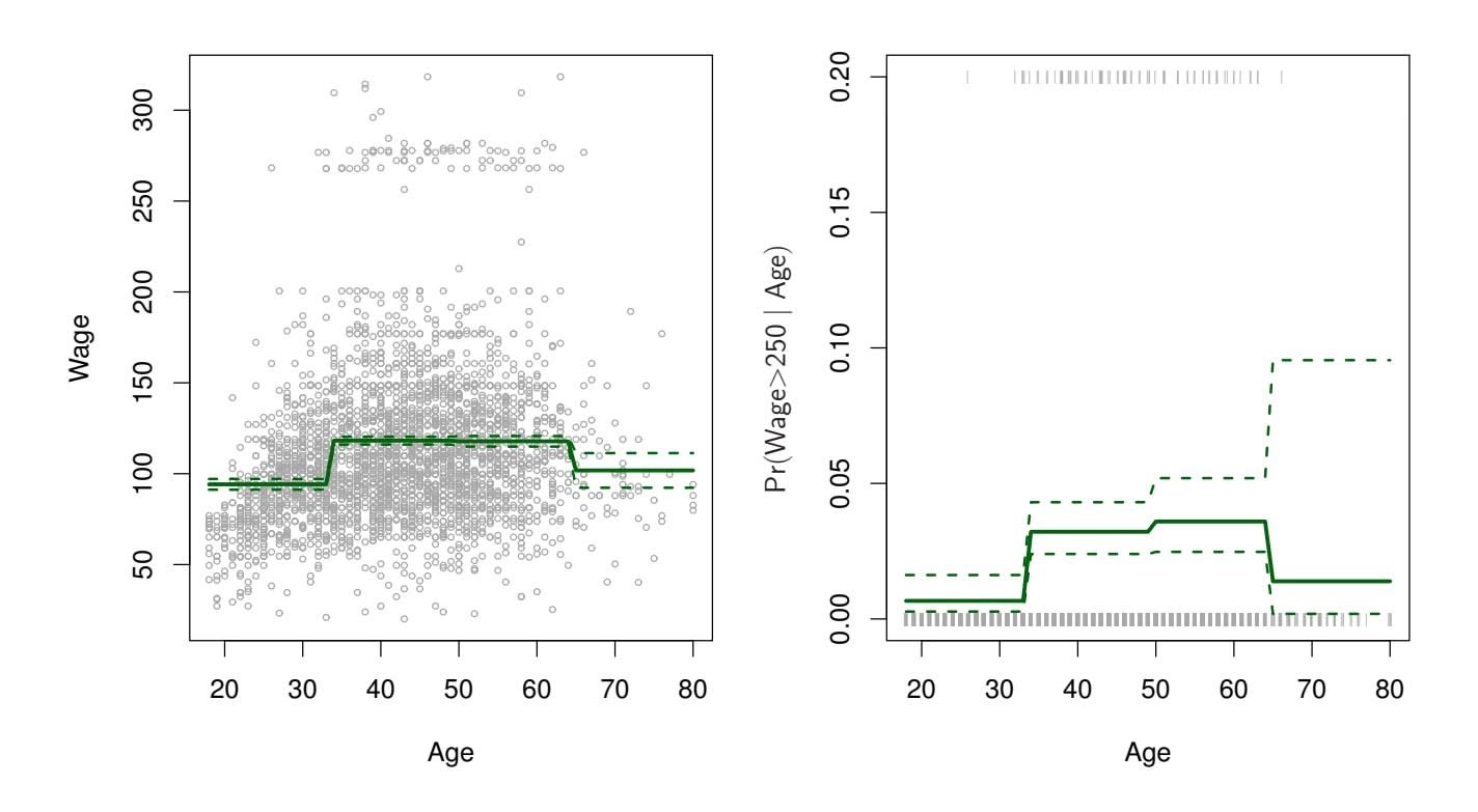
#### **Piecewise Constant**
**FIGURE 7.2.** *The* Wage *data.* Left: *The solid curve displays the ftted value from a least squares regression of* wage *(in thousands of dollars) using step functions of* age*. The dashed curves indicate an estimated 95 % confdence interval.* Right: *We model the binary event* wage>250 *using logistic regression, again using step functions of* age*. The ftted posterior probability of* wage *exceeding* \$250*,*000 *is shown, along with an estimated 95 % confdence interval.*
and returns a 0 otherwise. For example, $I(c_K \le X)$ equals 1 if $c_K \le X$ , and equals 0 otherwise. These are sometimes called *dummy* variables. Notice that for any value of $X$ , $C_0(X) + C_1(X) + \dots + C_K(X) = 1$ , since $X$ must be in exactly one of the $K + 1$ intervals. We then use least squares to fit a linear model using $C_1(X), C_2(X), \dots, C_K(X)$ as predictors2:
$$
y_i = \beta_0 + \beta_1 C_1(x_i) + \beta_2 C_2(x_i) + \dots + \beta_K C_K(x_i) + \epsilon_i \tag{7.5}
$$
For a given value of $X$ , at most one of $C_1, C_2, \dots, C_K$ can be non-zero. Note that when $X < c_1$ , all of the predictors in (7.5) are zero, so $\beta_0$ can be interpreted as the mean value of $Y$ for $X < c_1$ . By comparison, (7.5) predicts a response of $\beta_0 + \beta_j$ for $c_j \le X < c_{j+1}$ , so $\beta_j$ represents the average increase in the response for $X$ in $c_j \le X < c_{j+1}$ relative to $X < c_1$ .
An example of ftting step functions to the Wage data from Figure 7.1 is shown in the left-hand panel of Figure 7.2. We also ft the logistic regression
2We exclude *C*0(*X*) as a predictor in (7.5) because it is redundant with the intercept. This is similar to the fact that we need only two dummy variables to code a qualitative variable with three levels, provided that the model will contain an intercept. The decision to exclude *C*0(*X*) instead of some other *Ck*(*X*) in (7.5) is arbitrary. Alternatively, we could include *C*0(*X*)*, C*1(*X*)*,...,CK*(*X*), and exclude the intercept.
# 7. Moving Beyond Linearity
model
$$
\text{Pr}(y_i > 250|x_i) = \frac{\exp(\beta_0 + \beta_1 C_1(x_i) + \dots + \beta_K C_K(x_i))}{1 + \exp(\beta_0 + \beta_1 C_1(x_i) + \dots + \beta_K C_K(x_i))} \quad (7.6)
$$
in order to predict the probability that an individual is a high earner on the basis of age. The right-hand panel of Figure 7.2 displays the ftted posterior probabilities obtained using this approach.
Unfortunately, unless there are natural breakpoints in the predictors, piecewise-constant functions can miss the action. For example, in the lefthand panel of Figure 7.2, the frst bin clearly misses the increasing trend of wage with age. Nevertheless, step function approaches are very popular in biostatistics and epidemiology, among other disciplines. For example, 5-year age groups are often used to defne the bins.
### 7.3 Basis Functions
Polynomial and piecewise-constant regression models are in fact special cases of a *basis function* approach. The idea is to have at hand a family of functions or transformations that can be applied to a variable $X$ : $b_1(X), b_2(X), \dots, b_K(X)$ . Instead of fitting a linear model in $X$ , we fit the model
basis
unction
$$
y_i = \beta_0 + \beta_1 b_1(x_i) + \beta_2 b_2(x_i) + \beta_3 b_3(x_i) + \dots + \beta_K b_K(x_i) + \epsilon_i \quad (7.7)
$$
Note that the basis functions $b_1(·), b_2(·), ..., b_K(·)$ are fixed and known. (In other words, we choose the functions ahead of time.) For polynomial regression, the basis functions are $b_j(x_i) = x_i^j$ , and for piecewise constant functions they are $b_j(x_i) = I(c_j \le x_i < c_{j+1})$ . We can think of (7.7) as a standard linear model with predictors $b_1(x_i), b_2(x_i), ..., b_K(x_i)$ . Hence, we can use least squares to estimate the unknown regression coefficients in (7.7). Importantly, this means that all of the inference tools for linear models that are discussed in Chapter 3, such as standard errors for the coefficient estimates and F-statistics for the model's overall significance, are available in this setting.
Thus far we have considered the use of polynomial functions and piecewise constant functions for our basis functions; however, many alternatives are possible. For instance, we can use wavelets or Fourier series to construct basis functions. In the next section, we investigate a very common choice for a basis function: *regression splines*. regression
spline
7.4 Regression Splines 295
### 7.4 Regression Splines
Now we discuss a fexible class of basis functions that extends upon the polynomial regression and piecewise constant regression approaches that we have just seen.
### 7.4.1 Piecewise Polynomials
Instead of ftting a high-degree polynomial over the entire range of *X*, *piecewise polynomial regression* involves ftting separate low-degree polynomials piecewise over diferent regions of *X*. For example, a piecewise cubic polynomial works by ftting a cubic regression model of the form
polynomial regression
$$
y_i = \beta_0 + \beta_1 x_i + \beta_2 x_i^2 + \beta_3 x_i^3 + \epsilon_i, \quad (7.8)
$$
where the coeffcients β0, β1, β2, and β3 difer in diferent parts of the range of *X*. The points where the coeffcients change are called *knots*. knot For example, a piecewise cubic with no knots is just a standard cubic
For example, a piecewise cubic with no knots is just a standard cubic polynomial, as in (7.1) with $d = 3$ . A piecewise cubic polynomial with a single knot at a point $c$ takes the form
$$
y_i = \begin{cases} \beta_{01} + \beta_{11}x_i + \beta_{21}x_i^2 + \beta_{31}x_i^3 + \epsilon_i & \text{if } x_i < c \\ \beta_{02} + \beta_{12}x_i + \beta_{22}x_i^2 + \beta_{32}x_i^3 + \epsilon_i & \text{if } x_i \ge c. \end{cases}
$$
In other words, we fit two different polynomial functions to the data, one on the subset of the observations with $x_i < c$ , and one on the subset of the observations with $x_i ≥ c$ . The first polynomial function has coefficients $β_{01}$ , $β_{11}$ , $β_{21}$ , and $β_{31}$ , and the second has coefficients $β_{02}$ , $β_{12}$ , $β_{22}$ , and $β_{32}$ . Each of these polynomial functions can be fit using least squares applied to simple functions of the original predictor.
Using more knots leads to a more fexible piecewise polynomial. In general, if we place *K* diferent knots throughout the range of *X*, then we will end up ftting *K* + 1 diferent cubic polynomials. Note that we do not need to use a cubic polynomial. For example, we can instead ft piecewise linear functions. In fact, our piecewise constant functions of Section 7.2 are piecewise polynomials of degree 0!
The top left panel of Figure 7.3 shows a piecewise cubic polynomial fit to a subset of the Wage data, with a single knot at $age=50$ . We immediately see a problem: the function is discontinuous and looks ridiculous! Since each polynomial has four parameters, we are using a total of eight *degrees of freedom* in fitting this piecewise polynomial model.
freedom
### 7.4.2 Constraints and Splines
The top left panel of Figure 7.3 looks wrong because the ftted curve is just too fexible. To remedy this problem, we can ft a piecewise polynomial
t
296 7. Moving Beyond Linearity
**FIGURE 7.3.** *Various piecewise polynomials are ft to a subset of the* Wage *data, with a knot at* age=50*.* Top Left: *The cubic polynomials are unconstrained.* Top Right: *The cubic polynomials are constrained to be continuous at* age=50*.* Bottom Left: *The cubic polynomials are constrained to be continuous, and to have continuous frst and second derivatives.* Bottom Right: *A linear spline is shown, which is constrained to be continuous.*
under the *constraint* that the ftted curve must be continuous. In other words, there cannot be a jump when age=50. The top right plot in Figure 7.3 shows the resulting ft. This looks better than the top left plot, but the Vshaped join looks unnatural.
In the lower left plot, we have added two additional constraints: now both the frst and second *derivatives* of the piecewise polynomials are continuous derivative at age=50. In other words, we are requiring that the piecewise polynomial be not only continuous when age=50, but also very *smooth*. Each constraint that we impose on the piecewise cubic polynomials efectively frees up one degree of freedom, by reducing the complexity of the resulting piecewise polynomial ft. So in the top left plot, we are using eight degrees of freedom, but in the bottom left plot we imposed three constraints (continuity, continuity of the frst derivative, and continuity of the second derivative)
7.4 Regression Splines 297
and so are left with fve degrees of freedom. The curve in the bottom left plot is called a *cubic spline*. 3 In general, a cubic spline with *K* knots uses cubic spline a total of 4 + *K* degrees of freedom.
In Figure 7.3, the lower right plot is a *linear spline*, which is continuous linear spline at age=50. The general defnition of a degree-*d* spline is that it is a piecewise degree-*d* polynomial, with continuity in derivatives up to degree *d* − 1 at each knot. Therefore, a linear spline is obtained by ftting a line in each region of the predictor space defned by the knots, requiring continuity at each knot.
In Figure 7.3, there is a single knot at age=50. Of course, we could add more knots, and impose continuity at each.
### 7.4.3 The Spline Basis Representation
The regression splines that we just saw in the previous section may have seemed somewhat complex: how can we fit a piecewise degree- $d$ polynomial under the constraint that it (and possibly its first $d - 1$ derivatives) be continuous? It turns out that we can use the basis model (7.7) to represent a regression spline. A cubic spline with $K$ knots can be modeled as
$$
y_i = \beta_0 + \beta_1 b_1(x_i) + \beta_2 b_2(x_i) + \dots + \beta_{K+3} b_{K+3}(x_i) + \epsilon_i, \quad (7.9)
$$
for an appropriate choice of basis functions $b_1, b_2, ..., b_{K+3}$ . The model (7.9) can then be fit using least squares.
Just as there were several ways to represent polynomials, there are also many equivalent ways to represent cubic splines using diferent choices of basis functions in (7.9). The most direct way to represent a cubic spline using (7.9) is to start of with a basis for a cubic polynomial—namely, *x, x*2*,* and *x*3—and then add one *truncated power basis* function per knot. truncated A truncated power basis function is defned as power basis
truncated
power basis
$$
h(x, \xi) = (x - \xi)_+^3 = \begin{cases} (x - \xi)^3 & \text{if } x > \xi \\ 0 & \text{otherwise} \end{cases} \quad (7.10)
$$
where $\xi$ is the knot. One can show that adding a term of the form $\beta_4 h(x, \xi)$ to the model (7.8) for a cubic polynomial will lead to a discontinuity in only the third derivative at $\xi$ ; the function will remain continuous, with continuous first and second derivatives, at each of the knots.
In other words, in order to fit a cubic spline to a data set with $K$ knots, we perform least squares regression with an intercept and $3 + K$ predictors, of the form $X, X^2, X^3, h(X, \xi_1), h(X, \xi_2), \dots, h(X, \xi_K)$ , where $\xi_1, \dots, \xi_K$ are the knots. This amounts to estimating a total of $K + 4$ regression coefficients; for this reason, fitting a cubic spline with $K$ knots uses $K + 4$ degrees of freedom.
cubic spline
linear spline
3Cubic splines are popular because most human eyes cannot detect the discontinuity at the knots.
298 7. Moving Beyond Linearity
**FIGURE 7.4.** *A cubic spline and a natural cubic spline, with three knots, ft to a subset of the* Wage *data. The dashed lines denote the knot locations.*
Unfortunately, splines can have high variance at the outer range of the predictors—that is, when *X* takes on either a very small or very large value. Figure 7.4 shows a ft to the Wage data with three knots. We see that the confdence bands in the boundary region appear fairly wild. A *natural spline* is a regression spline with additional *boundary constraints*: the natural spline function is required to be linear at the boundary (in the region where *X* is smaller than the smallest knot, or larger than the largest knot). This additional constraint means that natural splines generally produce more stable estimates at the boundaries. In Figure 7.4, a natural cubic spline is also displayed as a red line. Note that the corresponding confdence intervals are narrower.
tural
spline
### 7.4.4 Choosing the Number and Locations of the Knots
When we ft a spline, where should we place the knots? The regression spline is most fexible in regions that contain a lot of knots, because in those regions the polynomial coeffcients can change rapidly. Hence, one option is to place more knots in places where we feel the function might vary most rapidly, and to place fewer knots where it seems more stable. While this option can work well, in practice it is common to place knots in a uniform fashion. One way to do this is to specify the desired degrees of freedom, and then have the software automatically place the corresponding number of knots at uniform quantiles of the data.
Figure 7.5 shows an example on the Wage data. As in Figure 7.4, we have ft a natural cubic spline with three knots, except this time the knot locations were chosen automatically as the 25th, 50th, and 75th percentiles of age. This was specifed by requesting four degrees of freedom. The ar-
7.4 Regression Splines 299
#### **Natural Cubic Spline**
**FIGURE 7.5.** *A natural cubic spline function with four degrees of freedom is ft to the* Wage *data.* Left: *A spline is ft to* wage *(in thousands of dollars) as a function of* age*.* Right: *Logistic regression is used to model the binary event* wage>250 *as a function of* age*. The ftted posterior probability of* wage *exceeding* \$250*,*000 *is shown. The dashed lines denote the knot locations.*
gument by which four degrees of freedom leads to three interior knots is somewhat technical.4
How many knots should we use, or equivalently how many degrees of freedom should our spline contain? One option is to try out diferent numbers of knots and see which produces the best looking curve. A somewhat more objective approach is to use cross-validation, as discussed in Chapters 5 and 6. With this method, we remove a portion of the data (say 10 %), ft a spline with a certain number of knots to the remaining data, and then use the spline to make predictions for the held-out portion. We repeat this process multiple times until each observation has been left out once, and then compute the overall cross-validated RSS. This procedure can be repeated for diferent numbers of knots *K*. Then the value of *K* giving the smallest RSS is chosen.
Figure 7.6 shows ten-fold cross-validated mean squared errors for splines with various degrees of freedom ft to the Wage data. The left-hand panel
4There are actually fve knots, including the two boundary knots. A cubic spline with fve knots has nine degrees of freedom. But natural cubic splines have two additional *natural* constraints at each boundary to enforce linearity, resulting in 9 − 4=5 degrees of freedom. Since this includes a constant, which is absorbed in the intercept, we count it as four degrees of freedom.
300 7. Moving Beyond Linearity
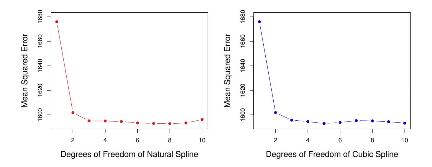
**FIGURE 7.6.** *Ten-fold cross-validated mean squared errors for selecting the degrees of freedom when ftting splines to the* Wage *data. The response is* wage *and the predictor* age*.* Left: *A natural cubic spline.* Right: *A cubic spline.*
corresponds to a natural cubic spline and the right-hand panel to a cubic spline. The two methods produce almost identical results, with clear evidence that a one-degree ft (a linear regression) is not adequate. Both curves fatten out quickly, and it seems that three degrees of freedom for the natural spline and four degrees of freedom for the cubic spline are quite adequate.
In Section 7.7 we ft additive spline models simultaneously on several variables at a time. This could potentially require the selection of degrees of freedom for each variable. In cases like this we typically adopt a more pragmatic approach and set the degrees of freedom to a fxed number, say four, for all terms.
### 7.4.5 Comparison to Polynomial Regression
Figure 7.7 compares a natural cubic spline with 15 degrees of freedom to a degree-15 polynomial on the Wage data set. The extra flexibility in the polynomial produces undesirable results at the boundaries, while the natural cubic spline still provides a reasonable fit to the data. Regression splines often give superior results to polynomial regression. This is because unlike polynomials, which must use a high degree (exponent in the highest monomial term, e.g. $X^{15}$ ) to produce flexible fits, splines introduce flexibility by increasing the number of knots but keeping the degree fixed. Generally, this approach produces more stable estimates. Splines also allow us to place more knots, and hence flexibility, over regions where the function $f$ seems to be changing rapidly, and fewer knots where $f$ appears more stable.
7.5 Smoothing Splines 301
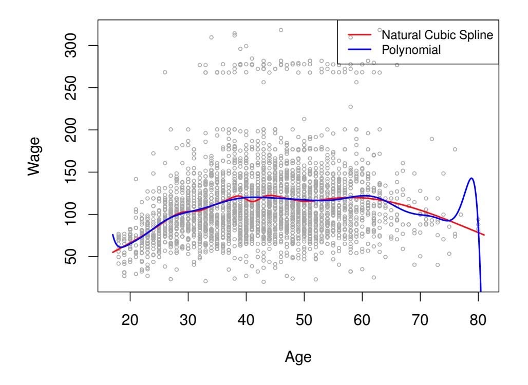
**FIGURE 7.7.** *On the* Wage *data set, a natural cubic spline with 15 degrees of freedom is compared to a degree-*15 *polynomial. Polynomials can show wild behavior, especially near the tails.*
### 7.5 Smoothing Splines
In the last section we discussed regression splines, which we create by specifying a set of knots, producing a sequence of basis functions, and then using least squares to estimate the spline coeffcients. We now introduce a somewhat diferent approach that also produces a spline.
### 7.5.1 An Overview of Smoothing Splines
In fitting a smooth curve to a set of data, what we really want to do is find some function, say $g(x)$ , that fits the observed data well: that is, we want $RSS = \sum_{i=1}^{n} (y_i - g(x_i))^2$ to be small. However, there is a problem with this approach. If we don't put any constraints on $g(x_i)$ , then we can always make RSS zero simply by choosing $g$ such that it *interpolates* all of the $y_i$ . Such a function would woefully overfit the data—it would be far too flexible. What we really want is a function $g$ that makes RSS small, but that is also *smooth*.
How might we ensure that *g* is smooth? There are a number of ways to do this. A natural approach is to fnd the function *g* that minimizes
$$
\sum_{i=1}^{n} (y_i - g(x_i))^2 + \lambda \int g''(t)^2 dt \quad (7.11)
$$
where λ is a nonnegative *tuning parameter*. The function *g* that minimizes
(7.11) is known as a *smoothing spline*. smoothing What does ( spline 7.11) mean? Equation 7.11 takes the "Loss+Penalty" formulation that we encounter in the context of ridge regression and the lasso
smoothing
spline
302 7. Moving Beyond Linearity
in Chapter 6. The term $\sum_{i=1}^{n}(y_i - g(x_i))^2$ is a *loss function* that encourages *g* to fit the data well, and the term $\lambda \int g''(t)^2 dt$ is a *penalty term* that penalizes the variability in *g*. The notation $g''(t)$ indicates the second derivative of the function *g*. The first derivative $g'(t)$ measures the slope of a function at *t*, and the second derivative corresponds to the amount by which the slope is changing. Hence, broadly speaking, the second derivative of a function is a measure of its *roughness*: it is large in absolute value if $g(t)$ is very wiggly near *t*, and it is close to zero otherwise. (The second derivative of a straight line is zero; note that a line is perfectly smooth.) The $\int$ notation is an *integral*, which we can think of as a summation over the range of *t*. In other words, $\int g''(t)^2 dt$ is simply a measure of the total change in the function $g'(t)$ , over its entire range. If *g* is very smooth, then $g'(t)$ will be close to constant and $\int g''(t)^2 dt$ will take on a small value. Conversely, if *g* is jumpy and variable then $g'(t)$ will vary significantly and $\int g''(t)^2 dt$ will take on a large value. Therefore, in (7.11), $\lambda \int g''(t)^2 dt$ encourages *g* to be smooth. The larger the value of $\lambda$ , the smoother *g* will be.
When $\lambda = 0$ , then the penalty term in (7.11) has no effect, and so the function *g* will be very jumpy and will exactly interpolate the training observations. When $\lambda \to \infty$ , *g* will be perfectly smooth—it will just be a straight line that passes as closely as possible to the training points. In fact, in this case, *g* will be the linear least squares line, since the loss function in (7.11) amounts to minimizing the residual sum of squares. For an intermediate value of $\lambda$ , *g* will approximate the training observations but will be somewhat smooth. We see that $\lambda$ controls the bias-variance trade-off of the smoothing spline.The function $g(x)$ that minimizes (7.11) can be shown to have some special properties: it is a piecewise cubic polynomial with knots at the unique values of $x_1, \dots, x_n$ , and continuous first and second derivatives at each knot. Furthermore, it is linear in the region outside of the extreme knots. In other words, *the function* $g(x)$ *that minimizes (7.11) is a natural cubic spline with knots at* $x_1, \dots, x_n$ *!* However, it is not the same natural cubic spline that one would get if one applied the basis function approach described in Section 7.4.3 with knots at $x_1, \dots, x_n$ —rather, it is a *shrunken* version of such a natural cubic spline, where the value of the tuning parameter $\lambda$ in (7.11) controls the level of shrinkage.
### 7.5.2 Choosing the Smoothing Parameter λ
We have seen that a smoothing spline is simply a natural cubic spline with knots at every unique value of $x_i$ . It might seem that a smoothing spline will have far too many degrees of freedom, since a knot at each data point allows a great deal of flexibility. But the tuning parameter $λ$ controls the roughness of the smoothing spline, and hence the *effective degrees of freedom*. It is possible to show that as $λ$ increases from $0$ to $∞$ , the effective degrees of freedom, which we write $df_λ$ , decrease from $n$ to 2.
effective
degrees of
freedom
7.5 Smoothing Splines 303
In the context of smoothing splines, why do we discuss *efective* degrees of freedom instead of degrees of freedom? Usually degrees of freedom refer to the number of free parameters, such as the number of coeffcients ft in a polynomial or cubic spline. Although a smoothing spline has *n* parameters and hence *n* nominal degrees of freedom, these *n* parameters are heavily constrained or shrunk down. Hence *df*λ is a measure of the fexibility of the smoothing spline—the higher it is, the more fexible (and the lower-bias but higher-variance) the smoothing spline. The defnition of efective degrees of freedom is somewhat technical. We can write
$$
\hat{\mathbf{g}}_{\lambda} = \mathbf{S}_{\lambda} \mathbf{y}
$$
(7.12)
where $\hat{\mathbf{g}}_{\lambda}$ is the solution to (7.11) for a particular choice of $\lambda$ —that is, it is an *n*-vector containing the fitted values of the smoothing spline at the training points $x_1, \dots, x_n$ . Equation 7.12 indicates that the vector of fitted values when applying a smoothing spline to the data can be written as an *n* × *n* matrix $\mathbf{S}_{\lambda}$ (for which there is a formula) times the response vector $\mathbf{y}$ . Then the effective degrees of freedom is defined to be
$$
df_{\lambda} = \sum_{i=1}^{n} \{ \mathbf{S}_{\lambda} \}_{ii}, \quad (7.13)
$$
the sum of the diagonal elements of the matrix Sλ.
In ftting a smoothing spline, we do not need to select the number or location of the knots—there will be a knot at each training observation, *x*1*,...,xn*. Instead, we have another problem: we need to choose the value of λ. It should come as no surprise that one possible solution to this problem is cross-validation. In other words, we can fnd the value of λ that makes the cross-validated RSS as small as possible. It turns out that the *leaveone-out* cross-validation error (LOOCV) can be computed very effciently for smoothing splines, with essentially the same cost as computing a single ft, using the following formula:
$$
RSS_{cv}(\lambda) = \sum_{i=1}^{n} (y_i - \hat{g}_{\lambda}^{(-i)}(x_i))^2 = \sum_{i=1}^{n} \left[ \frac{y_i - \hat{g}_{\lambda}(x_i)}{1 - \{S_{\lambda}\}_{ii}} \right]^2
$$
The notation $\hat{g}_{\lambda}^{(-i)}(x_i)$ indicates the fitted value for this smoothing spline evaluated at $x_i$ , where the fit uses all of the training observations except for the $i$ th observation $(x_i, y_i)$ . In contrast, $\hat{g}_{\lambda}(x_i)$ indicates the smoothing spline function fit to all of the training observations and evaluated at $x_i$ . This remarkable formula says that we can compute each of these *leave-one-out* fits using only $\hat{g}_{\lambda}$ , the original fit to *all* of the data!5 We have
5The exact formulas for computing *g*ˆ(*xi*) and Sλ are very technical; however, effcient algorithms are available for computing these quantities.
304 7. Moving Beyond Linearity
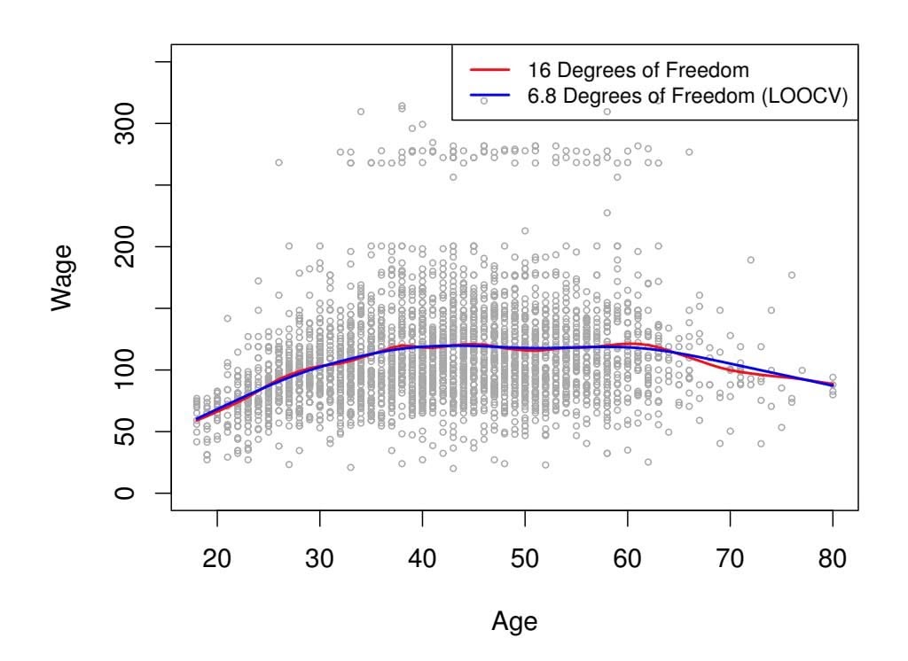
**Smoothing Spline**
**FIGURE 7.8.** *Smoothing spline fts to the* Wage *data. The red curve results from specifying* 16 *efective degrees of freedom. For the blue curve,* λ *was found automatically by leave-one-out cross-validation, which resulted in* 6*.*8 *efective degrees of freedom.*
a very similar formula (5.2) on page 202 in Chapter 5 for least squares linear regression. Using (5.2), we can very quickly perform LOOCV for the regression splines discussed earlier in this chapter, as well as for least squares regression using arbitrary basis functions.
Figure 7.8 shows the results from ftting a smoothing spline to the Wage data. The red curve indicates the ft obtained from pre-specifying that we would like a smoothing spline with 16 efective degrees of freedom. The blue curve is the smoothing spline obtained when λ is chosen using LOOCV; in this case, the value of λ chosen results in 6*.*8 efective degrees of freedom (computed using (7.13)). For this data, there is little discernible diference between the two smoothing splines, beyond the fact that the one with 16 degrees of freedom seems slightly wigglier. Since there is little diference between the two fts, the smoothing spline ft with 6*.*8 degrees of freedom is preferable, since in general simpler models are better unless the data provides evidence in support of a more complex model.
### 7.6 Local Regression
*Local regression* is a diferent approach for ftting fexible non-linear func- local regression tions, which involves computing the ft at a target point *x*0 using only the nearby training observations. Figure 7.9 illustrates the idea on some simulated data, with one target point near 0*.*4, and another near the boundary
local
regression
7.6 Local Regression 305
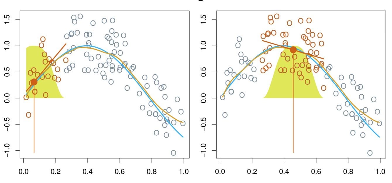
#### **Local Regression**
**FIGURE 7.9.** *Local regression illustrated on some simulated data, where the blue curve represents f*(*x*) *from which the data were generated, and the light orange curve corresponds to the local regression estimate* ˆ*f*(*x*)*. The orange colored points are local to the target point x*0*, represented by the orange vertical line. The yellow bell-shape superimposed on the plot indicates weights assigned to each point, decreasing to zero with distance from the target point. The ft* ˆ*f*(*x*0) *at x*0 *is obtained by ftting a weighted linear regression (orange line segment), and using the ftted value at x*0 *(orange solid dot) as the estimate* ˆ*f*(*x*0)*.*
at 0.05. In this figure the blue line represents the function $f(x)$ from which the data were generated, and the light orange line corresponds to the local regression estimate $\hat{f}(x)$ . Local regression is described in Algorithm 7.1.
Note that in Step 3 of Algorithm 7.1, the weights *Ki*0 will difer for each value of *x*0. In other words, in order to obtain the local regression ft at a new point, we need to ft a new weighted least squares regression model by minimizing (7.14) for a new set of weights. Local regression is sometimes referred to as a *memory-based* procedure, because like nearest-neighbors, we need all the training data each time we wish to compute a prediction. We will avoid getting into the technical details of local regression here—there are books written on the topic.
In order to perform local regression, there are a number of choices to be made, such as how to defne the weighting function *K*, and whether to ft a linear, constant, or quadratic regression in Step 3. (Equation 7.14 corresponds to a linear regression.) While all of these choices make some diference, the most important choice is the *span s*, which is the proportion of points used to compute the local regression at *x*0, as defned in Step 1 above. The span plays a role like that of the tuning parameter λ in smoothing splines: it controls the fexibility of the non-linear ft. The smaller the value of *s*, the more *local* and wiggly will be our ft; alternatively, a very large value of *s* will lead to a global ft to the data using all of the training observations. We can again use cross-validation to choose *s*, or we can
#### 306 7. Moving Beyond Linearity
#### **Algorithm 7.1** *Local Regression At X* = *x*0
- 1. Gather the fraction *s* = *k/n* of training points whose *xi* are closest to *x*0.
- 2. Assign a weight *Ki*0 = *K*(*xi, x*0) to each point in this neighborhood, so that the point furthest from *x*0 has weight zero, and the closest has the highest weight. All but these *k* nearest neighbors get weight zero.
- 3. Fit a *weighted least squares regression* of the *yi* on the *xi* using the aforementioned weights, by fnding βˆ0 and βˆ1 that minimize
$$
\sum_{i=1}^{n} K_{i0}(y_i - \beta_0 - \beta_1 x_i)^2 \quad (7.14)
$$
4. The ftted value at *x*0 is given by ˆ*f*(*x*0) = βˆ0 + βˆ1*x*0.
specify it directly. Figure 7.10 displays local linear regression fits on the Wage data, using two values of $s$ : $0.7$ and $0.2$ . As expected, the fit obtained using $s = 0.7$ is smoother than that obtained using $s = 0.2$ .
The idea of local regression can be generalized in many diferent ways. In a setting with multiple features *X*1*, X*2*,...,Xp*, one very useful generalization involves ftting a multiple linear regression model that is global in some variables, but local in another, such as time. Such *varying coeffcient models* are a useful way of adapting a model to the most recently gathered varying data. Local regression also generalizes very naturally when we want to ft models that are local in a pair of variables *X*1 and *X*2, rather than one. We can simply use two-dimensional neighborhoods, and ft bivariate linear regression models using the observations that are near each target point in two-dimensional space. Theoretically the same approach can be implemented in higher dimensions, using linear regressions ft to *p*-dimensional neighborhoods. However, local regression can perform poorly if *p* is much larger than about 3 or 4 because there will generally be very few training observations close to *x*0. Nearest-neighbors regression, discussed in Chapter 3, sufers from a similar problem in high dimensions.
### 7.7 Generalized Additive Models
In Sections 7.1–7.6, we present a number of approaches for fexibly predicting a response *Y* on the basis of a single predictor *X*. These approaches can be seen as extensions of simple linear regression. Here we explore the prob-
coeffcient model
7.7 Generalized Additive Models 307
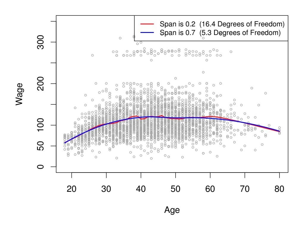
#### **Local Linear Regression**
**FIGURE 7.10.** *Local linear fts to the* Wage *data. The span specifes the fraction of the data used to compute the ft at each target point.*
lem of flexibly predicting $Y$ on the basis of several predictors, $X_1, ..., X_p$ . This amounts to an extension of multiple linear regression.
*Generalized additive models* (GAMs) provide a general framework for generalized extending a standard linear model by allowing non-linear functions of each of the variables, while maintaining *additivity*. Just like linear models, GAMs can be applied with both quantitative and qualitative responses. We frst additivity examine GAMs for a quantitative response in Section 7.7.1, and then for a qualitative response in Section 7.7.2.
additive model
### 7.7.1 GAMs for Regression Problems
A natural way to extend the multiple linear regression model
$$
y_i = \beta_0 + \beta_1 x_{i1} + \beta_2 x_{i2} + \dots + \beta_p x_{ip} + \epsilon_i
$$
in order to allow for non-linear relationships between each feature and the response is to replace each linear component β*jxij* with a (smooth) nonlinear function *fj* (*xij* ). We would then write the model as
$$
\begin{aligned} y_i &= \beta_0 + \sum_{j=1}^p f_j(x_{ij}) + \epsilon_i \\ &= \beta_0 + f_1(x_{i1}) + f_2(x_{i2}) + \cdots + f_p(x_{ip}) + \epsilon_i. \quad (7.15) \end{aligned}
$$
This is an example of a GAM. It is called an *additive* model because we calculate a separate *fj* for each *Xj* , and then add together all of their contributions.
308 7. Moving Beyond Linearity
**FIGURE 7.11.** *For the* Wage *data, plots of the relationship between each feature and the response,* wage*, in the ftted model (7.16). Each plot displays the ftted function and pointwise standard errors. The frst two functions are natural splines in* year *and* age*, with four and fve degrees of freedom, respectively. The third function is a step function, ft to the qualitative variable* education*.*
In Sections 7.1–7.6, we discuss many methods for ftting functions to a single variable. The beauty of GAMs is that we can use these methods as building blocks for ftting an additive model. In fact, for most of the methods that we have seen so far in this chapter, this can be done fairly trivially. Take, for example, natural splines, and consider the task of ftting the model
$$
\text{wage} = \beta_0 + f_1(\text{year}) + f_2(\text{age}) + f_3(\text{education}) + \epsilon \quad (7.16)
$$
on the Wage data. Here year and age are quantitative variables, while the variable education is qualitative with fve levels: Coll, referring to the amount of high school or college education that an individual has completed. We ft the frst two functions using natural splines. We ft the third function using a separate constant for each level, via the usual dummy variable approach of Section 3.3.1.
Figure 7.11 shows the results of ftting the model (7.16) using least squares. This is easy to do, since as discussed in Section 7.4, natural splines can be constructed using an appropriately chosen set of basis functions. Hence the entire model is just a big regression onto spline basis variables and dummy variables, all packed into one big regression matrix.
Figure 7.11 can be easily interpreted. The left-hand panel indicates that holding age and education fxed, wage tends to increase slightly with year; this may be due to infation. The center panel indicates that holding education and year fxed, wage tends to be highest for intermediate values of age, and lowest for the very young and very old. The right-hand panel indicates that holding year and age fxed, wage tends to increase with education: the more educated a person is, the higher their salary, on average. All of these fndings are intuitive.
7.7 Generalized Additive Models 309
**FIGURE 7.12.** *Details are as in Figure 7.11, but now f*1 *and f*2 *are smoothing splines with four and fve degrees of freedom, respectively.*
Figure 7.12 shows a similar triple of plots, but this time $f_1$ and $f_2$ are smoothing splines with four and five degrees of freedom, respectively. Fitting a GAM with a smoothing spline is not quite as simple as fitting a GAM with a natural spline, since in the case of smoothing splines, least squares cannot be used. However, standard software such as the gam() function in R can be used to fit GAMs using smoothing splines, via an approach known as *backfitting*. This method fits a model involving multiple predictors by repeatedly updating the fit for each predictor in turn, holding the others fixed. The beauty of this approach is that each time we update a function, we simply apply the fitting method for that variable to a *partial residual*.6
The ftted functions in Figures 7.11 and 7.12 look rather similar. In most situations, the diferences in the GAMs obtained using smoothing splines versus natural splines are small.
We do not have to use splines as the building blocks for GAMs: we can just as well use local regression, polynomial regression, or any combination of the approaches seen earlier in this chapter in order to create a GAM. GAMs are investigated in further detail in the lab at the end of this chapter.
#### Pros and Cons of GAMs
Before we move on, let us summarize the advantages and limitations of a GAM.
▲ GAMs allow us to ft a non-linear *fj* to each *Xj* , so that we can automatically model non-linear relationships that standard linear regression will miss. This means that we do not need to manually try out many diferent transformations on each variable individually.
backfitting
6A partial residual for *X*3, for example, has the form *ri* = *yi* −*f*1(*xi*1)−*f*2(*xi*2). If we know *f*1 and *f*2, then we can ft *f*3 by treating this residual as a response in a non-linear regression on *X*3.
- 310 7. Moving Beyond Linearity
- ▲ The non-linear fts can potentially make more accurate predictions for the response *Y* .
- ▲ Because the model is additive, we can examine the efect of each *Xj* on *Y* individually while holding all of the other variables fxed.
- ▲ The smoothness of the function *fj* for the variable *Xj* can be summarized via degrees of freedom.
- ◆ The main limitation of GAMs is that the model is restricted to be additive. With many variables, important interactions can be missed. However, as with linear regression, we can manually add interaction terms to the GAM model by including additional predictors of the form *Xj* × *Xk*. In addition we can add low-dimensional interaction functions of the form *fjk*(*Xj , Xk*) into the model; such terms can be ft using two-dimensional smoothers such as local regression, or two-dimensional splines (not covered here).
For fully general models, we have to look for even more flexible approaches such as random forests and boosting, described in Chapter 8. GAMs provide a useful compromise between linear and fully nonparametric models.
### 7.7.2 GAMs for Classification Problems
GAMs can also be used in situations where $Y$ is qualitative. For simplicity, here we assume $Y$ takes on values 0 or 1, and let $p(X) = \Pr(Y = 1|X)$ be the conditional probability (given the predictors) that the response equals one. Recall the logistic regression model (4.6):
$$
\log\left(\frac{p(X)}{1 - p(X)}\right) = \beta_0 + \beta_1 X_1 + \beta_2 X_2 + \dots + \beta_p X_p
$$
(7.17)
The left-hand side is the log of the odds of $P(Y = 1|X)$ versus $P(Y = 0|X)$ , which $(7.17)$ represents as a linear function of the predictors. A natural way to extend $(7.17)$ to allow for non-linear relationships is to use the model
$$
\log\left(\frac{p(X)}{1-p(X)}\right) = \beta_0 + f_1(X_1) + f_2(X_2) + \dots + f_p(X_p) \quad (7.18)
$$
Equation 7.18 is a logistic regression GAM. It has all the same pros and cons as discussed in the previous section for quantitative responses.
We fit a GAM to the Wage data in order to predict the probability that an individual's income exceeds $250,000$ per year. The GAM that we fit takes the form
$$
\log\left(\frac{p(X)}{1-p(X)}\right) = \beta_0 + \beta_1 \times \text{year} + f_2(\text{age}) + f_3(\text{education}), \quad (7.19)
$$
where
$$
p(X) = \Pr(\text{wage} > 250 | \text{year}, \text{age}, \text{education}).
$$
7.8 Lab: Non-linear Modeling 311
**FIGURE 7.13.** *For the* Wage *data, the logistic regression GAM given in (7.19) is ft to the binary response* I(wage>250)*. Each plot displays the ftted function and pointwise standard errors. The frst function is linear in* year*, the second function a smoothing spline with fve degrees of freedom in* age*, and the third a step function for* education*. There are very wide standard errors for the frst level* 2 is ft using a smoothing spline with fve degrees of freedom, and *f*3 is ft as a step function, by creating dummy variables for each of the levels of education. The resulting ft is shown in Figure 7.13. The last panel looks suspicious, with very wide confdence intervals for level library(ISLR2)
> attach(Wage)
```
312 7. Moving Beyond Linearity
**FIGURE 7.14.** *The same model is ft as in Figure 7.13, this time excluding the observations for which* education *is* fit <- lm(wage ∼ poly(age, 4), data = Wage)
> coef(summary(fit))
Estimate Std. Error t value Pr(>|t|)
(Intercept) 111.704 0.729 153.28 <2e-16
poly(age, 4)1 447.068 39.915 11.20 <2e-16
poly(age, 4)2 -478.316 39.915 -11.98 <2e-16
poly(age, 4)3 125.522 39.915 3.14 0.0017
poly(age, 4)4 -77.911 39.915 -1.95 0.0510
```
This syntax fts a linear model, using the lm() function, in order to predict wage using a fourth-degree polynomial in age: poly(age, 4). The poly() command allows us to avoid having to write out a long formula with powers of age. The function returns a matrix whose columns are a basis of *orthogonal polynomials*, which essentially means that each column is a lin- orthogonal polynomial ear combination of the variables age, age^2, age^3 and age^4.
thogonal
polynomial
However, we can also use poly() to obtain age, age^2, age^3 and age^4 directly, if we prefer. We can do this by using the raw = TRUE argument to the poly() function. Later we see that this does not afect the model in a meaningful way—though the choice of basis clearly afects the coeffcient estimates, it does not afect the ftted values obtained.
```
> fit2 <- lm(wage ∼ poly(age, 4, raw = T), data = Wage)
> coef(summary(fit2))
Estimate Std. Error t value Pr(>|t|)
(Intercept) -1.84e+02 6.00e+01 -3.07 0.002180
poly(age, 4, raw = T)1 2.12e+01 5.89e+00 3.61 0.000312
poly(age, 4, raw = T)2 -5.64e-01 2.06e-01 -2.74 0.006261
poly(age, 4, raw = T)3 6.81e-03 3.07e-03 2.22 0.026398
poly(age, 4, raw = T)4 -3.20e-05 1.64e-05 -1.95 0.051039
```
7.8 Lab: Non-linear Modeling 313
There are several other equivalent ways of ftting this model, which showcase the fexibility of the formula language in R. For example
```
> fit2a <- lm(wage ∼ age + I(age^2) + I(age^3) + I(age^4),
data = Wage)
> coef(fit2a)
(Intercept) age I(age^2) I(age^3) I(age^4)
-1.84e+02 2.12e+01 -5.64e-01 6.81e-03 -3.20e-05
```
This simply creates the polynomial basis functions on the fy, taking care to protect terms like age^2 via the *wrapper* function I() (the ^ symbol has wrapper a special meaning in formulas).
pper
> fit2b <- lm(wage ~ cbind(age, $age^2$ , $age^3$ , $age^4$ ), data = Wage)
This does the same more compactly, using the cbind() function for building a matrix from a collection of vectors; any function call such as cbind() inside a formula also serves as a wrapper.
We now create a grid of values for age at which we want predictions, and then call the generic predict() function, specifying that we want standard errors as well.
```
> agelims <- range(age)
> age.grid <- seq(from = agelims[1], to = agelims[2])
> preds <- predict(fit, newdata = list(age = age.grid),
se = TRUE)
> se.bands <- cbind(preds$fit + 2 * preds$se.fit,
preds$fit - 2 * preds$se.fit)
```
Finally, we plot the data and add the ft from the degree-4 polynomial.
```
> par(mfrow = c(1, 2), mar = c(4.5, 4.5, 1, 1),
oma = c(0, 0, 4, 0))
> plot(age, wage, xlim = agelims, cex = .5, col = "darkgrey")
> title("Degree -4 Polynomial", outer = T)
> lines(age.grid, preds$fit, lwd = 2, col = "blue")
> matlines(age.grid, se.bands, lwd = 1, col = "blue", lty = 3)
```
Here the mar and oma arguments to par() allow us to control the margins of the plot, and the title() function creates a fgure title that spans both title() subplots.
We mentioned earlier that whether or not an orthogonal set of basis functions is produced in the poly() function will not afect the model obtained in a meaningful way. What do we mean by this? The ftted values obtained in either case are identical:
```
> preds2 <- predict(fit2, newdata = list(age = age.grid),
se = TRUE)
> max(abs(preds$fit - preds2$fit))
[1] 7.82e-11
```
In performing a polynomial regression we must decide on the degree of the polynomial to use. One way to do this is by using hypothesis tests. We 314 7. Moving Beyond Linearity
now ft models ranging from linear to a degree-5 polynomial and seek to determine the simplest model which is suffcient to explain the relationship between wage and age. We use the anova() function, which performs an anova() *analysis of variance* (ANOVA, using an F-test) in order to test the null analysis of variance hypothesis that a model *M*1 is suffcient to explain the data against the alternative hypothesis that a more complex model *M*2 is required. In order to use the anova() function, *M*1 and *M*2 must be *nested* models: the predictors in *M*1 must be a subset of the predictors in *M*2. In this case, we ft fve diferent models and sequentially compare the simpler model to the more complex model.
va()`
analysis of
variance
```
> fit.1 <- lm(wage ∼ age, data = Wage)
> fit.2 <- lm(wage ∼ poly(age, 2), data = Wage)
> fit.3 <- lm(wage ∼ poly(age, 3), data = Wage)
> fit.4 <- lm(wage ∼ poly(age, 4), data = Wage)
> fit.5 <- lm(wage ∼ poly(age, 5), data = Wage)
> anova(fit.1, fit.2, fit.3, fit.4, fit.5)
Analysis of Variance Table
Model 1: wage ∼ age
Model 2: wage ∼ poly(age, 2)
Model 3: wage ∼ poly(age, 3)
Model 4: wage ∼ poly(age, 4)
Model 5: wage ∼ poly(age, 5)
Res.Df RSS Df Sum of Sq F Pr(>F)
1 2998 5022216
2 2997 4793430 1 228786 143.59 <2e-16 ***
3 2996 4777674 1 15756 9.89 0.0017 **
4 2995 4771604 1 6070 3.81 0.0510 .
5 2994 4770322 1 1283 0.80 0.3697
---
Signif. codes: 0 `***' 0.001 `**' 0.01 `*' 0.05 `.' 0.1 ` ' 1
```
The p-value comparing the linear Model 1 to the quadratic Model 2 is essentially zero (*<*10−15), indicating that a linear ft is not suffcient. Similarly the p-value comparing the quadratic Model 2 to the cubic Model 3 is very low (0*.*0017), so the quadratic ft is also insuffcient. The p-value comparing the cubic and degree-4 polynomials, Model 3 and Model 4, is approximately 5 % while the degree-5 polynomial Model 5 seems unnecessary because its p-value is 0*.*37. Hence, either a cubic or a quartic polynomial appear to provide a reasonable ft to the data, but lower- or higher-order models are not justifed.
In this case, instead of using the anova() function, we could have obtained these p-values more succinctly by exploiting the fact that poly() creates orthogonal polynomials.
| | Estimate | Std. Error | t value | Pr(> t ) |
|---------------|----------|------------|----------|-----------|
| (Intercept) | 111.70 | 0.7288 | 153.2780 | 0.000e+00 |
| poly(age, 5)1 | 447.07 | 39.9161 | 11.2002 | 1.491e-28 |
| poly(age, 5)2 | -478.32 | 39.9161 | -11.9830 | 2.368e-32 |
7.8 Lab: Non-linear Modeling 315
poly(age, 5)3 125.52 39.9161 3.1446 1.679e-03
poly(age, 5)4 -77.91 39.9161 -1.9519 5.105e-02
poly(age, 5)5 -35.81 39.9161 -0.8972 3.697e-01
Notice that the p-values are the same, and in fact the square of the *t*-statistics are equal to the F-statistics from the anova() function; for example:
> $(-11.983)^2$
[1] 143.6
However, the ANOVA method works whether or not we used orthogonal polynomials; it also works when we have other terms in the model as well. For example, we can use anova() to compare these three models:
```
> fit.1 <- lm(wage ∼ education + age, data = Wage)
> fit.2 <- lm(wage ∼ education + poly(age, 2), data = Wage)
> fit.3 <- lm(wage ∼ education + poly(age, 3), data = Wage)
> anova(fit.1, fit.2, fit.3)
```
As an alternative to using hypothesis tests and ANOVA, we could choose the polynomial degree using cross-validation, as discussed in Chapter 5.
Next we consider the task of predicting whether an individual earns more than \$250*,*000 per year. We proceed much as before, except that frst we create the appropriate response vector, and then apply the glm() function using family = "binomial" in order to ft a polynomial logistic regression model.
```
> fit <- glm(I(wage > 250) ∼ poly(age, 4), data = Wage,
family = binomial)
```
Note that we again use the wrapper I() to create this binary response variable on the fy. The expression wage > 250 evaluates to a logical variable containing TRUEs and FALSEs, which glm() coerces to binary by setting the TRUEs to 1 and the FALSEs to 0.
Once again, we make predictions using the predict() function.
```
> preds <- predict(fit, newdata = list(age = age.grid), se = T)
```
However, calculating the confdence intervals is slightly more involved than in the linear regression case. The default prediction type for a glm() model is type = "link", which is what we use here. This means we get predictions for the *logit*, or log-odds: that is, we have ft a model of the form
$$
\log\left(\frac{\Pr(Y=1|X)}{1-\Pr(Y=1|X)}\right) = X\beta,
$$
and the predictions given are of the form $X\hat{\beta}$ . The standard errors given are also for $X\hat{\beta}$ . In order to obtain confidence intervals for $\text{Pr}(Y = 1|X)$ , we use the transformation
$$
\Pr(Y = 1|X) = \frac{\exp(X\beta)}{1 + \exp(X\beta)}.
$$
316 7. Moving Beyond Linearity
```
> pfit <- exp(preds$fit) / (1 + exp(preds$fit))
> se.bands.logit <- cbind(preds$fit + 2 * preds$se.fit,
preds$fit - 2 * preds$se.fit)
> se.bands <- exp(se.bands.logit) / (1 + exp(se.bands.logit))
```
Note that we could have directly computed the probabilities by selecting the type = "response" option in the predict() function.
```
> preds <- predict(fit, newdata = list(age = age.grid),
type = "response", se = T)
```
However, the corresponding confdence intervals would not have been sensible because we would end up with negative probabilities!
Finally, the right-hand plot from Figure 7.1 was made as follows:
```
> plot(age, I(wage > 250), xlim = agelims, type = "n",
ylim = c(0, .2))
> points(jitter(age), I((wage > 250) / 5), cex = .5, pch = "|", col
= "darkgrey")
> lines(age.grid, pfit, lwd = 2, col = "blue")
> matlines(age.grid, se.bands, lwd = 1, col = "blue", lty = 3)
```
We have drawn the age values corresponding to the observations with wage values above 250 as gray marks on the top of the plot, and those with wage values below 250 are shown as gray marks on the bottom of the plot. We used the jitter() function to jitter the age values a bit so that observations jitter() with the same age value do not cover each other up. This is often called a
*rug plot*. rug plot In order to ft a step function, as discussed in Section 7.2, we use the cut() function. cut()
```
> table(cut(age, 4))
(17.9,33.5] (33.5,49] (49,64.5] (64.5,80.1]
750 1399 779 72
> fit <- lm(wage ∼ cut(age, 4), data = Wage)
> coef(summary(fit))
Estimate Std. Error t value Pr(>|t|)
(Intercept) 94.16 1.48 63.79 0.00e+00
cut(age, 4)(33.5,49] 24.05 1.83 13.15 1.98e-38
cut(age, 4)(49,64.5] 23.66 2.07 11.44 1.04e-29
cut(age, 4)(64.5,80.1] 7.64 4.99 1.53 1.26e-01
```
Here cut() automatically picked the cutpoints at 33*.*5, 49, and 64*.*5 years of age. We could also have specifed our own cutpoints directly using the breaks option. The function cut() returns an ordered categorical variable; the lm() function then creates a set of dummy variables for use in the regression. The age < 33.5 category is left out, so the intercept coeffcient of \$94*,*160 can be interpreted as the average salary for those under 33*.*5 years of age, and the other coeffcients can be interpreted as the average additional salary for those in the other age groups. We can produce predictions and plots just as we did in the case of the polynomial ft.
7.8 Lab: Non-linear Modeling 317
### 7.8.2 Splines
In order to ft regression splines in R, we use the splines library. In Section 7.4, we saw that regression splines can be ft by constructing an appropriate matrix of basis functions. The bs() function generates the entire matrix of bs() basis functions for splines with the specifed set of knots. By default, cubic splines are produced. Fitting wage to age using a regression spline is simple:
```
> library(splines)
> fit <- lm(wage ∼ bs(age, knots = c(25, 40, 60)), data = Wage)
> pred <- predict(fit, newdata = list(age = age.grid), se = T)
> plot(age, wage, col = "gray")
> lines(age.grid, pred$fit, lwd = 2)
> lines(age.grid, pred$fit + 2 * pred$se, lty = "dashed")
> lines(age.grid, pred$fit - 2 * pred$se, lty = "dashed")
```
Here we have prespecifed knots at ages 25, 40, and 60. This produces a spline with six basis functions. (Recall that a cubic spline with three knots has seven degrees of freedom; these degrees of freedom are used up by an intercept, plus six basis functions.) We could also use the df option to produce a spline with knots at uniform quantiles of the data.
```
> dim(bs(age, knots = c(25, 40, 60)))
[1] 3000 6
> dim(bs(age, df = 6))
[1] 3000 6
> attr(bs(age, df = 6), "knots")
25% 50% 75%
33.8 42.0 51.0
```
In this case R chooses knots at ages 33*.*8*,* 42*.*0, and 51*.*0, which correspond to the 25th, 50th, and 75th percentiles of age. The function bs() also has a degree argument, so we can ft splines of any degree, rather than the default degree of 3 (which yields a cubic spline).
In order to instead ft a natural spline, we use the ns() function. Here ns() we ft a natural spline with four degrees of freedom.
```
> fit2 <- lm(wage ∼ ns(age, df = 4), data = Wage)
> pred2 <- predict(fit2, newdata = list(age = age.grid),
se = T)
> lines(age.grid, pred2$fit, col = "red", lwd = 2)
```
As with the bs() function, we could instead specify the knots directly using the knots option.
In order to ft a smoothing spline, we use the smooth.spline() function. smooth. Figure spline() 7.8 was produced with the following code:
```
> plot(age, wage, xlim = agelims, cex = .5, col = "darkgrey")
> title("Smoothing Spline")
> fit <- smooth.spline(age, wage, df = 16)
> fit2 <- smooth.spline(age, wage, cv = TRUE)
> fit2$df
[1] 6.8
```
318 7. Moving Beyond Linearity
```
> lines(fit, col = "red", lwd = 2)
> lines(fit2, col = "blue", lwd = 2)
> legend("topright", legend = c("16 DF", "6.8 DF"),
col = c("red", "blue"), lty = 1, lwd = 2, cex = .8)
```
Notice that in the frst call to smooth.spline(), we specifed df = 16. The function then determines which value of λ leads to 16 degrees of freedom. In the second call to smooth.spline(), we select the smoothness level by crossvalidation; this results in a value of λ that yields 6.8 degrees of freedom.
In order to perform local regression, we use the loess() function. loess()
```
> plot(age, wage, xlim = agelims, cex = .5, col = "darkgrey")
> title("Local Regression")
> fit <- loess(wage ∼ age, span = .2, data = Wage)
> fit2 <- loess(wage ∼ age, span = .5, data = Wage)
> lines(age.grid, predict(fit, data.frame(age = age.grid)),
col = "red", lwd = 2)
> lines(age.grid, predict(fit2, data.frame(age = age.grid)),
col = "blue", lwd = 2)
> legend("topright", legend = c("Span = 0.2", "Span = 0.5"),
col = c("red", "blue"), lty = 1, lwd = 2, cex = .8)
```
Here we have performed local linear regression using spans of 0*.*2 and 0*.*5: that is, each neighborhood consists of 20 % or 50 % of the observations. The larger the span, the smoother the ft. The locfit library can also be used for ftting local regression models in R.
### 7.8.3 GAMs
We now ft a GAM to predict wage using natural spline functions of year and age, treating education as a qualitative predictor, as in (7.16). Since this is just a big linear regression model using an appropriate choice of basis functions, we can simply do this using the lm() function.
```
> gam1 <- lm(wage ∼ ns(year, 4) + ns(age, 5) + education ,
data = Wage)
```
We now ft the model (7.16) using smoothing splines rather than natural splines. In order to ft more general sorts of GAMs, using smoothing splines or other components that cannot be expressed in terms of basis functions and then ft using least squares regression, we will need to use the gam library in R.
The s() function, which is part of the gam library, is used to indicate that s() we would like to use a smoothing spline. We specify that the function of year should have 4 degrees of freedom, and that the function of age will have 5 degrees of freedom. Since education is qualitative, we leave it as is, and it is converted into four dummy variables. We use the gam() function in gam() order to ft a GAM using these components. All of the terms in (7.16) are ft simultaneously, taking each other into account to explain the response.
7.8 Lab: Non-linear Modeling 319
```
> library(gam)
> gam.m3 <- gam(wage ∼ s(year, 4) + s(age, 5) + education ,
data = Wage)
```
In order to produce Figure 7.12, we simply call the plot() function:
```
> par(mfrow = c(1, 3))
> plot(gam.m3, se = TRUE, col = "blue")
```
The generic plot() function recognizes that gam.m3 is an object of class Gam, and invokes the appropriate plot.Gam() method. Conveniently, even though plot.Gam() gam1 is not of class Gam but rather of class lm, we can *still* use plot.Gam() on it. Figure 7.11 was produced using the following expression:
> plot.Gam(gam1, se = TRUE, col = "red")
Notice here we had to use plot.Gam() rather than the *generic* plot() function.
In these plots, the function of year looks rather linear. We can perform a series of ANOVA tests in order to determine which of these three models is best: a GAM that excludes year ( $𝒜$ 1), a GAM that uses a linear function of year ( $𝒜$ 2), or a GAM that uses a spline function of year ( $𝒜$ 3).
```
> gam.m1 <- gam(wage ∼ s(age, 5) + education , data = Wage)
> gam.m2 <- gam(wage ∼ year + s(age, 5) + education ,
data = Wage)
> anova(gam.m1, gam.m2, gam.m3, test = "F")
Analysis of Deviance Table
Model 1: wage ∼ s(age, 5) + education
Model 2: wage ∼ year + s(age, 5) + education
Model 3: wage ∼ s(year, 4) + s(age, 5) + education
Resid. Df Resid. Dev Df Deviance F Pr(>F)
1 2990 3711730
2 2989 3693841 1 17889 14.5 0.00014 ***
3 2986 3689770 3 4071 1.1 0.34857
---
Signif.codes: 0 `***' 0.001 `**' 0.01 `*' 0.05 `.' 0.1 ` ' 1
```
We fnd that there is compelling evidence that a GAM with a linear function of year is better than a GAM that does not include year at all (p-value = 0.00014). However, there is no evidence that a non-linear function of year is needed (p-value = 0.349). In other words, based on the results of this ANOVA, *M*2 is preferred.
The summary() function produces a summary of the gam ft.
```
> summary(gam.m3)
Call: gam(formula = wage ∼ s(year, 4) + s(age, 5) + education ,
data = Wage)
Deviance Residuals:
Min 1Q Median 3Q Max
-119.43 -19.70 -3.33 14.17 213.48
(Dispersion Parameter for gaussian family taken to be 1236)
```
320 7. Moving Beyond Linearity
```
Null Deviance: 5222086 on 2999 degrees of freedom
Residual Deviance: 3689770 on 2986 degrees of freedom
AIC: 29888
Number of Local Scoring Iterations: 2
Anova for Parametric Effects
Df Sum Sq Mean Sq F value Pr(>F)
s(year, 4) 1 27162 27162 22 2.9e-06 ***
s(age, 5) 1 195338 195338 158 < 2e-16 ***
education 4 1069726 267432 216 < 2e-16 ***
Residuals 2986 3689770 1236
---
Signif. codes: 0 `***' 0.001 `**' 0.01 `*' 0.05 `.' 0.1 ` ' 1
Anova for Nonparametric Effects
Npar Df Npar F Pr(F)
(Intercept)
s(year, 4) 3 1.1 0.35
s(age, 5) 4 32.4 <2e-16 ***
education
---
Signif. codes: 0 `***' 0.001 `**' 0.01 `*' 0.05 `.' 0.1 ` ' 1
```
The "Anova for Parametric Efects" p-values clearly demonstrate that year, age, and education are all highly statistically signifcant, even when only assuming a linear relationship. Alternatively, the "Anova for Nonparametric Efects" p-values for year and age correspond to a null hypothesis of a linear relationship versus the alternative of a non-linear relationship. The large p-value for year reinforces our conclusion from the ANOVA test that a linear function is adequate for this term. However, there is very clear evidence that a non-linear term is required for age.
We can make predictions using the predict() method for the class Gam. Here we make predictions on the training set.
```
> preds <- predict(gam.m2, newdata = Wage)
```
We can also use local regression fts as building blocks in a GAM, using the lo() function. lo()
1o()
```
> gam.lo <- gam(
wage ∼ s(year, df = 4) + lo(age, span = 0.7) + education ,
data = Wage
)
> plot(gam.lo, se = TRUE, col = "green")
```
Here we have used local regression for the age term, with a span of 0*.*7. We can also use the lo() function to create interactions before calling the gam() function. For example,
```
> gam.lo.i <- gam(wage ∼ lo(year, age, span = 0.5) + education ,
data = Wage)
```
7.9 Exercises 321
fts a two-term model, in which the frst term is an interaction between year and age, ft by a local regression surface. We can plot the resulting two-dimensional surface if we frst install the akima package.
```
> library(akima)
> plot(gam.lo.i)
```
In order to ft a logistic regression GAM, we once again use the I() function in constructing the binary response variable, and set family=binomial.
```
> gam.lr <- gam(
I(wage > 250) ∼ year + s(age, df = 5) + education ,
family = binomial, data = Wage
)
> par(mfrow = c(1, 3))
> plot(gam.lr, se = T, col = "green")
```
It is easy to see that there are no high earners in the < HS category:
```
> table(education, I(wage > 250))
education FALSE TRUE
1. < HS Grad 268 0
2. HS Grad 966 5
3. Some College 643 7
4. College Grad 663 22
5. Advanced Degree 381 45
```
Hence, we ft a logistic regression GAM using all but this category. This provides more sensible results.
```
> gam.lr.s <- gam(
I(wage > 250) ∼ year + s(age, df = 5) + education ,
family = binomial , data = Wage,
subset = (education != "1. < HS Grad")
)
> plot(gam.lr.s, se = T, col = "green")
```
### 7.9 Exercises
#### *Conceptual*
1. It was mentioned in the chapter that a cubic regression spline with one knot at $\xi$ can be obtained using a basis of the form $x$ , $x^2$ , $x^3$ , $(x - \xi)_+^3$ , where $(x - \xi)_+^3 = (x - \xi)^3$ if $x > \xi$ and equals 0 otherwise. We will now show that a function of the form
$$
f(x) = \beta_0 + \beta_1 x + \beta_2 x^2 + \beta_3 x^3 + \beta_4 (x - \xi)_+^3
$$
is indeed a cubic regression spline, regardless of the values of β0*,* β1*,* β2*,* β3*,* β4.

# 7. Moving Beyond Linearity
(a) Find a cubic polynomial
$$
f_1(x) = a_1 + b_1 x + c_1 x^2 + d_1 x^3
$$
such that $f(x) = f_1(x)$ for all $x \le \xi$ . Express $a_1, b_1, c_1, d_1$ in terms of $\beta_0, \beta_1, \beta_2, \beta_3, \beta_4$ .
(b) Find a cubic polynomial
$$
f_2(x) = a_2 + b_2x + c_2x^2 + d_2x^3
$$
such that $f(x) = f_2(x)$ for all $x > \xi$ . Express $a_2, b_2, c_2, d_2$ in terms of $\beta_0, \beta_1, \beta_2, \beta_3, \beta_4$ . We have now established that $f(x)$ is a piecewise polynomial.
- (c) Show that *f*1(ξ) = *f*2(ξ). That is, *f*(*x*) is continuous at ξ.
- (d) Show that *f*′ 1(ξ) = *f*′ 2(ξ). That is, *f*′ (*x*) is continuous at ξ.
- (e) Show that *f*′′ 1 (ξ) = *f*′′ 2 (ξ). That is, *f*′′(*x*) is continuous at ξ.
Therefore, *f*(*x*) is indeed a cubic spline.
*Hint: Parts (d) and (e) of this problem require knowledge of singlevariable calculus. As a reminder, given a cubic polynomial*
$$
f_1(x) = a_1 + b_1 x + c_1 x^2 + d_1 x^3,
$$
*the frst derivative takes the form*
$$
f_1'(x) = b_1 + 2c_1x + 3d_1x^2
$$
*and the second derivative takes the form*
$$
f_1''(x) = 2c_1 + 6d_1x.
$$
2. Suppose that a curve *g*ˆ is computed to smoothly ft a set of *n* points using the following formula:
$$
\hat{g} = \arg\min_{g} \left( \sum_{i=1}^{n} (y_i - g(x_i))^2 + \lambda \int \left[ g^{(m)}(x) \right]^2 dx \right),
$$
where $g^{(m)}$ represents the $m$ th derivative of $g$ (and $g^{(0)} = g$ ). Provide example sketches of $\hat{g}$ in each of the following scenarios.
- (a) λ = ∞*, m* = 0.
- (b) λ = ∞*, m* = 1.
- (c) λ = ∞*, m* = 2.
- (d) λ = ∞*, m* = 3.
7.9 Exercises 323
(e) $\lambda = 0$ , $m = 3$ .
3. Suppose we ft a curve with basis functions *b*1(*X*) = *X*, *b*2(*X*) = (*X* − 1)2*I*(*X* ≥ 1). (Note that *I*(*X* ≥ 1) equals 1 for *X* ≥ 1 and 0 otherwise.) We ft the linear regression model
$$
Y = \beta_0 + \beta_1 b_1(X) + \beta_2 b_2(X) + \epsilon,
$$
and obtain coefficient estimates $\hat{\beta}_0 = 1$ , $\hat{\beta}_1 = 1$ , $\hat{\beta}_2 = -2$ . Sketch the estimated curve between $X = -2$ and $X = 2$ . Note the intercepts, slopes, and other relevant information.
4. Suppose we ft a curve with basis functions *b*1(*X*) = *I*(0 ≤ *X* ≤ 2) − (*X* −1)*I*(1 ≤ *X* ≤ 2), *b*2(*X*)=(*X* −3)*I*(3 ≤ *X* ≤ 4) +*I*(4 *< X* ≤ 5). We ft the linear regression model
$$
Y = \beta_0 + \beta_1 b_1(X) + \beta_2 b_2(X) + \epsilon,
$$
and obtain coefficient estimates $\hat{\beta}_0 = 1$ , $\hat{\beta}_1 = 1$ , $\hat{\beta}_2 = 3$ . Sketch the estimated curve between $X = -2$ and $X = 6$ . Note the intercepts, slopes, and other relevant information.
5. Consider two curves, *g*ˆ1 and *g*ˆ2, defned by
$$
\hat{g}_1 = \arg \min_{g} \left( \sum_{i=1}^n (y_i - g(x_i))^2 + \lambda \int \left[ g^{(3)}(x) \right]^2 dx \right),
$$
$$
\hat{g}_2 = \arg \min_{g} \left( \sum_{i=1}^n (y_i - g(x_i))^2 + \lambda \int \left[ g^{(4)}(x) \right]^2 dx \right),
$$
where *g*(*m*) represents the *m*th derivative of *g*.
- (a) As λ → ∞, will *g*ˆ1 or *g*ˆ2 have the smaller training RSS?
- (b) As λ → ∞, will *g*ˆ1 or *g*ˆ2 have the smaller test RSS?
- (c) For λ = 0, will *g*ˆ1 or *g*ˆ2 have the smaller training and test RSS?
#### *Applied*
- 6. In this exercise, you will further analyze the Wage data set considered throughout this chapter.
- (a) Perform polynomial regression to predict wage using age. Use cross-validation to select the optimal degree *d* for the polynomial. What degree was chosen, and how does this compare to the results of hypothesis testing using ANOVA? Make a plot of the resulting polynomial ft to the data.
- 324 7. Moving Beyond Linearity
- (b) Fit a step function to predict wage using age, and perform crossvalidation to choose the optimal number of cuts. Make a plot of the ft obtained.
- 7. The Wage data set contains a number of other features not explored in this chapter, such as marital status (maritl), job class (jobclass), and others. Explore the relationships between some of these other predictors and wage, and use non-linear ftting techniques in order to ft fexible models to the data. Create plots of the results obtained, and write a summary of your fndings.
- 8. Fit some of the non-linear models investigated in this chapter to the Auto data set. Is there evidence for non-linear relationships in this data set? Create some informative plots to justify your answer.
- 9. This question uses the variables dis (the weighted mean of distances to fve Boston employment centers) and nox (nitrogen oxides concentration in parts per 10 million) from the Boston data. We will treat dis as the predictor and nox as the response.
- (a) Use the poly() function to ft a cubic polynomial regression to predict nox using dis. Report the regression output, and plot the resulting data and polynomial fts.
- (b) Plot the polynomial fts for a range of diferent polynomial degrees (say, from 1 to 10), and report the associated residual sum of squares.
- (c) Perform cross-validation or another approach to select the optimal degree for the polynomial, and explain your results.
- (d) Use the bs() function to ft a regression spline to predict nox using dis. Report the output for the ft using four degrees of freedom. How did you choose the knots? Plot the resulting ft.
- (e) Now ft a regression spline for a range of degrees of freedom, and plot the resulting fts and report the resulting RSS. Describe the results obtained.
- (f) Perform cross-validation or another approach in order to select the best degrees of freedom for a regression spline on this data. Describe your results.
- 10. This question relates to the College data set.
- (a) Split the data into a training set and a test set. Using out-of-state tuition as the response and the other variables as the predictors, perform forward stepwise selection on the training set in order to identify a satisfactory model that uses just a subset of the predictors.
7.9 Exercises 325
- (b) Fit a GAM on the training data, using out-of-state tuition as the response and the features selected in the previous step as the predictors. Plot the results, and explain your fndings.
- (c) Evaluate the model obtained on the test set, and explain the results obtained.
- (d) For which variables, if any, is there evidence of a non-linear relationship with the response?
- 11. In Section 7.7, it was mentioned that GAMs are generally ft using a *backftting* approach. The idea behind backftting is actually quite simple. We will now explore backftting in the context of multiple linear regression.
Suppose that we would like to perform multiple linear regression, but we do not have software to do so. Instead, we only have software to perform simple linear regression. Therefore, we take the following iterative approach: we repeatedly hold all but one coeffcient estimate fxed at its current value, and update only that coeffcient estimate using a simple linear regression. The process is continued until *convergence*—that is, until the coeffcient estimates stop changing.
We now try this out on a toy example.
- (a) Generate a response *Y* and two predictors *X*1 and *X*2, with *n* = 100.
- (b) Initialize βˆ1 to take on a value of your choice. It does not matter what value you choose.
- (c) Keeping βˆ1 fxed, ft the model
$$
Y - \hat{\beta}_1 X_1 = \beta_0 + \beta_2 X_2 + \epsilon.
$$
You can do this as follows:
> a <- y - beta1 \* x1
> beta2 <- lm(a $~$ x2)\$**coef**[2]
(d) Keeping βˆ2 fxed, ft the model
$$
Y - \hat{\beta}_2 X_2 = \beta_0 + \beta_1 X_1 + \epsilon.
$$
You can do this as follows:
> a <- y - beta2 \* x2
> beta1 <- lm(a ~ x1)\$**coef**[2]
(e) Write a for loop to repeat (c) and (d) 1,000 times. Report the estimates of βˆ0, βˆ1, and βˆ2 at each iteration of the for loop. Create a plot in which each of these values is displayed, with βˆ0, βˆ1, and βˆ2 each shown in a diferent color.
- 326 7. Moving Beyond Linearity
- (f) Compare your answer in (e) to the results of simply performing multiple linear regression to predict *Y* using *X*1 and *X*2. Use the abline() function to overlay those multiple linear regression coeffcient estimates on the plot obtained in (e).
- (g) On this data set, how many backftting iterations were required in order to obtain a "good" approximation to the multiple regression coeffcient estimates?
- 12. This problem is a continuation of the previous exercise. In a toy example with *p* = 100, show that one can approximate the multiple linear regression coeffcient estimates by repeatedly performing simple linear regression in a backftting procedure. How many backftting iterations are required in order to obtain a "good" approximation to the multiple regression coeffcient estimates? Create a plot to justify your answer.
## 8 Tree-Based Methods
In this chapter, we describe *tree-based* methods for regression and classifcation. These involve *stratifying* or *segmenting* the predictor space into a number of simple regions. In order to make a prediction for a given observation, we typically use the mean or the mode response value for the training observations in the region to which it belongs. Since the set of splitting rules used to segment the predictor space can be summarized in
a tree, these types of approaches are known as *decision tree* methods. decision tree Tree-based methods are simple and useful for interpretation. However, they typically are not competitive with the best supervised learning approaches, such as those seen in Chapters 6 and 7, in terms of prediction accuracy. Hence in this chapter we also introduce *bagging*, *random forests*, *boosting*, and *Bayesian additive regression trees*. Each of these approaches involves producing multiple trees which are then combined to yield a single consensus prediction. We will see that combining a large number of trees can often result in dramatic improvements in prediction accuracy, at the expense of some loss in interpretation.
### 8.1 The Basics of Decision Trees
Decision trees can be applied to both regression and classifcation problems. We frst consider regression problems, and then move on to classifcation.
ecision tree
328 8. Tree-Based Methods
**FIGURE 8.1.** *For the* Hitters *data, a regression tree for predicting the log salary of a baseball player, based on the number of years that he has played in the major leagues and the number of hits that he made in the previous year. At a given internal node, the label (of the form Xj < tk) indicates the left-hand branch emanating from that split, and the right-hand branch corresponds to Xj* ≥ *tk. For instance, the split at the top of the tree results in two large branches. The left-hand branch corresponds to* Years<4.5*, and the right-hand branch corresponds to* Years>=4.5*. The tree has two internal nodes and three terminal nodes, or leaves. The number in each leaf is the mean of the response for the observations that fall there.*
### 8.1.1 Regression Trees
In order to motivate *regression trees*, we begin with a simple example. regression
tree
#### Predicting Baseball Players' Salaries Using Regression Trees
We use the Hitters data set to predict a baseball player's Salary based on Years (the number of years that he has played in the major leagues) and Hits (the number of hits that he made in the previous year). We frst remove observations that are missing Salary values, and log-transform Salary so that its distribution has more of a typical bell-shape. (Recall that Salary is measured in thousands of dollars.)
Figure 8.1 shows a regression tree ft to this data. It consists of a series of splitting rules, starting at the top of the tree. The top split assigns observations having Years<4.5 to the left branch.1 The predicted salary for these players is given by the mean response value for the players in the data set with Years<4.5. For such players, the mean log salary is 5*.*107, and so we make a prediction of *e*5*.*107 thousands of dollars, i.e. \$165,174, for
1Both Years and Hits are integers in these data; the function used to ft this tree labels the splits at the midpoint between two adjacent values.
8.1 The Basics of Decision Trees 329
**FIGURE 8.2.** *The three-region partition for the* Hitters *data set from the regression tree illustrated in Figure 8.1.*
these players. Players with $Years>=4.5$ are assigned to the right branch, and then that group is further subdivided by Hits. Overall, the tree stratifies or segments the players into three regions of predictor space: players who have played for four or fewer years, players who have played for five or more years and who made fewer than 118 hits last year, and players who have played for five or more years and who made at least 118 hits last year. These three regions can be written as $R_1 = {X | Years<4.5}$ , $R_2 = {X | Years>=4.5, Hits<117.5}$ , and $R_3 = {X | Years>=4.5, Hits>=117.5}$ . Figure 8.2 illustrates the regions as a function of Years and Hits. The predicted salaries for these three groups are $$1,000 \times e^{5.107} = $165,174$ , $$1,000 \times e^{5.999} = $402,834$ , and $$1,000 \times e^{6.740} = $845,346$ respectively.
In keeping with the *tree* analogy, the regions *R*1, *R*2, and *R*3 are known as *terminal nodes* or *leaves* of the tree. As is the case for Figure 8.1, decision terminal trees are typically drawn *upside down*, in the sense that the leaves are at the bottom of the tree. The points along the tree where the predictor space is split are referred to as *internal nodes*. In Figure 8.1, the two internal internal node nodes are indicated by the text Years<4.5 and Hits<117.5. We refer to the
node leaf
segments of the trees that connect the nodes as *branches*. branch We might interpret the regression tree displayed in Figure 8.1 as follows: Years is the most important factor in determining Salary, and players with less experience earn lower salaries than more experienced players. Given that a player is less experienced, the number of hits that he made in the previous year seems to play little role in his salary. But among players who have been in the major leagues for fve or more years, the number of hits made in the previous year does afect salary, and players who made more hits last year tend to have higher salaries. The regression tree shown in
330 8. Tree-Based Methods
Figure 8.1 is likely an over-simplifcation of the true relationship between Hits, Years, and Salary. However, it has advantages over other types of regression models (such as those seen in Chapters 3 and 6): it is easier to interpret, and has a nice graphical representation.
#### Prediction via Stratifcation of the Feature Space
We now discuss the process of building a regression tree. Roughly speaking, there are two steps.
- 1. We divide the predictor space that is, the set of possible values for *X*1*, X*2*,...,Xp* — into *J* distinct and non-overlapping regions, *R*1*, R*2*,...,RJ* .
- 2. For every observation that falls into the region *Rj* , we make the same prediction, which is simply the mean of the response values for the training observations in *Rj* .
For instance, suppose that in Step 1 we obtain two regions, $R_1$ and $R_2$ , and that the response mean of the training observations in the first region is 10, while the response mean of the training observations in the second region is 20. Then for a given observation $X = x$ , if $x ∈ R_1$ we will predict a value of 10, and if $x ∈ R_2$ we will predict a value of 20.
We now elaborate on Step 1 above. How do we construct the regions *R*1*,...,RJ* ? In theory, the regions could have any shape. However, we choose to divide the predictor space into high-dimensional rectangles, or *boxes*, for simplicity and for ease of interpretation of the resulting predictive model. The goal is to fnd boxes *R*1*,...,RJ* that minimize the RSS, given by
$$
\sum_{j=1}^{J} \sum_{i \in R_j} (y_i - \hat{y}_{R_j})^2, \quad (8.1)
$$
where *y*ˆ*Rj* is the mean response for the training observations within the *j*th box. Unfortunately, it is computationally infeasible to consider every possible partition of the feature space into *J* boxes. For this reason, we take a *top-down*, *greedy* approach that is known as *recursive binary splitting*. The recursive approach is *top-down* because it begins at the top of the tree (at which point all observations belong to a single region) and then successively splits the predictor space; each split is indicated via two new branches further down on the tree. It is *greedy* because at each step of the tree-building process, the *best* split is made at that particular step, rather than looking ahead and picking a split that will lead to a better tree in some future step.
In order to perform recursive binary splitting, we first select the predictor $X_j$ and the cutpoint $s$ such that splitting the predictor space into the regions ${X|X_j < s}$ and ${X|X_j ≥ s}$ leads to the greatest possible reduction in RSS. (The notation ${X|X_j < s}$ means *the region of predictor*
binary splitting 8.1 The Basics of Decision Trees 331
*space in which Xj takes on a value less than s*.) That is, we consider all predictors *X*1*,...,Xp*, and all possible values of the cutpoint *s* for each of the predictors, and then choose the predictor and cutpoint such that the resulting tree has the lowest RSS. In greater detail, for any *j* and *s*, we defne the pair of half-planes
$$
R_{1}(j, s) = \{X | X_{j} < s\} \quad \text{and} \quad R_{2}(j, s) = \{X | X_{j} \geq s\}, \quad (8.2)
$$
and we seek the value of *j* and *s* that minimize the equation
$$
\sum_{i: x_i \in R_1(j,s)} (y_i - \hat{y}_{R_1})^2 + \sum_{i: x_i \in R_2(j,s)} (y_i - \hat{y}_{R_2})^2, \quad (8.3)
$$
where $\hat{y}_{R_1}$ is the mean response for the training observations in $R_1(j, s)$ , and $\hat{y}_{R_2}$ is the mean response for the training observations in $R_2(j, s)$ . Finding the values of $j$ and $s$ that minimize (8.3) can be done quite quickly, especially when the number of features $p$ is not too large.
Next, we repeat the process, looking for the best predictor and best cutpoint in order to split the data further so as to minimize the RSS within each of the resulting regions. However, this time, instead of splitting the entire predictor space, we split one of the two previously identifed regions. We now have three regions. Again, we look to split one of these three regions further, so as to minimize the RSS. The process continues until a stopping criterion is reached; for instance, we may continue until no region contains more than fve observations.
Once the regions *R*1*,...,RJ* have been created, we predict the response for a given test observation using the mean of the training observations in the region to which that test observation belongs.
A fve-region example of this approach is shown in Figure 8.3.
#### Tree Pruning
The process described above may produce good predictions on the training set, but is likely to overft the data, leading to poor test set performance. This is because the resulting tree might be too complex. A smaller tree with fewer splits (that is, fewer regions *R*1*,...,RJ* ) might lead to lower variance and better interpretation at the cost of a little bias. One possible alternative to the process described above is to build the tree only so long as the decrease in the RSS due to each split exceeds some (high) threshold. This strategy will result in smaller trees, but is too short-sighted since a seemingly worthless split early on in the tree might be followed by a very good split—that is, a split that leads to a large reduction in RSS later on.
Therefore, a better strategy is to grow a very large tree *T*0, and then *prune* it back in order to obtain a *subtree*. How do we determine the best prune subtree way to prune the tree? Intuitively, our goal is to select a subtree that leads to the lowest test error rate. Given a subtree, we can estimate its
332 8. Tree-Based Methods
**FIGURE 8.3.** Top Left: *A partition of two-dimensional feature space that could not result from recursive binary splitting.* Top Right: *The output of recursive binary splitting on a two-dimensional example.* Bottom Left: *A tree corresponding to the partition in the top right panel.* Bottom Right: *A perspective plot of the prediction surface corresponding to that tree.*
test error using cross-validation or the validation set approach. However, estimating the cross-validation error for every possible subtree would be too cumbersome, since there is an extremely large number of possible subtrees. Instead, we need a way to select a small set of subtrees for consideration.
*Cost complexity pruning*—also known as *weakest link pruning*—gives us cost a way to do just this. Rather than considering every possible subtree, we consider a sequence of trees indexed by a nonnegative tuning parameter α. For each value of α there corresponds a subtree *T* ⊂ *T*0 such that
complexity pruning weakest link pruning
$$
\sum_{m=1}^{|T|} \sum_{i: x_i \in R_m} (y_i - \hat{y}_{R_m})^2 + \alpha |T|
$$
8.1 The Basics of Decision Trees 333
#### **Algorithm 8.1** *Building a Regression Tree*
- 1. Use recursive binary splitting to grow a large tree on the training data, stopping only when each terminal node has fewer than some minimum number of observations.
- 2. Apply cost complexity pruning to the large tree in order to obtain a sequence of best subtrees, as a function of α.
- 3. Use K-fold cross-validation to choose α. That is, divide the training observations into *K* folds. For each *k* = 1*,...,K*:
- (a) Repeat Steps 1 and 2 on all but the *k*th fold of the training data.
(b) Evaluate the mean squared prediction error on the data in the left-out *k*th fold, as a function of α.
Average the results for each value of α, and pick α to minimize the average error.
4. Return the subtree from Step 2 that corresponds to the chosen value of α.
is as small as possible. Here $|T|$ indicates the number of terminal nodes of the tree $T$ , $R_m$ is the rectangle (i.e. the subset of predictor space) corresponding to the $m$ th terminal node, and $\hat{y}_{R_m}$ is the predicted response associated with $R_m$ —that is, the mean of the training observations in $R_m$ . The tuning parameter $\alpha$ controls a trade-off between the subtree's complexity and its fit to the training data. When $\alpha = 0$ , then the subtree $T$ will simply equal $T_0$ , because then (8.4) just measures the training error. However, as $\alpha$ increases, there is a price to pay for having a tree with many terminal nodes, and so the quantity (8.4) will tend to be minimized for a smaller subtree. Equation 8.4 is reminiscent of the lasso (6.7) from Chapter 6, in which a similar formulation was used in order to control the complexity of a linear model.
It turns out that as we increase α from zero in (8.4), branches get pruned from the tree in a nested and predictable fashion, so obtaining the whole sequence of subtrees as a function of α is easy. We can select a value of α using a validation set or using cross-validation. We then return to the full data set and obtain the subtree corresponding to α. This process is summarized in Algorithm 8.1.
Figures 8.4 and 8.5 display the results of ftting and pruning a regression tree on the Hitters data, using nine of the features. First, we randomly divided the data set in half, yielding 132 observations in the training set and 131 observations in the test set. We then built a large regression tree on the training data and varied α in (8.4) in order to create subtrees with diferent numbers of terminal nodes. Finally, we performed six-fold cross-
334 8. Tree-Based Methods
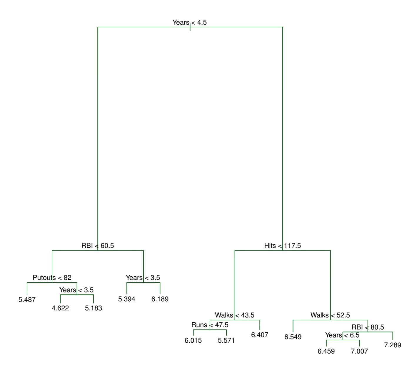
**FIGURE 8.4.** *Regression tree analysis for the* Hitters *data. The unpruned tree that results from top-down greedy splitting on the training data is shown.*
validation in order to estimate the cross-validated MSE of the trees as a function of α. (We chose to perform six-fold cross-validation because 132 is an exact multiple of six.) The unpruned regression tree is shown in Figure 8.4. The green curve in Figure 8.5 shows the CV error as a function of the number of leaves,2 while the orange curve indicates the test error. Also shown are standard error bars around the estimated errors. For reference, the training error curve is shown in black. The CV error is a reasonable approximation of the test error: the CV error takes on its minimum for a three-node tree, while the test error also dips down at the three-node tree (though it takes on its lowest value at the ten-node tree). The pruned tree containing three terminal nodes is shown in Figure 8.1.
2Although CV error is computed as a function of α, it is convenient to display the result as a function of *|T|*, the number of leaves; this is based on the relationship between α and *|T|* in the original tree grown to all the training data.
8.1 The Basics of Decision Trees 335
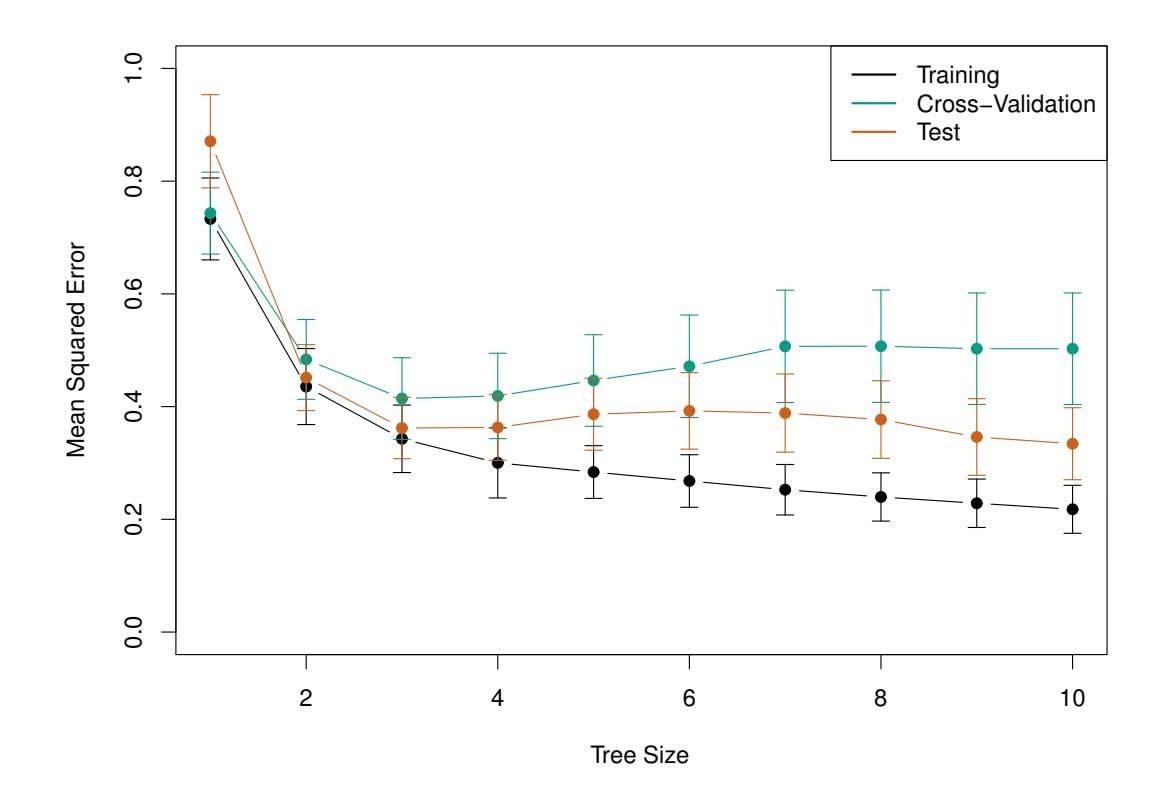
**FIGURE 8.5.** *Regression tree analysis for the* Hitters *data. The training, cross-validation, and test MSE are shown as a function of the number of terminal nodes in the pruned tree. Standard error bands are displayed. The minimum cross-validation error occurs at a tree size of three.*
### 8.1.2 Classifcation Trees
A *classifcation tree* is very similar to a regression tree, except that it is classifcation tree used to predict a qualitative response rather than a quantitative one. Recall that for a regression tree, the predicted response for an observation is given by the mean response of the training observations that belong to the same terminal node. In contrast, for a classifcation tree, we predict that each observation belongs to the *most commonly occurring class* of training observations in the region to which it belongs. In interpreting the results of a classifcation tree, we are often interested not only in the class prediction corresponding to a particular terminal node region, but also in the *class proportions* among the training observations that fall into that region.
The task of growing a classifcation tree is quite similar to the task of growing a regression tree. Just as in the regression setting, we use recursive binary splitting to grow a classifcation tree. However, in the classifcation setting, RSS cannot be used as a criterion for making the binary splits. A natural alternative to RSS is the *classifcation error rate*. Since we plan classifcation error rate to assign an observation in a given region to the *most commonly occurring class* of training observations in that region, the classifcation error rate is simply the fraction of the training observations in that region that do not belong to the most common class:
classification
tree
classification
error rate
$$
E = 1 - \max_{k}(\hat{p}_{mk}) \quad (8.5)
$$
336 8. Tree-Based Methods
Here *p*ˆ*mk* represents the proportion of training observations in the *m*th region that are from the *k*th class. However, it turns out that classifcation error is not suffciently sensitive for tree-growing, and in practice two other measures are preferable.
The *Gini index* is defned by Gini index
$$
G = \sum_{k=1}^{K} \hat{p}_{mk}(1 - \hat{p}_{mk}), \quad (8.6)
$$
a measure of total variance across the *K* classes. It is not hard to see that the Gini index takes on a small value if all of the *p*ˆ*mk*'s are close to zero or one. For this reason the Gini index is referred to as a measure of node *purity*—a small value indicates that a node contains predominantly observations from a single class.
An alternative to the Gini index is *entropy*, given by entropy
$$
D = -\sum_{k=1}^{K} \hat{p}_{mk} \log \hat{p}_{mk} \tag{8.7}
$$
Since $0 \le \hat{p}_{mk} \le 1$ , it follows that $0 \le -\hat{p}_{mk} \log \hat{p}_{mk}$ . One can show that the entropy will take on a value near zero if the $\hat{p}_{mk}$ 's are all near zero or near one. Therefore, like the Gini index, the entropy will take on a small value if the *m*th node is pure. In fact, it turns out that the Gini index and the entropy are quite similar numerically.
When building a classifcation tree, either the Gini index or the entropy are typically used to evaluate the quality of a particular split, since these two approaches are more sensitive to node purity than is the classifcation error rate. Any of these three approaches might be used when *pruning* the tree, but the classifcation error rate is preferable if prediction accuracy of the fnal pruned tree is the goal.
Figure 8.6 shows an example on the Heart data set. These data contain a binary outcome HD for 303 patients who presented with chest pain. An outcome value of Yes indicates the presence of heart disease based on an angiographic test, while No means no heart disease. There are 13 predictors including Age, Sex, Chol (a cholesterol measurement), and other heart and lung function measurements. Cross-validation results in a tree with six terminal nodes.
In our discussion thus far, we have assumed that the predictor variables take on continuous values. However, decision trees can be constructed even in the presence of qualitative predictor variables. For instance, in the Heart data, some of the predictors, such as Sex, Thal (Thallium stress test), and ChestPain, are qualitative. Therefore, a split on one of these variables amounts to assigning some of the qualitative values to one branch and assigning the remaining to the other branch. In Figure 8.6, some of the internal nodes correspond to splitting qualitative variables. For instance, the
entropy
8.1 The Basics of Decision Trees 337
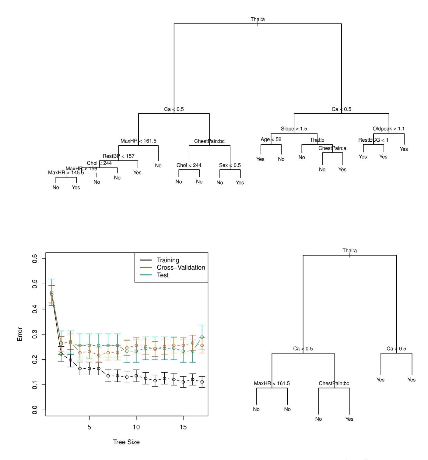
**FIGURE 8.6.** Heart *data.* Top: *The unpruned tree.* Bottom Left: *Cross-validation error, training, and test error, for diferent sizes of the pruned tree.* Bottom Right: *The pruned tree corresponding to the minimal cross-validation error.*
top internal node corresponds to splitting Thal. The text Thal:a indicates that the left-hand branch coming out of that node consists of observations with the frst value of the Thal variable (normal), and the right-hand node consists of the remaining observations (fxed or reversible defects). The text ChestPain:bc two splits down the tree on the left indicates that the left-hand branch coming out of that node consists of observations with the second and third values of the ChestPain variable, where the possible values are typical angina, atypical angina, non-anginal pain, and asymptomatic.
Figure 8.6 has a surprising characteristic: some of the splits yield two terminal nodes that have the *same predicted value*. For instance, consider the split RestECG<1 near the bottom right of the unpruned tree. Regardless
# 8. Tree-Based Methods
of the value of RestECG, a response value of Yes is predicted for those observations. Why, then, is the split performed at all? The split is performed because it leads to increased *node purity*. That is, all 9 of the observations corresponding to the right-hand leaf have a response value of Yes, whereas $7/11$ of those corresponding to the left-hand leaf have a response value of Yes. Why is node purity important? Suppose that we have a test observation that belongs to the region given by that right-hand leaf. Then we can be pretty certain that its response value is Yes. In contrast, if a test observation belongs to the region given by the left-hand leaf, then its response value is probably Yes, but we are much less certain. Even though the split $RestECG<1$ does not reduce the classification error, it improves the Gini index and the entropy, which are more sensitive to node purity.
### 8.1.3 Trees Versus Linear Models
Regression and classifcation trees have a very diferent favor from the more classical approaches for regression and classifcation presented in Chapters 3 and 4. In particular, linear regression assumes a model of the form
$$
f(X) = \beta_0 + \sum_{j=1}^{p} X_j \beta_j, \quad (8.8)
$$
whereas regression trees assume a model of the form
$$
f(X) = \sum_{m=1}^{M} c_m \cdot 1_{(X \in R_m)} \quad (8.9)
$$
where *R*1*,...,RM* represent a partition of feature space, as in Figure 8.3.
Which model is better? It depends on the problem at hand. If the relationship between the features and the response is well approximated by a linear model as in (8.8), then an approach such as linear regression will likely work well, and will outperform a method such as a regression tree that does not exploit this linear structure. If instead there is a highly nonlinear and complex relationship between the features and the response as indicated by model (8.9), then decision trees may outperform classical approaches. An illustrative example is displayed in Figure 8.7. The relative performances of tree-based and classical approaches can be assessed by estimating the test error, using either cross-validation or the validation set approach (Chapter 5).
Of course, other considerations beyond simply test error may come into play in selecting a statistical learning method; for instance, in certain settings, prediction using a tree may be preferred for the sake of interpretability and visualization.
8.1 The Basics of Decision Trees 339
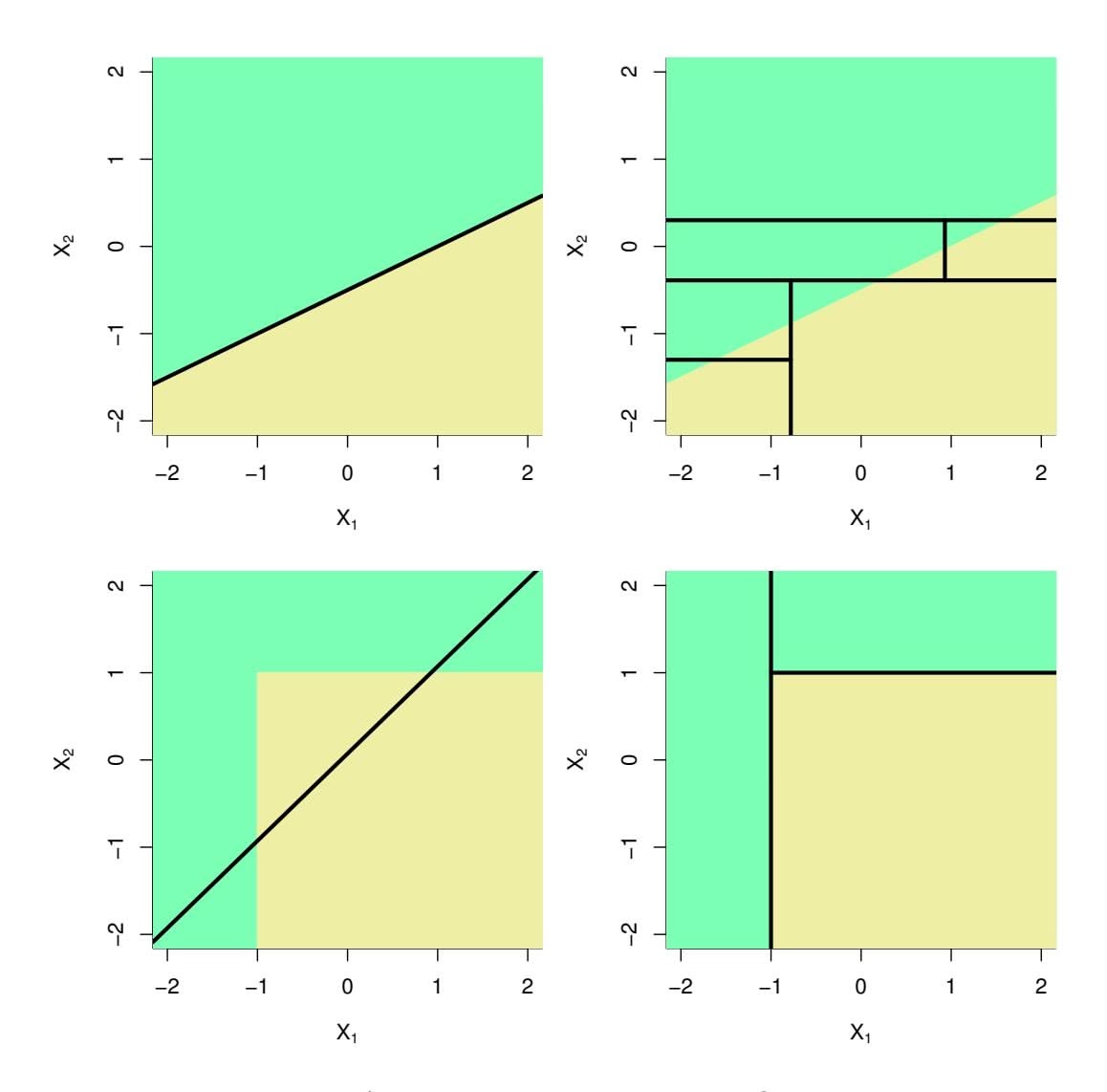
**FIGURE 8.7.** Top Row: *A two-dimensional classifcation example in which the true decision boundary is linear, and is indicated by the shaded regions. A classical approach that assumes a linear boundary (left) will outperform a decision tree that performs splits parallel to the axes (right).* Bottom Row: *Here the true decision boundary is non-linear. Here a linear model is unable to capture the true decision boundary (left), whereas a decision tree is successful (right).*
### 8.1.4 Advantages and Disadvantages of Trees
Decision trees for regression and classifcation have a number of advantages over the more classical approaches seen in Chapters 3 and 4:
- ▲ Trees are very easy to explain to people. In fact, they are even easier to explain than linear regression!
- ▲ Some people believe that decision trees more closely mirror human decision-making than do the regression and classifcation approaches seen in previous chapters.
- ▲ Trees can be displayed graphically, and are easily interpreted even by a non-expert (especially if they are small).
- ▲ Trees can easily handle qualitative predictors without the need to create dummy variables.
# 8. Tree-Based Methods
- ▼ Unfortunately, trees generally do not have the same level of predictive accuracy as some of the other regression and classifcation approaches seen in this book.
- ▼ Additionally, trees can be very non-robust. In other words, a small change in the data can cause a large change in the fnal estimated tree.
However, by aggregating many decision trees, using methods like *bagging*, *random forests*, and *boosting*, the predictive performance of trees can be substantially improved. We introduce these concepts in the next section.
### 8.2 Bagging, Random Forests, Boosting, and Bayesian Additive Regression Trees
An *ensemble* method is an approach that combines many simple "building ensemble block" models in order to obtain a single and potentially very powerful model. These simple building block models are sometimes known as *weak*
*learners*, since they may lead to mediocre predictions on their own. weak We will now discuss bagging, random forests, boosting, and Bayesian learners additive regression trees. These are ensemble methods for which the simple building block is a regression or a classifcation tree.
ensemble
### 8.2.1 Bagging
The bootstrap, introduced in Chapter 5, is an extremely powerful idea. It is used in many situations in which it is hard or even impossible to directly compute the standard deviation of a quantity of interest. We see here that the bootstrap can be used in a completely diferent context, in order to improve statistical learning methods such as decision trees.
The decision trees discussed in Section 8.1 sufer from *high variance*. This means that if we split the training data into two parts at random, and ft a decision tree to both halves, the results that we get could be quite diferent. In contrast, a procedure with *low variance* will yield similar results if applied repeatedly to distinct data sets; linear regression tends to have low variance, if the ratio of *n* to *p* is moderately large. *Bootstrap aggregation*, or *bagging*, is a general-purpose procedure for reducing the bagging variance of a statistical learning method; we introduce it here because it is particularly useful and frequently used in the context of decision trees.
Recall that given a set of $n$ independent observations $Z_1, \dots, Z_n$ , each with variance $\sigma^2$ , the variance of the mean $\bar{Z}$ of the observations is given by $\sigma^2/n$ . In other words, *averaging a set of observations reduces variance*. Hence a natural way to reduce the variance and increase the test set accuracy of a statistical learning method is to take many training sets from
8.2 Bagging, Random Forests, Boosting, and Bayesian Additive Regression Trees 341
the population, build a separate prediction model using each training set, and average the resulting predictions. In other words, we could calculate $\hat{f}^1(x), \dots, \hat{f}^B(x)$ using $B$ separate training sets, and average them in order to obtain a single low-variance statistical learning model, given by
$$
\hat{f}_{\text{avg}}(x) = \frac{1}{B} \sum_{b=1}^{B} \hat{f}^{b}(x).
$$
Of course, this is not practical because we generally do not have access to multiple training sets. Instead, we can bootstrap, by taking repeated samples from the (single) training data set. In this approach we generate *B* diferent bootstrapped training data sets. We then train our method on the *b*th bootstrapped training set in order to get ˆ*f* ∗*b*(*x*), and fnally average all the predictions, to obtain
$$
\hat{f}_{\text{bag}}(x) = \frac{1}{B} \sum_{b=1}^{B} \hat{f}^{*b}(x).
$$
This is called bagging.
While bagging can improve predictions for many regression methods, it is particularly useful for decision trees. To apply bagging to regression trees, we simply construct *B* regression trees using *B* bootstrapped training sets, and average the resulting predictions. These trees are grown deep, and are not pruned. Hence each individual tree has high variance, but low bias. Averaging these *B* trees reduces the variance. Bagging has been demonstrated to give impressive improvements in accuracy by combining together hundreds or even thousands of trees into a single procedure.
Thus far, we have described the bagging procedure in the regression context, to predict a quantitative outcome *Y* . How can bagging be extended to a classifcation problem where *Y* is qualitative? In that situation, there are a few possible approaches, but the simplest is as follows. For a given test observation, we can record the class predicted by each of the *B* trees, and take a *majority vote*: the overall prediction is the most commonly occurring majority vote class among the *B* predictions.
jority
vote
Figure 8.8 shows the results from bagging trees on the Heart data. The test error rate is shown as a function of $B$ , the number of trees constructed using bootstrapped training data sets. We see that the bagging test error rate is slightly lower in this case than the test error rate obtained from a single tree. The number of trees $B$ is not a critical parameter with bagging; using a very large value of $B$ will not lead to overfitting. In practice we use a value of $B$ sufficiently large that the error has settled down. Using $B = 100$ is sufficient to achieve good performance in this example.
342 8. Tree-Based Methods
**FIGURE 8.8.** *Bagging and random forest results for the* Heart *data. The test error (black and orange) is shown as a function of B, the number of bootstrapped training sets used. Random forests were applied with m* = √*p. The dashed line indicates the test error resulting from a single classifcation tree. The green and blue traces show the OOB error, which in this case is — by chance — considerably lower.*
#### *Out-of-Bag* Error Estimation
It turns out that there is a very straightforward way to estimate the test error of a bagged model, without the need to perform cross-validation or the validation set approach. Recall that the key to bagging is that trees are repeatedly ft to bootstrapped subsets of the observations. One can show that on average, each bagged tree makes use of around two-thirds of the observations.3 The remaining one-third of the observations not used to ft a given bagged tree are referred to as the *out-of-bag* (OOB) observations. We out-of-bag can predict the response for the *i*th observation using each of the trees in which that observation was OOB. This will yield around *B/*3 predictions for the *i*th observation. In order to obtain a single prediction for the *i*th observation, we can average these predicted responses (if regression is the goal) or can take a majority vote (if classifcation is the goal). This leads to a single OOB prediction for the *i*th observation. An OOB prediction can be obtained in this way for each of the *n* observations, from which the
3This relates to Exercise 2 of Chapter 5.
8.2 Bagging, Random Forests, Boosting, and Bayesian Additive Regression Trees 343
overall OOB MSE (for a regression problem) or classifcation error (for a classifcation problem) can be computed. The resulting OOB error is a valid estimate of the test error for the bagged model, since the response for each observation is predicted using only the trees that were not ft using that observation. Figure 8.8 displays the OOB error on the Heart data. It can be shown that with *B* suffciently large, OOB error is virtually equivalent to leave-one-out cross-validation error. The OOB approach for estimating the test error is particularly convenient when performing bagging on large data sets for which cross-validation would be computationally onerous.
#### Variable Importance Measures
As we have discussed, bagging typically results in improved accuracy over prediction using a single tree. Unfortunately, however, it can be diffcult to interpret the resulting model. Recall that one of the advantages of decision trees is the attractive and easily interpreted diagram that results, such as the one displayed in Figure 8.1. However, when we bag a large number of trees, it is no longer possible to represent the resulting statistical learning procedure using a single tree, and it is no longer clear which variables are most important to the procedure. Thus, bagging improves prediction accuracy at the expense of interpretability.
Although the collection of bagged trees is much more diffcult to interpret than a single tree, one can obtain an overall summary of the importance of each predictor using the RSS (for bagging regression trees) or the Gini index (for bagging classifcation trees). In the case of bagging regression trees, we can record the total amount that the RSS (8.1) is decreased due to splits over a given predictor, averaged over all *B* trees. A large value indicates an important predictor. Similarly, in the context of bagging classifcation trees, we can add up the total amount that the Gini index (8.6) is decreased by splits over a given predictor, averaged over all *B* trees.
A graphical representation of the *variable importances* in the Heart data variable importance is shown in Figure 8.9. We see the mean decrease in Gini index for each variable, relative to the largest. The variables with the largest mean decrease in Gini index are Thal, Ca, and ChestPain.
variable
importance
### 8.2.2 Random Forests
*Random forests* provide an improvement over bagged trees by way of a random forest small tweak that *decorrelates* the trees. As in bagging, we build a number of decision trees on bootstrapped training samples. But when building these decision trees, each time a split in a tree is considered, *a random sample of m predictors* is chosen as split candidates from the full set of *p* predictors. The split is allowed to use only one of those *m* predictors. A fresh sample of *m* predictors is taken at each split, and typically we choose *m* ≈ √*p*—that is, the number of predictors considered at each split is approximately equal
344 8. Tree-Based Methods
**FIGURE 8.9.** *A variable importance plot for the* Heart *data. Variable importance is computed using the mean decrease in Gini index, and expressed relative to the maximum.*
to the square root of the total number of predictors (4 out of the 13 for the Heart data).
In other words, in building a random forest, at each split in the tree, the algorithm is *not even allowed to consider* a majority of the available predictors. This may sound crazy, but it has a clever rationale. Suppose that there is one very strong predictor in the data set, along with a number of other moderately strong predictors. Then in the collection of bagged trees, most or all of the trees will use this strong predictor in the top split. Consequently, all of the bagged trees will look quite similar to each other. Hence the predictions from the bagged trees will be highly correlated. Unfortunately, averaging many highly correlated quantities does not lead to as large of a reduction in variance as averaging many uncorrelated quantities. In particular, this means that bagging will not lead to a substantial reduction in variance over a single tree in this setting.
Random forests overcome this problem by forcing each split to consider only a subset of the predictors. Therefore, on average $(p - m)/p$ of the splits will not even consider the strong predictor, and so other predictors will have more of a chance. We can think of this process as *decorrelating* the trees, thereby making the average of the resulting trees less variable and hence more reliable.
8.2 Bagging, Random Forests, Boosting, and Bayesian Additive Regression Trees 345
The main difference between bagging and random forests is the choice of predictor subset size $m$ . For instance, if a random forest is built using $m = p$ , then this amounts simply to bagging. On the Heart data, random forests using $m = \sqrt{p}$ leads to a reduction in both test error and OOB error over bagging (Figure 8.8).
Using a small value of $m$ in building a random forest will typically be helpful when we have a large number of correlated predictors. We applied random forests to a high-dimensional biological data set consisting of expression measurements of 4,718 genes measured on tissue samples from 349 patients. There are around 20,000 genes in humans, and individual genes have different levels of activity, or expression, in particular cells, tissues, and biological conditions. In this data set, each of the patient samples has a qualitative label with 15 different levels: either normal or 1 of 14 different types of cancer. Our goal was to use random forests to predict cancer type based on the 500 genes that have the largest variance in the training set. We randomly divided the observations into a training and a test set, and applied random forests to the training set for three different values of the number of splitting variables $m$ . The results are shown in Figure 8.10. The error rate of a single tree is 45.7%, and the null rate is 75.4%.4 We see that using 400 trees is sufficient to give good performance, and that the choice $m = \sqrt{p}$ gave a small improvement in test error over bagging ( $m = p$ ) in this example. As with bagging, random forests will not overfit if we increase $B$ , so in practice we use a value of $B$ sufficiently large for the error rate to have settled down.
### 8.2.3 Boosting
We now discuss *boosting*, yet another approach for improving the predic- boosting tions resulting from a decision tree. Like bagging, boosting is a general approach that can be applied to many statistical learning methods for regression or classifcation. Here we restrict our discussion of boosting to the context of decision trees.
posting
Recall that bagging involves creating multiple copies of the original training data set using the bootstrap, ftting a separate decision tree to each copy, and then combining all of the trees in order to create a single predictive model. Notably, each tree is built on a bootstrap data set, independent of the other trees. Boosting works in a similar way, except that the trees are grown *sequentially*: each tree is grown using information from previously grown trees. Boosting does not involve bootstrap sampling; instead each tree is ft on a modifed version of the original data set.
4The null rate results from simply classifying each observation to the dominant class overall, which is in this case the normal class.
346 8. Tree-Based Methods
**FIGURE 8.10.** *Results from random forests for the 15-class gene expression data set with p* = 500 *predictors. The test error is displayed as a function of the number of trees. Each colored line corresponds to a diferent value of m, the number of predictors available for splitting at each interior tree node. Random forests (m1*,...,* ˆ*f B*. Boosting is described in Algorithm 8.2.
What is the idea behind this procedure? Unlike ftting a single large decision tree to the data, which amounts to *ftting the data hard* and potentially overftting, the boosting approach instead *learns slowly*. Given the current model, we ft a decision tree to the residuals from the model. That is, we ft a tree using the current residuals, rather than the outcome *Y* , as the response. We then add this new decision tree into the ftted function in order to update the residuals. Each of these trees can be rather small, with just a few terminal nodes, determined by the parameter *d* in the algorithm. By ftting small trees to the residuals, we slowly improve ˆ*f* in areas where it does not perform well. The shrinkage parameter λ slows the process down even further, allowing more and diferent shaped trees to attack the residuals. In general, statistical learning approaches that *learn slowly* tend to perform well. Note that in boosting, unlike in bagging, the construction of each tree depends strongly on the trees that have already been grown.
We have just described the process of boosting regression trees. Boosting classifcation trees proceeds in a similar but slightly more complex way, and the details are omitted here.
Boosting has three tuning parameters:
8.2 Bagging, Random Forests, Boosting, and Bayesian Additive Regression Trees 347
**Algorithm 8.2** *Boosting for Regression Trees*
- 1. Set ˆ*f*(*x*)=0 and *ri* = *yi* for all *i* in the training set.
- 2. For *b* = 1*,* 2*,...,B*, repeat:
- (a) Fit a tree ˆ*f b* with *d* splits (*d* + 1 terminal nodes) to the training data (*X, r*).
- (b) Update ˆ*f* by adding in a shrunken version of the new tree:
$$
\hat{f}(x) \leftarrow \hat{f}(x) + \lambda \hat{f}^b(x).
$$
(8.10)
(c) Update the residuals,
$$
r_i \leftarrow r_i - \lambda \hat{f}^b(x_i) \quad (8.11)
$$
3. Output the boosted model,
$$
\hat{f}(x) = \sum_{b=1}^{B} \lambda \hat{f}^b(x) \quad (8.12)
$$
- 1. The number of trees *B*. Unlike bagging and random forests, boosting can overft if *B* is too large, although this overftting tends to occur slowly if at all. We use cross-validation to select *B*.
- 2. The shrinkage parameter λ, a small positive number. This controls the rate at which boosting learns. Typical values are 0*.*01 or 0*.*001, and the right choice can depend on the problem. Very small λ can require using a very large value of *B* in order to achieve good performance.
- 3. The number *d* of splits in each tree, which controls the complexity of the boosted ensemble. Often *d* = 1 works well, in which case each tree is a *stump*, consisting of a single split. In this case, the boosted stump ensemble is ftting an additive model, since each term involves only a single variable. More generally *d* is the *interaction depth*, and controls interaction depth the interaction order of the boosted model, since *d* splits can involve at most *d* variables.
I
interaction
depth
In Figure 8.11, we applied boosting to the 15-class cancer gene expression data set, in order to develop a classifer that can distinguish the normal class from the 14 cancer classes. We display the test error as a function of the total number of trees and the interaction depth *d*. We see that simple stumps with an interaction depth of one perform well if enough of them are included. This model outperforms the depth-two model, and both outperform a random forest. This highlights one diference between boosting
348 8. Tree-Based Methods
**FIGURE 8.11.** *Results from performing boosting and random forests on the 15-class gene expression data set in order to predict* cancer *versus* normal*. The test error is displayed as a function of the number of trees. For the two boosted models,* λ = 0*.*01*. Depth-1 trees slightly outperform depth-2 trees, and both outperform the random forest, although the standard errors are around 0.02, making none of these diferences signifcant. The test error rate for a single tree is 24 %.*
and random forests: in boosting, because the growth of a particular tree takes into account the other trees that have already been grown, smaller trees are typically suffcient. Using smaller trees can aid in interpretability as well; for instance, using stumps leads to an additive model.
### 8.2.4 Bayesian Additive Regression Trees
Finally, we discuss *Bayesian additive regression trees* (BART), another en- Bayesian semble method that uses decision trees as its building blocks. For simplicity, we present BART for regression (as opposed to classifcation).
Recall that bagging and random forests make predictions from an average of regression trees, each of which is built using a random sample of data and/or predictors. Each tree is built separately from the others. By contrast, boosting uses a weighted sum of trees, each of which is constructed by ftting a tree to the residual of the current ft. Thus, each new tree attempts to capture signal that is not yet accounted for by the current set of trees. BART is related to both approaches: each tree is constructed in a random manner as in bagging and random forests, and each tree tries to capture signal not yet accounted for by the current model, as in boosting. The main novelty in BART is the way in which new trees are generated.
Before we introduce the BART algorithm, we define some notation. We let *K* denote the number of regression trees, and *B* the number of iterations for which the BART algorithm will be run. The notation $\hat{f}_k^b(x)$ represents
additive regression trees
8.2 Bagging, Random Forests, Boosting, and Bayesian Additive Regression Trees 349
**FIGURE 8.12.** *A schematic of perturbed trees from the BART algorithm.* (a): *The kth tree at the* (*b* − 1)*st iteration,* ˆ*f b*−1 *k* (*X*)*, is displayed. Panels (b)–(d) display three of many possibilities for* ˆ*f b k*(*X*)*, given the form of* ˆ*f b*−1 *k* (*X*)*.* (b): *One possibility is that* ˆ*f b k*(*X*) *has the same structure as* ˆ*f b*−1 *k* (*X*)*, but with diferent predictions at the terminal nodes.* (c): *Another possibility is that* ˆ*f b k*(*X*) *results from pruning* ˆ*f b*−1 *k* (*X*)*.* (d): *Alternatively,* ˆ*f b k*(*X*) *may have more terminal nodes than* ˆ*f b*−1 *k* (*X*)*.*
the prediction at $x$ for the $k$ th regression tree used in the $b$ th iteration. At the end of each iteration, the $K$ trees from that iteration will be summed, i.e. $\hat{f}^b(x) = \sum_{k=1}^K \hat{f}_k^b(x)$ for $b = 1, \dots, B$ .
In the first iteration of the BART algorithm, all trees are initialized to have a single root node, with $\hat{f}_k^1(x) = \frac{1}{nK} \sum_{i=1}^n y_i$ , the mean of the response values divided by the total number of trees. Thus, $\hat{f}^1(x) = \sum_{k=1}^K \hat{f}_k^1(x) = \frac{1}{n} \sum_{i=1}^n y_i$ .
In subsequent iterations, BART updates each of the $K$ trees, one at a time. In the $b$ th iteration, to update the $k$ th tree, we subtract from each response value the predictions from all but the $k$ th tree, in order to obtain a *partial residual*.
$$
r_i = y_i - \sum_{k' < k} \hat{f}_{k'}^b(x_i) - \sum_{k' > k} \hat{f}_{k'}^{b-1}(x_i)
$$
for the *i*th observation, $i = 1, \dots, n$ . Rather than fitting a fresh tree to this partial residual, BART randomly chooses a perturbation to the tree from the previous iteration ( $\hat{f}_k^{b-1}$ ) from a set of possible perturbations, favoring ones that improve the fit to the partial residual. There are two components to this perturbation:349
# 8. Tree-Based Methods
- 1. We may change the structure of the tree by adding or pruning branches.
- 2. We may change the prediction in each terminal node of the tree.
Figure 8.12 illustrates examples of possible perturbations to a tree.
The output of BART is a collection of prediction models,
$$
\hat{f}^b(x) = \sum_{k=1}^K \hat{f}_k^b(x), \text{ for } b = 1, 2, \dots, B.
$$
We typically throw away the first few of these prediction models, since models obtained in the earlier iterations — known as the *burn-in* period — tend not to provide very good results. We can let $L$ denote the number of burn-in iterations; for instance, we might take $L = 200$ . Then, to obtain a single prediction, we simply take the average after the burn-in iterations, $\hat{f}(x) = \frac{1}{B-L} \sum_{b=L+1}^{B} \hat{f}^b(x)$ . However, it is also possible to compute quantities other than the average: for instance, the percentiles of $\hat{f}^{L+1}(x), \dots, \hat{f}^B(x)$ provide a measure of uncertainty in the final prediction. The overall BART procedure is summarized in Algorithm 8.3.
A key element of the BART approach is that in Step 3(a)ii., we do *not* ft a fresh tree to the current partial residual: instead, we try to improve the ft to the current partial residual by slightly modifying the tree obtained in the previous iteration (see Figure 8.12). Roughly speaking, this guards against overftting since it limits how "hard" we ft the data in each iteration. Furthermore, the individual trees are typically quite small. We limit the tree size in order to avoid overftting the data, which would be more likely to occur if we grew very large trees.
Figure 8.13 shows the result of applying BART to the Heart data, using $K = 200$ trees, as the number of iterations is increased to 10,000. During the initial iterations, the test and training errors jump around a bit. After this initial burn-in period, the error rates settle down. We note that there is only a small difference between the training error and the test error, indicating that the tree perturbation process largely avoids overfitting.
The training and test errors for boosting are also displayed in Figure 8.13. We see that the test error for boosting approaches that of BART, but then begins to increase as the number of iterations increases. Furthermore, the training error for boosting decreases as the number of iterations increases, indicating that boosting has overft the data.
Though the details are outside of the scope of this book, it turns out that the BART method can be viewed as a *Bayesian* approach to ftting an ensemble of trees: each time we randomly perturb a tree in order to ft the residuals, we are in fact drawing a new tree from a *posterior* distribution. (Of course, this Bayesian connection is the motivation for BART's name.) Furthermore, Algorithm 8.3 can be viewed as a *Markov chain Monte Carlo* Markov algorithm for ftting the BART model.
chain Monte Carlo
8.2 Bagging, Random Forests, Boosting, and Bayesian Additive Regression Trees 351
**Algorithm 8.3** *Bayesian Additive Regression Trees*
- 1. Let ˆ*f* 1 1 (*x*) = ˆ*f* 1 2 (*x*) = *···* = ˆ*f* 1 *K*(*x*) = 1 *nK* )*n i*=1 *yi*.
- 2. Compute ˆ*f* 1(*x*) = )*K k*=1 ˆ*f* 1 *k* (*x*) = 1 *n* )*n i*=1 *yi*.
- 3. For *b* = 2*,...,B*:
- (a) For *k* = 1*,* 2*,...,K*:
- i. For *i* = 1*,...,n*, compute the current partial residual
$$
r_i = y_i - \sum_{k' < k} \hat{f}_{k'}^b(x_i) - \sum_{k' > k} \hat{f}_{k'}^{b-1}(x_i).
$$
- ii. Fit a new tree, ˆ*f b k*(*x*), to *ri*, by randomly perturbing the *k*th tree from the previous iteration, ˆ*f b*−1 *k* (*x*). Perturbations that improve the ft are favored.
- (b) Compute ˆ*f b*(*x*) = )*K k*=1 ˆ*f b k*(*x*).
- 4. Compute the mean after *L* burn-in samples,
$$
\hat{f}(x) = \frac{1}{B - L} \sum_{b=L+1}^{B} \hat{f}^b(x).
$$
When we apply BART, we must select the number of trees $K$ , the number of iterations $B$ , and the number of burn-in iterations $L$ . We typically choose large values for $B$ and $K$ , and a moderate value for $L$ : for instance, $K = 200$ , $B = 1,000$ , and $L = 100$ is a reasonable choice. BART has been shown to have very impressive out-of-box performance — that is, it performs well with minimal tuning.
### 8.2.5 Summary of Tree Ensemble Methods
Trees are an attractive choice of weak learner for an ensemble method for a number of reasons, including their flexibility and ability to handle predictors of mixed types (i.e. qualitative as well as quantitative). We have now seen four approaches for fitting an ensemble of trees: bagging, random forests, boosting, and BART.
- In *bagging*, the trees are grown independently on random samples of the observations. Consequently, the trees tend to be quite similar to each other. Thus, bagging can get caught in local optima and can fail to thoroughly explore the model space.
352 8. Tree-Based Methods
**FIGURE 8.13.** *BART and boosting results for the* Heart *data. Both training and test errors are displayed. After a burn-in period of* 100 *iterations (shown in gray), the error rates for BART settle down. Boosting begins to overft after a few hundred iterations.*
- In *random forests*, the trees are once again grown independently on random samples of the observations. However, each split on each tree is performed using a random subset of the features, thereby decorrelating the trees, and leading to a more thorough exploration of model space relative to bagging.
- In *boosting*, we only use the original data, and do not draw any random samples. The trees are grown successively, using a "slow" learning approach: each new tree is ft to the signal that is left over from the earlier trees, and shrunken down before it is used.
- In *BART*, we once again only make use of the original data, and we grow the trees successively. However, each tree is perturbed in order to avoid local minima and achieve a more thorough exploration of the model space.
8.3 Lab: Decision Trees 353
### 8.3 Lab: Decision Trees
### 8.3.1 Fitting Classifcation Trees
The tree library is used to construct classifcation and regression trees.
```
> library(tree)
```
We frst use classifcation trees to analyze the Carseats data set. In these data, Sales is a continuous variable, and so we begin by recoding it as a binary variable. We use the ifelse() function to create a variable, called ifelse() High, which takes on a value of Yes if the Sales variable exceeds 8, and takes on a value of No otherwise.
```
> library(ISLR2)
> attach(Carseats)
> High <- factor(ifelse(Sales <= 8, "No", "Yes"))
```
Finally, we use the data.frame() function to merge High with the rest of the Carseats data.
```
> Carseats <- data.frame(Carseats, High)
```
We now use the tree() function to ft a classifcation tree in order to predict tree() High using all variables but Sales. The syntax of the tree() function is quite similar to that of the lm() function.
> tree.carseats <- tree(High ~ . - Sales, Carseats)
The summary() function lists the variables that are used as internal nodes in the tree, the number of terminal nodes, and the (training) error rate.
```
> summary(tree.carseats)
Classification tree:
tree(formula = High ∼ . - Sales, data = Carseats)
Variables actually used in tree construction:
[1] "ShelveLoc" "Price" "Income" "CompPrice"
[5] "Population" "Advertising" "Age" "US"
Number of terminal nodes: 27
Residual mean deviance: 0.4575 = 170.7 / 373
Misclassification error rate: 0.09 = 36 / 400
```
We see that the training error rate is 9%. For classifcation trees, the deviance reported in the output of summary() is given by
$$
-2\sum_{m}\sum_{k}n_{mk}\log \hat{p}_{mk},
$$
where $n_{mk}$ is the number of observations in the $m$ th terminal node that belong to the $k$ th class. This is closely related to the entropy, defined in (8.7). A small deviance indicates a tree that provides a good fit to the (training) data. The *residual mean deviance* reported is simply the deviance divided by $n - |T_0|$ , which in this case is $400 - 27 = 373$ .
354 8. Tree-Based Methods
One of the most attractive properties of trees is that they can be graphically displayed. We use the plot() function to display the tree structure, and the text() function to display the node labels. The argument pretty = 0 instructs R to include the category names for any qualitative predictors, rather than simply displaying a letter for each category.
```
> plot(tree.carseats)
> text(tree.carseats, pretty = 0)
```
The most important indicator of Sales appears to be shelving location, since the frst branch diferentiates Good locations from Bad and Medium locations.
If we just type the name of the tree object, R prints output corresponding to each branch of the tree. R displays the split criterion (e.g. Price < 92.5), the number of observations in that branch, the deviance, the overall prediction for the branch (Yes or No), and the fraction of observations in that branch that take on values of Yes and No. Branches that lead to terminal nodes are indicated using asterisks.
```
> tree.carseats
node), split, n, deviance , yval, (yprob)
* denotes terminal node
1) root 400 541.5 No ( 0.590 0.410 )
2) ShelveLoc: Bad,Medium 315 390.6 No ( 0.689 0.311 )
4) Price < 92.5 46 56.53 Yes ( 0.304 0.696 )
8) Income < 57 10 12.22 No ( 0.700 0.300 )
```
In order to properly evaluate the performance of a classifcation tree on these data, we must estimate the test error rather than simply computing the training error. We split the observations into a training set and a test set, build the tree using the training set, and evaluate its performance on the test data. The predict() function can be used for this purpose. In the case of a classifcation tree, the argument type = "class" instructs R to return the actual class prediction. This approach leads to correct predictions for around 77 % of the locations in the test data set.
```
> set.seed(2)
> train <- sample(1:nrow(Carseats), 200)
> Carseats.test <- Carseats[-train, ]
> High.test <- High[-train]
> tree.carseats <- tree(High ∼ . - Sales, Carseats,
subset = train)
> tree.pred <- predict(tree.carseats, Carseats.test,
type = "class")
> table(tree.pred, High.test)
High.test
tree.pred No Yes
No 104 33
Yes 13 50
> (104 + 50) / 200
[1] 0.77
```
8.3 Lab: Decision Trees 355
(If you re-run the predict() function then you might get slightly diferent results, due to "ties": for instance, this can happen when the training observations corresponding to a terminal node are evenly split between Yes and No response values.)
Next, we consider whether pruning the tree might lead to improved results. The function cv.tree() performs cross-validation in order to cv.tree() determine the optimal level of tree complexity; cost complexity pruning is used in order to select a sequence of trees for consideration. We use the argument FUN = prune.misclass in order to indicate that we want the classifcation error rate to guide the cross-validation and pruning process, rather than the default for the cv.tree() function, which is deviance. The cv.tree() function reports the number of terminal nodes of each tree considered (size) as well as the corresponding error rate and the value of the cost-complexity parameter used (k, which corresponds to α in (8.4)).
```
> set.seed(7)
> cv.carseats <- cv.tree(tree.carseats, FUN = prune.misclass)
> names(cv.carseats)
[1] "size" "dev" "k" "method"
> cv.carseats
$size
[1] 21 19 14 9 8 5 3 2 1
$dev
[1] 75 75 75 74 82 83 83 85 82
$k
[1] -Inf 0.0 1.0 1.4 2.0 3.0 4.0 9.0 18.0
$method
[1] "misclass"
attr(,"class")
[1] "prune" "tree.sequence"
```
Despite its name, dev corresponds to the number of cross-validation errors. The tree with 9 terminal nodes results in only 74 cross-validation errors. We plot the error rate as a function of both size and k.
```
> par(mfrow = c(1, 2))
> plot(cv.carseats$size, cv.carseats$dev, type = "b")
> plot(cv.carseats$k, cv.carseats$dev, type = "b")
```
We now apply the prune.misclass() function in order to prune the tree to prune.misclass() obtain the nine-node tree.
```
> prune.carseats <- prune.misclass(tree.carseats, best = 9)
> plot(prune.carseats)
> text(prune.carseats, pretty = 0)
```
How well does this pruned tree perform on the test data set? Once again, we apply the predict() function.
```
> tree.pred <- predict(prune.carseats, Carseats.test,
type = "class")
> table(tree.pred, High.test)
High.test
```
### **1. Introduction**
This document outlines the standard operating procedures for the laboratory. It is essential that all personnel adhere to these guidelines to ensure safety and consistency in experimental results.
### **2. Safety Protocols**
- Always wear appropriate personal protective equipment (PPE).
- Report any accidents or spills immediately to the lab supervisor.
- Ensure all chemical containers are properly labeled.
### **3. Equipment Usage**
| Labels | Values |
|------------------|-------------|
| Equipment Name | Centrifuge |
| Calibration Date | 2023-10-15 |
| Status | Operational |
### **4. Data Analysis**
The relationship between variables can be expressed as:
$$
y = mx + b
$$
Where $m$ represents the slope and $b$ represents the y-intercept.
prune.misclass()
356 8. Tree-Based Methods
```
tree.pred No Yes
No 97 25
Yes 20 58
> (97 + 58) / 200
[1] 0.775
```
Now 77*.*5 % of the test observations are correctly classifed, so not only has the pruning process produced a more interpretable tree, but it has also slightly improved the classifcation accuracy.
If we increase the value of best, we obtain a larger pruned tree with lower classifcation accuracy:
```
> prune.carseats <- prune.misclass(tree.carseats, best = 14)
> plot(prune.carseats)
> text(prune.carseats, pretty = 0)
> tree.pred <- predict(prune.carseats, Carseats.test,
type = "class")
> table(tree.pred, High.test)
High.test
tree.pred No Yes
No 102 31
Yes 15 52
> (102 + 52) / 200
[1] 0.77
```
### 8.3.2 Fitting Regression Trees
Here we ft a regression tree to the Boston data set. First, we create a training set, and ft the tree to the training data.
```
> set.seed(1)
> train <- sample(1:nrow(Boston), nrow(Boston) / 2)
> tree.boston <- tree(medv ∼ ., Boston, subset = train)
> summary(tree.boston)
Regression tree:
tree(formula = medv ∼ ., data = Boston, subset = train)
Variables actually used in tree construction:
[1] "rm" "lstat" "crim" "age"
Number of terminal nodes: 7
Residual mean deviance: 10.4 = 2550 / 246
Distribution of residuals:
Min. 1st Qu. Median Mean 3rd Qu. Max.
-10.200 -1.780 -0.177 0.000 1.920 16.600
```
Notice that the output of summary() indicates that only four of the variables have been used in constructing the tree. In the context of a regression tree, the deviance is simply the sum of squared errors for the tree. We now plot the tree.
```
> plot(tree.boston)
> text(tree.boston, pretty = 0)
```
8.3 Lab: Decision Trees 357
The variable lstat measures the percentage of individuals with lower socioeconomic status, while the variable rm corresponds to the average number of rooms. The tree indicates that larger values of rm, or lower values of lstat, correspond to more expensive houses. For example, the tree predicts a median house price of \$45*,*400 for homes in census tracts in which rm >= 7.553.
It is worth noting that we could have ft a much bigger tree, by passing control = tree.control(nobs = length(train), mindev = 0) into the tree() function.
Now we use the cv.tree() function to see whether pruning the tree will improve performance.
```
> cv.boston <- cv.tree(tree.boston)
> plot(cv.boston$size, cv.boston$dev, type = "b")
```
In this case, the most complex tree under consideration is selected by crossvalidation. However, if we wish to prune the tree, we could do so as follows, using the prune.tree() function: prune.tree()
```
> prune.boston <- prune.tree(tree.boston, best = 5)
> plot(prune.boston)
> text(prune.boston, pretty = 0)
```
In keeping with the cross-validation results, we use the unpruned tree to make predictions on the test set.
```
> yhat <- predict(tree.boston, newdata = Boston[-train, ])
> boston.test <- Boston[-train, "medv"]
> plot(yhat, boston.test)
> abline(0, 1)
> mean((yhat - boston.test)^2)
[1] 35.29
```
In other words, the test set MSE associated with the regression tree is 35*.*29. The square root of the MSE is therefore around 5*.*941, indicating that this model leads to test predictions that are (on average) within approximately \$5*,*941 of the true median home value for the census tract.
### 8.3.3 Bagging and Random Forests
Here we apply bagging and random forests to the Boston data, using the randomForest package in R. The exact results obtained in this section may depend on the version of R and the version of the randomForest package installed on your computer. Recall that bagging is simply a special case of a random forest with *m* = *p*. Therefore, the randomForest() function can randomForest() be used to perform both random forests and bagging. We perform bagging as follows:
Forest()
```
> library(randomForest)
> set.seed(1)
> bag.boston <- randomForest(medv ∼ ., data = Boston,
```
358 8. Tree-Based Methods
```
subset = train, mtry = 12, importance = TRUE)
> bag.boston
Call:
randomForest(formula = medv ∼ ., data = Boston , mtry = 12,
importance = TRUE, subset = train)
Type of random forest: regression
Number of trees: 500
No. of variables tried at each split: 12
Mean of squared residuals: 11.40
% Var explained: 85.17
```
The argument mtry = 12 indicates that all 12 predictors should be considered for each split of the tree—in other words, that bagging should be done. How well does this bagged model perform on the test set?
```
> yhat.bag <- predict(bag.boston, newdata = Boston[-train, ])
> plot(yhat.bag, boston.test)
> abline(0, 1)
> mean((yhat.bag - boston.test)^2)
[1] 23.42
```
The test set MSE associated with the bagged regression tree is 23*.*42, about two-thirds of that obtained using an optimally-pruned single tree. We could change the number of trees grown by randomForest() using the ntree argument:
```
> bag.boston <- randomForest(medv ∼ ., data = Boston,
subset = train, mtry = 12, ntree = 25)
> yhat.bag <- predict(bag.boston, newdata = Boston[-train, ])
> mean((yhat.bag - boston.test)^2)
[1] 25.75
```
Growing a random forest proceeds in exactly the same way, except that we use a smaller value of the mtry argument. By default, randomForest() uses *p/*3 variables when building a random forest of regression trees, and √*p* variables when building a random forest of classifcation trees. Here we use mtry = 6.
```
> set.seed(1)
> rf.boston <- randomForest(medv ∼ ., data = Boston,
subset = train, mtry = 6, importance = TRUE)
> yhat.rf <- predict(rf.boston, newdata = Boston[-train, ])
> mean((yhat.rf - boston.test)^2)
[1] 20.07
```
The test set MSE is 20*.*07; this indicates that random forests yielded an improvement over bagging in this case.
Using the importance() function, we can view the importance of each importance() variable.
importance()
```
> importance(rf.boston)
%IncMSE IncNodePurity
crim 19.436 1070.42
```
8.3 Lab: Decision Trees 359
| zn | 3.092 | 82.19 |
|---------|--------|---------|
| indus | 6.141 | 590.10 |
| chas | 1.370 | 36.70 |
| nox | 13.263 | 859.97 |
| rm | 35.095 | 8270.34 |
| age | 15.145 | 634.31 |
| dis | 9.164 | 684.88 |
| rad | 4.794 | 83.19 |
| tax | 4.411 | 292.21 |
| ptratio | 8.613 | 902.20 |
| lstat | 28.725 | 5813.05 |
Two measures of variable importance are reported. The frst is based upon the mean decrease of accuracy in predictions on the out of bag samples when a given variable is permuted. The second is a measure of the total decrease in node impurity that results from splits over that variable, averaged over all trees (this was plotted in Figure 8.9). In the case of regression trees, the node impurity is measured by the training RSS, and for classifcation trees by the deviance. Plots of these importance measures can be produced using the varImpPlot() function. varImpPlot()
varImpPlot(
> varImpPlot(**rf.boston)**
The results indicate that across all of the trees considered in the random forest, the wealth of the community ( $lstat$ ) and the house size ( $rm$ ) are by far the two most important variables.
### 8.3.4 Boosting
Here we use the gbm package, and within it the gbm() function, to ft boosted gbm() regression trees to the Boston data set. We run gbm() with the option distribution = "gaussian" since this is a regression problem; if it were a binary classifcation problem, we would use distribution = "bernoulli". The argument n.trees = 5000 indicates that we want 5000 trees, and the option interaction.depth = 4 limits the depth of each tree.
```
> library(gbm)
> set.seed(1)
> boost.boston <- gbm(medv ∼ ., data = Boston[train, ],
distribution = "gaussian", n.trees = 5000,
interaction.depth = 4)
```
The summary() function produces a relative infuence plot and also outputs the relative infuence statistics.
| var | rel.inf |
|-------|---------|
| rm | 44.482 |
| lstat | 32.703 |
| crim | 4.851 |
| dis | 4.487 |
| nox | 3.752 |
360 8. Tree-Based Methods
| age | age | 3.198 |
|---------|---------|-------|
| ptratio | ptratio | 2.814 |
| tax | tax | 1.544 |
| indus | indus | 1.034 |
| rad | rad | 0.876 |
| zn | zn | 0.162 |
| chas | chas | 0.097 |
We see that lstat and rm are by far the most important variables. We can also produce *partial dependence plots* for these two variables. These plots partial illustrate the marginal efect of the selected variables on the response after *integrating* out the other variables. In this case, as we might expect, median house prices are increasing with rm and decreasing with lstat.
```
dependence
plot
```
```
> plot(boost.boston, i = "rm")
> plot(boost.boston, i = "lstat")
```
We now use the boosted model to predict medv on the test set:
```
> yhat.boost <- predict(boost.boston,
newdata = Boston[-train, ], n.trees = 5000)
> mean((yhat.boost - boston.test)^2)
[1] 18.39
```
The test MSE obtained is 18*.*39: this is superior to the test MSE of random forests and bagging. If we want to, we can perform boosting with a diferent value of the shrinkage parameter λ in (8.10). The default value is 0*.*001, but this is easily modifed. Here we take λ = 0*.*2.
```
> boost.boston <- gbm(medv ∼ ., data = Boston[train, ],
distribution = "gaussian", n.trees = 5000,
interaction.depth = 4, shrinkage = 0.2, verbose = F)
> yhat.boost <- predict(boost.boston,
newdata = Boston[-train, ], n.trees = 5000)
> mean((yhat.boost - boston.test)^2)
[1] 16.55
```
In this case, using λ = 0*.*2 leads to a lower test MSE than λ = 0*.*001.
### 8.3.5 Bayesian Additive Regression Trees
In this section we use the BART package, and within it the gbart() function, gbart() to ft a Bayesian additive regression tree model to the Boston housing data set. The gbart() function is designed for quantitative outcome variables. For binary outcomes, lbart() and pbart() are available. lbart()
pbart() To run the gbart() function, we must frst create matrices of predictors for the training and test data. We run BART with default settings.
```
> library(BART)
> x <- Boston[, 1:12]
> y <- Boston[, "medv"]
> xtrain <- x[train, ]
> ytrain <- y[train]
```
8.4 Exercises 361
```
> xtest <- x[-train, ]
> ytest <- y[-train]
> set.seed(1)
> bartfit <- gbart(xtrain, ytrain, x.test = xtest)
```
Next we compute the test error.
```
> yhat.bart <- bartfit$yhat.test.mean
> mean((ytest - yhat.bart)^2)
[1] 15.95
```
On this data set, the test error of BART is lower than the test error of random forests and boosting.
Now we can check how many times each variable appeared in the collection of trees.
```
> ord <- order(bartfit$varcount.mean, decreasing = T)
> bartfit$varcount.mean[ord]
nox lstat tax rad rm indus chas ptratio
22.95 21.33 21.25 20.78 19.89 19.82 19.05 18.98
age zn dis crim
18.27 15.95 14.46 11.01
```
### 8.4 Exercises
#### *Conceptual*
1. Draw an example (of your own invention) of a partition of twodimensional feature space that could result from recursive binary splitting. Your example should contain at least six regions. Draw a decision tree corresponding to this partition. Be sure to label all aspects of your fgures, including the regions *R*1*, R*2*,...*, the cutpoints *t*1*, t*2*,...*, and so forth.
*Hint: Your result should look something like Figures 8.1 and 8.2.*
2. It is mentioned in Section 8.2.3 that boosting using depth-one trees (or *stumps*) leads to an *additive* model: that is, a model of the form
$$
f(X) = \sum_{j=1}^{p} f_j(X_j).
$$
Explain why this is the case. You can begin with (8.12) in Algorithm 8.2.
3. Consider the Gini index, classifcation error, and entropy in a simple classifcation setting with two classes. Create a single plot that displays each of these quantities as a function of *p*ˆ*m*1. The *x*-axis should
362 8. Tree-Based Methods
**FIGURE 8.14.** Left*: A partition of the predictor space corresponding to Exercise 4a.* Right*: A tree corresponding to Exercise 4b.*
display *p*ˆ*m*1, ranging from 0 to 1, and the *y*-axis should display the value of the Gini index, classifcation error, and entropy.
*Hint: In a setting with two classes,* $\hat{p}_{m1} = 1 - \hat{p}_{m2}$ *. You could make this plot by hand, but it will be much easier to make in* R*.*
- 4. This question relates to the plots in Figure 8.14.
- (a) Sketch the tree corresponding to the partition of the predictor space illustrated in the left-hand panel of Figure 8.14. The numbers inside the boxes indicate the mean of *Y* within each region.
- (b) Create a diagram similar to the left-hand panel of Figure 8.14, using the tree illustrated in the right-hand panel of the same fgure. You should divide up the predictor space into the correct regions, and indicate the mean for each region.
- 5. Suppose we produce ten bootstrapped samples from a data set containing red and green classes. We then apply a classifcation tree to each bootstrapped sample and, for a specifc value of *X*, produce 10 estimates of *P*(Class is Red*|X*):
```
0.1, 0.15, 0.2, 0.2, 0.55, 0.6, 0.6, 0.65, 0.7, and 0.75.
```
There are two common ways to combine these results together into a single class prediction. One is the majority vote approach discussed in this chapter. The second approach is to classify based on the average probability. In this example, what is the fnal classifcation under each of these two approaches?
6. Provide a detailed explanation of the algorithm that is used to ft a regression tree.
8.4 Exercises 363
#### *Applied*
- 7. In the lab, we applied random forests to the Boston data using mtry = 6 and using ntree = 25 and ntree = 500. Create a plot displaying the test error resulting from random forests on this data set for a more comprehensive range of values for mtry and ntree. You can model your plot after Figure 8.10. Describe the results obtained.
- 8. In the lab, a classifcation tree was applied to the Carseats data set after converting Sales into a qualitative response variable. Now we will seek to predict Sales using regression trees and related approaches, treating the response as a quantitative variable.
- (a) Split the data set into a training set and a test set.
- (b) Fit a regression tree to the training set. Plot the tree, and interpret the results. What test MSE do you obtain?
- (c) Use cross-validation in order to determine the optimal level of tree complexity. Does pruning the tree improve the test MSE?
- (d) Use the bagging approach in order to analyze this data. What test MSE do you obtain? Use the importance() function to determine which variables are most important.
- (e) Use random forests to analyze this data. What test MSE do you obtain? Use the importance() function to determine which variables are most important. Describe the efect of *m*, the number of variables considered at each split, on the error rate obtained.
- (f) Now analyze the data using BART, and report your results.
- 9. This problem involves the OJ data set which is part of the ISLR2 package.
- (a) Create a training set containing a random sample of 800 observations, and a test set containing the remaining observations.
- (b) Fit a tree to the training data, with Purchase as the response and the other variables as predictors. Use the summary() function to produce summary statistics about the tree, and describe the results obtained. What is the training error rate? How many terminal nodes does the tree have?
- (c) Type in the name of the tree object in order to get a detailed text output. Pick one of the terminal nodes, and interpret the information displayed.
- (d) Create a plot of the tree, and interpret the results.
- (e) Predict the response on the test data, and produce a confusion matrix comparing the test labels to the predicted test labels. What is the test error rate?
- 364 8. Tree-Based Methods
- (f) Apply the cv.tree() function to the training set in order to determine the optimal tree size.
- (g) Produce a plot with tree size on the *x*-axis and cross-validated classifcation error rate on the *y*-axis.
- (h) Which tree size corresponds to the lowest cross-validated classifcation error rate?
- (i) Produce a pruned tree corresponding to the optimal tree size obtained using cross-validation. If cross-validation does not lead to selection of a pruned tree, then create a pruned tree with fve terminal nodes.
- (j) Compare the training error rates between the pruned and unpruned trees. Which is higher?
- (k) Compare the test error rates between the pruned and unpruned trees. Which is higher?
- 10. We now use boosting to predict Salary in the Hitters data set.
- (a) Remove the observations for whom the salary information is unknown, and then log-transform the salaries.
- (b) Create a training set consisting of the frst 200 observations, and a test set consisting of the remaining observations.
- (c) Perform boosting on the training set with 1,000 trees for a range of values of the shrinkage parameter λ. Produce a plot with diferent shrinkage values on the *x*-axis and the corresponding training set MSE on the *y*-axis.
- (d) Produce a plot with diferent shrinkage values on the *x*-axis and the corresponding test set MSE on the *y*-axis.
- (e) Compare the test MSE of boosting to the test MSE that results from applying two of the regression approaches seen in Chapters 3 and 6.
- (f) Which variables appear to be the most important predictors in the boosted model?
- (g) Now apply bagging to the training set. What is the test set MSE for this approach?
- 11. This question uses the Caravan data set.
- (a) Create a training set consisting of the frst 1,000 observations, and a test set consisting of the remaining observations.
- (b) Fit a boosting model to the training set with Purchase as the response and the other variables as predictors. Use 1,000 trees, and a shrinkage value of 0*.*01. Which predictors appear to be the most important?
8.4 Exercises 365
- (c) Use the boosting model to predict the response on the test data. Predict that a person will make a purchase if the estimated probability of purchase is greater than 20 %. Form a confusion matrix. What fraction of the people predicted to make a purchase do in fact make one? How does this compare with the results obtained from applying KNN or logistic regression to this data set?
- 12. Apply boosting, bagging, random forests, and BART to a data set of your choice. Be sure to ft the models on a training set and to evaluate their performance on a test set. How accurate are the results compared to simple methods like linear or logistic regression? Which of these approaches yields the best performance?
# 1. Introduction
This document provides a comprehensive overview of the project requirements and specifications. It is intended for all stakeholders involved in the development process.
## 1.1 Purpose
The purpose of this document is to define the scope, objectives, and technical requirements for the upcoming software release.
## 1.2 Scope
- Define core features
- Outline technical constraints
- Establish project timeline
| Labels | Values |
|--------------|--------------|
| Project Name | Alpha System |
| Version | 1.0.2 |
| Status | Draft |
For further information, please refer to the [official documentation](https://example.com).
# 9 Support Vector Machines
In this chapter, we discuss the *support vector machine* (SVM), an approach for classifcation that was developed in the computer science community in the 1990s and that has grown in popularity since then. SVMs have been shown to perform well in a variety of settings, and are often considered one of the best "out of the box" classifers.
The support vector machine is a generalization of a simple and intuitive classifer called the *maximal margin classifer*, which we introduce in Section 9.1. Though it is elegant and simple, we will see that this classifer unfortunately cannot be applied to most data sets, since it requires that the classes be separable by a linear boundary. In Section 9.2, we introduce the *support vector classifer*, an extension of the maximal margin classifer that can be applied in a broader range of cases. Section 9.3 introduces the *support vector machine*, which is a further extension of the support vector classifer in order to accommodate non-linear class boundaries. Support vector machines are intended for the binary classifcation setting in which there are two classes; in Section 9.4 we discuss extensions of support vector machines to the case of more than two classes. In Section 9.5 we discuss the close connections between support vector machines and other statistical methods such as logistic regression.
People often loosely refer to the maximal margin classifer, the support vector classifer, and the support vector machine as "support vector machines". To avoid confusion, we will carefully distinguish between these three notions in this chapter.
368 9. Support Vector Machines
### 9.1 Maximal Margin Classifer
In this section, we defne a hyperplane and introduce the concept of an optimal separating hyperplane.
### 9.1.1 What Is a Hyperplane?
In a $p$ -dimensional space, a *hyperplane* is a flat affine subspace of dimension $p - 1$ .[1](#1) For instance, in two dimensions, a hyperplane is a flat one-dimensional subspace—in other words, a line. In three dimensions, a hyperplane is a flat two-dimensional subspace—that is, a plane. In $p > 3$ dimensions, it can be hard to visualize a hyperplane, but the notion of a $(p - 1)$ -dimensional flat subspace still applies.
The mathematical defnition of a hyperplane is quite simple. In two dimensions, a hyperplane is defned by the equation
$$
\beta_{0} + \beta_{1}X_{1} + \beta_{2}X_{2} = 0
$$
(9.1)
for parameters $\beta_0$ , $\beta_1$ , and $\beta_2$ . When we say that (9.1) "defines" the hyperplane, we mean that any $X = (X_1, X_2)^T$ for which (9.1) holds is a point on the hyperplane. Note that (9.1) is simply the equation of a line, since indeed in two dimensions a hyperplane is a line.
Equation 9.1 can be easily extended to the *p*-dimensional setting:
$$
\beta_0 + \beta_1 X_1 + \beta_2 X_2 + \dots + \beta_p X_p = 0
$$
(9.2)
defines a $p$ -dimensional hyperplane, again in the sense that if a point $X = (X_1, X_2, \dots, X_p)^T$ in $p$ -dimensional space (i.e. a vector of length $p$ ) satisfies (9.2), then $X$ lies on the hyperplane.
Now, suppose that *X* does not satisfy (9.2); rather,
$$
\beta_0 + \beta_1 X_1 + \beta_2 X_2 + \dots + \beta_p X_p > 0.
$$
(9.3)
Then this tells us that *X* lies to one side of the hyperplane. On the other hand, if
$$
\beta_0 + \beta_1 X_1 + \beta_2 X_2 + \dots + \beta_p X_p < 0
$$
(9.4)
then *X* lies on the other side of the hyperplane. So we can think of the hyperplane as dividing *p*-dimensional space into two halves. One can easily determine on which side of the hyperplane a point lies by simply calculating the sign of the left-hand side of (9.2). A hyperplane in two-dimensional space is shown in Figure 9.1.
1The word *affne* indicates that the subspace need not pass through the origin.
9.1 Maximal Margin Classifer 369
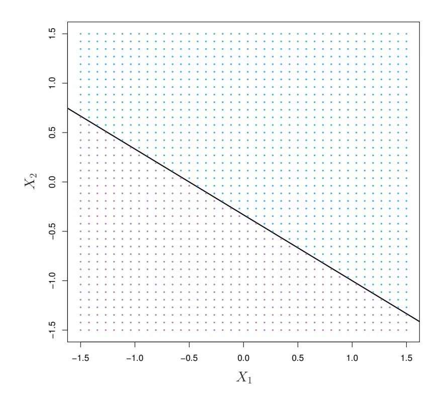
**FIGURE 9.1.** *The hyperplane* 1+2*X*1 + 3*X*2 = 0 *is shown. The blue region is the set of points for which* 1+2*X*1 + 3*X*2 *>* 0*, and the purple region is the set of points for which* 1+2*X*1 + 3*X*2 *<* 0*.*
### 9.1.2 Classifcation Using a Separating Hyperplane
Now suppose that we have an *n* × *p* data matrix X that consists of *n* training observations in *p*-dimensional space,
$$
x_{1} = \begin{pmatrix} x_{11} \\ \vdots \\ x_{1p} \end{pmatrix}, \dots, x_{n} = \begin{pmatrix} x_{n1} \\ \vdots \\ x_{np} \end{pmatrix} \quad (9.5)
$$
and that these observations fall into two classes—that is, $y_1, \dots, y_n \in \{-1, 1\}$ where $-1$ represents one class and $1$ the other class. We also have a test observation, a $p$ -vector of observed features $x^* = (x^*_1 \dots x^*_p)^T$ . Our goal is to develop a classifier based on the training data that will correctly classify the test observation using its feature measurements. We have seen a number of approaches for this task, such as linear discriminant analysis and logistic regression in Chapter 4, and classification trees, bagging, and boosting in Chapter 8. We will now see a new approach that is based upon the concept of a *separating hyperplane*.
separating
hyperplane
Suppose that it is possible to construct a hyperplane that separates the training observations perfectly according to their class labels. Examples of three such *separating hyperplanes* are shown in the left-hand panel of Figure 9.2. We can label the observations from the blue class as $y_i = 1$ and those from the purple class as $y_i = -1$ . Then a separating hyperplane has the property that
$$
\beta_0 + \beta_1 x_{i1} + \beta_2 x_{i2} + \dots + \beta_p x_{ip} > 0 \quad \text{if } y_i = 1, \tag{9.6}
$$
370 9. Support Vector Machines
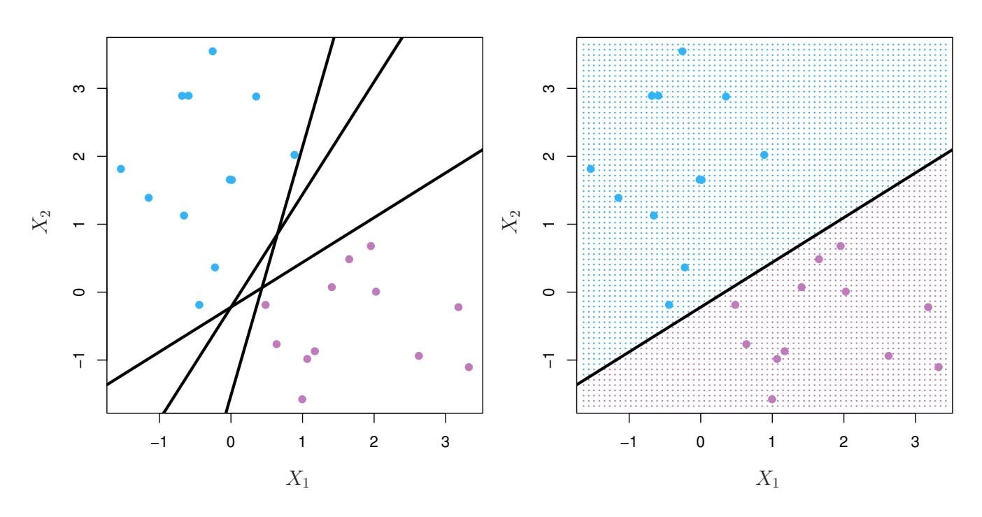
**FIGURE 9.2.** Left: *There are two classes of observations, shown in blue and in purple, each of which has measurements on two variables. Three separating hyperplanes, out of many possible, are shown in black.* Right: *A separating hyperplane is shown in black. The blue and purple grid indicates the decision rule made by a classifier based on this separating hyperplane: a test observation that falls in the blue portion of the grid will be assigned to the blue class, and a test observation that falls into the purple portion of the grid will be assigned to the purple class.*
and
$$
\beta_0 + \beta_1 x_{i1} + \beta_2 x_{i2} + \dots + \beta_p x_{ip} < 0 \text{ if } y_i = -1.
$$
(9.7)
Equivalently, a separating hyperplane has the property that
$$
y_i(\beta_0 + \beta_1 x_{i1} + \beta_2 x_{i2} + \dots + \beta_p x_{ip}) > 0 \quad (9.8)
$$
for all $i = 1, \dots, n.$
If a separating hyperplane exists, we can use it to construct a very natural classifier: a test observation is assigned a class depending on which side of the hyperplane it is located. The right-hand panel of Figure 9.2 shows an example of such a classifier. That is, we classify the test observation $x^*$ based on the sign of $f(x^*) = \beta_0 + \beta_1 x_1^* + \beta_2 x_2^* + \dots + \beta_p x_p^*$ . If $f(x^*)$ is positive, then we assign the test observation to class 1, and if $f(x^*)$ is negative, then we assign it to class $-1$ . We can also make use of the *magnitude* of $f(x^*)$ . If $f(x^*)$ is far from zero, then this means that $x^*$ lies far from the hyperplane, and so we can be confident about our class assignment for $x^*$ . On the other hand, if $f(x^*)$ is close to zero, then $x^*$ is located near the hyperplane, and so we are less certain about the class assignment for $x^*$ . Not surprisingly, and as we see in Figure 9.2, a classifier that is based on a separating hyperplane leads to a linear decision boundary.
9.1 Maximal Margin Classifer 371
### 9.1.3 The Maximal Margin Classifer
In general, if our data can be perfectly separated using a hyperplane, then there will in fact exist an infnite number of such hyperplanes. This is because a given separating hyperplane can usually be shifted a tiny bit up or down, or rotated, without coming into contact with any of the observations. Three possible separating hyperplanes are shown in the left-hand panel of Figure 9.2. In order to construct a classifer based upon a separating hyperplane, we must have a reasonable way to decide which of the infnite possible separating hyperplanes to use.
A natural choice is the *maximal margin hyperplane* (also known as the maximal *optimal separating hyperplane*), which is the separating hyperplane that is farthest from the training observations. That is, we can compute the (perpendicular) distance from each training observation to a given separating hyperplane; the smallest such distance is the minimal distance from the observations to the hyperplane, and is known as the *margin*. The maximal margin hyperplane is the separating hyperplane for which the margin is margin largest—that is, it is the hyperplane that has the farthest minimum distance to the training observations. We can then classify a test observation based on which side of the maximal margin hyperplane it lies. This is known as the *maximal margin classifer*. We hope that a classifer that has a large maximal margin on the training data will also have a large margin on the test data, and hence will classify the test observations correctly. Although the maximal margin classifer is often successful, it can also lead to overftting when *p* is large.
If $\beta_0, \beta_1, \dots, \beta_p$ are the coefficients of the maximal margin hyperplane, then the maximal margin classifier classifies the test observation $x^*$ based on the sign of $f(x^*) = \beta_0 + \beta_1 x_1^* + \beta_2 x_2^* + \dots + \beta_p x_p^*$ .
Figure 9.3 shows the maximal margin hyperplane on the data set of Figure 9.2. Comparing the right-hand panel of Figure 9.2 to Figure 9.3, we see that the maximal margin hyperplane shown in Figure 9.3 does indeed result in a greater minimal distance between the observations and the separating hyperplane—that is, a larger margin. In a sense, the maximal margin hyperplane represents the mid-line of the widest "slab" that we can insert between the two classes.
Examining Figure 9.3, we see that three training observations are equidistant from the maximal margin hyperplane and lie along the dashed lines indicating the width of the margin. These three observations are known as *support vectors*, since they are vectors in $p$ -dimensional space (in Figure 9.3, $p = 2$ ) and they "support" the maximal margin hyperplane in the sense that if these points were moved slightly then the maximal margin hyperplane would move as well. Interestingly, the maximal margin hyperplane depends directly on the support vectors, but not on the other observations: a movement to any of the other observations would not affect the separating hyperplane, provided that the observation's movement does not cause it to
margin hyperplane optimal separating hyperplane
margin classifer
support
vector
372 9. Support Vector Machines
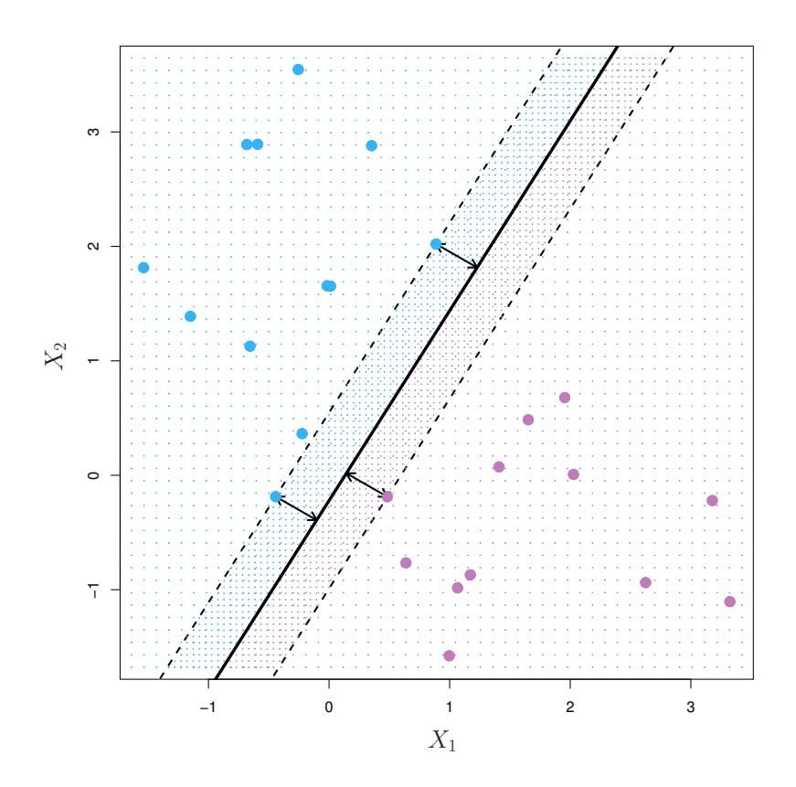
**FIGURE 9.3.** *There are two classes of observations, shown in blue and in purple. The maximal margin hyperplane is shown as a solid line. The margin is the distance from the solid line to either of the dashed lines. The two blue points and the purple point that lie on the dashed lines are the support vectors, and the distance from those points to the hyperplane is indicated by arrows. The purple and blue grid indicates the decision rule made by a classifer based on this separating hyperplane.*
cross the boundary set by the margin. The fact that the maximal margin hyperplane depends directly on only a small subset of the observations is an important property that will arise later in this chapter when we discuss the support vector classifer and support vector machines.
### 9.1.4 Construction of the Maximal Margin Classifer
We now consider the task of constructing the maximal margin hyperplane based on a set of $n$ training observations $x_1, \dots, x_n \in \mathbb{R}^p$ and associated class labels $y_1, \dots, y_n \in \{-1, 1\}$ . Briefly, the maximal margin hyperplane is the solution to the optimization problem
$$
\underset{\beta_0, \beta_1, \ldots, \beta_p, M}{\text{maximize}} \, M \quad (9.9)
$$
$$
\text{subject to } \sum_{j=1}^{p} \beta_j^2 = 1, \quad (9.10)
$$
$$
y_i(\beta_0 + \beta_1 x_{i1} + \beta_2 x_{i2} + \dots + \beta_p x_{ip}) \ge M \quad \forall \ i = 1, \dots, n. \quad (9.11)
$$
This optimization problem (9.9)–(9.11) is actually simpler than it looks. First of all, the constraint in (9.11) that
$$
y_i(\beta_0 + \beta_1 x_{i1} + \beta_2 x_{i2} + \cdots + \beta_p x_{ip}) \ge M \quad \forall \ i = 1, \dots, n
$$
9.2 Support Vector Classifers 373
guarantees that each observation will be on the correct side of the hyperplane, provided that $M$ is positive. (Actually, for each observation to be on the correct side of the hyperplane we would simply need $y_i(\beta_0 + \beta_1 x_{i1} + \beta_2 x_{i2} + \dots + \beta_p x_{ip}) > 0$ , so the constraint in (9.11) in fact requires that each observation be on the correct side of the hyperplane, with some cushion, provided that $M$ is positive.)Second, note that (9.10) is not really a constraint on the hyperplane, since if $\beta_0 + \beta_1 x_{i1} + \beta_2 x_{i2} + \dots + \beta_p x_{ip} = 0$ defines a hyperplane, then so does $k(\beta_0 + \beta_1 x_{i1} + \beta_2 x_{i2} + \dots + \beta_p x_{ip}) = 0$ for any $k \neq 0$ . However, (9.10) adds meaning to (9.11); one can show that with this constraint the perpendicular distance from the *i*th observation to the hyperplane is given by
$$
y_i(\beta_0 + \beta_1x_{i1} + \beta_2x_{i2} + \cdots + \beta_px_{ip}).
$$
Therefore, the constraints (9.10) and (9.11) ensure that each observation is on the correct side of the hyperplane and at least a distance *M* from the hyperplane. Hence, *M* represents the margin of our hyperplane, and the optimization problem chooses β0*,* β1*,...,* β*p* to maximize *M*. This is exactly the defnition of the maximal margin hyperplane! The problem (9.9)–(9.11) can be solved effciently, but details of this optimization are outside of the scope of this book.
### 9.1.5 The Non-separable Case
The maximal margin classifer is a very natural way to perform classifcation, *if a separating hyperplane exists*. However, as we have hinted, in many cases no separating hyperplane exists, and so there is no maximal margin classifer. In this case, the optimization problem (9.9)–(9.11) has no solution with *M >* 0. An example is shown in Figure 9.4. In this case, we cannot *exactly* separate the two classes. However, as we will see in the next section, we can extend the concept of a separating hyperplane in order to develop a hyperplane that *almost* separates the classes, using a so-called *soft margin*. The generalization of the maximal margin classifer to the non-separable case is known as the *support vector classifer*.
### 9.2 Support Vector Classifers
### 9.2.1 Overview of the Support Vector Classifer
In Figure 9.4, we see that observations that belong to two classes are not necessarily separable by a hyperplane. In fact, even if a separating hyperplane does exist, then there are instances in which a classifer based on a separating hyperplane might not be desirable. A classifer based on a separating hyperplane will necessarily perfectly classify all of the training
374 9. Support Vector Machines
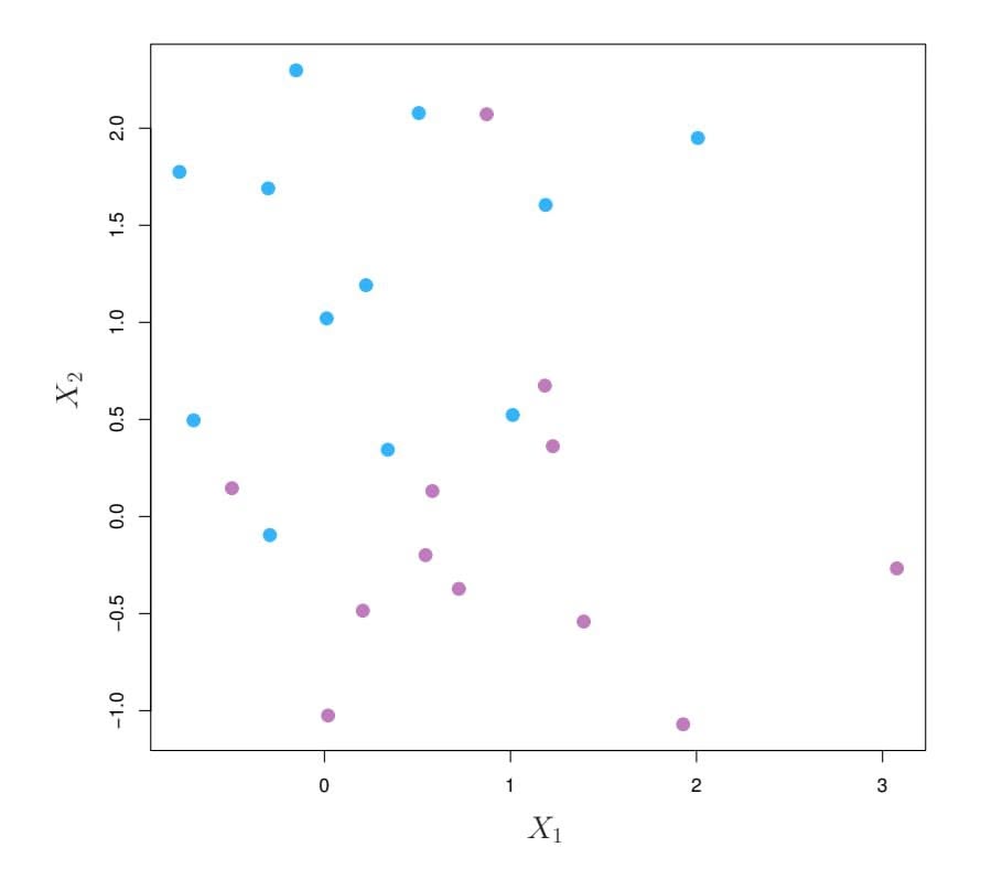
**FIGURE 9.4.** *There are two classes of observations, shown in blue and in purple. In this case, the two classes are not separable by a hyperplane, and so the maximal margin classifer cannot be used.*
observations; this can lead to sensitivity to individual observations. An example is shown in Figure 9.5. The addition of a single observation in the right-hand panel of Figure 9.5 leads to a dramatic change in the maximal margin hyperplane. The resulting maximal margin hyperplane is not satisfactory—for one thing, it has only a tiny margin. This is problematic because as discussed previously, the distance of an observation from the hyperplane can be seen as a measure of our confdence that the observation was correctly classifed. Moreover, the fact that the maximal margin hyperplane is extremely sensitive to a change in a single observation suggests that it may have overft the training data.
In this case, we might be willing to consider a classifer based on a hyperplane that does *not* perfectly separate the two classes, in the interest of
- Greater robustness to individual observations, and
- Better classifcation of *most* of the training observations.
That is, it could be worthwhile to misclassify a few training observations in order to do a better job in classifying the remaining observations.
The *support vector classifer*, sometimes called a *soft margin classifer*, support does exactly this. Rather than seeking the largest possible margin so that every observation is not only on the correct side of the hyperplane but also on the correct side of the margin, we instead allow some observations to be on the incorrect side of the margin, or even the incorrect side of the hyperplane. (The margin is *soft* because it can be violated by some of the training observations.) An example is shown in the left-hand panel
vector classifer soft margin classifer
9.2 Support Vector Classifers 375
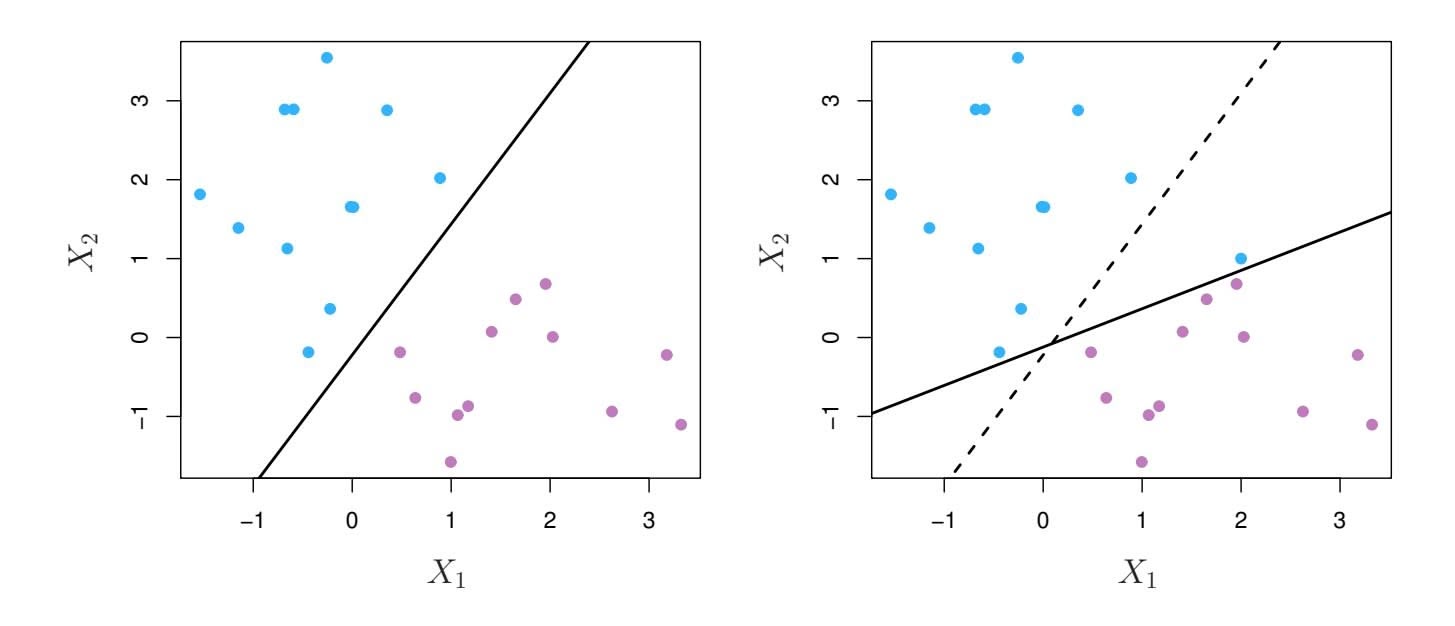
**FIGURE 9.5.** Left: *Two classes of observations are shown in blue and in purple, along with the maximal margin hyperplane.* Right: *An additional blue observation has been added, leading to a dramatic shift in the maximal margin hyperplane shown as a solid line. The dashed line indicates the maximal margin hyperplane that was obtained in the absence of this additional point.*
of Figure 9.6. Most of the observations are on the correct side of the margin. However, a small subset of the observations are on the wrong side of the margin.
An observation can be not only on the wrong side of the margin, but also on the wrong side of the hyperplane. In fact, when there is no separating hyperplane, such a situation is inevitable. Observations on the wrong side of the hyperplane correspond to training observations that are misclassifed by the support vector classifer. The right-hand panel of Figure 9.6 illustrates such a scenario.
### 9.2.2 Details of the Support Vector Classifer
The support vector classifer classifes a test observation depending on which side of a hyperplane it lies. The hyperplane is chosen to correctly separate most of the training observations into the two classes, but may misclassify a few observations. It is the solution to the optimization problem
maximizeβ0, β1, ..., βp, ε1, ..., εn, M M (9.12)
$$
\underset{\beta_0, \beta_1, \dots, \beta_p, \epsilon_1, \dots, \epsilon_n, M}{\text{maximize}} \quad M \tag{9.12}
$$
$$
\text{subject to } \sum_{j=1}^{p} \beta_j^2 = 1, \tag{9.13}
$$
$$
y_i(\beta_0 + \beta_1 x_{i1} + \beta_2 x_{i2} + \dots + \beta_p x_{ip}) \ge M(1 - \epsilon_i), \qquad (9.14)
$$
$$
\epsilon_i \ge 0, \sum_{i=1}^n \epsilon_i \le C
$$
(9.15)
376 9. Support Vector Machines
**FIGURE 9.6.** Left: A support vector classifier was fit to a small data set. The hyperplane is shown as a solid line and the margins are shown as dashed lines. Purple observations: Observations 3, 4, 5, and 6 are on the correct side of the margin, observation 2 is on the margin, and observation 1 is on the wrong side of the margin. Blue observations: Observations 7 and 10 are on the correct side of the margin, observation 9 is on the margin, and observation 8 is on the wrong side of the margin. No observations are on the wrong side of the hyperplane. Right: Same as left panel with two additional points, 11 and 12. These two observations are on the wrong side of the hyperplane and the wrong side of the margin.
where *C* is a nonnegative tuning parameter. As in (9.11), *M* is the width of the margin; we seek to make this quantity as large as possible. In (9.14), $\epsilon_1, \dots, \epsilon_n$ are *slack variables* that allow individual observations to be on the wrong side of the margin or the hyperplane; we will explain them in greater detail momentarily. Once we have solved (9.12)–(9.15), we classify a test observation $x^*$ as before, by simply determining on which side of the hyperplane it lies. That is, we classify the test observation based on the sign of $f(x^*) = \beta_0 + \beta_1 x_1^* + \dots + \beta_p x_p^*$ .The problem (9.12)–(9.15) seems complex, but insight into its behavior can be made through a series of simple observations presented below. First of all, the slack variable $\epsilon_i$ tells us where the $i$ th observation is located, relative to the hyperplane and relative to the margin. If $\epsilon_i = 0$ then the $i$ th observation is on the correct side of the margin, as we saw in Section 9.1.4. If $\epsilon_i > 0$ then the $i$ th observation is on the wrong side of the margin, and we say that the $i$ th observation has *violated* the margin. If $\epsilon_i > 1$ then it is on the wrong side of the hyperplane.
We now consider the role of the tuning parameter $C$ . In (9.15), $C$ bounds the sum of the $\epsilon_i$ 's, and so it determines the number and severity of the violations to the margin (and to the hyperplane) that we will tolerate. We can think of $C$ as a *budget* for the amount that the margin can be violated by the $n$ observations. If $C = 0$ then there is no budget for violations to the margin, and it must be the case that $\epsilon_1 = \dots = \epsilon_n = 0$ , in which case (9.12)–(9.15) simply amounts to the maximal margin hyperplane optimiza-
9.2 Support Vector Classifers 377
tion problem (9.9)–(9.11). (Of course, a maximal margin hyperplane exists only if the two classes are separable.) For $C > 0$ no more than $C$ observations can be on the wrong side of the hyperplane, because if an observation is on the wrong side of the hyperplane then $\epsilon_i > 1$ , and (9.15) requires that $\sum_{i=1}^n \epsilon_i \le C$ . As the budget $C$ increases, we become more tolerant of violations to the margin, and so the margin will widen. Conversely, as $C$ decreases, we become less tolerant of violations to the margin and so the margin narrows. An example is shown in Figure 9.7.
In practice, *C* is treated as a tuning parameter that is generally chosen via cross-validation. As with the tuning parameters that we have seen throughout this book, *C* controls the bias-variance trade-of of the statistical learning technique. When *C* is small, we seek narrow margins that are rarely violated; this amounts to a classifer that is highly ft to the data, which may have low bias but high variance. On the other hand, when *C* is larger, the margin is wider and we allow more violations to it; this amounts to ftting the data less hard and obtaining a classifer that is potentially more biased but may have lower variance.
The optimization problem (9.12)–(9.15) has a very interesting property: it turns out that only observations that either lie on the margin or that violate the margin will afect the hyperplane, and hence the classifer obtained. In other words, an observation that lies strictly on the correct side of the margin does not afect the support vector classifer! Changing the position of that observation would not change the classifer at all, provided that its position remains on the correct side of the margin. Observations that lie directly on the margin, or on the wrong side of the margin for their class, are known as *support vectors*. These observations do afect the support vector classifer.
The fact that only support vectors afect the classifer is in line with our previous assertion that *C* controls the bias-variance trade-of of the support vector classifer. When the tuning parameter *C* is large, then the margin is wide, many observations violate the margin, and so there are many support vectors. In this case, many observations are involved in determining the hyperplane. The top left panel in Figure 9.7 illustrates this setting: this classifer has low variance (since many observations are support vectors) but potentially high bias. In contrast, if *C* is small, then there will be fewer support vectors and hence the resulting classifer will have low bias but high variance. The bottom right panel in Figure 9.7 illustrates this setting, with only eight support vectors.
The fact that the support vector classifer's decision rule is based only on a potentially small subset of the training observations (the support vectors) means that it is quite robust to the behavior of observations that are far away from the hyperplane. This property is distinct from some of the other classifcation methods that we have seen in preceding chapters, such as linear discriminant analysis. Recall that the LDA classifcation rule depends on the mean of *all* of the observations within each class, as well as
378 9. Support Vector Machines
**FIGURE 9.7.** *A support vector classifer was ft using four diferent values of the tuning parameter C in (9.12)–(9.15). The largest value of C was used in the top left panel, and smaller values were used in the top right, bottom left, and bottom right panels. When C is large, then there is a high tolerance for observations being on the wrong side of the margin, and so the margin will be large. As C decreases, the tolerance for observations being on the wrong side of the margin decreases, and the margin narrows.*
the within-class covariance matrix computed using *all* of the observations. In contrast, logistic regression, unlike LDA, has very low sensitivity to observations far from the decision boundary. In fact we will see in Section 9.5 that the support vector classifer and logistic regression are closely related.
9.3 Support Vector Machines 379
**FIGURE 9.8.** Left: *The observations fall into two classes, with a non-linear boundary between them.* Right: *The support vector classifer seeks a linear boundary, and consequently performs very poorly.*
### 9.3 Support Vector Machines
We frst discuss a general mechanism for converting a linear classifer into one that produces non-linear decision boundaries. We then introduce the support vector machine, which does this in an automatic way.
### 9.3.1 Classifcation with Non-Linear Decision Boundaries
The support vector classifer is a natural approach for classifcation in the two-class setting, if the boundary between the two classes is linear. However, in practice we are sometimes faced with non-linear class boundaries. For instance, consider the data in the left-hand panel of Figure 9.8. It is clear that a support vector classifer or any linear classifer will perform poorly here. Indeed, the support vector classifer shown in the right-hand panel of Figure 9.8 is useless here.
In Chapter 7, we are faced with an analogous situation. We see there that the performance of linear regression can sufer when there is a nonlinear relationship between the predictors and the outcome. In that case, we consider enlarging the feature space using functions of the predictors, such as quadratic and cubic terms, in order to address this non-linearity. In the case of the support vector classifer, we could address the problem of possibly non-linear boundaries between classes in a similar way, by enlarging the feature space using quadratic, cubic, and even higher-order polynomial functions of the predictors. For instance, rather than ftting a support vector classifer using *p* features
$X_1, X_2, \ldots, X_p,$
380 9. Support Vector Machines
we could instead ft a support vector classifer using 2*p* features
$$
X_1, X_1^2, X_2, X_2^2, \ldots, X_p, X_p^2.
$$
Then (9.12)–(9.15) would become
maximize $M$ (9.16)
subject to
$$
y_{i} \left( \beta_{0} + \sum_{j=1}^{p} \beta_{j1} x_{ij} + \sum_{j=1}^{p} \beta_{j2} x_{ij}^{2} \right) \geq M(1 - \epsilon_{i}),
$$
$$
\sum_{i=1}^{n} \epsilon_{i} \leq C, \quad \epsilon_{i} \geq 0, \quad \sum_{j=1}^{p} \sum_{k=1}^{2} \beta_{jk}^{2} = 1.
$$
Why does this lead to a non-linear decision boundary? In the enlarged feature space, the decision boundary that results from (9.16) is in fact linear. But in the original feature space, the decision boundary is of the form $q(x) = 0$ , where $q$ is a quadratic polynomial, and its solutions are generally non-linear. One might additionally want to enlarge the feature space with higher-order polynomial terms, or with interaction terms of the form $X_j X_{j'}$ for $j
eq j'$ . Alternatively, other functions of the predictors could be considered rather than polynomials. It is not hard to see that there are many possible ways to enlarge the feature space, and that unless we are careful, we could end up with a huge number of features. Then computations would become unmanageable. The support vector machine, which we present next, allows us to enlarge the feature space used by the support vector classifier in a way that leads to efficient computations.
### 9.3.2 The Support Vector Machine
The *support vector machine* (SVM) is an extension of the support vector support classifer that results from enlarging the feature space in a specifc way, using *kernels*. We will now discuss this extension, the details of which are somewhat complex and beyond the scope of this book. However, the main kernel idea is described in Section 9.3.1: we may want to enlarge our feature space in order to accommodate a non-linear boundary between the classes. The kernel approach that we describe here is simply an effcient computational approach for enacting this idea.
vector machine
We have not discussed exactly how the support vector classifier is computed because the details become somewhat technical. However, it turns out that the solution to the support vector classifier problem (9.12)–(9.15) involves only the *inner products* of the observations (as opposed to the observations themselves). The inner product of two *r*-vectors *a* and *b* is defined as $\langle a, b \rangle = \sum_{i=1}^{r} a_i b_i$ . Thus the inner product of two observations
9.3 Support Vector Machines 381
$x_i, x_{i'}$ is given by
$$
\langle x_i, x_{i'} \rangle = \sum_{j=1}^{p} x_{ij} x_{i'j}. \quad (9.17)
$$
It can be shown that
• The linear support vector classifer can be represented as
$$
f(x) = \beta_0 + \sum_{i=1}^{n} \alpha_i \langle x, x_i \rangle, \quad (9.18)
$$
where there are *n* parameters α*i, i* = 1*,...,n*, one per training observation.
• To estimate the parameters α1*,...,* α*n* and β0, all we need are the '*n* 2 ( inner products ⟨*xi, xi*′ ⟩ between all pairs of training observations. (The notation '*n* 2 ( means *n*(*n* − 1)*/*2, and gives the number of pairs among a set of *n* items.)
Notice that in (9.18), in order to evaluate the function $f(x)$ , we need to compute the inner product between the new point $x$ and each of the training points $x_i$ . However, it turns out that $\alpha_i$ is nonzero only for the support vectors in the solution—that is, if a training observation is not a support vector, then its $\alpha_i$ equals zero. So if $\mathcal{S}$ is the collection of indices of these support points, we can rewrite any solution function of the form (9.18) as
$$
f(x) = \beta_0 + \sum_{i \in \mathcal{S}} \alpha_i \langle x, x_i \rangle, \quad (9.19)
$$
which typically involves far fewer terms than in (9.18).2
To summarize, in representing the linear classifer *f*(*x*), and in computing its coeffcients, all we need are inner products.
Now suppose that every time the inner product (9.17) appears in the representation (9.18), or in a calculation of the solution for the support vector classifer, we replace it with a *generalization* of the inner product of the form
$$
K(xi,xi')(9.20)
$$
where $K$ is some function that we will refer to as a *kernel*. A kernel is a function that quantifies the similarity of two observations. For instance, we could simply take
$$
K(x_i, x_{i'}) = \sum_{j=1}^{p} x_{ij} x_{i'j}, \quad (9.21)
$$
2By expanding each of the inner products in (9.19), it is easy to see that *f*(*x*) is a linear function of the coordinates of *x*. Doing so also establishes the correspondence between the α*i* and the original parameters β*j* .
382 9. Support Vector Machines
which would just give us back the support vector classifier. Equation 9.21 is known as a *linear* kernel because the support vector classifier is linear in the features; the linear kernel essentially quantifies the similarity of a pair of observations using Pearson (standard) correlation. But one could instead choose another form for (9.20). For instance, one could replace every instance of $\sum_{j=1}^{p} x_{ij}x_{i'j}$ with the quantity
$$
K(x_i, x_{i'}) = (1 + \sum_{j=1}^{p} x_{ij} x_{i'j})^d \tag{9.22}
$$
This is known as a *polynomial kernel* of degree $d$ , where $d$ is a positive integer. Using such a kernel with $d > 1$ , instead of the standard linear kernel (9.21), in the support vector classifier algorithm leads to a much more flexible decision boundary. It essentially amounts to fitting a support vector classifier in a higher-dimensional space involving polynomials of degree $d$ , rather than in the original feature space. When the support vector classifier is combined with a non-linear kernel such as (9.22), the resulting classifier is known as a support vector machine. Note that in this case the (non-linear) function has the form
$$
f(x) = \beta_0 + \sum_{i \in \mathcal{S}} \alpha_i K(x, x_i).
$$
(9.23)
The left-hand panel of Figure 9.9 shows an example of an SVM with a polynomial kernel applied to the non-linear data from Figure 9.8. The fit is a substantial improvement over the linear support vector classifier. When $d = 1$ , then the SVM reduces to the support vector classifier seen earlier in this chapter.
The polynomial kernel shown in (9.22) is one example of a possible non-linear kernel, but alternatives abound. Another popular choice is the *radial kernel*, which takes the form
radial kernel
$$
K(x_i, x_{i'}) = \exp\left(-\gamma \sum_{j=1}^{p} (x_{ij} - x_{i'j})^2\right) \quad (9.24)
$$
In $(9.24)$ , $\gamma$ is a positive constant. The right-hand panel of Figure 9.9 shows an example of an SVM with a radial kernel on this non-linear data; it also does a good job in separating the two classes.
How does the radial kernel (9.24) actually work? If a given test observation $x^* = (x^*_1, \dots, x^*_p)^T$ is far from a training observation $x_i$ in terms of Euclidean distance, then $\sum_{j=1}^p (x^*_j - x_{ij})^2$ will be large, and so $K(x^*, x_i) = \exp(-\gamma \sum_{j=1}^p (x^*_j - x_{ij})^2)$ will be tiny. This means that in (9.23), $x_i$ will play virtually no role in $f(x^*)$ . Recall that the predicted class label for the test observation $x^*$ is based on the sign of $f(x^*)$ . In other words, training observations that are far from $x^*$ will play essentially no role in the predicted class label for $x^*$ . This means that the radial kernel has very *local*
9.3 Support Vector Machines 383
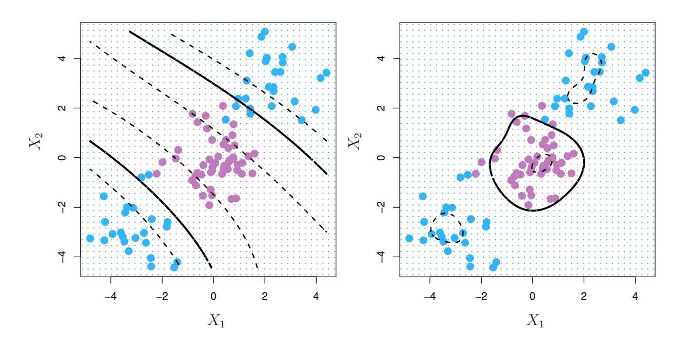
**FIGURE 9.9.** Left: *An SVM with a polynomial kernel of degree 3 is applied to the non-linear data from Figure 9.8, resulting in a far more appropriate decision rule.* Right: *An SVM with a radial kernel is applied. In this example, either kernel is capable of capturing the decision boundary.*
behavior, in the sense that only nearby training observations have an efect on the class label of a test observation.
What is the advantage of using a kernel rather than simply enlarging the feature space using functions of the original features, as in (9.16)? One advantage is computational, and it amounts to the fact that using kernels, one need only compute $K(x_i, x_i')$ for all $\binom{n}{2}$ distinct pairs $i, i'$ . This can be done without explicitly working in the enlarged feature space. This is important because in many applications of SVMs, the enlarged feature space is so large that computations are intractable. For some kernels, such as the radial kernel (9.24), the feature space is *implicit* and infinite-dimensional, so we could never do the computations there anyway!
### 9.3.3 An Application to the Heart Disease Data
In Chapter 8 we apply decision trees and related methods to the Heart data. The aim is to use 13 predictors such as Age, Sex, and Chol in order to predict whether an individual has heart disease. We now investigate how an SVM compares to LDA on this data. After removing 6 missing observations, the data consist of 297 subjects, which we randomly split into 207 training and 90 test observations.
We first fit LDA and the support vector classifier to the training data. Note that the support vector classifier is equivalent to an SVM using a polynomial kernel of degree $d = 1$ . The left-hand panel of Figure 9.10 displays ROC curves (described in Section 4.4.2) for the training set predictions for both LDA and the support vector classifier. Both classifiers compute scores of the form $\hat{f}(X) = \hat{\beta}_0 + \hat{\beta}_1 X_1 + \hat{\beta}_2 X_2 + \dots + \hat{\beta}_p X_p$ for each observation.
384 9. Support Vector Machines
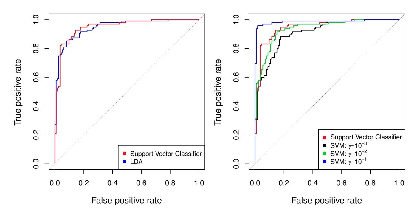
**FIGURE 9.10.** *ROC curves for the* Heart *data training set.* Left: The support vector classifier and LDA are compared. Right: The support vector classifier is compared to an SVM using a radial basis kernel with $\gamma = 10^{-3}$ , $10^{-2}$ , and $10^{-1}$ .
For any given cutoff $t$ , we classify observations into the *heart disease* or *no heart disease* categories depending on whether $\hat{f}(X) < t$ or $\hat{f}(X) \ge t$ . The ROC curve is obtained by forming these predictions and computing the false positive and true positive rates for a range of values of $t$ . An optimal classifier will hug the top left corner of the ROC plot. In this instance LDA and the support vector classifier both perform well, though there is a suggestion that the support vector classifier may be slightly superior.
The right-hand panel of Figure 9.10 displays ROC curves for SVMs using a radial kernel, with various values of $\gamma$ . As $\gamma$ increases and the fit becomes more non-linear, the ROC curves improve. Using $\gamma = 10^{-1}$ appears to give an almost perfect ROC curve. However, these curves represent training error rates, which can be misleading in terms of performance on new test data. Figure 9.11 displays ROC curves computed on the 90 test observations. We observe some differences from the training ROC curves. In the left-hand panel of Figure 9.11, the support vector classifier appears to have a small advantage over LDA (although these differences are not statistically significant). In the right-hand panel, the SVM using $\gamma = 10^{-1}$ , which showed the best results on the training data, produces the worst estimates on the test data. This is once again evidence that while a more flexible method will often produce lower training error rates, this does not necessarily lead to improved performance on test data. The SVMs with $\gamma = 10^{-2}$ and $\gamma = 10^{-3}$ perform comparably to the support vector classifier, and all three outperform the SVM with $\gamma = 10^{-1}$ .
9.4 SVMs with More than Two Classes 385
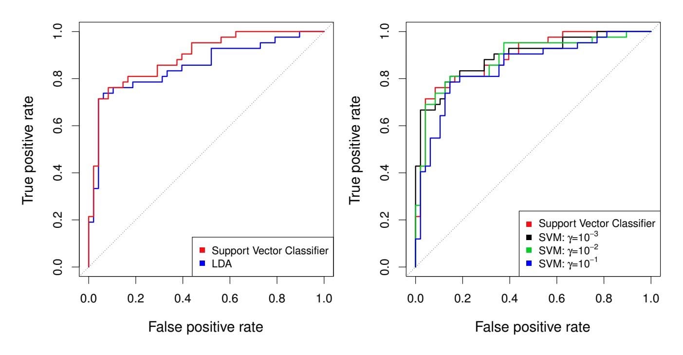
**FIGURE 9.11.** *ROC curves for the test set of the* Heart *data.* Left: *The support vector classifer and LDA are compared.* Right: *The support vector classifer is compared to an SVM using a radial basis kernel with* γ = 10−3*,* 10−2*, and* 10−1*.*
### 9.4 SVMs with More than Two Classes
So far, our discussion has been limited to the case of binary classifcation: that is, classifcation in the two-class setting. How can we extend SVMs to the more general case where we have some arbitrary number of classes? It turns out that the concept of separating hyperplanes upon which SVMs are based does not lend itself naturally to more than two classes. Though a number of proposals for extending SVMs to the *K*-class case have been made, the two most popular are the *one-versus-one* and *one-versus-all* approaches. We briefy discuss those two approaches here.
### 9.4.1 One-Versus-One Classifcation
Suppose that we would like to perform classifcation using SVMs, and there are *K >* 2 classes. A *one-versus-one* or *all-pairs* approach constructs '*K* 2 ( SVMs, each of which compares a pair of classes. For example, one such one SVM might compare the *k*th class, coded as +1, to the *k*′ th class, coded as −1. We classify a test observation using each of the '*K* 2 ( classifers, and we tally the number of times that the test observation is assigned to each of the *K* classes. The fnal classifcation is performed by assigning the test observation to the class to which it was most frequently assigned in these '*K* 2 ( pairwise classifcations.
### 9.4.2 One-Versus-All Classifcation
The *one-versus-all* approach (also referred to as *one-versus-rest*) is an alternative procedure for applying SVMs in the case of $K > 2$ classes. We
all one-versusrest
one-versus-
386 9. Support Vector Machines
fit $K$ SVMs, each time comparing one of the $K$ classes to the remaining $K - 1$ classes. Let $\beta_{0k}, \beta_{1k}, \dots, \beta_{pk}$ denote the parameters that result from fitting an SVM comparing the $k$ th class (coded as +1) to the others (coded as -1). Let $x^*$ denote a test observation. We assign the observation to the class for which $\beta_{0k} + \beta_{1k}x_1^* + \beta_{2k}x_2^* + \dots + \beta_{pk}x_p^*$ is largest, as this amounts to a high level of confidence that the test observation belongs to the $k$ th class rather than to any of the other classes.
### 9.5 Relationship to Logistic Regression
When SVMs were first introduced in the mid-1990s, they made quite a splash in the statistical and machine learning communities. This was due in part to their good performance, good marketing, and also to the fact that the underlying approach seemed both novel and mysterious. The idea of finding a hyperplane that separates the data as well as possible, while allowing some violations to this separation, seemed distinctly different from classical approaches for classification, such as logistic regression and linear discriminant analysis. Moreover, the idea of using a kernel to expand the feature space in order to accommodate non-linear class boundaries appeared to be a unique and valuable characteristic.
However, since that time, deep connections between SVMs and other more classical statistical methods have emerged. It turns out that one can rewrite the criterion (9.12)–(9.15) for fitting the support vector classifier $f(X) = \beta_0 + \beta_1 X_1 + \dots + \beta_p X_p$ as
$$
\underset{\beta_0, \beta_1, \dots, \beta_p}{\text{minimize}} \left\{ \sum_{i=1}^{n} \max [0, 1 - y_i f(x_i)] + \lambda \sum_{j=1}^{p} \beta_j^2 \right\}, \quad (9.25)
$$
where $\lambda$ is a nonnegative tuning parameter. When $\lambda$ is large then $\beta_1, \dots, \beta_p$ are small, more violations to the margin are tolerated, and a low-variance but high-bias classifier will result. When $\lambda$ is small then few violations to the margin will occur; this amounts to a high-variance but low-bias classifier. Thus, a small value of $\lambda$ in (9.25) amounts to a small value of $C$ in (9.15). Note that the $\lambda \sum_{j=1}^p \beta_j^2$ term in (9.25) is the ridge penalty term from Section 6.2.1, and plays a similar role in controlling the bias-variance trade-off for the support vector classifier.Now $(9.25)$ takes the "Loss + Penalty" form that we have seen repeatedly throughout this book:
$$
\underset{\beta_0,\beta_1,\ldots,\beta_p}{\text{minimize}} \left\{ L(\mathbf{X}, \mathbf{y}, \beta) + \lambda P(\beta) \right\}.
$$
(9.26)
In (9.26), $L(\mathbf{X}, \mathbf{y}, \beta)$ is some loss function quantifying the extent to which the model, parametrized by $\beta$ , fits the data $(\mathbf{X}, \mathbf{y})$ , and $P(\beta)$ is a penalty9.5 Relationship to Logistic Regression 387
function on the parameter vector β whose efect is controlled by a nonnegative tuning parameter λ. For instance, ridge regression and the lasso both take this form with
$$
L(\mathbf{X}, \mathbf{y}, \beta) = \sum_{i=1}^{n} \left( y_i - \beta_0 - \sum_{j=1}^{p} x_{ij} \beta_j \right)^2
$$
and with $P(\beta) = \sum_{j=1}^{p} \beta_j^2$ for ridge regression and $P(\beta) = \sum_{j=1}^{p} |\beta_j|$ for the lasso. In the case of (9.25) the loss function instead takes the form
$$
L(\mathbf{X}, \mathbf{y}, \beta) = \sum_{i=1}^{n} \max [0, 1 - y_i(\beta_0 + \beta_1 x_{i1} + \dots + \beta_p x_{ip})].
$$
This is known as *hinge loss*, and is depicted in Figure 9.12. However, it hinge loss turns out that the hinge loss function is closely related to the loss function used in logistic regression, also shown in Figure 9.12.
An interesting characteristic of the support vector classifier is that only support vectors play a role in the classifier obtained; observations on the correct side of the margin do not affect it. This is due to the fact that the loss function shown in Figure 9.12 is exactly zero for observations for which $y_i(\beta_0 + \beta_1x_{i1} + \dots + \beta_px_{ip}) \ge 1$ ; these correspond to observations that are on the correct side of the margin.3 In contrast, the loss function for logistic regression shown in Figure 9.12 is not exactly zero anywhere. But it is very small for observations that are far from the decision boundary. Due to the similarities between their loss functions, logistic regression and the support vector classifier often give very similar results. When the classes are well separated, SVMs tend to behave better than logistic regression; in more overlapping regimes, logistic regression is often preferred.
When the support vector classifer and SVM were frst introduced, it was thought that the tuning parameter *C* in (9.15) was an unimportant "nuisance" parameter that could be set to some default value, like 1. However, the "Loss + Penalty" formulation (9.25) for the support vector classifer indicates that this is not the case. The choice of tuning parameter is very important and determines the extent to which the model underfts or overfts the data, as illustrated, for example, in Figure 9.7.
We have established that the support vector classifer is closely related to logistic regression and other preexisting statistical methods. Is the SVM unique in its use of kernels to enlarge the feature space to accommodate non-linear class boundaries? The answer to this question is "no". We could just as well perform logistic regression or many of the other classifcation methods seen in this book using non-linear kernels; this is closely related
hinge loss
3With this hinge-loss + penalty representation, the margin corresponds to the value one, and the width of the margin is determined by !β2 *j* .
388 9. Support Vector Machines
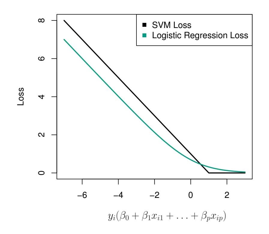
**FIGURE 9.12.** *The SVM and logistic regression loss functions are compared, as a function of yi*(β0 +β1*xi*1 +*···*+β*pxip*)*. When yi*(β0 +β1*xi*1 +*···*+β*pxip*) *is greater than 1, then the SVM loss is zero, since this corresponds to an observation that is on the correct side of the margin. Overall, the two loss functions have quite similar behavior.*
to some of the non-linear approaches seen in Chapter 7. However, for historical reasons, the use of non-linear kernels is much more widespread in the context of SVMs than in the context of logistic regression or other methods.
Though we have not addressed it here, there is in fact an extension of the SVM for regression (i.e. for a quantitative rather than a qualitative response), called *support vector regression*. In Chapter 3, we saw that least squares regression seeks coefficients $\beta_0, \beta_1, \dots, \beta_p$ such that the sum of squared residuals is as small as possible. (Recall from Chapter 3 that residuals are defined as $y_i - \beta_0 - \beta_1 x_{i1} - \dots - \beta_p x_{ip}$ .) Support vector regression instead seeks coefficients that minimize a different type of loss, where only residuals larger in absolute value than some positive constant contribute to the loss function. This is an extension of the margin used in support vector classifiers to the regression setting.
vector regression
### 9.6 Lab: Support Vector Machines
We use the e1071 library in R to demonstrate the support vector classifer and the SVM. Another option is the LiblineaR library, which is useful for very large linear problems.
9.6 Lab: Support Vector Machines 389
### 9.6.1 Support Vector Classifer
The e1071 library contains implementations for a number of statistical learning methods. In particular, the svm() function can be used to ft a svm() support vector classifer when the argument kernel = "linear" is used. This function uses a slightly diferent formulation from (9.14) and (9.25) for the support vector classifer. A cost argument allows us to specify the cost of a violation to the margin. When the cost argument is small, then the margins will be wide and many support vectors will be on the margin or will violate the margin. When the cost argument is large, then the margins will be narrow and there will be few support vectors on the margin or violating the margin.
We now use the svm() function to ft the support vector classifer for a given value of the cost parameter. Here we demonstrate the use of this function on a two-dimensional example so that we can plot the resulting decision boundary. We begin by generating the observations, which belong to two classes, and checking whether the classes are linearly separable.
```
> set.seed(1)
> x <- matrix(rnorm(20 * 2), ncol = 2)
> y <- c(rep(-1, 10), rep(1, 10))
> x[y == 1, ] <- x[y == 1, ] + 1
> plot(x, col = (3 - y))
```
They are not. Next, we ft the support vector classifer. Note that in order for the svm() function to perform classifcation (as opposed to SVM-based regression), we must encode the response as a factor variable. We now create a data frame with the response coded as a factor.
```
> dat <- data.frame(x = x, y = as.factor(y))
> library(e1071)
> svmfit <- svm(y ∼ ., data = dat, kernel = "linear",
cost = 10, scale = FALSE)
```
The argument `scale = FALSE` tells the `svm()` function not to scale each feature to have mean zero or standard deviation one; depending on the application, one might prefer to use `scale = TRUE`.
We can now plot the support vector classifer obtained:
```
> plot(svmfit, dat)
```
Note that the two arguments to the SVM plot() function are the output of the call to svm(), as well as the data used in the call to svm(). The region of feature space that will be assigned to the −1 class is shown in light yellow, and the region that will be assigned to the +1 class is shown in red. The decision boundary between the two classes is linear (because we used the argument kernel = "linear"), though due to the way in which the plotting function is implemented in this library the decision boundary looks somewhat jagged in the plot. (Note that here the second feature is plotted on the *x*-axis and the frst feature is plotted on the *y*-axis, in contrast to 390 9. Support Vector Machines
the behavior of the usual plot() function in R.) The support vectors are plotted as crosses and the remaining observations are plotted as circles; we see here that there are seven support vectors. We can determine their identities as follows:
> svmfit\$index
[1] 1 2 5 7 14 16 17
We can obtain some basic information about the support vector classifer ft using the summary() command:
```
> summary(svmfit)
Call:
svm(formula = y ∼ ., data = dat, kernel = "linear", cost = 10,
scale = FALSE)
Parameters:
SVM-Type: C-classification
SVM-Kernel: linear
cost: 10
Number of Support Vectors: 7
(43)
Number of Classes: 2
Levels:
-1 1
```
This tells us, for instance, that a linear kernel was used with cost = 10, and that there were seven support vectors, four in one class and three in the other.
What if we instead used a smaller value of the cost parameter?
```
> svmfit <- svm(y ∼ ., data = dat, kernel = "linear",
cost = 0.1, scale = FALSE)
> plot(svmfit, dat)
> svmfit$index
[1] 1 2 3 4 5 7 9 10 12 13 14 15 16 17 18 20
```
Now that a smaller value of the cost parameter is being used, we obtain a larger number of support vectors, because the margin is now wider. Unfortunately, the svm() function does not explicitly output the coeffcients of the linear decision boundary obtained when the support vector classifer is ft, nor does it output the width of the margin.
The e1071 library includes a built-in function, tune(), to perform cross- tune() validation. By default, tune() performs ten-fold cross-validation on a set of models of interest. In order to use this function, we pass in relevant information about the set of models that are under consideration. The following command indicates that we want to compare SVMs with a linear kernel, using a range of values of the cost parameter.
```
> set.seed(1)
> tune.out <- tune(svm, y ∼ ., data = dat, kernel = "linear",
ranges = list(cost = c(0.001, 0.01, 0.1, 1, 5, 10, 100)))
```
tune()
9.6 Lab: Support Vector Machines 391
We can easily access the cross-validation errors for each of these models using the summary() command:
```
> summary(tune.out)
Parameter tuning of `svm':
- sampling method: 10-fold cross validation
- best parameters:
cost
0.1
- best performance: 0.05
- Detailed performance results:
cost error dispersion
1 1e-03 0.55 0.438
2 1e-02 0.55 0.438
3 1e-01 0.05 0.158
4 1e+00 0.15 0.242
5 5e+00 0.15 0.242
6 1e+01 0.15 0.242
7 1e+02 0.15 0.242
```
We see that cost = 0.1 results in the lowest cross-validation error rate. The tune() function stores the best model obtained, which can be accessed as follows:
```
> bestmod <- tune.out$best.model
> summary(bestmod)
```
The predict() function can be used to predict the class label on a set of test observations, at any given value of the cost parameter. We begin by generating a test data set.
```
> xtest <- matrix(rnorm(20 * 2), ncol = 2)
> ytest <- sample(c(-1, 1), 20, rep = TRUE)
> xtest[ytest == 1, ] <- xtest[ytest == 1, ] + 1
> testdat <- data.frame(x = xtest, y = as.factor(ytest))
```
Now we predict the class labels of these test observations. Here we use the best model obtained through cross-validation in order to make predictions.
```
> ypred <- predict(bestmod, testdat)
> table(predict = ypred, truth = testdat$y)
truth
predict -1 1
-1 9 1
1 28
```
Thus, with this value of cost, 17 of the test observations are correctly classifed. What if we had instead used cost = 0.01?
```
> svmfit <- svm(y ∼ ., data = dat, kernel = "linear",
cost = .01, scale = FALSE)
> ypred <- predict(svmfit, testdat)
> table(predict = ypred, truth = testdat$y)
truth
predict -1 1
```
392 9. Support Vector Machines
$-1$ $11$ $6$
$1$ $0$ $3$
In this case three additional observations are misclassifed.
Now consider a situation in which the two classes are linearly separable. Then we can fnd a separating hyperplane using the svm() function. We frst further separate the two classes in our simulated data so that they are linearly separable:
```
> x[y == 1, ] <- x[y == 1, ] + 0.5
> plot(x, col = (y + 5) / 2, pch = 19)
```
Now the observations are just barely linearly separable. We ft the support vector classifer and plot the resulting hyperplane, using a very large value of cost so that no observations are misclassifed.
```
> dat <- data.frame(x = x, y = as.factor(y))
> svmfit <- svm(y ∼ ., data = dat, kernel = "linear",
cost = 1e5)
> summary(svmfit)
Call:
svm(formula = y ∼ ., data = dat, kernel = "linear", cost =
1e+05)
Parameters:
SVM-Type: C-classification
SVM-Kernel: linear
cost: 1e+05
Number of Support Vectors: 3
(12)
Number of Classes: 2
Levels:
-1 1
> plot(svmfit, dat)
```
No training errors were made and only three support vectors were used. However, we can see from the fgure that the margin is very narrow (because the observations that are not support vectors, indicated as circles, are very close to the decision boundary). It seems likely that this model will perform poorly on test data. We now try a smaller value of cost:
```
> svmfit <- svm(y ∼ ., data = dat, kernel = "linear", cost = 1)
> summary(svmfit)
> plot(svmfit, dat)
```
Using cost = 1, we misclassify a training observation, but we also obtain a much wider margin and make use of seven support vectors. It seems likely that this model will perform better on test data than the model with cost = 1e5.
### 9.6.2 Support Vector Machine
In order to ft an SVM using a non-linear kernel, we once again use the svm() function. However, now we use a diferent value of the parameter kernel. 9.6 Lab: Support Vector Machines 393
To ft an SVM with a polynomial kernel we use kernel = "polynomial", and to ft an SVM with a radial kernel we use kernel = "radial". In the former case we also use the degree argument to specify a degree for the polynomial kernel (this is *d* in (9.22)), and in the latter case we use gamma to specify a value of γ for the radial basis kernel (9.24).
We frst generate some data with a non-linear class boundary, as follows:
```
> set.seed(1)
> x <- matrix(rnorm(200 * 2), ncol = 2)
> x[1:100, ] <- x[1:100, ] + 2
> x[101:150, ] <- x[101:150, ] - 2
> y <- c(rep(1, 150), rep(2, 50))
> dat <- data.frame(x = x, y = as.factor(y))
```
Plotting the data makes it clear that the class boundary is indeed nonlinear:
`> plot(x, col = y)`The data is randomly split into training and testing groups. We then ft the training data using the svm() function with a radial kernel and γ = 1:
```
> train <- sample(200, 100)
> svmfit <- svm(y ∼ ., data = dat[train, ], kernel = "radial",
gamma = 1, cost = 1)
> plot(svmfit, dat[train, ])
```
The plot shows that the resulting SVM has a decidedly non-linear boundary. The summary() function can be used to obtain some information about the SVM ft:
```
> summary(svmfit)
Call:
svm(formula = y ∼ ., data = dat[train, ], kernel = "radial",
gamma = 1, cost = 1)
Parameters:
SVM-Type: C-classification
SVM-Kernel: radial
cost: 1
Number of Support Vectors: 31
( 16 15 )
Number of Classes: 2
Levels:
1 2
```
We can see from the fgure that there are a fair number of training errors in this SVM ft. If we increase the value of cost, we can reduce the number of training errors. However, this comes at the price of a more irregular decision boundary that seems to be at risk of overftting the data.
```
> svmfit <- svm(y ∼ ., data = dat[train, ], kernel = "radial",
gamma = 1, cost = 1e5)
> plot(svmfit, dat[train, ])
```
394 9. Support Vector Machines
We can perform cross-validation using tune() to select the best choice of γ and cost for an SVM with a radial kernel:
```
> set.seed(1)
> tune.out <- tune(svm, y ∼ ., data = dat[train, ],
kernel = "radial",
ranges = list(
cost = c(0.1, 1, 10, 100, 1000),
gamma = c(0.5, 1, 2, 3, 4)
)
)
> summary(tune.out)
Parameter tuning of `svm':
- sampling method: 10-fold cross validation
- best parameters:
cost gamma
1 0.5
- best performance: 0.07
- Detailed performance results:
cost gamma error dispersion
1 1e-01 0.5 0.26 0.158
2 1e+00 0.5 0.07 0.082
3 1e+01 0.5 0.07 0.082
4 1e+02 0.5 0.14 0.151
5 1e+03 0.5 0.11 0.074
6 1e-01 1.0 0.22 0.162
7 1e+00 1.0 0.07 0.082
...
```
Therefore, the best choice of parameters involves cost = 1 and gamma = 0.5. We can view the test set predictions for this model by applying the predict() function to the data. Notice that to do this we subset the dataframe dat using -train as an index set.
```
> table(
true = dat[-train, "y"],
pred = predict(
tune.out$best.model, newdata = dat[-train, ]
)
)
```
12 % of test observations are misclassifed by this SVM.
### 9.6.3 ROC Curves
The ROCR package can be used to produce ROC curves such as those in Figures 9.10 and 9.11. We frst write a short function to plot an ROC curve given a vector containing a numerical score for each observation, pred, and a vector containing the class label for each observation, truth.
```
> library(ROCR)
> rocplot <- function(pred, truth, ...) {
+ predob <- prediction(pred, truth)
```
9.6 Lab: Support Vector Machines 395
```
+ perf <- performance(predob, "tpr", "fpr")
+ plot(perf, ...)
+ }
```
SVMs and support vector classifiers output class labels for each observation. However, it is also possible to obtain *fitted values* for each observation, which are the numerical scores used to obtain the class labels. For instance, in the case of a support vector classifier, the fitted value for an observation $X = (X_1, X_2, \dots, X_p)^T$ takes the form $\hat{\beta}_0 + \hat{\beta}_1X_1 + \hat{\beta}_2X_2 + \dots + \hat{\beta}_pX_p$ . For an SVM with a non-linear kernel, the equation that yields the fitted value is given in (9.23). In essence, the sign of the fitted value determines on which side of the decision boundary the observation lies. Therefore, the relationship between the fitted value and the class prediction for a given observation is simple: if the fitted value exceeds zero then the observation is assigned to one class, and if it is less than zero then it is assigned to the other. In order to obtain the fitted values for a given SVM model fit, we use decision.values = TRUE when fitting svm(). Then the predict() function will output the fitted values.
```
> svmfit.opt <- svm(y ∼ ., data = dat[train, ],
kernel = "radial", gamma = 2, cost = 1,
decision.values = T)
> fitted <- attributes(
predict(svmfit.opt, dat[train, ], decision.values = TRUE)
)$decision.values
```
Now we can produce the ROC plot. Note we use the negative of the ftted values so that negative values correspond to class 1 and positive values to class 2.
```
> par(mfrow = c(1, 2))
> rocplot(-fitted, dat[train, "y"], main = "Training Data")
```
SVM appears to be producing accurate predictions. By increasing γ we can produce a more fexible ft and generate further improvements in accuracy.
```
> svmfit.flex <- svm(y ∼ ., data = dat[train, ],
kernel = "radial", gamma = 50, cost = 1,
decision.values = T)
> fitted <- attributes(
predict(svmfit.flex, dat[train, ], decision.values = T)
)$decision.values
> rocplot(-fitted, dat[train, "y"], add = T, col = "red")
```
However, these ROC curves are all on the training data. We are really more interested in the level of prediction accuracy on the test data. When we compute the ROC curves on the test data, the model with γ = 2 appears to provide the most accurate results.
```
> fitted <- attributes(
predict(svmfit.opt, dat[-train, ], decision.values = T)
)$decision.values
```
396 9. Support Vector Machines
```
> rocplot(-fitted, dat[-train, "y"], main = "Test Data")
> fitted <- attributes(
predict(svmfit.flex, dat[-train, ], decision.values = T)
)$decision.values
> rocplot(-fitted, dat[-train, "y"], add = T, col = "red")
```
### 9.6.4 SVM with Multiple Classes
If the response is a factor containing more than two levels, then the svm() function will perform multi-class classifcation using the one-versus-one approach. We explore that setting here by generating a third class of observations.
```
> set.seed(1)
> x <- rbind(x, matrix(rnorm(50 * 2), ncol = 2))
> y <- c(y, rep(0, 50))
> x[y == 0, 2] <- x[y == 0, 2] + 2
> dat <- data.frame(x = x, y = as.factor(y))
> par(mfrow = c(1, 1))
> plot(x, col = (y + 1))
```
We now ft an SVM to the data:
```
> svmfit <- svm(y ∼ ., data = dat, kernel = "radial",
cost = 10, gamma = 1)
> plot(svmfit, dat)
```
The e1071 library can also be used to perform support vector regression, if the response vector that is passed in to svm() is numerical rather than a factor.
### 9.6.5 Application to Gene Expression Data
We now examine the Khan data set, which consists of a number of tissue samples corresponding to four distinct types of small round blue cell tumors. For each tissue sample, gene expression measurements are available. The data set consists of training data, xtrain and ytrain, and testing data, xtest and ytest.
We examine the dimension of the data:
```
> library(ISLR2)
> names(Khan)
[1] "xtrain" "xtest" "ytrain" "ytest"
> dim(Khan$xtrain)
[1] 63 2308
> dim(Khan$xtest)
[1] 20 2308
> length(Khan$ytrain)
[1] 63
> length(Khan$ytest)
[1] 20
```
9.6 Lab: Support Vector Machines 397
This data set consists of expression measurements for 2*,*308 genes. The training and test sets consist of 63 and 20 observations respectively.
```
> table(Khan$ytrain)
1234
8 23 12 20
> table(Khan$ytest)
1234
3665
```
We will use a support vector approach to predict cancer subtype using gene expression measurements. In this data set, there are a very large number of features relative to the number of observations. This suggests that we should use a linear kernel, because the additional fexibility that will result from using a polynomial or radial kernel is unnecessary.
```
> dat <- data.frame(
x = Khan$xtrain,
y = as.factor(Khan$ytrain)
)
> out <- svm(y ∼ ., data = dat, kernel = "linear",
cost = 10)
> summary(out)
Call:
svm(formula = y ∼ ., data = dat, kernel = "linear",
cost = 10)
Parameters:
SVM-Type: C-classification
SVM-Kernel: linear
cost: 10
Number of Support Vectors: 58
( 20 20 11 7 )
Number of Classes: 4
Levels:
1234
> table(out$fitted, dat$y)
1234
18000
2 0 23 0 0
3 0 0 12 0
4 0 0 0 20
```
We see that there are *no* training errors. In fact, this is not surprising, because the large number of variables relative to the number of observations implies that it is easy to fnd hyperplanes that fully separate the classes. We are most interested not in the support vector classifer's performance on the training observations, but rather its performance on the test observations.
```
> dat.te <- data.frame(
x = Khan$xtest,
y = as.factor(Khan$ytest))
> pred.te <- predict(out, newdata = dat.te)
> table(pred.te, dat.te$y)
pred.te 1 2 3 4
```
398 9. Support Vector Machines
1 3 0 0 0
2 0 6 2 0
3 0 0 4 0
4 0 0 0 5
We see that using cost = 10 yields two test set errors on this data.
### 9.7 Exercises
#### *Conceptual*
- 1. This problem involves hyperplanes in two dimensions.
- (a) Sketch the hyperplane 1+3*X*1 − *X*2 = 0. Indicate the set of points for which 1+3*X*1 − *X*2 *>* 0, as well as the set of points for which 1+3*X*1 − *X*2 *<* 0.
- (b) On the same plot, sketch the hyperplane −2 + *X*1 + 2*X*2 = 0. Indicate the set of points for which −2 + *X*1 + 2*X*2 *>* 0, as well as the set of points for which −2 + *X*1 + 2*X*2 *<* 0.
- 2. We have seen that in *p* = 2 dimensions, a linear decision boundary takes the form β0+β1*X*1+β2*X*2 = 0. We now investigate a non-linear decision boundary.
- (a) Sketch the curve
$$
(1 + X_{1})^{2} + (2 - X_{2})^{2} = 4.
$$
(b) On your sketch, indicate the set of points for which
$$
(1 + X_1)^2 + (2 - X_2)^2 > 4,
$$
as well as the set of points for which
$$
(1 + X_1)^2 + (2 - X_2)^2 \le 4.
$$
(c) Suppose that a classifer assigns an observation to the blue class if
$$
(1 + X_{1})^{2} + (2 - X_{2})^{2} > 4,
$$
and to the red class otherwise. To what class is the observation $(0, 0)$ classified? $(-1, 1)$ ? $(2, 2)$ ? $(3, 8)$ ?
- (d) Argue that while the decision boundary in (c) is not linear in terms of *X*1 and *X*2, it is linear in terms of *X*1, *X*2 1 , *X*2, and *X*2 2 .
- 3. Here we explore the maximal margin classifer on a toy data set.
9.7 Exercises 399
| Obs. | X1 | X2 | Y |
|------|----|----|------|
| 1 | 3 | 4 | Red |
| 2 | 2 | 2 | Red |
| 3 | 4 | 4 | Red |
| 4 | 1 | 4 | Red |
| 5 | 2 | 1 | Blue |
| 6 | 4 | 3 | Blue |
| 7 | 4 | 1 | Blue |
(a) We are given *n* = 7 observations in *p* = 2 dimensions. For each observation, there is an associated class label.
Sketch the observations.
- (b) Sketch the optimal separating hyperplane, and provide the equation for this hyperplane (of the form (9.1)).
- (c) Describe the classifcation rule for the maximal margin classifer. It should be something along the lines of "Classify to Red if β0 + β1*X*1 + β2*X*2 *>* 0, and classify to Blue otherwise." Provide the values for β0, β1, and β2.
- (d) On your sketch, indicate the margin for the maximal margin hyperplane.
- (e) Indicate the support vectors for the maximal margin classifer.
- (f) Argue that a slight movement of the seventh observation would not afect the maximal margin hyperplane.
- (g) Sketch a hyperplane that is *not* the optimal separating hyperplane, and provide the equation for this hyperplane.
- (h) Draw an additional observation on the plot so that the two classes are no longer separable by a hyperplane.
#### *Applied*
- 4. Generate a simulated two-class data set with 100 observations and two features in which there is a visible but non-linear separation between the two classes. Show that in this setting, a support vector machine with a polynomial kernel (with degree greater than 1) or a radial kernel will outperform a support vector classifer on the training data. Which technique performs best on the test data? Make plots and report training and test error rates in order to back up your assertions.
- 5. We have seen that we can ft an SVM with a non-linear kernel in order to perform classifcation using a non-linear decision boundary. We will now see that we can also obtain a non-linear decision boundary by performing logistic regression using non-linear transformations of the features.
# 9. Support Vector Machines
(a) Generate a data set with *n* = 500 and *p* = 2, such that the observations belong to two classes with a quadratic decision boundary between them. For instance, you can do this as follows:
```
> x1 <- runif(500) - 0.5
> x2 <- runif(500) - 0.5
> y <- 1 * (x1^2 - x2^2 > 0)
```
- (b) Plot the observations, colored according to their class labels. Your plot should display *X*1 on the *x*-axis, and *X*2 on the *y*axis.
- (c) Fit a logistic regression model to the data, using *X*1 and *X*2 as predictors.
- (d) Apply this model to the *training data* in order to obtain a predicted class label for each training observation. Plot the observations, colored according to the *predicted* class labels. The decision boundary should be linear.
- (e) Now ft a logistic regression model to the data using non-linear functions of *X*1 and *X*2 as predictors (e.g. *X*2 1 , *X*1×*X*2, log(*X*2), and so forth).
- (f) Apply this model to the *training data* in order to obtain a predicted class label for each training observation. Plot the observations, colored according to the *predicted* class labels. The decision boundary should be obviously non-linear. If it is not, then repeat (a)-(e) until you come up with an example in which the predicted class labels are obviously non-linear.
- (g) Fit a support vector classifer to the data with *X*1 and *X*2 as predictors. Obtain a class prediction for each training observation. Plot the observations, colored according to the *predicted class labels*.
- (h) Fit a SVM using a non-linear kernel to the data. Obtain a class prediction for each training observation. Plot the observations, colored according to the *predicted class labels*.
- (i) Comment on your results.
- 6. At the end of Section 9.6.1, it is claimed that in the case of data that is just barely linearly separable, a support vector classifer with a small value of cost that misclassifes a couple of training observations may perform better on test data than one with a huge value of cost that does not misclassify any training observations. You will now investigate this claim.
- (a) Generate two-class data with *p* = 2 in such a way that the classes are just barely linearly separable.
9.7 Exercises 401
- (b) Compute the cross-validation error rates for support vector classifers with a range of cost values. How many training observations are misclassifed for each value of cost considered, and how does this relate to the cross-validation errors obtained?
- (c) Generate an appropriate test data set, and compute the test errors corresponding to each of the values of cost considered. Which value of cost leads to the fewest test errors, and how does this compare to the values of cost that yield the fewest training errors and the fewest cross-validation errors?
- (d) Discuss your results.
- 7. In this problem, you will use support vector approaches in order to predict whether a given car gets high or low gas mileage based on the Auto data set.
- (a) Create a binary variable that takes on a 1 for cars with gas mileage above the median, and a 0 for cars with gas mileage below the median.
- (b) Fit a support vector classifer to the data with various values of cost, in order to predict whether a car gets high or low gas mileage. Report the cross-validation errors associated with different values of this parameter. Comment on your results. Note you will need to ft the classifer without the gas mileage variable to produce sensible results.
- (c) Now repeat (b), this time using SVMs with radial and polynomial basis kernels, with diferent values of gamma and degree and cost. Comment on your results.
- (d) Make some plots to back up your assertions in (b) and (c).
*Hint: In the lab, we used the* plot() *function for* svm *objects only in cases with p* = 2*. When p >* 2*, you can use the* plot() *function to create plots displaying pairs of variables at a time. Essentially, instead of typing*
> plot(svmfit, dat)
*where* svmfit *contains your ftted model and* dat *is a data frame containing your data, you can type*
> plot(svmfit, dat, x1 ∼ x4)
*in order to plot just the frst and fourth variables. However, you must replace* x1 *and* x4 *with the correct variable names. To fnd out more, type* ?plot.svm*.*
8. This problem involves the OJ data set which is part of the ISLR2 package.
- 402 9. Support Vector Machines
- (a) Create a training set containing a random sample of 800 observations, and a test set containing the remaining observations.
- (b) Fit a support vector classifer to the training data using cost = 0.01, with Purchase as the response and the other variables as predictors. Use the summary() function to produce summary statistics, and describe the results obtained.
- (c) What are the training and test error rates?
- (d) Use the tune() function to select an optimal cost. Consider values in the range 0*.*01 to 10.
- (e) Compute the training and test error rates using this new value for cost.
- (f) Repeat parts (b) through (e) using a support vector machine with a radial kernel. Use the default value for gamma.
- (g) Repeat parts (b) through (e) using a support vector machine with a polynomial kernel. Set degree = 2.
- (h) Overall, which approach seems to give the best results on this data?
## 10 Deep Learning
This chapter covers the important topic of *deep learning*. At the time of deep writing (2020), deep learning is a very active area of research in the machine learning learning and artifcial intelligence communities. The cornerstone of deep
eep
learning
eural
network
learning is the *neural network*. neural Neural networks rose to fame in the late 1980s. There was a lot of excite- network ment and a certain amount of hype associated with this approach, and they were the impetus for the popular *Neural Information Processing Systems* meetings (NeurIPS, formerly NIPS) held every year, typically in exotic places like ski resorts. This was followed by a synthesis stage, where the properties of neural networks were analyzed by machine learners, mathematicians and statisticians; algorithms were improved, and the methodology stabilized. Then along came SVMs, boosting, and random forests, and neural networks fell somewhat from favor. Part of the reason was that neural networks required a lot of tinkering, while the new methods were more automatic. Also, on many problems the new methods outperformed poorly-trained neural networks. This was the *status quo* for the frst decade in the new millennium.
All the while, though, a core group of neural-network enthusiasts were pushing their technology harder on ever-larger computing architectures and data sets. Neural networks resurfaced after 2010 with the new name *deep learning*, with new architectures, additional bells and whistles, and a string of success stories on some niche problems such as image and video classifcation, speech and text modeling. Many in the feld believe that the major reason for these successes is the availability of ever-larger training datasets, made possible by the wide-scale use of digitization in science and industry.
404 10. Deep Learning
In this chapter we discuss the basics of neural networks and deep learning, and then go into some of the specializations for specific problems, such as convolutional neural networks (CNNs) for image classification, and recurrent neural networks (RNNs) for time series and other sequences. We will also demonstrate these models using the Python package keras, which interfaces with the tensorflow deep-learning software developed at Google.1
The material in this chapter is slightly more challenging than elsewhere in this book.
### 10.1 Single Layer Neural Networks
A neural network takes an input vector of $p$ variables $X = (X_1, X_2, \dots, X_p)$ and builds a nonlinear function $f(X)$ to predict the response $Y$ . We have built nonlinear prediction models in earlier chapters, using trees, boosting and generalized additive models. What distinguishes neural networks from these methods is the particular *structure* of the model. Figure 10.1 shows a simple *feed-forward neural network* for modeling a quantitative response using $p = 4$ predictors. In the terminology of neural networks, the four features $X_1, \dots, X_4$ make up the units in the *input layer*. The arrows indicate that each of the inputs from the input layer feeds into each of the $K$ *hidden units* (we get to pick $K$ ; here we chose 5). The neural network model has the form
feed-forward
neural
network
input layer
hidden units
$$
\begin{aligned} f(X) &= \beta_0 + \sum_{k=1}^{K} \beta_k h_k(X) \\ &= \beta_0 + \sum_{k=1}^{K} \beta_k g\left(w_{k0} + \sum_{j=1}^{p} w_{kj} X_j\right) \end{aligned} \tag{10.1}
$$
It is built up here in two steps. First the $K$ activations $A_k, k = 1, \dots, K,$ in the hidden layer are computed as functions of the input features $X_1, \dots, X_p,$
$$
A_k = h_k(X) = g\left(w_{k0} + \sum_{j=1}^p w_{kj} X_j\right), \tag{10.2}
$$
where $g(z)$ is a nonlinear *activation function* that is specified in advance. We can think of each $A_k$ as a different transformation $h_k(X)$ of the original features, much like the basis functions of Chapter 7. These $K$ activations from the hidden layer then feed into the output layer, resulting inactivation
function
from the hidden layer then feed into the output layer, resulting in
$$
f(X) = \beta_0 + \sum_{k=1}^{K} \beta_k A_k, \quad (10.3)
$$
a linear regression model in the $K = 5$ activations. All the parameters $\beta_0, \dots, \beta_K$ and $w_{10}, \dots, w_{Kp}$ need to be estimated from data. In the early
1For more information about keras, see Chollet et al. (2015) "Keras", available at https://keras.io. For more information about tensorflow, see Abadi et al. (2015) "TensorFlow: Large-scale machine learning on heterogeneous distributed systems", available at https://www.tensorflow.org/.10.1 Single Layer Neural Networks 405
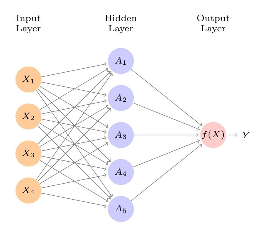
**FIGURE 10.1.** *Neural network with a single hidden layer. The hidden layer computes activations Ak* = *hk*(*X*) *that are nonlinear transformations of linear combinations of the inputs X*1*, X*2*,...,Xp. Hence these Ak are not directly observed. The functions hk*(*·*) *are not fxed in advance, but are learned during the training of the network. The output layer is a linear model that uses these activations Ak as inputs, resulting in a function f*(*X*)*.*
instances of neural networks, the *sigmoid* activation function was favored, sigmoid
$$
g(z) = \frac{e^z}{1 + e^z} = \frac{1}{1 + e^{-z}} \quad (10.4)
$$
which is the same function used in logistic regression to convert a linear function into probabilities between zero and one (see Figure 10.2). The preferred choice in modern neural networks is the *ReLU* (*rectifed linear* ReLU *unit*) activation function, which takes the form rectifed
linear unit
$$
g(z) = (z)_{+} = \begin{cases} 0 & \text{if } z < 0 \\ z & \text{otherwise.} \end{cases} \tag{10.5}
$$
A ReLU activation can be computed and stored more effciently than a sigmoid activation. Although it thresholds at zero, because we apply it to a linear function (10.2) the constant term *wk*0 will shift this infection point.
So in words, the model depicted in Figure 10.1 derives fve new features by computing fve diferent linear combinations of *X*, and then squashes each through an activation function *g*(*·*) to transform it. The fnal model is linear in these derived variables.
The name *neural network* originally derived from thinking of these hidden units as analogous to neurons in the brain — values of the activations $A_k = h_k(X)$ close to one are *firing*, while those close to zero are *silent* (using the sigmoid activation function).
406 10. Deep Learning
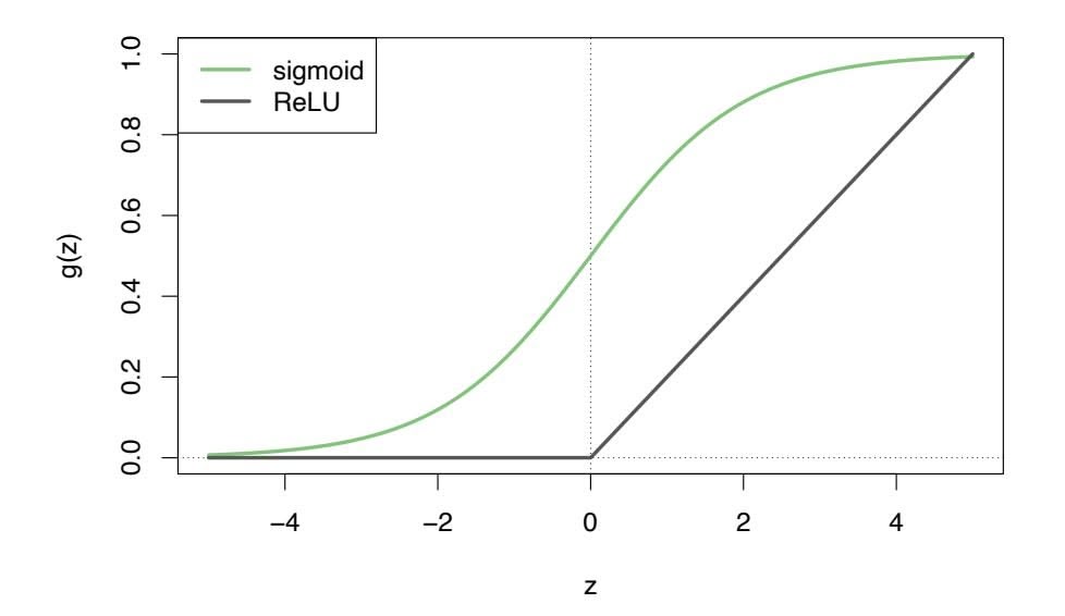
**FIGURE 10.2.** *Activation functions. The piecewise-linear* ReLU *function is popular for its effciency and computability. We have scaled it down by a factor of fve for ease of comparison.*
The nonlinearity in the activation function $g(·)$ is essential, since without it the model $f(X)$ in (10.1) would collapse into a simple linear model in $X_1, ..., X_p$ . Moreover, having a nonlinear activation function allows the model to capture complex nonlinearities and interaction effects. Consider a very simple example with $p = 2$ input variables $X = (X_1, X_2)$ , and $K = 2$ hidden units $h_1(X)$ and $h_2(X)$ with $g(z) = z^2$ . We specify the other parameters as
$$
β0=0,β1=14,β2=-14,w10=0,w11=1,w12=1,w20=0,w21=1,w22=-1.(10.6)
$$
From (10.2), this means that
$$
\begin{aligned} h_1(X) &= (X_1 + X_2)^2, \\ h_2(X) &= (X_1 - X_2)^2. \end{aligned} \tag{10.7}
$$
Then plugging (10.7) into (10.1), we get
$$
f(X)=0+14⋅(0+X1+X2)2−14⋅(0+X1−X2)2=14[(X1+X2)2−(X1−X2)2]=X1X2.(10.8)
$$
So the sum of two nonlinear transformations of linear functions can give us an interaction! In practice we would not use a quadratic function for *g*(*z*), since we would always get a second-degree polynomial in the original coordinates *X*1*,...,Xp*. The sigmoid or ReLU activations do not have such a limitation.
Fitting a neural network requires estimating the unknown parameters in (10.1). For a quantitative response, typically squared-error loss is used, so that the parameters are chosen to minimize
$$
\sum_{i=1}^{n} (y_i - f(x_i))^2 \tag{10.9}
$$
10.2 Multilayer Neural Networks 407
**FIGURE 10.3.** *Examples of handwritten digits from the* MNIST *corpus. Each grayscale image has* 28 × 28 *pixels, each of which is an eight-bit number (0–255) which represents how dark that pixel is. The frst 3, 5, and 8 are enlarged to show their 784 individual pixel values.*
Details about how to perform this minimization are provided in Section 10.7.
### 10.2 Multilayer Neural Networks
Modern neural networks typically have more than one hidden layer, and often many units per layer. In theory a single hidden layer with a large number of units has the ability to approximate most functions. However, the learning task of discovering a good solution is made much easier with multiple layers each of modest size.
We will illustrate a large dense network on the famous and publicly available MNIST handwritten digit dataset.2 Figure 10.3 shows examples of these digits. The idea is to build a model to classify the images into their correct digit class 0–9. Every image has *p* = 28 × 28 = 784 pixels, each of which is an eight-bit grayscale value between 0 and 255 representing the relative amount of the written digit in that tiny square.3 These pixels are stored in the input vector *X* (in, say, column order). The output is the class label, represented by a vector *Y* = (*Y*0*, Y*1*,...,Y*9) of 10 dummy variables, with a one in the position corresponding to the label, and zeros elsewhere. In the machine learning community, this is known as *one-hot*
*encoding*. There are 60,000 training images, and 10,000 test images. one-hot On a historical note, digit recognition problems were the catalyst that encoding accelerated the development of neural network technology in the late 1980s at AT&T Bell Laboratories and elsewhere. Pattern recognition tasks of this
e-hot
encoding
2See LeCun, Cortes, and Burges (2010) "The MNIST database of handwritten digits", available at http://yann.lecun.com/exdb/mnist.
3In the analog-to-digital conversion process, only part of the written numeral may fall in the square representing a particular pixel.
408 10. Deep Learning
kind are relatively simple for humans. Our visual system occupies a large fraction of our brains, and good recognition is an evolutionary force for survival. These tasks are not so simple for machines, and it has taken more than 30 years to refne the neural-network architectures to match human performance.
Figure 10.4 shows a multilayer network architecture that works well for solving the digit-classifcation task. It difers from Figure 10.1 in several ways:
- It has two hidden layers *L*1 (256 units) and *L*2 (128 units) rather than one. Later we will see a network with seven hidden layers.
- It has ten output variables, rather than one. In this case the ten variables really represent a single qualitative variable and so are quite dependent. (We have indexed them by the digit class 0–9 rather than 1–10, for clarity.) More generally, in *multi-task learning* one can pre- multi-task learning dict diferent responses simultaneously with a single network; they all have a say in the formation of the hidden layers.
ulti-task
learning
• The loss function used for training the network is tailored for the multiclass classifcation task.
The frst hidden layer is as in (10.2), with
$$
\begin{aligned} A_k^{(1)} &= h_k^{(1)}(X) \\ &= g\left(w_{k0}^{(1)} + \sum_{j=1}^p w_{kj}^{(1)} X_j\right) \quad (10.10) \end{aligned}
$$
for $k = 1, \dots, K_1$ . The second hidden layer treats the activations $A_k^{(1)}$ of the first hidden layer as inputs and computes new activations
$$
Aℓ(2)=hℓ(2)(X)=gwℓ0(2)+∑k=1K1wℓk(2)Ak(1)(10.11)
$$
for $\ell = 1, \dots, K_2$ . Notice that each of the activations in the second layer $A_\ell^{(2)} = h_\ell^{(2)}(X)$ is a function of the input vector $X$ . This is the case because while they are explicitly a function of the activations $A_k^{(1)}$ from layer $L_1$ , these in turn are functions of $X$ . This would also be the case with more hidden layers. Thus, through a chain of transformations, the network is able to build up fairly complex transformations of $X$ that ultimately feed into the output layer as features.We have introduced additional superscript notation such as $h_\ell^{(2)}(X)$ and $w_{\ell j}^{(2)}$ in (10.10) and (10.11) to indicate to which layer the activations and *weights* (coefficients) belong, in this case layer 2. The notation $\mathbf{W}_1$ in Figure 10.4 represents the entire matrix of weights that feed from the input layer to the first hidden layer $L_1$ . This matrix will have $785 \times 256 = 200,960$
eights
10.2 Multilayer Neural Networks 409
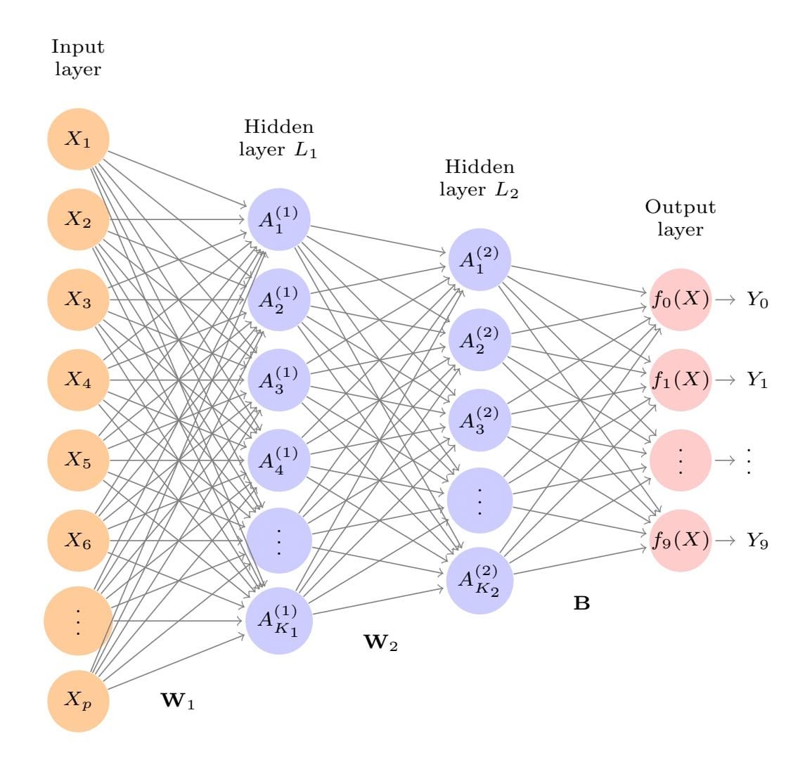
**FIGURE 10.4.** *Neural network diagram with two hidden layers and multiple outputs, suitable for the* MNIST *handwritten-digit problem. The input layer has p* = 784 *units, the two hidden layers K*1 = 256 *and K*2 = 128 *units respectively, and the output layer* 10 *units. Along with intercepts (referred to as* biases *in the deep-learning community) this network has 235,146 parameters (referred to as weights).*
elements; there are 785 rather than 784 because we must account for the intercept or *bias* term.4
Each element $A_k^{(1)}$ feeds to the second hidden layer $L_2$ via the matrix of weights $\mathbf{W}_2$ of dimension $257 \times 128 = 32,896$ .
We now get to the output layer, where we now have ten responses rather than one. The frst step is to compute ten diferent linear models similar to our single model (10.1),
$$
\begin{aligned} Z_m &= \beta_{m0} + \sum_{\ell=1}^{K_2} \beta_{m\ell} h_{\ell}^{(2)}(X) \\ &= \beta_{m0} + \sum_{\ell=1}^{K_2} \beta_{m\ell} A_{\ell}^{(2)}, \end{aligned} \tag{10.12}
$$
bias
for $m = 0, 1, \dots, 9$ . The matrix **B** stores all $129 \times 10 = 1,290$ of these weights.
4The use of "weights" for coeffcients and "bias" for the intercepts *wk*0 in (10.2) is popular in the machine learning community; this use of bias is not to be confused with the "bias-variance" usage elsewhere in this book.
410 10. Deep Learning
| Method | Test Error |
|-----------------------------------------|------------|
| Neural Network + Ridge Regularization | 2.3% |
| Neural Network + Dropout Regularization | 1.8% |
| Multinomial Logistic Regression | 7.2% |
| Linear Discriminant Analysis | 12.7% |
**TABLE 10.1.** *Test error rate on the* MNIST *data, for neural networks with two forms of regularization, as well as multinomial logistic regression and linear discriminant analysis. In this example, the extra complexity of the neural network leads to a marked improvement in test error.*
If these were all separate quantitative responses, we would simply set each $f_m(X) = Z_m$ and be done. However, we would like our estimates to represent class probabilities $f_m(X) = \Pr(Y = m|X)$ , just like in multinomial logistic regression in Section 4.3.5. So we use the special *softmax* activation function (see (4.13) on page 141),
$$
f_m(X) = \Pr(Y = m|X) = \frac{e^{Z_m}}{\sum_{\ell=0}^{9} e^{Z_{\ell}}}
$$
(10.13)
for $m = 0, 1, \dots, 9$ . This ensures that the 10 numbers behave like probabilities (non-negative and sum to one). Even though the goal is to build a classifier, our model actually estimates a probability for each of the 10 classes. The classifier then assigns the image to the class with the highest probability.
To train this network, since the response is qualitative, we look for coeffcient estimates that minimize the negative multinomial log-likelihood
$$
-\sum_{i=1}^{n} \sum_{m=0}^{9} y_{im} \log(f_m(x_i)),
$$
(10.14)
also known as the *cross-entropy*. This is a generalization of the crite- crossrion (4.5) for two-class logistic regression. Details on how to minimize this entropy objective are given in Section 10.7. If the response were quantitative, we would instead minimize squared-error loss as in (10.9).
cross-entropy
Table 10.1 compares the test performance of the neural network with two simple models presented in Chapter 4 that make use of linear decision boundaries: multinomial logistic regression and linear discriminant analysis. The improvement of neural networks over both of these linear methods is dramatic: the network with dropout regularization achieves a test error rate below 2% on the 10*,*000 test images. (We describe dropout regularization in Section 10.7.3.) In Section 10.9.2 of the lab, we present the code for ftting this model, which runs in just over two minutes on a laptop computer.
Adding the number of coefficients in $\mathbf{W}_1$ , $\mathbf{W}_2$ and $\mathbf{B}$ , we get 235,146 in all, more than 33 times the number $785 \times 9 = 7,065$ needed for multinomial logistic regression. Recall that there are 60,000 images in the training set.
10.3 Convolutional Neural Networks 411
**FIGURE 10.5.** *A sample of images from the* CIFAR100 *database: a collection of natural images from everyday life, with 100 diferent classes represented.*
While this might seem like a large training set, there are almost four times as many coeffcients in the neural network model as there are observations in the training set! To avoid overftting, some regularization is needed. In this example, we used two forms of regularization: ridge regularization, which is similar to ridge regression from Chapter 6, and *dropout* regularization. dropout We discuss both forms of regularization in Section 10.7.
pout
### 10.3 Convolutional Neural Networks
Neural networks rebounded around 2010 with big successes in image classifcation. Around that time, massive databases of labeled images were being accumulated, with ever-increasing numbers of classes. Figure 10.5 shows 75 images drawn from the CIFAR100 database.5 This database consists of 60,000 images labeled according to 20 superclasses (e.g. aquatic mammals), with fve classes per superclass (beaver, dolphin, otter, seal, whale). Each image has a resolution of 32 × 32 pixels, with three eight-bit numbers per pixel representing red, green and blue. The numbers for each image are organized in a three-dimensional array called a *feature map*. The frst two feature map axes are spatial (both are 32-dimensional), and the third is the *channel* channel axis,6 representing the three colors. There is a designated training set of 50,000 images, and a test set of 10,000.
A special family of *convolutional neural networks* (CNNs) has evolved for convolutional classifying images such as these, and has shown spectacular success on a wide range of problems. CNNs mimic to some degree how humans classify images, by recognizing specifc features or patterns anywhere in the image
channel
neural networks
5See Chapter 3 of Krizhevsky (2009) "Learning multiple layers of features from tiny images", available at https://www.cs.toronto.edu/~kriz/ learning-features-2009-TR.pdf.
6The term *channel* is taken from the signal-processing literature. Each channel is a distinct source of information.
412 10. Deep Learning
**FIGURE 10.6.** *Schematic showing how a convolutional neural network classifes an image of a tiger. The network takes in the image and identifes local features. It then combines the local features in order to create compound features, which in this example include eyes and ears. These compound features are used to output the label "tiger".*
that distinguish each particular object class. In this section we give a brief overview of how they work.
Figure 10.6 illustrates the idea behind a convolutional neural network on a cartoon image of a tiger.7
The network frst identifes low-level features in the input image, such as small edges, patches of color, and the like. These low-level features are then combined to form higher-level features, such as parts of ears, eyes, and so on. Eventually, the presence or absence of these higher-level features contributes to the probability of any given output class.
How does a convolutional neural network build up this hierarchy? It combines two specialized types of hidden layers, called *convolution* layers and *pooling* layers. Convolution layers search for instances of small patterns in the image, whereas pooling layers downsample these to select a prominent subset. In order to achieve state-of-the-art results, contemporary neuralnetwork architectures make use of many convolution and pooling layers. We describe convolution and pooling layers next.
### 10.3.1 Convolution Layers
A *convolution layer* is made up of a large number of *convolution flters*, each convolution of which is a template that determines whether a particular local feature is present in an image. A convolution flter relies on a very simple operation, called a *convolution*, which basically amounts to repeatedly multiplying matrix elements and then adding the results.
layer convolution flter
7Thanks to Elena Tuzhilina for producing the diagram and https://www. cartooning4kids.com/ for permission to use the cartoon tiger.
10.3 Convolutional Neural Networks 413
To understand how a convolution flter works, consider a very simple example of a 4 × 3 image:
Original Image =
$$
\begin{bmatrix} a & b & c \\ d & e & f \\ g & h & i \\ j & k & l \end{bmatrix}.
$$
Now consider a 2 × 2 flter of the form
Convolution Filter = $\begin{bmatrix} \alpha & \beta \\ \gamma & \delta \end{bmatrix}.$
When we *convolve* the image with the flter, we get the result8
Convolved Image =
$$
\begin{bmatrix} a\alpha + b\beta + d\gamma + e\delta & b\alpha + c\beta + e\gamma + f\delta \\ d\alpha + e\beta + g\gamma + h\delta & e\alpha + f\beta + h\gamma + i\delta \\ g\alpha + h\beta + j\gamma + k\delta & h\alpha + i\beta + k\gamma + l\delta \end{bmatrix}
$$
.
For instance, the top-left element comes from multiplying each element in the $2 \times 2$ filter by the corresponding element in the top left $2 \times 2$ portion of the image, and adding the results. The other elements are obtained in a similar way: the convolution filter is applied to every $2 \times 2$ submatrix of the original image in order to obtain the convolved image. If a $2 \times 2$ submatrix of the original image resembles the convolution filter, then it will have a *large* value in the convolved image; otherwise, it will have a *small* value. Thus, *the convolved image highlights regions of the original image that resemble the convolution filter.* We have used $2 \times 2$ as an example; in general convolution filters are small $\ell_1 \times \ell_2$ arrays, with $\ell_1$ and $\ell_2$ small positive integers that are not necessarily equal.
Figure 10.7 illustrates the application of two convolution filters to a $192 imes 179$ image of a tiger, shown on the left-hand side.9 Each convolution filter is a $15 imes 15$ image containing mostly zeros (black), with a narrow strip of ones (white) oriented either vertically or horizontally within the image. When each filter is convolved with the image of the tiger, areas of the tiger that resemble the filter (i.e. that have either horizontal or vertical stripes or edges) are given large values, and areas of the tiger that do not resemble the feature are given small values. The convolved images are displayed on the right-hand side. We see that the horizontal stripe filter picks out horizontal stripes and edges in the original image, whereas the vertical stripe filter picks out vertical stripes and edges in the original image.
8The convolved image is smaller than the original image because its dimension is given by the number of 2 × 2 submatrices in the original image. Note that 2 × 2 is the dimension of the convolution flter. If we want the convolved image to have the same dimension as the original image, then padding can be applied.
9The tiger image used in Figures 10.7–10.9 was obtained from the public domain image resource https://www.needpix.com/.
414 10. Deep Learning
**FIGURE 10.7.** *Convolution flters fnd local features in an image, such as edges and small shapes. We begin with the image of the tiger shown on the left, and apply the two small convolution flters in the middle. The convolved images highlight areas in the original image where details similar to the flters are found. Specifcally, the top convolved image highlights the tiger's vertical stripes, whereas the bottom convolved image highlights the tiger's horizontal stripes. We can think of the original image as the input layer in a convolutional neural network, and the convolved images as the units in the frst hidden layer.*
We have used a large image and two large flters in Figure 10.7 for illustration. For the CIFAR100 database there are 32×32 color pixels per image, and we use 3 × 3 convolution flters.
In a convolution layer, we use a whole bank of flters to pick out a variety of diferently-oriented edges and shapes in the image. Using predefned flters in this way is standard practice in image processing. By contrast, with CNNs the flters are *learned* for the specifc classifcation task. We can think of the flter weights as the parameters going from an input layer to a hidden layer, with one hidden unit for each pixel in the convolved image. This is in fact the case, though the parameters are highly structured and constrained (see Exercise 4 for more details). They operate on localized patches in the input image (so there are many structural zeros), and the same weights in a given flter are reused for all possible patches in the image (so the weights are constrained).10
We now give some additional details.
• Since the input image is in color, it has three channels represented by a three-dimensional feature map (array). Each channel is a twodimensional (32 × 32) feature map — one for red, one for green, and one for blue. A single convolution flter will also have three channels, one per color, each of dimension 3×3, with potentially diferent flter weights. The results of the three convolutions are summed to form
10This used to be called *weight sharing* in the early years of neural networks.
10.3 Convolutional Neural Networks 415
a two-dimensional output feature map. Note that at this point the color information has been used, and is not passed on to subsequent layers except through its role in the convolution.
- If we use *K* diferent convolution flters at this frst hidden layer, we get *K* two-dimensional output feature maps, which together are treated as a single three-dimensional feature map. We view each of the *K* output feature maps as a separate channel of information, so now we have *K* channels in contrast to the three color channels of the original input feature map. The three-dimensional feature map is just like the activations in a hidden layer of a simple neural network, except organized and produced in a spatially structured way.
- We typically apply the ReLU activation function (10.5) to the convolved image. This step is sometimes viewed as a separate layer in the convolutional neural network, in which case it is referred to as a *detector layer*. detector
layer
### 10.3.2 Pooling Layers
A *pooling* layer provides a way to condense a large image into a smaller pooling summary image. While there are a number of possible ways to perform pooling, the *max pooling* operation summarizes each non-overlapping 2 × 2 block of pixels in an image using the maximum value in the block. This reduces the size of the image by a factor of two in each direction, and it also provides some *location invariance*: i.e. as long as there is a large value in one of the four pixels in the block, the whole block registers as a large value in the reduced image.
Here is a simple example of max pooling:
$$
\text{Max pool } \begin{bmatrix} 1 & 2 & 5 & 3 \\ 3 & 0 & 1 & 2 \\ 2 & 1 & 3 & 4 \\ 1 & 1 & 2 & 0 \end{bmatrix} \rightarrow \begin{bmatrix} 3 & 5 \\ 2 & 4 \end{bmatrix}.
$$
### 10.3.3 Architecture of a Convolutional Neural Network
So far we have defned a single convolution layer — each flter produces a new two-dimensional feature map. The number of convolution flters in a convolution layer is akin to the number of units at a particular hidden layer in a fully-connected neural network of the type we saw in Section 10.2. This number also defnes the number of channels in the resulting threedimensional feature map. We have also described a pooling layer, which reduces the frst two dimensions of each three-dimensional feature map. Deep CNNs have many such layers. Figure 10.8 shows a typical architecture for a CNN for the CIFAR100 image classifcation task.
416 10. Deep Learning
**FIGURE 10.8.** *Architecture of a deep CNN for the* CIFAR100 *classifcation task. Convolution layers are interspersed with* 2 × 2 *max-pool layers, which reduce the size by a factor of 2 in both dimensions.*
At the input layer, we see the three-dimensional feature map of a color image, where the channel axis represents each color by a 32 × 32 twodimensional feature map of pixels. Each convolution flter produces a new channel at the frst hidden layer, each of which is a 32 × 32 feature map (after some padding at the edges). After this frst round of convolutions, we now have a new "image"; a feature map with considerably more channels than the three color input channels (six in the fgure, since we used six convolution flters).
This is followed by a max-pool layer, which reduces the size of the feature map in each channel by a factor of four: two in each dimension.
This convolve-then-pool sequence is now repeated for the next two layers. Some details are as follows:
- Each subsequent convolve layer is similar to the frst. It takes as input the three-dimensional feature map from the previous layer and treats it like a single multi-channel image. Each convolution flter learned has as many channels as this feature map.
- Since the channel feature maps are reduced in size after each pool layer, we usually increase the number of flters in the next convolve layer to compensate.
- Sometimes we repeat several convolve layers before a pool layer. This efectively increases the dimension of the flter.
These operations are repeated until the pooling has reduced each channel feature map down to just a few pixels in each dimension. At this point the three-dimensional feature maps are *fattened* — the pixels are treated as separate units — and fed into one or more fully-connected layers before reaching the output layer, which is a *softmax activation* for the 100 classes (as in (10.13)).
There are many tuning parameters to be selected in constructing such a network, apart from the number, nature, and sizes of each layer. Dropout learning can be used at each layer, as well as lasso or ridge regularization (see Section 10.7). The details of constructing a convolutional neural network can seem daunting. Fortunately, terrifc software is available, with
10.3 Convolutional Neural Networks 417

**FIGURE 10.9.** *Data augmentation. The original image (leftmost) is distorted in natural ways to produce diferent images with the same class label. These distortions do not fool humans, and act as a form of regularization when ftting the CNN.*
extensive examples and vignettes that provide guidance on sensible choices for the parameters. For the CIFAR100 offcial test set, the best accuracy as of this writing is just above 75%, but undoubtedly this performance will continue to improve.
### 10.3.4 Data Augmentation
An additional important trick used with image modeling is *data augment-* data augmentation *ation*. Essentially, each training image is replicated many times, with each replicate randomly distorted in a natural way such that human recognition is unafected. Figure 10.9 shows some examples. Typical distortions are zoom, horizontal and vertical shift, shear, small rotations, and in this case horizontal fips. At face value this is a way of increasing the training set considerably with somewhat diferent examples, and thus protects against overftting. In fact we can see this as a form of regularization: we build a cloud of images around each original image, all with the same label. This kind of fattening of the data is similar in spirit to ridge regularization.
We will see in Section 10.7.2 that the stochastic gradient descent algorithms for ftting deep learning models repeatedly process randomlyselected batches of, say, 128 training images at a time. This works hand-inglove with augmentation, because we can distort each image in the batch on the fy, and hence do not have to store all the new images.
### 10.3.5 Results Using a Pretrained Classifer
Here we use an industry-level pretrained classifer to predict the class of some new images. The resnet50 classifer is a convolutional neural network that was trained using the imagenet data set, which consists of millions of images that belong to an ever-growing number of categories.11 Figure 10.10
ta aug-
mentation
11For more information about resnet50, see He, Zhang, Ren, and Sun (2015) "Deep residual learning for image recognition", https://arxiv.org/abs/1512.03385. For details about imagenet, see Russakovsky, Deng, et al. (2015) "ImageNet Large Scale Visual Recognition Challenge", in *International Journal of Computer Vision*.
418 10. Deep Learning
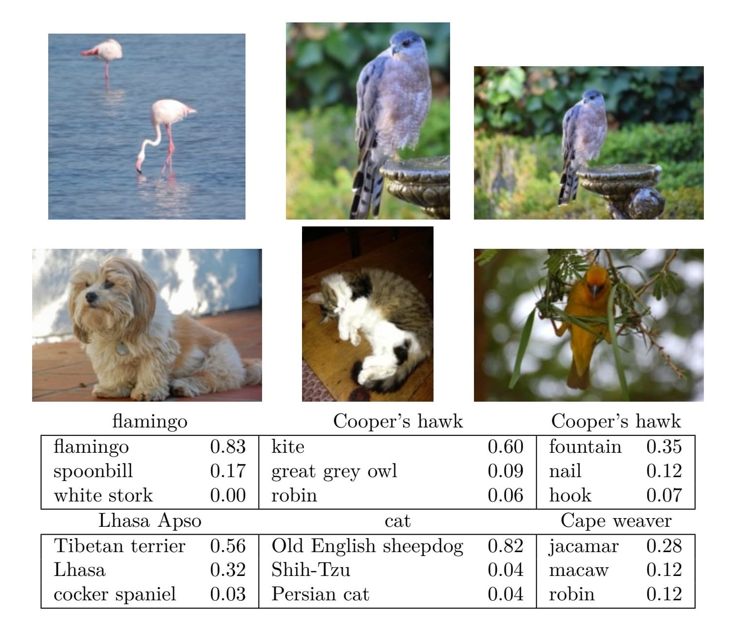
**FIGURE 10.10.** *Classifcation of six photographs using the* resnet50 *CNN trained on the* imagenet *corpus. The table below the images displays the true (intended) label at the top of each panel, and the top three choices of the classifer (out of 100). The numbers are the estimated probabilities for each choice. (A kite is a raptor, but not a hawk.)*
demonstrates the performance of resnet50 on six photographs (private collection of one of the authors).12 The CNN does a reasonable job classifying the hawk in the second image. If we zoom out as in the third image, it gets confused and chooses the fountain rather than the hawk. In the fnal image a "jacamar" is a tropical bird from South and Central America with similar coloring to the South African Cape Weaver. We give more details on this example in Section 10.9.4.
Much of the work in ftting a CNN is in learning the convolution flters at the hidden layers; these are the coeffcients of a CNN. For models ft to massive corpora such as imagenet with many classes, the output of these
12These resnet results can change with time, since the publicly-trained model gets updated periodically.
10.4 Document Classifcation 419
flters can serve as features for general natural-image classifcation problems. One can use these pretrained hidden layers for new problems with much smaller training sets (a process referred to as *weight freezing*), and weight freezing just train the last few layers of the network, which requires much less data. The vignettes and book13 that accompany the keras package give more details on such applications.
eight
freezing
### 10.4 Document Classifcation
In this section we introduce a new type of example that has important applications in industry and science: predicting attributes of documents. Examples of documents include articles in medical journals, Reuters news feeds, emails, tweets, and so on. Our example will be IMDb (Internet Movie Database) ratings — short documents where viewers have written critiques of movies.14 The response in this case is the sentiment of the review, which will be *positive* or *negative*.
Here is the beginning of a rather amusing negative review:
*This has to be one of the worst flms of the 1990s. When my friends & I were watching this flm (being the target audience it was aimed at) we just sat & watched the frst half an hour with our jaws touching the foor at how bad it really was. The rest of the time, everyone else in the theater just started talking to each other, leaving or generally crying into their popcorn ...*
Each review can be a diferent length, include slang or non-words, have spelling errors, etc. We need to fnd a way to *featurize* such a document. featurize This is modern parlance for defning a set of predictors.
The simplest and most common featurization is the *bag-of-words* model. bag-of-words We score each document for the presence or absence of each of the words in a language dictionary — in this case an English dictionary. If the dictionary contains *M* words, that means for each document we create a binary feature vector of length *M*, and score a 1 for every word present, and 0 otherwise. That can be a very wide feature vector, so we limit the dictionary — in this case to the 10,000 most frequently occurring words in the training corpus of 25,000 reviews. Fortunately there are nice tools for doing this automatically. Here is the beginning of a positive review that has been redacted in this way:
⟨*START* ⟩ *this flm was just brilliant casting location scenery story direction everyone's really suited the part they played and*
featurize
bag-of-words
13*Deep Learning with R* by F. Chollet and J.J. Allaire, 2018, Manning Publications.
14For details, see Maas et al. (2011) "Learning word vectors for sentiment analysis", in *Proceedings of the 49th Annual Meeting of the Association for Computational Linguistics: Human Language Technologies*, pages 142–150.
420 10. Deep Learning
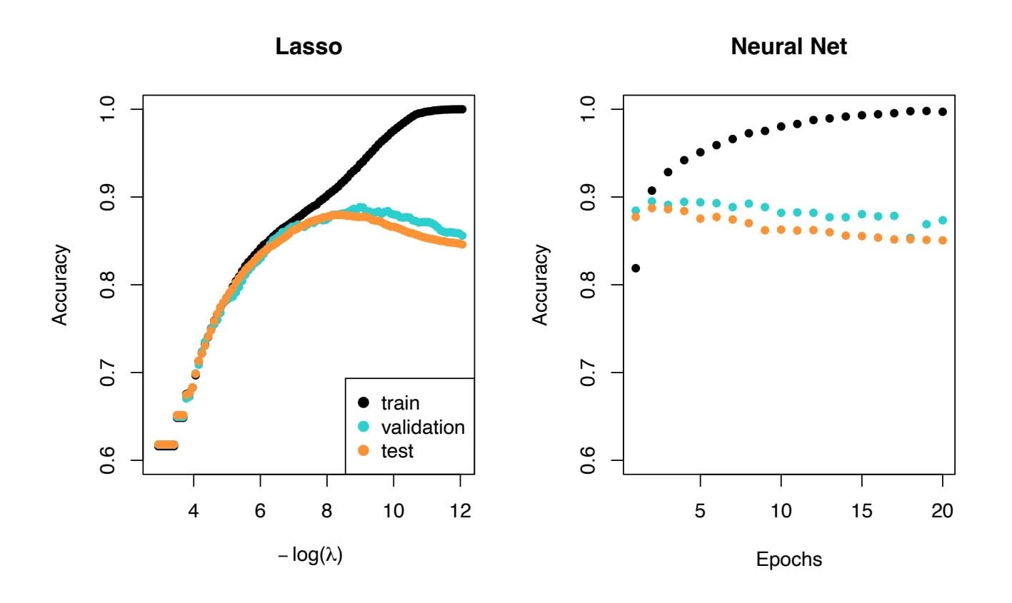
**FIGURE 10.11.** *Accuracy of the lasso and a two-hidden-layer neural network on the* IMDb *data. For the lasso, the x-axis displays* − log(λ)*, while for the neural network it displays epochs (number of times the ftting algorithm passes through the training set). Both show a tendency to overft, and achieve approximately the same test accuracy.*
#### *you could just imagine being there robert* ⟨*UNK* ⟩ *is an amazing actor and now the same being director* ⟨*UNK* ⟩ *father came from the same scottish island as myself so i loved ...*
Here we can see many words have been omitted, and some unknown words (UNK) have been marked as such. With this reduction the binary feature vector has length $10,000$ , and consists mostly of 0's and a smattering of 1's in the positions corresponding to words that are present in the document. We have a training set and test set, each with $25,000$ examples, and each balanced with regard to sentiment. The resulting training feature matrix **X** has dimension $25,000 \times 10,000$ , but only $1.3%$ of the binary entries are non-zero. We call such a matrix sparse, because most of the values are the same (zero in this case); it can be stored efficiently in *sparse matrix format*.15 There are a variety of ways to account for the document length; here we only score a word as in or out of the document, but for example one could instead record the relative frequency of words. We split off a validation set of size $2,000$ from the $25,000$ training observations (for model tuning), and fit two model sequences:
sparse matrix format
15Rather than store the whole matrix, we can store instead the location and values for the nonzero entries. In this case, since the nonzero entries are all 1, just the locations are stored.
10.5 Recurrent Neural Networks 421
- A lasso logistic regression using the glmnet package;
- A two-class neural network with two hidden layers, each with 16 ReLU units.
Both methods produce a sequence of solutions. The lasso sequence is indexed by the regularization parameter λ. The neural-net sequence is indexed by the number of gradient-descent iterations used in the ftting, as measured by training epochs or passes through the training set (Section 10.7). Notice that the training accuracy in Figure 10.11 (black points) increases monotonically in both cases. We can use the validation error to pick a good solution from each sequence (blue points in the plots), which would then be used to make predictions on the test data set.
Note that a two-class neural network amounts to a nonlinear logistic regression model. From (10.12) and (10.13) we can see that
$$
\begin{aligned} \log\left(\frac{\Pr(Y = 1|X)}{\Pr(Y = 0|X)}\right) &= Z_1 - Z_0 \\ &= (\beta_{10} - \beta_{00}) + \sum_{\ell=1}^{K_2} (\beta_{1\ell} - \beta_{0\ell}) A_{\ell}^{(2)}. \end{aligned} \tag{10.15}
$$
(This shows the redundancy in the softmax function; for $K$ classes we really only need to estimate $K - 1$ sets of coefficients. See Section 4.3.5.) In Figure 10.11 we show *accuracy* (fraction correct) rather than classification error (fraction incorrect), the former being more popular in the machine learning community. Both models achieve a test-set accuracy of about 88%.
The bag-of-words model summarizes a document by the words present, and ignores their context. There are at least two popular ways to take the context into account:
- The *bag-of-n-grams* model. For example, a bag of 2-grams records bag-of-*n*grams the consecutive co-occurrence of every distinct pair of words. "Blissfully long" can be seen as a positive phrase in a movie review, while "blissfully short" a negative.
- Treat the document as a sequence, taking account of all the words in the context of those that preceded and those that follow.
In the next section we explore models for sequences of data, which have applications in weather forecasting, speech recognition, language translation, and time-series prediction, to name a few. We continue with this IMDb example there.
### 10.5 Recurrent Neural Networks
Many data sources are sequential in nature, and call for special treatment when building predictive models. Examples include:
ccuracy
422 10. Deep Learning
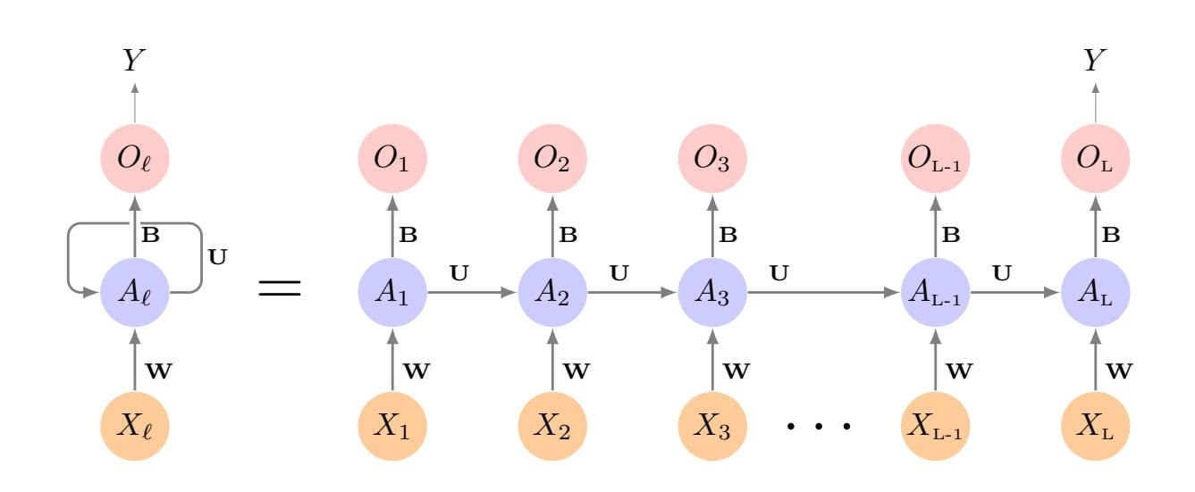
**FIGURE 10.12.** *Schematic of a simple recurrent neural network. The input is a sequence of vectors {X*ℓ*}L* 1 *, and here the target is a single response. The network processes the input sequence X sequentially; each X*ℓ *feeds into the hidden layer, which also has as input the activation vector A*ℓ−1 *from the previous element in the sequence, and produces the current activation vector A*ℓ*. The same collections of weights* W*,* U *and* B *are used as each element of the sequence is processed. The output layer produces a sequence of predictions O*ℓ *from the current activation A*ℓ*, but typically only the last of these, OL, is of relevance. To the left of the equal sign is a concise representation of the network, which is* unrolled *into a more explicit version on the right.*
- Documents such as book and movie reviews, newspaper articles, and tweets. The sequence and relative positions of words in a document capture the narrative, theme and tone, and can be exploited in tasks such as topic classifcation, sentiment analysis, and language translation.
- Time series of temperature, rainfall, wind speed, air quality, and so on. We may want to forecast the weather several days ahead, or climate several decades ahead.
- Financial time series, where we track market indices, trading volumes, stock and bond prices, and exchange rates. Here prediction is often diffcult, but as we will see, certain indices can be predicted with reasonable accuracy.
- Recorded speech, musical recordings, and other sound recordings. We may want to give a text transcription of a speech, or perhaps a language translation. We may want to assess the quality of a piece of music, or assign certain attributes.
- Handwriting, such as doctor's notes, and handwritten digits such as zip codes. Here we want to turn the handwriting into digital text, or read the digits (optical character recognition).
In a *recurrent neural network* (RNN), the input object *X* is a *sequence*. recurrent
neural network
10.5 Recurrent Neural Networks 423
Consider a corpus of documents, such as the collection of IMDb movie reviews. Each document can be represented as a sequence of $L$ words, so $X = \{X_1, X_2, \dots, X_L\}$ , where each $X_\ell$ represents a word. The order of the words, and closeness of certain words in a sentence, convey semantic meaning. RNNs are designed to accommodate and take advantage of the sequential nature of such input objects, much like convolutional neural networks accommodate the spatial structure of image inputs. The output $Y$ can also be a sequence (such as in language translation), but often is a scalar, like the binary sentiment label of a movie review document.
Figure 10.12 illustrates the structure of a very basic RNN with a sequence $X = \{X_1, X_2, \dots, X_L\}$ as input, a simple output $Y$ , and a hidden-layer sequence $\{A_\ell\}_1^L = \{A_1, A_2, \dots, A_L\}$ . Each $X_\ell$ is a vector; in the document example $X_\ell$ could represent a one-hot encoding for the $\ell$ th word based on the language dictionary for the corpus (see the top panel in Figure 10.13 for a simple example). As the sequence is processed one vector $X_\ell$ at a time, the network updates the activations $A_\ell$ in the hidden layer, taking as input the vector $X_\ell$ and the activation vector $A_{\ell-1}$ from the previous step in the sequence. Each $A_\ell$ feeds into the output layer and produces a prediction $O_\ell$ for $Y$ . $O_L$ , the last of these, is the most relevant.
In detail, suppose each vector $X_\ell$ of the input sequence has $p$ components $X_\ell^T = (X_{\ell 1}, X_{\ell 2}, \dots, X_{\ell p})$ , and the hidden layer consists of $K$ units $A_\ell^T = (A_{\ell 1}, A_{\ell 2}, \dots, A_{\ell K})$ . As in Figure 10.4, we represent the collection of $K \times (p + 1)$ shared weights $w_{kj}$ for the input layer by a matrix $\mathbf{W}$ , and similarly $\mathbf{U}$ is a $K \times K$ matrix of the weights $u_{ks}$ for the hidden-to-hidden layers, and $\mathbf{B}$ is a $K + 1$ vector of weights $\beta_k$ for the output layer. Then
$$
A_{\ell k} = g \left( w_{k0} + \sum_{j=1}^{p} w_{kj} X_{\ell j} + \sum_{s=1}^{K} u_{ks} A_{\ell-1,s} \right), \quad (10.16)
$$
and the output $O_ℓ$ is computed as
$$
O_{\ell} = \beta_0 + \sum_{k=1}^{K} \beta_k A_{\ell k} \quad (10.17)
$$
for a quantitative response, or with an additional sigmoid activation function for a binary response, for example. Here $g(·)$ is an activation function such as ReLU. Notice that the same weights $W$ , $U$ and $B$ are used as we process each element in the sequence, i.e. they are not functions of $ℓ$ . This is a form of *weight sharing* used by RNNs, and similar to the use of filters in convolutional neural networks (Section 10.3.1.) As we proceed from beginning to end, the activations $Aℓ$ accumulate a history of what has been seen before, so that the learned context can be used for prediction. *weight sharing*
weight
sharing
For regression problems the loss function for an observation $(X, Y)$ is
$$
(Y - O_{L})^{2}
$$
(10.18)
# 10. Deep Learning
which only references the final output $O_L = \beta_0 + \sum_{k=1}^K \beta_k A_{Lk}$ . Thus $O_1, O_2, \dots, O_{L-1}$ are not used. When we fit the model, each element $X_\ell$ of the input sequence $X$ contributes to $O_L$ via the chain (10.16), and hence contributes indirectly to learning the shared parameters **W**, **U** and **B** via the loss (10.18). With $n$ input sequence/response pairs $(x_i, y_i)$ , the parameters are found by minimizing the sum of squares
$$
\sum_{i=1}^{n} (y_i - o_{iL})^2 = \sum_{i=1}^{n} \left( y_i - \left( \beta_0 + \sum_{k=1}^{K} \beta_k g(w_{k0} + \sum_{j=1}^{p} w_{kj} x_{iLj} + \sum_{s=1}^{K} u_{ks} a_{i,L-1,s}) \right) \right)^2. \quad (10.19)
$$
Here we use lowercase letters for the observed $y_i$ and vector sequences $x_i = {x_{i1}, x_{i2}, \dots, x_{iL}}$ 16 as well as the derived activations.
Since the intermediate outputs $O_\ell$ are not used, one may well ask why they are there at all. First of all, they come for free, since they use the same output weights $\mathbf{B}$ needed to produce $O_L$ , and provide an evolving prediction for the output. Furthermore, for some learning tasks the response is also a sequence, and so the output sequence $\{O_1, O_2, \dots, O_L\}$ is explicitly needed.
When used at full strength, recurrent neural networks can be quite complex. We illustrate their use in two simple applications. In the frst, we continue with the IMDb sentiment analysis of the previous section, where we process the words in the reviews sequentially. In the second application, we illustrate their use in a fnancial time series forecasting problem.
### 10.5.1 Sequential Models for Document Classifcation
Here we return to our classifcation task with the IMDb reviews. Our approach in Section 10.4 was to use the bag-of-words model. Here the plan is to use instead the sequence of words occurring in a document to make predictions about the label for the entire document.
We have, however, a dimensionality problem: each word in our document is represented by a one-hot-encoded vector (dummy variable) with 10,000 elements (one per word in the dictionary)! An approach that has become popular is to represent each word in a much lower-dimensional *embedding* embedding space. This means that rather than representing each word by a binary vector with 9,999 zeros and a single one in some position, we will represent it instead by a set of *m* real numbers, none of which are typically zero. Here *m* is the embedding dimension, and can be in the low 100s, or even less. This means (in our case) that we need a matrix E of dimension *m*×10*,*000, where each column is indexed by one of the 10,000 words in our dictionary, and the values in that column give the *m* coordinates for that word in the embedding space.
16This is a sequence of vectors; each element *xi*ℓ is a *p*-vector.
10.5 Recurrent Neural Networks 425
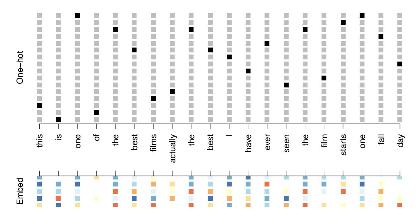
**FIGURE 10.13.** *Depiction of a sequence of* 20 *words representing a single document: one-hot encoded using a dictionary of* 16 *words (top panel) and embedded in an m-dimensional space with m* = 5 *(bottom panel).*
Figure 10.13 illustrates the idea (with a dictionary of 16 rather than 10,000, and *m* = 5). Where does E come from? If we have a large corpus of labeled documents, we can have the neural network *learn* E as part of the optimization. In this case E is referred to as an *embedding layer,* embedding layer and a specialized E is learned for the task at hand. Otherwise we can insert a precomputed matrix E in the embedding layer, a process known as *weight freezing*. Two pretrained embeddings, word2vec and GloVe, are weight widely used.17 These are built from a very large corpus of documents by a variant of principal components analysis (Section 12.2). The idea is that the positions of words in the embedding space preserve semantic meaning; e.g. synonyms should appear near each other.
So far, so good. Each document is now represented as a sequence of $m$ -vectors that represents the sequence of words. The next step is to limit each document to the last $L$ words. Documents that are shorter than $L$ get padded with zeros upfront. So now each document is represented by a series consisting of $L$ vectors $X = {X_1, X_2, \dots, X_L}$ , and each $X_\ell$ in the sequence has $m$ components.
We now use the RNN structure in Figure 10.12. The training corpus consists of *n* separate series (documents) of length *L*, each of which gets processed sequentially from left to right. In the process, a parallel series of hidden activation vectors $A_\ell$ , $\ell = 1, \dots, L$ is created as in (10.16) for each document. $A_\ell$ feeds into the output layer to produce the evolving prediction
embedding
layer
freezing word2vec GloVe
17word2vec is described in Mikolov, Chen, Corrado, and Dean (2013), available at https://code.google.com/archive/p/word2vec. GloVe is described in Pennington, Socher, and Manning (2014), available at https://nlp.stanford.edu/projects/glove.
426 10. Deep Learning
*O*ℓ. We use the fnal value *OL* to predict the response: the sentiment of the review.
This is a simple RNN, and has relatively few parameters. If there are $K$ hidden units, the common weight matrix $\mathbf{W}$ has $K \times (m + 1)$ parameters, the matrix $\mathbf{U}$ has $K \times K$ parameters, and $\mathbf{B}$ has $2(K + 1)$ for the two-class logistic regression as in (10.15). These are used repeatedly as we process the sequence $X = \{X_\ell\}_1^L$ from left to right, much like we use a single convolution filter to process each patch in an image (Section 10.3.1). If the embedding layer $\mathbf{E}$ is learned, that adds an additional $m \times D$ parameters ( $D = 10,000$ here), and is by far the biggest cost.
We fit the RNN as described in Figure 10.12 and the accompanying text to the IMDb data. The model had an embedding matrix $\mathbf{E}$ with $m = 32$ (which was learned in training as opposed to precomputed), followed by a single recurrent layer with $K = 32$ hidden units. The model was trained with dropout regularization on the 25,000 reviews in the designated training set, and achieved a disappointing 76% accuracy on the IMDb test data. A network using the GloVe pretrained embedding matrix $\mathbf{E}$ performed slightly worse.
For ease of exposition we have presented a very simple RNN. More elaborate versions use *long term* and *short term* memory (LSTM). Two tracks of hidden-layer activations are maintained, so that when the activation *A*ℓ is computed, it gets input from hidden units both further back in time, and closer in time — a so-called *LSTM RNN*. With long sequences, this LSTM RNN overcomes the problem of early signals being washed out by the time they get propagated through the chain to the fnal activation vector *AL*.
When we reft our model using the LSTM architecture for the hidden layer, the performance improved to 87% on the IMDb test data. This is comparable with the 88% achieved by the bag-of-words model in Section 10.4. We give details on ftting these models in Section 10.9.6.
Despite this added LSTM complexity, our RNN is still somewhat "entry level". We could probably achieve slightly better results by changing the size of the model, changing the regularization, and including additional hidden layers. However, LSTM models take a long time to train, which makes exploring many architectures and parameter optimization tedious.
RNNs provide a rich framework for modeling data sequences, and they continue to evolve. There have been many advances in the development of RNNs — in architecture, data augmentation, and in the learning algorithms. At the time of this writing (early 2020) the leading RNN confgurations report accuracy above 95% on the IMDb data. The details are beyond the scope of this book.18
LSTM RNN
18An IMDb leaderboard can be found at https://paperswithcode.com/sota/ sentiment-analysis-on-imdb.
10.5 Recurrent Neural Networks 427
### 10.5.2 Time Series Forecasting
Figure 10.14 shows historical trading statistics from the New York Stock Exchange. Shown are three daily time series covering the period December 3, 1962 to December 31, 1986:19
- Log trading volume. This is the fraction of all outstanding shares that are traded on that day, relative to a 100-day moving average of past turnover, on the log scale.
- Dow Jones return. This is the diference between the log of the Dow Jones Industrial Index on consecutive trading days.
- Log volatility. This is based on the absolute values of daily price movements.
Predicting stock prices is a notoriously hard problem, but it turns out that predicting trading volume based on recent past history is more manageable (and is useful for planning trading strategies).
An observation here consists of the measurements $(v_t, r_t, z_t)$ on day $t$ , in this case the values for log\_volume, DJ\_return and log\_volatility. There are a total of $T = 6,051$ such triples, each of which is plotted as a time series in Figure 10.14. One feature that strikes us immediately is that the day-to-day observations are not independent of each other. The series exhibit *auto-correlation* — in this case values nearby in time tend to be similar to each other. This distinguishes time series from other data sets we have encountered, in which observations can be assumed to be independent of each other. To be clear, consider pairs of observations $(v_t, v_{t-\ell})$ , a *lag* of $\ell$ days apart. If we take all such pairs in the $v_t$ series and compute their correlation coefficient, this gives the autocorrelation at lag $\ell$ . Figure 10.15 shows the autocorrelation function for all lags up to 37, and we see considerable correlation.
Another interesting characteristic of this forecasting problem is that the response variable *vt* — log\_volume — is also a predictor! In particular, we will use the past values of log\_volume to predict values in the future.
#### RNN forecaster
We wish to predict a value *vt* from past values *vt*−1*, vt*−2*,...*, and also to make use of past values of the other series *rt*−1*, rt*−2*,...* and *zt*−1*, zt*−2*,...*. Although our combined data is quite a long series with 6,051 trading days, the structure of the problem is diferent from the previous documentclassifcation example.
• We only have one series of data, not 25,000.
uto
correlation
19These data were assembled by LeBaron and Weigend (1998) *IEEE Transactions on Neural Networks*, 9(1): 213–220.
428 10. Deep Learning
**FIGURE 10.14.** *Historical trading statistics from the New York Stock Exchange. Daily values of the normalized log trading volume, DJIA return, and log volatility are shown for a 24-year period from 1962–1986. We wish to predict trading volume on any day, given the history on all earlier days. To the left of the red bar (January 2, 1980) is training data, and to the right test data.*
- We have an entire *series* of targets $v_t$ , and the inputs include past values of this series.
How do we represent this problem in terms of the structure displayed in Figure 10.12? The idea is to extract many short mini-series of input sequences $X = \{X_1, X_2, \dots, X_L\}$ with a predefined length $L$ (called the *lag* in this context), and a corresponding target $Y$ . They have the form
$$
X_1 = \begin{pmatrix} v_{t-L} \\ r_{t-L} \\ z_{t-L} \end{pmatrix}, X_2 = \begin{pmatrix} v_{t-L+1} \\ r_{t-L+1} \\ z_{t-L+1} \end{pmatrix}, \cdots, X_L = \begin{pmatrix} v_{t-1} \\ r_{t-1} \\ z_{t-1} \end{pmatrix}, \text{ and } Y = v_t.
$$
$(10.20)$ So here the target $Y$ is the value of $\text{log\_volume}$ $v_t$ at a single timepoint $t$ , and the input sequence $X$ is the series of 3-vectors $\{X_\ell\}_1^L$ each consisting of the three measurements $\text{log\_volume}$ , $\text{DJ\_return}$ and $\text{log\_volatility}$ from day $t - L$ , $t - L + 1$ , up to $t - 1$ . Each value of $t$ makes a separate $(X, Y)$ .
10.5 Recurrent Neural Networks 429
**FIGURE 10.15.** *The autocorrelation function for* log\_volume*. We see that nearby values are fairly strongly correlated, with correlations above* 0*.*2 *as far as 20 days apart.*
Year **FIGURE 10.16.** *RNN forecast of* log\_volume *on the* NYSE *test data. The black lines are the true volumes, and the superimposed orange the forecasts. The forecasted series accounts for 42% of the variance of* log\_volume*.*
pair, for *t* running from *L* + 1 to *T*. For the NYSE data we will use the past fve trading days to predict the next day's trading volume. Hence, we use *L* = 5. Since *T* = 6*,*051, we can create 6,046 such (*X, Y* ) pairs. Clearly *L* is a parameter that should be chosen with care, perhaps using validation data.
We fit this model with $K = 12$ hidden units using the 4,281 training sequences derived from the data before January 2, 1980 (see Figure 10.14), and then used it to forecast the 1,770 values of log\_volume after this date. We achieve an $R^2 = 0.42$ on the test data. Details are given in Section 10.9.6. As a *straw man*,20 using yesterday's value for log\_volume as the prediction for today has $R^2 = 0.18$ . Figure 10.16 shows the forecast results. We have plotted the observed values of the daily log\_volume for the
20A straw man here refers to a simple and sensible prediction that can be used as a baseline for comparison.
430 10. Deep Learning
test period 1980–1986 in black, and superimposed the predicted series in orange. The correspondence seems rather good.
In forecasting the value of log\_volume in the test period, we have to use the test data itself in forming the input sequences *X*. This may feel like cheating, but in fact it is not; we are always using past data to predict the future.
#### Autoregression
The RNN we just ft has much in common with a traditional *autoregression* autoregression (AR) linear model, which we present now for comparison. We frst consider the response sequence *vt* alone, and construct a response vector y and a matrix M of predictors for least squares regression as follows:
uto-regression
$$
\mathbf{y} = \begin{bmatrix} v_{L+1} \\ v_{L+2} \\ v_{L+3} \\ \vdots \\ v_T \end{bmatrix} \qquad \mathbf{M} = \begin{bmatrix} 1 & v_L & v_{L-1} & \cdots & v_1 \\ 1 & v_{L+1} & v_L & \cdots & v_2 \\ 1 & v_{L+2} & v_{L+1} & \cdots & v_3 \\ \vdots & \vdots & \vdots & \ddots & \vdots \\ 1 & v_{T-1} & v_{T-2} & \cdots & v_{T-L} \end{bmatrix}
$$
(10.21)
M and y each have *T* − *L* rows, one per observation. We see that the predictors for any given response *vt* on day *t* are the previous *L* values of the same series. Fitting a regression of y on M amounts to ftting the model
$$
\hat{v}_t = \hat{\beta}_0 + \hat{\beta}_1 v_{t-1} + \hat{\beta}_2 v_{t-2} + \dots + \hat{\beta}_L v_{t-L}, \quad (10.22)
$$
and is called an order- $L$ autoregressive model, or simply AR( $L$ ). For the NYSE data we can include lagged versions of DJ\_return and log\_volatility, $r_t$ and $z_t$ , in the predictor matrix $M$ , resulting in $3L + 1$ columns. An AR model with $L = 5$ achieves a test $R^2$ of $0.41$ , slightly inferior to the $0.42$ achieved by the RNN.Of course the RNN and AR models are very similar. They both use the same response *Y* and input sequences *X* of length *L* = 5 and dimension *p* = 3 in this case. The RNN processes this sequence from left to right with the same weights W (for the input layer), while the AR model simply treats all *L* elements of the sequence equally as a vector of *L* × *p* predictors — a process called *fattening* in the neural network literature. fattening Of course the RNN also includes the hidden layer activations *A*ℓ which transfer information along the sequence, and introduces additional nonlinearity. From (10.19) with *K* = 12 hidden units, we see that the RNN has 13 + 12 × (1 + 3 + 12) = 205 parameters, compared to the 16 for the AR(5) model.
An obvious extension of the AR model is to use the set of lagged predictors as the input vector to an ordinary feedforward neural network (10.1), and hence add more fexibility. This achieved a test *R*2 = 0*.*42, slightly better than the linear AR, and the same as the RNN.
10.5 Recurrent Neural Networks 431
All the models can be improved by including the variable day\_of\_week corresponding to the day *t* of the target *vt* (which can be learned from the calendar dates supplied with the data); trading volume is often higher on Mondays and Fridays. Since there are fve trading days, this one-hot encodes to fve binary variables. The performance of the AR model improved to *R*2 = 0*.*46 as did the RNN, and the nonlinear AR model improved to *R*2 = 0*.*47.
We used the most simple version of the RNN in our examples here. Additional experiments with the LSTM extension of the RNN yielded small improvements, typically of up to 1% in *R*2 in these examples.
We give details of how we ft all three models in Section 10.9.6.
### 10.5.3 Summary of RNNs
We have illustrated RNNs through two simple use cases, and have only scratched the surface.
There are many variations and enhancements of the simple RNN we used for sequence modeling. One approach we did not discuss uses a onedimensional convolutional neural network, treating the sequence of vectors (say words, as represented in the embedding space) as an image. The convolution flter slides along the sequence in a one-dimensional fashion, with the potential to learn particular phrases or short subsequences relevant to the learning task.
One can also have additional hidden layers in an RNN. For example, with two hidden layers, the sequence *A*ℓ is treated as an input sequence to the next hidden layer in an obvious fashion.
The RNN we used scanned the document from beginning to end; alter-
native *bidirectional* RNNs scan the sequences in both directions. bidirectional In language translation the target is also a sequence of words, in a language diferent from that of the input sequence. Both the input sequence and the target sequence are represented by a structure similar to Figure 10.12, and they share the hidden units. In this so-called *Seq2Seq* Seq2Seq learning, the hidden units are thought to capture the semantic meaning of the sentences. Some of the big breakthroughs in language modeling and translation resulted from the relatively recent improvements in such RNNs.
Algorithms used to ft RNNs can be complex and computationally costly. Fortunately, good software protects users somewhat from these complexities, and makes specifying and ftting these models relatively painless. Many of the models that we enjoy in daily life (like *Google Translate*) use stateof-the-art architectures developed by teams of highly skilled engineers, and have been trained using massive computational and data resources.
bidirectiona
Seq2Seq
432 10. Deep Learning
### 10.6 When to Use Deep Learning
The performance of deep learning in this chapter has been rather impressive. It nailed the digit classifcation problem, and deep CNNs have really revolutionized image classifcation. We see daily reports of new success stories for deep learning. Many of these are related to image classifcation tasks, such as machine diagnosis of mammograms or digital X-ray images, ophthalmology eye scans, annotations of MRI scans, and so on. Likewise there are numerous successes of RNNs in speech and language translation, forecasting, and document modeling. The question that then begs an answer is: *should we discard all our older tools, and use deep learning on every problem with data?* To address this question, we revisit our Hitters dataset from Chapter 6.
This is a regression problem, where the goal is to predict the Salary of a baseball player in 1987 using his performance statistics from 1986. After removing players with missing responses, we are left with 263 players and 19 variables. We randomly split the data into a training set of 176 players (two thirds), and a test set of 87 players (one third). We used three methods for ftting a regression model to these data.
- A linear model was used to ft the training data, and make predictions on the test data. The model has 20 parameters.
- The same linear model was ft with lasso regularization. The tuning parameter was selected by 10-fold cross-validation on the training data. It selected a model with 12 variables having nonzero coeffcients.
- A neural network with one hidden layer consisting of 64 ReLU units was ft to the data. This model has 1,345 parameters.21
Table 10.2 compares the results. We see similar performance for all three models. We report the mean absolute error on the test data, as well as the test *R*2 for each method, which are all respectable (see Exercise 5). We spent a fair bit of time fddling with the confguration parameters of the neural network to achieve these results. It is possible that if we were to spend more time, and got the form and amount of regularization just right, that we might be able to match or even outperform linear regression and the lasso. But with great ease we obtained linear models that work well. Linear models are much easier to present and understand than the neural network, which is essentially a black box. The lasso selected 12 of the 19 variables in making its prediction. So in cases like this we are much better of following the *Occam's razor* principle: when faced with several methods Occam's
razor
21The model was ft by stochastic gradient descent with a batch size of 32 for 1,000 epochs, and 10% dropout regularization. The test error performance fattened out and started to slowly increase after 1,000 epochs. These ftting details are discussed in Section 10.7.
10.6 When to Use Deep Learning 433
| Model | # Parameters | Mean Abs. Error | Test Set R2 |
|-------------------|--------------|-----------------|-------------|
| Linear Regression | 20 | 254.7 | 0.56 |
| Lasso | 12 | 252.3 | 0.51 |
| Neural Network | 1345 | 257.4 | 0.54 |
**TABLE 10.2.** *Prediction results on the* Hitters *test data for linear models ft by ordinary least squares and lasso, compared to a neural network ft by stochastic gradient descent with dropout regularization.*
| | Coefficient | Std. error | t-statistic | p-value |
|-----------|-------------|------------|-------------|----------|
| Intercept | -226.67 | 86.26 | -2.63 | 0.0103 |
| Hits | 3.06 | 1.02 | 3.00 | 0.0036 |
| Walks | 0.181 | 2.04 | 0.09 | 0.9294 |
| CRuns | 0.859 | 0.12 | 7.09 | < 0.0001 |
| PutOuts | 0.465 | 0.13 | 3.60 | 0.0005 |
**TABLE 10.3.** *Least squares coeffcient estimates associated with the regression of* Salary *on four variables chosen by lasso on the* Hitters *data set. This model achieved the best performance on the test data, with a mean absolute error of 224.8. The results reported here were obtained from a regression on the test data, which was not used in ftting the lasso model.*
that give roughly equivalent performance, pick the simplest.
After a bit more exploration with the lasso model, we identifed an even simpler model with four variables. We then reft the linear model with these four variables to the training data (the so-called *relaxed lasso*), and achieved a test mean absolute error of 224.8, the overall winner! It is tempting to present the summary table from this ft, so we can see coeffcients and pvalues; however, since the model was selected on the training data, there would be *selection bias*. Instead, we reft the model on the test data, which was not used in the selection. Table 10.3 shows the results.
We have a number of very powerful tools at our disposal, including neural networks, random forests and boosting, support vector machines and generalized additive models, to name a few. And then we have linear models, and simple variants of these. When faced with new data modeling and prediction problems, it's tempting to always go for the trendy new methods. Often they give extremely impressive results, especially when the datasets are very large and can support the ftting of high-dimensional nonlinear models. However, *if* we can produce models with the simpler tools that perform as well, they are likely to be easier to ft and understand, and potentially less fragile than the more complex approaches. Wherever possible, it makes sense to try the simpler models as well, and then make a choice based on the performance/complexity tradeof.
Typically we expect deep learning to be an attractive choice when the sample size of the training set is extremely large, and when interpretability of the model is not a high priority.
434 10. Deep Learning
### 10.7 Fitting a Neural Network
Fitting neural networks is somewhat complex, and we give a brief overview here. The ideas generalize to much more complex networks. Readers who fnd this material challenging can safely skip it. Fortunately, as we see in the lab at the end of this chapter, good software is available to ft neural network models in a relatively automated way, without worrying about the technical details of the model-ftting procedure.
We start with the simple network depicted in Figure 10.1 in Section 10.1. In model (10.1) the parameters are $\beta = (\beta_0, \beta_1, \dots, \beta_K)$ , as well as each of the $w_k = (w_{k0}, w_{k1}, \dots, w_{kp})$ , $k = 1, \dots, K$ . Given observations $(x_i, y_i)$ , $i = 1, \dots, n$ , we could fit the model by solving a nonlinear least squares problem
$$
\underset{\{w_k\}_{1}^{K}, \beta}{\text{minimize}} \frac{1}{2} \sum_{i=1}^{n} (y_i - f(x_i))^2, \quad (10.23)
$$
where
$$
f(x_i) = \beta_0 + \sum_{k=1}^{K} \beta_k g \left( w_{k0} + \sum_{j=1}^{p} w_{kj} x_{ij} \right). \quad (10.24)
$$
The objective in (10.23) looks simple enough, but because of the nested arrangement of the parameters and the symmetry of the hidden units, it is not straightforward to minimize. The problem is nonconvex in the parameters, and hence there are multiple solutions. As an example, Figure 10.17 shows a simple nonconvex function of a single variable θ; there are two solutions: one is a *local minimum* and the other is a *global minimum*. Fur- local thermore, (10.1) is the very simplest of neural networks; in this chapter we have presented much more complex ones where these problems are compounded. To overcome some of these issues and to protect from overftting, two general strategies are employed when ftting neural networks.
minimum global minimum
• *Slow Learning:* the model is ft in a somewhat slow iterative fashion, using *gradient descent*. The ftting process is then stopped when gradient descent overftting is detected.
gradient
descent
• *Regularization:* penalties are imposed on the parameters, usually lasso or ridge as discussed in Section 6.2.
Suppose we represent all the parameters in one long vector θ. Then we can rewrite the objective in (10.23) as
$$
R(\theta) = \frac{1}{2} \sum_{i=1}^{n} (y_i - f_{\theta}(x_i))^2, \tag{10.25}
$$
where we make explicit the dependence of *f* on the parameters. The idea of gradient descent is very simple.

10.7 Fitting a Neural Network 435
**FIGURE 10.17.** *Illustration of gradient descent for one-dimensional $\theta$ . The objective function $R(\theta)$ is not convex, and has two minima, one at $\theta = -0.46$ (local), the other at $\theta = 1.02$ (global). Starting at some value $\theta^0$ (typically randomly chosen), each step in $\theta$ moves downhill — against the gradient — until it cannot go down any further. Here gradient descent reached the global minimum in 7 steps.*
- 1. Start with a guess θ0 for all the parameters in θ, and set *t* = 0.
- 2. Iterate until the objective (10.25) fails to decrease:
- (a) Find a vector δ that refects a small change in θ, such that θ*t*+1 = θ*t* + δ *reduces* the objective; i.e. such that *R*(θ*t*+1) *< R*(θ*t* ).
- (b) Set *t* ← *t* + 1.
One can visualize (Figure 10.17) standing in a mountainous terrain, and the goal is to get to the bottom through a series of steps. As long as each step goes downhill, we must eventually get to the bottom. In this case we were lucky, because with our starting guess $\theta^{0}$ we end up at the global minimum. In general we can hope to end up at a (good) local minimum.
### 10.7.1 Backpropagation
How do we find the directions to move $θ$ so as to decrease the objective $R(θ)$ in (10.25)? The *gradient* of $R(θ)$ , evaluated at some current value $θ = θ^m$ , is the vector of partial derivatives at that point:
$$
\nabla R(\theta^m) = \left. \frac{\partial R(\theta)}{\partial \theta} \right|_{\theta=\theta^m} \quad (10.26)
$$
The subscript $\theta = \theta^m$ means that after computing the vector of derivatives, we evaluate it at the current guess, $\theta^m$ . This gives the direction in $\theta$ -space in which $R(\theta)$ *increases* most rapidly. The idea of gradient descent is to
436 10. Deep Learning
move $\theta$ a little in the *opposite* direction (since we wish to go downhill):
$$
\theta^{m+1} \leftarrow \theta^m - \rho \nabla R(\theta^m). \quad (10.27)
$$
For a small enough value of the *learning rate* $\rho$ , this step will decrease the objective $R(\theta)$ ; i.e. $R(\theta^{m+1}) \le R(\theta^m)$ . If the gradient vector is zero, then we may have arrived at a minimum of the objective.
How complicated is the calculation $(10.26)$ ? It turns out that it is quite simple here, and remains simple even for much more complex networks, because of the *chain rule* of differentiation.
because of the *chain rule* of differentiation. chain rule
Since $R(\theta) = \sum_{i=1}^{n} R_i(\theta) = \frac{1}{2} \sum_{i=1}^{n} (y_i - f_{\theta}(x_i))^2$ is a sum, its gradient is also a sum over the *n* observations, so we will just examine one of these terms,
$$
R_i(\theta) = \frac{1}{2} \left( y_i - \beta_0 - \sum_{k=1}^K \beta_k g \left( w_{k0} + \sum_{j=1}^p w_{kj} x_{ij} \right) \right)^2.
$$
(10.28)
To simplify the expressions to follow, we write $z_{ik} = w_{k0} + \sum_{j=1}^{p} w_{kj}x_{ij}$ . First we take the derivative with respect to $\beta_k$ :
$$
\begin{array}{rcl} \frac{\partial R_i(\theta)}{\partial \beta_k} & = & \frac{\partial R_i(\theta)}{\partial f_{\theta}(x_i)} \cdot \frac{\partial f_{\theta}(x_i)}{\partial \beta_k} \\ & = & -(y_i - f_{\theta}(x_i)) \cdot g(z_{ik}) \end{array} \tag{10.29}
$$
And now we take the derivative with respect to $w_{kj}$ :
$$
\begin{array}{rcl} \frac{\partial R_i(\theta)}{\partial w_{kj}} & = & \frac{\partial R_i(\theta)}{\partial f_{\theta}(x_i)} \cdot \frac{\partial f_{\theta}(x_i)}{\partial g(z_{ik})} \cdot \frac{\partial g(z_{ik})}{\partial z_{ik}} \cdot \frac{\partial z_{ik}}{\partial w_{kj}} \\ & = & -(y_i - f_{\theta}(x_i)) \cdot \beta_k \cdot g'(z_{ik}) \cdot x_{ij}. \end{array} \tag{10.30}
$$
Notice that both these expressions contain the residual $y_i - f_\theta(x_i)$ . In (10.29) we see that a fraction of that residual gets attributed to each of the hidden units according to the value of $g(z_{ik})$ . Then in (10.30) we see a similar attribution to input $j$ via hidden unit $k$ . So the act of differentiation assigns a fraction of the residual to each of the parameters via the chain rule — a process known as *backpropagation* in the neural network literature. Although these calculations are straightforward, it takes careful bookkeeping to keep track of all the pieces.
backpropagation
### 10.7.2 Regularization and Stochastic Gradient Descent
Gradient descent usually takes many steps to reach a local minimum. In practice, there are a number of approaches for accelerating the process. Also, when $n$ is large, instead of summing (10.29)–(10.30) over all $n$ observations, we can sample a small fraction or *minibatch* of them each time.
minibatch
learning rate
10.7 Fitting a Neural Network 437
**FIGURE 10.18.** *Evolution of training and validation errors for the* MNIST *neural network depicted in Figure 10.4, as a function of training epochs. The objective refers to the log-likelihood (10.14).*
we compute a gradient step. This process is known as *stochastic gradient descent* (SGD) and is the state of the art for learning deep neural networks. stochastic Fortunately, there is very good software for setting up deep learning models, and for ftting them to data, so most of the technicalities are hidden from the user.
gradient descent
We now turn to the multilayer network (Figure 10.4) used in the digit recognition problem. The network has over 235,000 weights, which is around four times the number of training examples. Regularization is essential here to avoid overftting. The frst row in Table 10.1 uses ridge regularization on the weights. This is achieved by augmenting the objective function (10.14) with a penalty term:
$$
R(\theta; \lambda) = -\sum_{i=1}^{n} \sum_{m=0}^{9} y_{im} \log(f_m(x_i)) + \lambda \sum_{j} \theta_j^2 \quad (10.31)
$$
The parameter $\lambda$ is often preset at a small value, or else it is found using the validation-set approach of Section 5.3.1. We can also use different values of $\lambda$ for the groups of weights from different layers; in this case **W**1 and **W**2 were penalized, while the relatively few weights **B** of the output layer were not penalized at all. Lasso regularization is also popular as an additional form of regularization, or as an alternative to ridge.
Figure 10.18 shows some metrics that evolve during the training of the network on the MNIST data. It turns out that SGD naturally enforces its own form of approximately quadratic regularization.22 Here the minibatch
22This and other properties of SGD for deep learning are the subject of much research in the machine learning literature at the time of writing.
438 10. Deep Learning
**FIGURE 10.19.** *Dropout Learning. Left: a fully connected network. Right: network with dropout in the input and hidden layer. The nodes in grey are selected at random, and ignored in an instance of training.*
size was 128 observations per gradient update. The term *epochs* labeling the epochs horizontal axis in Figure 10.18 counts the number of times an equivalent of the full training set has been processed. For this network, 20% of the 60,000 training observations were used as a validation set in order to determine when training should stop. So in fact 48,000 observations were used for training, and hence there are 48*,*000*/*128 ≈ 375 minibatch gradient updates per epoch. We see that the value of the validation objective actually starts to increase by 30 epochs, so *early stopping* can also be used as an additional early stopping form of regularization.
early
stopping
### 10.7.3 Dropout Learning
The second row in Table 10.1 is labeled *dropout*. This is a relatively new and efficient form of regularization, similar in some respects to ridge regularization. Inspired by random forests (Section 8.2), the idea is to randomly remove a fraction $\phi$ of the units in a layer when fitting the model. Figure 10.19 illustrates this. This is done separately each time a training observation is processed. The surviving units stand in for those missing, and their weights are scaled up by a factor of $1/(1 - \phi)$ to compensate. This prevents nodes from becoming over-specialized, and can be seen as a form of regularization. In practice dropout is achieved by randomly setting the activations for the "dropped out" units to zero, while keeping the architecture intact.
### 10.7.4 Network Tuning
The network in Figure 10.4 is considered to be relatively straightforward; it nevertheless requires a number of choices that all have an efect on the performance:
10.8 Interpolation and Double Descent 439
- *The number of hidden layers, and the number of units per layer.* Modern thinking is that the number of units per hidden layer can be large, and overftting can be controlled via the various forms of regularization.
- *Regularization tuning parameters.* These include the dropout rate φ and the strength λ of lasso and ridge regularization, and are typically set separately at each layer.
- *Details of stochastic gradient descent.* These include the batch size, the number of epochs, and if used, details of data augmentation (Section 10.3.4.)
Choices such as these can make a diference. In preparing this MNIST example, we achieved a respectable 1*.*8% misclassifcation error after some trial and error. Finer tuning and training of a similar network can get under 1% error on these data, but the tinkering process can be tedious, and can result in overftting if done carelessly.
### 10.8 Interpolation and Double Descent
Throughout this book, we have repeatedly discussed the bias-variance tradeof, frst presented in Section 2.2.2. This trade-of indicates that statistical learning methods tend to perform the best, in terms of test-set error, for an intermediate level of model complexity. In particular, if we plot "fexibility" on the *x*-axis and error on the *y*-axis, then we generally expect to see that test error has a U-shape, whereas training error decreases monotonically. Two "typical" examples of this behavior can be seen in the right-hand panel of Figure 2.9 on page 31, and in Figure 2.17 on page 42. One implication of the bias-variance trade-of is that it is generally not a good idea to *interpolate* the training data — that is, to get zero training error — since interpolate that will often result in very high test error.
interpolate
However, it turns out that in certain specifc settings it can be possible for a statistical learning method that interpolates the training data to perform well — or at least, better than a slightly less complex model that does not quite interpolate the data. This phenomenon is known as *double descent*, and is displayed in Figure 10.20. "Double descent" gets its name from the fact that the test error has a U-shape before the interpolation threshold is reached, and then it descends again (for a while, at least) as an increasingly fexible model is ft.
We now describe the set-up that resulted in Figure 10.20. We simulated *n* = 20 observations from the model
$$
Y = \sin(X) + \epsilon,
$$
440 10. Deep Learning
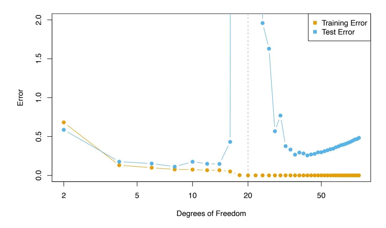
**FIGURE 10.20.** *Double descent phenomenon, illustrated using error plots for a one-dimensional natural spline example. The horizontal axis refers to the number of spline basis functions on the log scale. The training error hits zero when the degrees of freedom coincides with the sample size $n = 20$ , the "interpolation threshold", and remains zero thereafter. The test error increases dramatically at this threshold, but then descends again to a reasonable value before finally increasing again.*
where $X \sim U[-5, 5]$ (uniform distribution), and $\epsilon \sim N(0, \sigma^2)$ with $\sigma = 0.3$ . We then fit a natural spline to the data, as described in Section 7.4, with $d$ degrees of freedom.[23](#23) Recall from Section 7.4 that fitting a natural spline with $d$ degrees of freedom amounts to fitting a least-squares regression of the response onto a set of $d$ basis functions. The upper-left panel of Figure 10.21 shows the data, the true function $f(X)$ , and $\hat{f}_8(X)$ , the fitted natural spline with $d = 8$ degrees of freedom.Next, we fit a natural spline with $d = 20$ degrees of freedom. Since $n = 20$ , this means that $n = d$ , and we have zero training error; in other words, we have interpolated the training data! We can see from the top-right panel of Figure 10.21 that $\hat{f}_{20}(X)$ makes wild excursions, and hence the test error will be large.
We now continue to fit natural splines to the data, with increasing values of *d*. For *d* > 20, the least squares regression of *Y* onto *d* basis functions is not unique: there are an infinite number of least squares coefficient estimates that achieve zero error. To select among them, we choose the one with the smallest sum of squared coefficients, $\sum_{j=1}^{d} \hat{\beta}_j^2$ . This is known as the *minimum-norm* solution.The two lower panels of Figure 10.21 show the minimum-norm natural spline fits with $d = 42$ and $d = 80$ degrees of freedom. Incredibly, $\hat{f}_{42}(X)$
23This implies the choice of $d$ knots, here chosen at $d$ equi-probability quantiles of the training data. When $d > n$ , the quantiles are found by interpolation.440 10. Deep Learning

**FIGURE 10.20.** *Double descent phenomenon, illustrated using error plots for a one-dimensional natural spline example. The horizontal axis refers to the number of spline basis functions on the log scale. The training error hits zero when the degrees of freedom coincides with the sample size $n = 20$ , the "interpolation threshold", and remains zero thereafter. The test error increases dramatically at this threshold, but then descends again to a reasonable value before finally increasing again.*
where $X \sim U[-5, 5]$ (uniform distribution), and $\epsilon \sim N(0, \sigma^2)$ with $\sigma = 0.3$ . We then fit a natural spline to the data, as described in Section 7.4, with $d$ degrees of freedom.[23](#23) Recall from Section 7.4 that fitting a natural spline with $d$ degrees of freedom amounts to fitting a least-squares regression of the response onto a set of $d$ basis functions. The upper-left panel of Figure 10.21 shows the data, the true function $f(X)$ , and $\hat{f}_8(X)$ , the fitted natural spline with $d = 8$ degrees of freedom.Next, we fit a natural spline with $d = 20$ degrees of freedom. Since $n = 20$ , this means that $n = d$ , and we have zero training error; in other words, we have interpolated the training data! We can see from the top-right panel of Figure 10.21 that $\hat{f}_{20}(X)$ makes wild excursions, and hence the test error will be large.
We now continue to fit natural splines to the data, with increasing values of *d*. For *d* > 20, the least squares regression of *Y* onto *d* basis functions is not unique: there are an infinite number of least squares coefficient estimates that achieve zero error. To select among them, we choose the one with the smallest sum of squared coefficients, $\sum_{j=1}^{d} \hat{\beta}_j^2$ . This is known as the *minimum-norm* solution.The two lower panels of Figure 10.21 show the minimum-norm natural spline fits with $d = 42$ and $d = 80$ degrees of freedom. Incredibly, $\hat{f}_{42}(X)$
23This implies the choice of $d$ knots, here chosen at $d$ equi-probability quantiles of the training data. When $d > n$ , the quantiles are found by interpolation.10.8 Interpolation and Double Descent 441
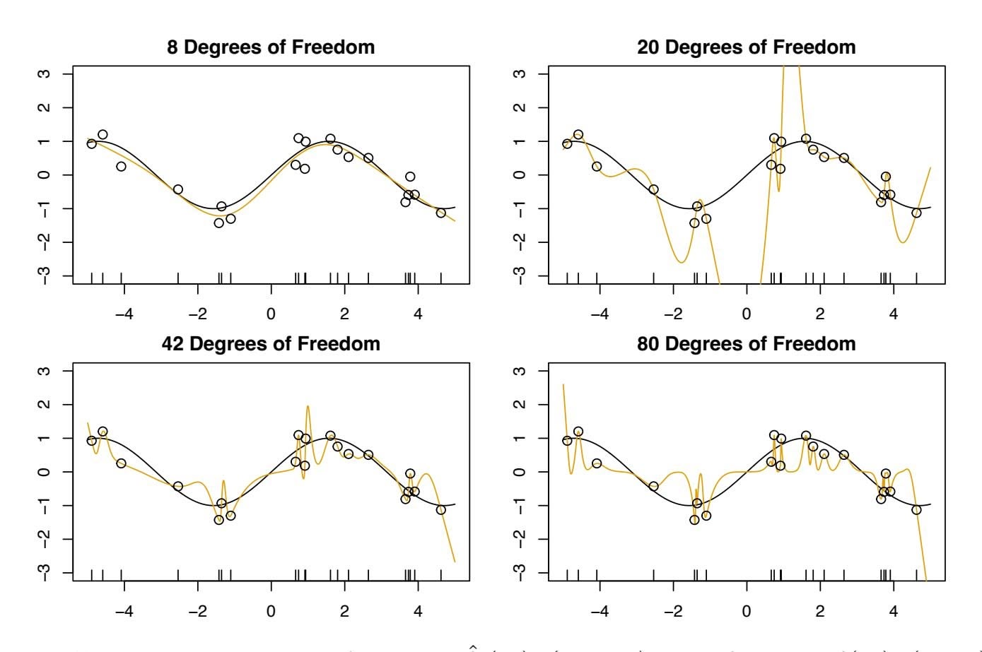
**FIGURE 10.21.** *Fitted functions* $\hat{f}_d(X)$ *(orange), true function* $f(X)$ *(black) and the observed* 20 *training data points. A different value of* $d$ *(degrees of freedom) is used in each panel. For* $d \ge 20$ *the orange curves all interpolate the training points, and hence the training error is zero.*is quite a bit *less* wild than $\hat{f}_{20}(X)$ , *even though it makes use of more degrees of freedom*. And $\hat{f}_{80}(X)$ is not much different. How can this be? Essentially, $\hat{f}_{20}(X)$ is very wild because there is just a single way to interpolate $n = 20$ observations using $d = 20$ basis functions, and that single way results in a somewhat extreme fitted function. By contrast, there are an infinite number of ways to interpolate $n = 20$ observations using $d = 42$ or $d = 80$ basis functions, and the smoothest of them — that is, the minimum norm solution — is much less wild than $\hat{f}_{20}(X)$ !
In Figure 10.20, we display the training error and test error associated with $\hat{f}_d(X)$ , for a range of values of the degrees of freedom $d$ . We see that the training error drops to zero once $d = 20$ and beyond; i.e. once the interpolation threshold is reached. By contrast, the test error shows a *U*-shape for $d \le 20$ , grows extremely large around $d = 20$ , and then shows a second region of descent for $d > 20$ . For this example the signal-to-noise ratio — $\text{Var}(f(X))/\sigma^2$ — is 5.9, which is quite high (the data points are close to the true curve). So an estimate that interpolates the data and does not wander too far inbetween the observed data points will likely do well.
In Figures 10.20 and 10.21, we have illustrated the double descent phenomenon in a simple one-dimensional setting using natural splines. However, it turns out that the same phenomenon can arise for deep learning. Basically, when we fit neural networks with a huge number of parameters, we are sometimes able to get good results with zero training error. This is
442 10. Deep Learning
particularly true in problems with high signal-to-noise ratio, such as natural image recognition and language translation, for example. This is because the techniques used to ft neural networks, including stochastic gradient descent, naturally lend themselves to selecting a "smooth" interpolating model that has good test-set performance on these kinds of problems.
Some points are worth emphasizing:
- *The double-descent phenomenon does not contradict the bias-variance trade-of, as presented in Section 2.2.2.* Rather, the double-descent curve seen in the right-hand side of Figure 10.20 is a consequence of the fact that the *x*-axis displays the number of spline basis functions used, which does not properly capture the true "fexibility" of models that interpolate the training data. Stated another way, in this example, the minimum-norm natural spline with *d* = 42 has lower variance than the natural spline with *d* = 20.
- *Most of the statistical learning methods seen in this book do not exhibit double descent.* For instance, regularization approaches typically do not interpolate the training data, and thus double descent does not occur. This is not a drawback of regularized methods: they can give great results *without interpolating the data*!
In particular, in the examples here, if we had ft the natural splines using ridge regression with an appropriately-chosen penalty rather than least squares, then we would not have seen double descent, and in fact would have obtained better test error results.
- *In Chapter 9, we saw that maximal margin classifers and SVMs that have zero training error nonetheless often achieve very good test error.* This is in part because those methods seek smooth minimum norm solutions. This is similar to the fact that the minimum-norm natural spline can give good results with zero training error.
- *The double-descent phenomenon has been used by the machine learning community to explain the successful practice of using an overparametrized neural network (many layers, and many hidden units), and then ftting all the way to zero training error.* However, ftting to zero error is not always optimal, and whether it is advisable depends on the signal-to-noise ratio. For instance, we may use ridge regularization to avoid overftting a neural network, as in (10.31). In this case, provided that we use an appropriate choice for the tuning parameter λ, we will never interpolate the training data, and thus will not see the double descent phenomenon. Nonetheless we can get very good test-set performance, likely much better than we would have achieved had we interpolated the training data. Early stopping during stochastic gradient descent can also serve as a form of regular-
10.9 Lab: Deep Learning 443
ization that prevents us from interpolating the training data, while still getting very good results on test data.
To summarize: though double descent can sometimes occur in neural networks, we typically do not want to rely on this behavior. Moreover, it is important to remember that the bias-variance trade-of always holds (though it is possible that test error as a function of fexibility may not exhibit a U-shape, depending on how we have parametrized the notion of "fexibility" on the *x*-axis).
# 10.9 Lab: Deep Learning
In this section, we show how to ft the examples discussed in the text. We use the keras package, which interfaces to the tensorflow package which in turn links to effcient python code. This code is impressively fast, and the package is well-structured. A good companion is the text *Deep Learning with R*24, and most of our code is adapted from there.
Getting keras up and running on your computer can be a challenge. The book website www.statlearning.com gives step-by-step instructions on how to achieve this.25 Guidance can also be found at keras.rstudio.com.
Since the frst printing of this book, the torch package has become available as an alternative to the keras package for deep learning. While torch does not require a python installation, the current implementation appears to be a fair bit slower than keras. A version of this lab that makes use of torch is available on the book website.26
### *10.9.1 A Single Layer Network on the Hitters Data*
We start by ftting the models in Section 10.6. We set up the data, and separate out a training and test set.
```
> library(ISLR2)
> Gitters <- na.omit(Hitters)
> n <- nrow(Gitters)
> set.seed(13)
> ntest <- trunc(n / 3)
> testid <- sample(1:n, ntest)
```
The linear model should be familiar, but we present it anyway.
> lfit <- lm(Salary ~ ., data = Gitters[-testid, ])
24F. Chollet and J.J. Allaire, *Deep Learning with R* (2018), Manning Publications.
25Many thanks to Balasubramanian Narasimhan for preparing the keras installation instructions.
26Many thanks to Daniel Falbel and Sigrid Keydana for preparing the torch version of this lab.
444 10. Deep Learning
```
> lpred <- predict(lfit, Gitters[testid, ])
> with(Gitters[testid, ], mean(abs(lpred - Salary)))
[1] 254.6687
```
Notice the use of the with() command: the frst argument is a dataframe, with() and the second an expression that can refer to elements of the dataframe by name. In this instance the dataframe corresponds to the test data and the expression computes the mean absolute prediction error on this data.
Next we ft the lasso using glmnet. Since this package does not use formulas, we create x and y frst.
```
> x <- scale(model.matrix(Salary ∼ . - 1, data = Gitters))
> y <- Gitters$Salary
```
The frst line makes a call to model.matrix(), which produces the same matrix that was used by lm() (the -1 omits the intercept). This function automatically converts factors to dummy variables. The scale() function standardizes the matrix so each column has mean zero and variance one.
```
> library(glmnet)
> cvfit <- cv.glmnet(x[-testid, ], y[-testid],
type.measure = "mae")
> cpred <- predict(cvfit, x[testid, ], s = "lambda.min")
> mean(abs(y[testid] - cpred))
[1] 252.2994
```
To ft the neural network, we frst set up a model structure that describes the network.
```
> library(keras)
> modnn <- keras_model_sequential() %>%
+ layer_dense(units = 50, activation = "relu",
input_shape = ncol(x)) %>%
+ layer_dropout(rate = 0.4) %>%
+ layer_dense(units = 1)
```
We have created a vanilla model object called modnn, and have added details about the successive layers in a sequential manner, using the function keras\_model\_sequential(). The *pipe* operator %>% passes the previous term keras\_model\_ as the frst argument to the next function, and returns the result. It allows us to specify the layers of a neural network in a readable form.
sequential pipe
We illustrate the use of the pipe operator on a simple example. Earlier, we created x using the command
```
> x <- scale(model.matrix(Salary ∼ . - 1, data = Gitters))
```
We frst make a matrix, and then we center each of the variables. Compound expressions like this can be diffcult to parse. We could have obtained the same result using the pipe operator:
> x <- model.matrix(Salary ~ . - 1, data = Gitters) %>% scale()
Using the pipe operator makes it easier to follow the sequence of operations.
10.9 Lab: Deep Learning 445
We now return to our neural network. The object modnn has a single hidden layer with 50 hidden units, and a ReLU activation function. It then has a dropout layer, in which a random 40% of the 50 activations from the previous layer are set to zero during each iteration of the stochastic gradient descent algorithm. Finally, the output layer has just one unit with no activation function, indicating that the model provides a single quantitative output.
Next we add details to modnn that control the ftting algorithm. Here we have simply followed the examples given in the Keras book. We minimize squared-error loss as in (10.23). The algorithm tracks the mean absolute error on the training data, and on validation data if it is supplied.
```
> modnn %>% compile(loss = "mse",
optimizer = optimizer_rmsprop(),
metrics = list("mean_absolute_error")
)
```
In the previous line, the pipe operator passes modnn as the frst argument to compile(). The compile() function does not actually change the R object compile() modnn, but it does communicate these specifcations to the corresponding python instance of this model that has been created along the way.
Now we fit the model. We supply the training data and two fitting parameters, epochs and batch\_size. Using 32 for the latter means that at each step of SGD, the algorithm randomly selects 32 training observations for the computation of the gradient. Recall from Sections 10.4 and 10.7 that an epoch amounts to the number of SGD steps required to process $n$ observations. Since the training set has $n = 176$ , an epoch is $176/32 = 5.5$ SGD steps. The fit() function has an argument validation\_data; these data are not used in the fitting, but can be used to track the progress of the model (in this case reporting the mean absolute error). Here we actually supply the test data so we can see the mean absolute error of both the training data and test data as the epochs proceed. To see more options for fitting, use ?fit.keras.engine.training.Model.
```
> history <- modnn %>% fit(
x[-testid, ], y[-testid], epochs = 1500, batch_size = 32,
validation_data = list(x[testid, ], y[testid])
)
```
We can plot the history to display the mean absolute error for the training and test data. For the best aesthetics, install the ggplot2 package before calling the plot() function. If you have not installed ggplot2, then the code below will still run, but the plot will be less attractive.
> plot(history)
It is worth noting that if you run the fit() command a second time in the same R session, then the ftting process will pick up where it left of. Try re-running the fit() command, and then the plot() command, to see!
compile()
446 10. Deep Learning
Finally, we predict from the fnal model, and evaluate its performance on the test data. Due to the use of SGD, the results vary slightly with each ft. Unfortunately the set.seed() function does not ensure identical results (since the ftting is done in python), so your results will difer slightly.
```
> npred <- predict(modnn, x[testid, ])
> mean(abs(y[testid] - npred))
[1] 257.43
```
### *10.9.2 A Multilayer Network on the MNIST Digit Data*
The keras package comes with a number of example datasets, including the MNIST digit data. Our frst step is to load the MNIST data. The dataset\_mnist() function is provided for this purpose. dataset\_mnist()
taset\_mnist()
```
> mnist <- dataset_mnist()
> x_train <- mnist$train$x
> g_train <- mnist$train$y
> x_test <- mnist$test$x
> g_test <- mnist$test$y
> dim(x_train)
[1] 60000 28 28
> dim(x_test)
[1] 10000 28 28
```
There are 60,000 images in the training data and 10,000 in the test data. The images are 28×28, and stored as a three-dimensional array, so we need to reshape them into a matrix. Also, we need to "one-hot" encode the class label. Luckily keras has a lot of built-in functions that do this for us.
```
> x_train <- array_reshape(x_train, c(nrow(x_train), 784))
> x_test <- array_reshape(x_test, c(nrow(x_test), 784))
> y_train <- to_categorical(g_train, 10)
> y_test <- to_categorical(g_test, 10)
```
Neural networks are somewhat sensitive to the scale of the inputs. For example, ridge and lasso regularization are afected by scaling. Here the inputs are eight-bit27 grayscale values between 0 and 255, so we rescale to the unit interval.
```
> x_train <- x_train / 255
> x_test <- x_test / 255
```
Now we are ready to ft our neural network.
```
> modelnn <- keras_model_sequential()
> modelnn %>%
+ layer_dense(units = 256, activation = "relu",
input_shape = c(784)) %>%
```
27Eight bits means 28, which equals 256. Since the convention is to start at 0, the possible values range from 0 to 255.
10.9 Lab: Deep Learning 447
```
+ layer_dropout(rate = 0.4) %>%
+ layer_dense(units = 128, activation = "relu") %>%
+ layer_dropout(rate = 0.3) %>%
```
```
+ layer_dense(units = 10, activation = "softmax")
```
The frst layer goes from 28 × 28 = 784 input units to a hidden layer of 256 units, which uses the ReLU activation function. This is specifed by a call to layer\_dense(), which takes as input a modelnn object, and returns layer\_dense() a modifed modelnn object. This is then piped through layer\_dropout() to layer\_dropout() perform dropout regularization. The second hidden layer comes next, with 128 hidden units, followed by a dropout layer. The fnal layer is the output layer, with activation "softmax" (10.13) for the 10-class classifcation problem, which defnes the map from the second hidden layer to class probabilities. Finally, we use summary() to summarize the model, and to make sure we got it all right.
```
> summary(modelnn)
```
| ________________________________________________________________ | | | |
|---------------------------------------------------------------------------------------------------------------------------------------------------------------------|--------|-------|------------|
| Layer
(type) | Output | Shape | #
Param |
| ================================================================
dense
(Dense)
________________________________________________________________ | (None, | 256) | 200960 |
| dropout
(Dropout)
________________________________________________________________ | (None, | 256) | 0 |
| dense_1
(Dense)
________________________________________________________________ | (None, | 128) | 32896 |
| dropout_1
(Dropout)
________________________________________________________________ | (None, | 128) | 0 |
| dense_2
(Dense) | (None, | 10) | 1290 |
| ================================================================
Total
params:
235,146
Trainable
params:
235,146
Non-trainable
params:
0 | | | |
The parameters for each layer include a bias term, which results in a parameter count of 235,146. For example, the frst hidden layer involves (784 + 1) × 256 = 200*,*960 parameters.
Notice that the layer names such as dropout\_1 and dense\_2 have subscripts. These may appear somewhat random; in fact, if you ft the same model again, these will change. They are of no consequence: they vary because the model specifcation code is run in python, and these subscripts are incremented every time keras\_model\_sequential() is called.
Next, we add details to the model to specify the ftting algorithm. We ft the model by minimizing the cross-entropy function given by (10.14).
```
> modelnn %>% compile(loss = "categorical_crossentropy",
optimizer = optimizer_rmsprop(), metrics = c("accuracy")
)
```
Now we are ready to go. The fnal step is to supply training data, and ft the model.
layer\_dense()`
`layer\_dropout()
448 10. Deep Learning
```
> system.time(
+ history <- modelnn %>%
+ fit(x_train, y_train, epochs = 30, batch_size = 128,
validation_split = 0.2)
+ )
> plot(history, smooth = FALSE)
```
We have suppressed the output here, which is a progress report on the ftting of the model, grouped by epoch. This is very useful, since on large datasets ftting can take time. Fitting this model took 144 seconds on a 2.9 GHz MacBook Pro with 4 cores and 32 GB of RAM. Here we specifed a validation split of 20%, so the training is actually performed on 80% of the 60,000 observations in the training set. This is an alternative to actually supplying validation data, like we did in Section 10.9.1. See ?fit.keras.engine.training.Model for all the optional ftting arguments. SGD uses batches of 128 observations in computing the gradient, and doing the arithmetic, we see that an epoch corresponds to 375 gradient steps. The last plot() command produces a fgure similar to Figure 10.18.
To obtain the test error in Table 10.1, we frst write a simple function accuracy() that compares predicted and true class labels, and then use it to evaluate our predictions.
```
> accuracy <- function(pred, truth)
+ mean(drop(as.numeric(pred)) == drop(truth))
> modelnn %>% predict(x_test) %>% k_argmax() %>% accuracy(g_test)
[1] 0.9813
```
The table also reports LDA (Chapter 4) and multiclass logistic regression. Although packages such as glmnet can handle multiclass logistic regression, they are quite slow on this large dataset. It is much faster and quite easy to ft such a model using the keras software. We just have an input layer and output layer, and omit the hidden layers!
```
> modellr <- keras_model_sequential() %>%
+ layer_dense(input_shape = 784, units = 10,
activation = "softmax")
> summary(modellr)
________________________________________________________________
Layer (type) Output Shape Param #
================================================================
dense_6 (Dense) (None, 10) 7850
================================================================
Total params: 7,850
Trainable params: 7,850
Non-trainable params: 0
```
We ft the model just as before.
```
> modellr %>% compile(loss = "categorical_crossentropy",
optimizer = optimizer_rmsprop(), metrics = c("accuracy"))
> modellr %>% fit(x_train, y_train, epochs = 30,
batch_size = 128, validation_split = 0.2)
```
10.9 Lab: Deep Learning 449
```
> modellr %>% predict(x_test) %>% k_argmax() %>% accuracy(g_test)
[1] 0.9286
```
### *10.9.3 Convolutional Neural Networks*
In this section we ft a CNN to the CIFAR100 data, which is available in the keras package. It is arranged in a similar fashion as the MNIST data.
```
> cifar100 <- dataset_cifar100()
> names(cifar100)
[1] "train" "test"
> x_train <- cifar100$train$x
> g_train <- cifar100$train$y
> x_test <- cifar100$test$x
> g_test <- cifar100$test$y
> dim(x_train)
[1] 50000 32 32 3
> range(x_train[1,,, 1])
[1] 13 255
```
The array of 50,000 training images has four dimensions: each three-color image is represented as a set of three channels, each of which consists of 32 × 32 eight-bit pixels. We standardize as we did for the digits, but keep the array structure. We one-hot encode the response factors to produce a 100-column binary matrix.
```
> x_train <- x_train / 255
> x_test <- x_test / 255
> y_train <- to_categorical(g_train, 100)
> dim(y_train)
[1] 50000 100
```
Before we start, we look at some of the training images using the jpeg jpeg package; similar code produced Figure 10.5 on page 411.
```
> library(jpeg)
> par(mar = c(0, 0, 0, 0), mfrow = c(5, 5))
> index <- sample(seq(50000), 25)
> for (i in index) plot(as.raster(x_train[i,,, ]))
```
The as.raster() function converts the feature map so that it can be plotted as.raster() as a color image.
Here we specify a moderately-sized CNN for demonstration purposes, similar in structure to Figure 10.8.
```
> model <- keras_model_sequential() %>%
+ layer_conv_2d(filters = 32, kernel_size = c(3, 3),
padding = "same", activation = "relu",
input_shape = c(32, 32, 3)) %>%
+ layer_max_pooling_2d(pool_size = c(2, 2)) %>%
+ layer_conv_2d(filters = 64, kernel_size = c(3, 3),
padding = "same", activation = "relu") %>%
+ layer_max_pooling_2d(pool_size = c(2, 2)) %>%
```
s.raster()
450 10. Deep Learning
```
+ layer_conv_2d(filters = 128, kernel_size = c(3, 3),
padding = "same", activation = "relu") %>%
+ layer_max_pooling_2d(pool_size = c(2, 2)) %>%
+ layer_conv_2d(filters = 256, kernel_size = c(3, 3),
padding = "same", activation = "relu") %>%
+ layer_max_pooling_2d(pool_size = c(2, 2)) %>%
+ layer_flatten() %>%
+ layer_dropout(rate = 0.5) %>%
+ layer_dense(units = 512, activation = "relu") %>%
+ layer_dense(units = 100, activation = "softmax")
> summary(model)
________________________________________________________________
Layer (type) Output Shape Param #
================================================================
conv2d (Conv2D) (None, 32, 32, 32) 896
________________________________________________________________
max_pooling2d (MaxPooling2D (None, 16, 16, 32) 0
________________________________________________________________
conv2d_1 (Conv2D) (None, 16, 16, 64) 18496
________________________________________________________________
max_pooling2d_1 (MaxPooling (None, 8, 8, 64) 0
________________________________________________________________
conv2d_2 (Conv2D) (None, 8, 8, 128) 73856
________________________________________________________________
max_pooling2d_2 (MaxPooling (None, 4, 4, 128) 0
________________________________________________________________
conv2d_3 (Conv2D) (None, 4, 4, 256) 295168
________________________________________________________________
max_pooling2d_3 (MaxPooling (None, 2, 2, 256) 0
________________________________________________________________
flatten (Flatten) (None, 1024) 0
________________________________________________________________
dropout (Dropout) (None, 1024) 0
________________________________________________________________
dense (Dense) (None, 512) 524800
________________________________________________________________
dense_1 (Dense) (None, 100) 51300
================================================================
Total params: 964,516
Trainable params: 964,516
Non-trainable params: 0
```
Notice that we used the padding = "same" argument to layer\_conv\_2D(), layer\_conv\_2D() which ensures that the output channels have the same dimension as the input channels. There are 32 channels in the frst hidden layer, in contrast to the three channels in the input layer. We use a 3 × 3 convolution flter for each channel in all the layers. Each convolution is followed by a maxpooling layer over 2 × 2 blocks. By studying the summary, we can see that the channels halve in both dimensions after each of these max-pooling operations. After the last of these we have a layer with 256 channels of dimension 2 × 2. These are then fattened to a dense layer of size 1,024: in other words, each of the 2 × 2 matrices is turned into a 4-vector, and
layer*conv*2D()
10.9 Lab: Deep Learning 451
put side-by-side in one layer. This is followed by a dropout regularization layer, then another dense layer of size 512, which fnally reaches the softmax output layer.
Finally, we specify the ftting algorithm, and ft the model.
```
> model %>% compile(loss = "categorical_crossentropy",
optimizer = optimizer_rmsprop(), metrics = c("accuracy"))
> history <- model %>% fit(x_train, y_train, epochs = 30,
batch_size = 128, validation_split = 0.2)
> model %>% predict(x_test) %>% k_argmax() %>% accuracy(g_test)
[1] 0.4561
```
This model takes 10 minutes to run and achieves 46% accuracy on the test data. Although this is not terrible for 100-class data (a random classifer gets 1% accuracy), searching the web we see results around 75%. Typically it takes a lot of architecture carpentry, fddling with regularization, and time to achieve such results.
### *10.9.4 Using Pretrained CNN Models*
We now show how to use a CNN pretrained on the imagenet database to classify natural images, and demonstrate how we produced Figure 10.10. We copied six jpeg images from a digital photo album into the directory book\_images. 28 We frst read in the images, and convert them into the array format expected by the keras software to match the specifcations in imagenet. Make sure that your working directory in R is set to the folder in which the images are stored.
```
> img_dir <- "book_images"
> image_names <- list.files(img_dir)
> num_images <- length(image_names)
> x <- array(dim = c(num_images, 224, 224, 3))
> for (i in 1:num_images) {
+ img_path <- paste(img_dir, image_names[i], sep = "/")
+ img <- image_load(img_path, target_size = c(224, 224))
+ x[i,,, ] <- image_to_array(img)
+ }
> x <- imagenet_preprocess_input(x)
```
We then load the trained network. The model has 50 layers, with a fair bit of complexity.
```
> model <- application_resnet50(weights = "imagenet")
> summary(model)
```
Finally, we classify our six images, and return the top three class choices in terms of predicted probability for each.
28These images are available from the data section of www.statlearning.com, the ISL book website. Download book\_images.zip; when clicked it creates the book\_images directory.
452 10. Deep Learning
```
> pred6 <- model %>% predict(x) %>%
+ imagenet_decode_predictions(top = 3)
> names(pred6) <- image_names
> print(pred6)
```
### *10.9.5 IMDb Document Classifcation*
Now we perform document classifcation (Section 10.4) on the IMDb dataset, which is available as part of the keras package. We limit the dictionary size to the 10,000 most frequently-used words and tokens.
```
> max_features <- 10000
> imdb <- dataset_imdb(num_words = max_features)
> c(c(x_train, y_train), c(x_test, y_test)) %<-% imdb
```
The third line is a shortcut for unpacking the list of lists. Each element of x\_train is a vector of numbers between 0 and 9999 (the document), referring to the words found in the dictionary. For example, the frst training document is the positive review on page 419. The indices of the frst 12 words are given below.
```
> x_train[[1]][1:12]
[1] 1 14 22 16 43 530 973 1622 1385 65 458 4468
```
To see the words, we create a function, decode\_review(), that provides a simple interface to the dictionary.
```
> word_index <- dataset_imdb_word_index()
> decode_review <- function(text, word_index) {
+ word <- names(word_index)
+ idx <- unlist(word_index, use.names = FALSE)
+ word <- c("", "", "", "", word)
+ idx <- c(0:3, idx + 3)
+ words <- word[match(text, idx, 2)]
+ paste(words, collapse = " ")
+ }
> decode_review(x_train[[1]][1:12], word_index)
[1] " this film was just brilliant casting location scenery
story direction everyone's"
```
Next we write a function to "one-hot" encode each document in a list of documents, and return a binary matrix in sparse-matrix format.
```
> library(Matrix)
> one_hot <- function(sequences, dimension) {
+ seqlen <- sapply(sequences, length)
+ n <- length(seqlen)
+ rowind <- rep(1:n, seqlen)
+ colind <- unlist(sequences)
+ sparseMatrix(i = rowind, j = colind,
dims = c(n, dimension))
+ }
```
10.9 Lab: Deep Learning 453
To construct the sparse matrix, one supplies just the entries that are nonzero. In the last line we call the function sparseMatrix() and supply the row indices corresponding to each document and the column indices corresponding to the words in each document, since we omit the values they are taken to be all ones. Words that appear more than once in any given document still get recorded as a one.
```
> x_train_1h <- one_hot(x_train, 10000)
> x_test_1h <- one_hot(x_test, 10000)
> dim(x_train_1h)
[1] 25000 10000
> nnzero(x_train_1h) / (25000 * 10000)
[1] 0.01316987
```
Only 1.3% of the entries are nonzero, so this amounts to considerable savings in memory. We create a validation set of size 2,000, leaving 23,000 for training.
```
> set.seed(3)
> ival <- sample(seq(along = y_train), 2000)
```
First we ft a lasso logistic regression model using glmnet() on the training data, and evaluate its performance on the validation data. Finally, we plot the accuracy, acclmv, as a function of the shrinkage parameter, λ. Similar expressions compute the performance on the test data, and were used to produce the left plot in Figure 10.11. The code takes advantage of the sparse-matrix format of x\_train\_1h, and runs in about 5 seconds; in the usual dense format it would take about 5 minutes.
```
> library(glmnet)
> fitlm <- glmnet(x_train_1h[-ival, ], y_train[-ival],
family = "binomial", standardize = FALSE)
> classlmv <- predict(fitlm, x_train_1h[ival, ]) > 0
> acclmv <- apply(classlmv, 2, accuracy, y_train[ival] > 0)
```
We applied the accuracy() function that we wrote in Lab 10.9.2 to every column of the prediction matrix classlmv, and since this is a logical matrix of TRUE/FALSE values, we supply the second argument truth as a logical vector as well.
Before making a plot, we adjust the plotting window.
```
> par(mar = c(4, 4, 4, 4), mfrow = c(1, 1))
> plot(-log(fitlm$lambda), acclmv)
```
Next we ft a fully-connected neural network with two hidden layers, each with 16 units and ReLU activation.
```
> model <- keras_model_sequential() %>%
+ layer_dense(units = 16, activation = "relu",
input_shape = c(10000)) %>%
+ layer_dense(units = 16, activation = "relu") %>%
+ layer_dense(units = 1, activation = "sigmoid")
> model %>% compile(optimizer = "rmsprop",
```
454 10. Deep Learning
```
loss = "binary_crossentropy", metrics = c("accuracy"))
> history <- model %>% fit(x_train_1h[-ival, ], y_train[-ival],
epochs = 20, batch_size = 512,
validation_data = list(x_train_1h[ival, ], y_train[ival]))
```
The history object has a metrics component that records both the training and validation accuracy at each epoch. Figure 10.11 includes test accuracy at each epoch as well. To compute the test accuracy, we rerun the entire sequence above, replacing the last line with
```
> history <- model %>% fit(
x_train_1h[-ival, ], y_train[-ival], epochs = 20,
batch_size = 512, validation_data = list(x_test_1h, y_test)
)
```
### *10.9.6 Recurrent Neural Networks*

In this lab we ft the models illustrated in Section 10.5.
### Sequential Models for Document Classifcation
Here we ft a simple LSTM RNN for sentiment analysis with the IMDb movie-review data, as discussed in Section 10.5.1. We showed how to input the data in 10.9.5, so we will not repeat that here.
We frst calculate the lengths of the documents.
```
> wc <- sapply(x_train, length)
> median(wc)
[1] 178
> sum(wc <= 500) / length(wc)
[1] 0.91568
```
We see that over 91% of the documents have fewer than 500 words. Our RNN requires all the document sequences to have the same length. We hence restrict the document lengths to the last *L* = 500 words, and pad the beginning of the shorter ones with blanks.
```
> maxlen <- 500
> x_train <- pad_sequences(x_train, maxlen = maxlen)
> x_test <- pad_sequences(x_test, maxlen = maxlen)
> dim(x_train)
[1] 25000 500
> dim(x_test)
[1] 25000 500
> x_train[1, 490:500]
[1] 16 4472 113 103 32 15 16 5345 19 178 32
```
The last expression shows the last few words in the frst document. At this stage, each of the 500 words in the document is represented using an integer corresponding to the location of that word in the 10,000-word dictionary. The frst layer of the RNN is an embedding layer of size 32, which will be 10.9 Lab: Deep Learning 455
learned during training. This layer one-hot encodes each document as a matrix of dimension 500×10*,* 000, and then maps these 10*,* 000 dimensions down to 32.
```
> model <- keras_model_sequential() %>%
+ layer_embedding(input_dim = 10000, output_dim = 32) %>%
+ layer_lstm(units = 32) %>%
+ layer_dense(units = 1, activation = "sigmoid")
```
The second layer is an LSTM with 32 units, and the output layer is a single sigmoid for the binary classifcation task.
The rest is now similar to other networks we have ft. We track the test performance as the network is ft, and see that it attains 87% accuracy.
```
> model %>% compile(optimizer = "rmsprop",
loss = "binary_crossentropy", metrics = c("acc"))
> history <- model %>% fit(x_train, y_train, epochs = 10,
batch_size = 128, validation_data = list(x_test, y_test))
> plot(history)
> predy <- predict(model, x_test) > 0.5
> mean(abs(y_test == as.numeric(predy)))
[1] 0.8721
```
#### Time Series Prediction
We now show how to ft the models in Section 10.5.2 for time series prediction. We frst set up the data, and standardize each of the variables.
```
> library(ISLR2)
> xdata <- data.matrix(
NYSE[, c("DJ_return", "log_volume","log_volatility")]
)
> istrain <- NYSE[, "train"]
> xdata <- scale(xdata)
```
The variable istrain contains a TRUE for each year that is in the training set, and a FALSE for each year in the test set.
We frst write functions to create lagged versions of the three time series. We start with a function that takes as input a data matrix and a lag *L*, and returns a lagged version of the matrix. It simply inserts *L* rows of NA at the top, and truncates the bottom.
```
> lagm <- function(x, k = 1) {
+ n <- nrow(x)
+ pad <- matrix(NA, k, ncol(x))
+ rbind(pad, x[1:(n - k), ])
+ }
```
We now use this function to create a data frame with all the required lags, as well as the response variable.
```
> arframe <- data.frame(log_volume = xdata[, "log_volume"],
L1 = lagm(xdata, 1), L2 = lagm(xdata, 2),
```
456 10. Deep Learning
```
L3 = lagm(xdata, 3), L4 = lagm(xdata, 4),
L5 = lagm(xdata, 5)
)
```
If we look at the frst fve rows of this frame, we will see some missing values in the lagged variables (due to the construction above). We remove these rows, and adjust istrain accordingly.
```
> arframe <- arframe[-(1:5), ]
> istrain <- istrain[-(1:5)]
```
We now ft the linear AR model to the training data using lm(), and predict on the test data.
```
> arfit <- lm(log_volume ∼ ., data = arframe[istrain, ])
> arpred <- predict(arfit, arframe[!istrain, ])
> V0 <- var(arframe[!istrain, "log_volume"])
>1- mean((arpred - arframe[!istrain, "log_volume"])^2) / V0
[1] 0.4132
```
The last two lines compute the *R*2 on the test data, as defned in (3.17). We reft this model, including the factor variable day\_of\_week.
```
> arframed <- data.frame(day = NYSE[-(1:5), "day_of_week"], arframe
)
> arfitd <- lm(log_volume ∼ ., data = arframed[istrain, ])
> arpredd <- predict(arfitd, arframed[!istrain, ])
>1- mean((arpredd - arframe[!istrain, "log_volume"])^2) / V0
[1] 0.4599
```
To fit the RNN, we need to reshape these data, since it expects a sequence of $L = 5$ feature vectors $X = \{X_\ell\}_1^L$ for each observation, as in (10.20) on page 428. These are lagged versions of the time series going back $L$ time points.
```
> n <- nrow(arframe)
> xrnn <- data.matrix(arframe[, -1])
> xrnn <- array(xrnn, c(n, 3, 5))
> xrnn <- xrnn[,, 5:1]
> xrnn <- aperm(xrnn, c(1, 3, 2))
> dim(xrnn)
[1] 6046 5 3
```
We have done this in four steps. The frst simply extracts the *n*×15 matrix of lagged versions of the three predictor variables from arframe. The second converts this matrix to an *n*×3×5 array. We can do this by simply changing the dimension attribute, since the new array is flled column wise. The third step reverses the order of lagged variables, so that index 1 is furthest back in time, and index 5 closest. The fnal step rearranges the coordinates of the array (like a partial transpose) into the format that the RNN module in keras expects.
Now we are ready to proceed with the RNN, which uses 12 hidden units.
10.9 Lab: Deep Learning 457
```
> model <- keras_model_sequential() %>%
+ layer_simple_rnn(units = 12,
input_shape = list(5, 3),
dropout = 0.1, recurrent_dropout = 0.1) %>%
+ layer_dense(units = 1)
> model %>% compile(optimizer = optimizer_rmsprop(),
loss = "mse")
```
We specify two forms of dropout for the units feeding into the hidden layer. The frst is for the input sequence feeding into this layer, and the second is for the previous hidden units feeding into the layer. The output layer has a single unit for the response.
We ft the model in a similar fashion to previous networks. We supply the fit function with test data as validation data, so that when we monitor its progress and plot the history function we can see the progress on the test data. Of course we should not use this as a basis for early stopping, since then the test performance would be biased.
```
> history <- model %>% fit(
xrnn[istrain,, ], arframe[istrain, "log_volume"],
batch_size = 64, epochs = 200,
validation_data =
list(xrnn[!istrain,, ], arframe[!istrain, "log_volume"])
)
> kpred <- predict(model, xrnn[!istrain,, ])
>1- mean((kpred - arframe[!istrain, "log_volume"])^2) / V0
[1] 0.416
```
This model takes about one minute to train.
We could replace the keras\_model\_sequential() command above with the following command:
```
> model <- keras_model_sequential() %>%
+ layer_flatten(input_shape = c(5, 3)) %>%
+ layer_dense(units = 1)
```
Here, layer\_flatten() simply takes the input sequence and turns it into a long vector of predictors. This results in a linear AR model. To ft a nonlinear AR model, we could add in a hidden layer.
However, since we already have the matrix of lagged variables from the AR model that we ft earlier using the lm() command, we can actually ft a nonlinear AR model without needing to perform fattening. We extract the model matrix x from arframed, which includes the day\_of\_week variable.
```
> x <- model.matrix(log_volume ∼ . - 1, data = arframed)
> colnames(x)
[1] "dayfri" "daymon" "daythur"
[4] "daytues" "daywed" "L1.DJ_return"
[7] "L1.log_volume" "L1.log_volatility" "L2.DJ_return"
[10] "L2.log_volume" "L2.log_volatility" "L3.DJ_return"
[13] "L3.log_volume" "L3.log_volatility" "L4.DJ_return"
[16] "L4.log_volume" "L4.log_volatility" "L5.DJ_return"
[19] "L5.log_volume" "L5.log_volatility"
```
458 10. Deep Learning
The -1 in the formula avoids the creation of a column of ones for the intercept. The variable day\_of\_week is a fve-level factor (there are fve trading days), and the -1 results in fve rather than four dummy variables.
The rest of the steps to ft a nonlinear AR model should by now be familiar.
```
> arnnd <- keras_model_sequential() %>%
+ layer_dense(units = 32, activation = 'relu',
input_shape = ncol(x)) %>%
+ layer_dropout(rate = 0.5) %>%
+ layer_dense(units = 1)
> arnnd %>% compile(loss = "mse",
optimizer = optimizer_rmsprop())
> history <- arnnd %>% fit(
x[istrain, ], arframe[istrain, "log_volume"], epochs = 100,
batch_size = 32, validation_data =
list(x[!istrain, ], arframe[!istrain, "log_volume"])
)
> plot(history)
> npred <- predict(arnnd, x[!istrain, ])
>1- mean((arframe[!istrain, "log_volume"] - npred)^2) / V0
[1] 0.4698
```
# 10.10 Exercises
### *Conceptual*
- 1. Consider a neural network with two hidden layers: *p* = 4 input units, 2 units in the frst hidden layer, 3 units in the second hidden layer, and a single output.
- (a) Draw a picture of the network, similar to Figures 10.1 or 10.4.
- (b) Write out an expression for *f*(*X*), assuming ReLU activation functions. Be as explicit as you can!
- (c) Now plug in some values for the coeffcients and write out the value of *f*(*X*).
- (d) How many parameters are there?
- 2. Consider the *softmax* function in (10.13) (see also (4.13) on page 141) for modeling multinomial probabilities.
- (a) In (10.13), show that if we add a constant *c* to each of the *z*ℓ, then the probability is unchanged.
- (b) In (4.13), show that if we add constants *cj , j* = 0*,* 1*,...,p*, to each of the corresponding coeffcients for each of the classes, then the predictions at any new point *x* are unchanged.
10.10 Exercises 459
This shows that the softmax function is *over-parametrized*. However, overregularization and SGD typically constrain the solutions so that this parametrized is not a problem.
- 3. Show that the negative multinomial log-likelihood (10.14) is equivalent to the negative log of the likelihood expression (4.5) when there are *M* = 2 classes.
- 4. Consider a CNN that takes in 32 × 32 grayscale images and has a single convolution layer with three 5 × 5 convolution flters (without boundary padding).
- (a) Draw a sketch of the input and frst hidden layer similar to Figure 10.8.
- (b) How many parameters are in this model?
- (c) Explain how this model can be thought of as an ordinary feedforward neural network with the individual pixels as inputs, and with constraints on the weights in the hidden units. What are the constraints?
- (d) If there were no constraints, then how many weights would there be in the ordinary feed-forward neural network in (c)?
- 5. In Table 10.2 on page 433, we see that the ordering of the three methods with respect to mean absolute error is diferent from the ordering with respect to test set *R*2. How can this be?
### *Applied*
- 6. Consider the simple function *R*(β) = sin(β) + β*/*10.
- (a) Draw a graph of this function over the range β ∈ [−6*,* 6].
- (b) What is the derivative of this function?
- (c) Given β0 = 2*.*3, run gradient descent to fnd a local minimum of *R*(β) using a learning rate of ρ = 0*.*1. Show each of β0*,* β1*,...* in your plot, as well as the fnal answer.
- (d) Repeat with β0 = 1*.*4.
- 7. Fit a neural network to the Default data. Use a single hidden layer with 10 units, and dropout regularization. Have a look at Labs 10.9.1– 10.9.2 for guidance. Compare the classifcation performance of your model with that of linear logistic regression.
- 8. From your collection of personal photographs, pick 10 images of animals (such as dogs, cats, birds, farm animals, etc.). If the subject does not occupy a reasonable part of the image, then crop the image.
### 10. Deep Learning
Now use a pretrained image classifcation CNN as in Lab 10.9.4 to predict the class of each of your images, and report the probabilities for the top fve predicted classes for each image.
- 9. Fit a lag-5 autoregressive model to the NYSE data, as described in the text and Lab 10.9.6. Reft the model with a 12-level factor representing the month. Does this factor improve the performance of the model?
- 10. In Section 10.9.6, we showed how to ft a linear AR model to the NYSE data using the lm() function. However, we also mentioned that we can "fatten" the short sequences produced for the RNN model in order to ft a linear AR model. Use this latter approach to ft a linear AR model to the NYSE data. Compare the test *R*2 of this linear AR model to that of the linear AR model that we ft in the lab. What are the advantages/disadvantages of each approach?
- 11. Repeat the previous exercise, but now ft a nonlinear AR model by "fattening" the short sequences produced for the RNN model.
- 12. Consider the RNN ft to the NYSE data in Section 10.9.6. Modify the code to allow inclusion of the variable day\_of\_week, and ft the RNN. Compute the test *R*2.
- 13. Repeat the analysis of Lab 10.9.5 on the IMDb data using a similarly structured neural network. There we used a dictionary of size 10,000. Consider the efects of varying the dictionary size. Try the values 1000, 3000, 5000, and 10,000, and compare the results.
# 11 Survival Analysis and Censored Data
In this chapter, we will consider the topics of *survival analysis* and *censored* survival analysis *data*. These arise in the analysis of a unique kind of outcome variable: the *time until an event occurs*.
censored data
For example, suppose that we have conducted a fve-year medical study, in which patients have been treated for cancer. We would like to ft a model to predict patient survival time, using features such as baseline health measurements or type of treatment. At frst pass, this may sound like a regression problem of the kind discussed in Chapter 3. But there is an important complication: hopefully some or many of the patients have survived until the end of the study. Such a patient's survival time is said to be *censored*: we know that it is at least fve years, but we do not know its true value. We do not want to discard this subset of surviving patients, as the fact that they survived at least fve years amounts to valuable information. However, it is not clear how to make use of this information using the techniques covered thus far in this textbook.
Though the phrase "survival analysis" evokes a medical study, the applications of survival analysis extend far beyond medicine. For example, consider a company that wishes to model *churn*, the process by which customers cancel subscription to a service. The company might collect data on customers over some time period, in order to model each customer's time to cancellation as a function of demographics or other predictors. However, presumably not all customers will have canceled their subscription by the end of this time period; for such customers, the time to cancellation is censored.
### 11. Survival Analysis and Censored Data
In fact, survival analysis is relevant even in application areas that are unrelated to time. For instance, suppose we wish to model a person's weight as a function of some covariates, using a dataset with measurements for a large number of people. Unfortunately, the scale used to weigh those people is unable to report weights above a certain number. Then, any weights that exceed that number are censored. The survival analysis methods presented in this chapter could be used to analyze this dataset.
Survival analysis is a very well-studied topic within statistics, due to its critical importance in a variety of applications, both in and out of medicine. However, it has received relatively little attention in the machine learning community.
# 11.1 Survival and Censoring Times
For each individual, we suppose that there is a true *survival time*, *T*, as well survival time as a true *censoring time*, *C*. (The survival time is also known as the *failure* censoring time *time* or the *event time*.) The survival time represents the time at which the event of interest occurs: for instance, the time at which the patient dies, or the customer cancels his or her subscription. By contrast, the censoring time is the time at which censoring occurs: for example, the time at which the patient drops out of the study or the study ends.
failure time event time
We observe either the survival time *T* or else the censoring time *C*. Specifcally, we observe the random variable
$$
Y = \min(T, C). \quad (11.1)
$$
In other words, if the event occurs before censoring (i.e. $T < C$ ) then we observe the true survival time $T$ ; however, if censoring occurs before the event ( $T > C$ ) then we observe the censoring time. We also observe a status indicator,
$$
\delta = \begin{cases} 1 & \text{if } T \le C \\ 0 & \text{if } T > C. \end{cases}
$$
Thus, δ = 1 if we observe the true survival time, and δ = 0 if we instead observe the censoring time.
Now, suppose we observe $n$ $(Y, \delta)$ pairs, which we denote as $(y_1, \delta_1), \dots, (y_n, \delta_n)$ . Figure 11.1 displays an example from a (fictitious) medical study in which we observe $n = 4$ patients for a 365-day follow-up period. For patients 1 and 3, we observe the time to event (such as death or disease relapse) $T = t_i$ . Patient 2 was alive when the study ended, and patient 4 dropped out of the study, or was "lost to follow-up"; for these patients we observe $C = c_i$ . Therefore, $y_1 = t_1$ , $y_3 = t_3$ , $y_2 = c_2$ , $y_4 = c_4$ , $\delta_1 = \delta_3 = 1$ , and $\delta_2 = \delta_4 = 0$ .
11.2 A Closer Look at Censoring 463
**FIGURE 11.1.** *Illustration of censored survival data. For patients 1 and 3, the event was observed. Patient 2 was alive when the study ended. Patient 4 dropped out of the study.*
# 11.2 A Closer Look at Censoring
In order to analyze survival data, we need to make some assumptions about *why* censoring has occurred. For instance, suppose that a number of patients drop out of a cancer study early because they are very sick. An analysis that does not take into consideration the reason why the patients dropped out will likely overestimate the true average survival time. Similarly, suppose that males who are very sick are more likely to drop out of the study than females who are very sick. Then a comparison of male and female survival times may wrongly suggest that males survive longer than females.
In general, we need to assume that the censoring mechanism is *independent*: conditional on the features, the event time *T* is independent of the censoring time *C*. The two examples above violate the assumption of independent censoring. Typically, it is not possible to determine from the data itself whether the censoring mechanism is independent. Instead, one has to carefully consider the data collection process in order to determine whether independent censoring is a reasonable assumption. In the remainder of this chapter, we will assume that the censoring mechanism is independent.1
In this chapter, we focus on *right censoring*, which occurs when $T \ge Y$ , i.e. the true event time $T$ is at least as large as the observed time $Y$ . (Notice that $T \ge Y$ is a consequence of (11.1). Right censoring derives its name from the fact that time is typically displayed from left to right, as in Figure 11.1.) However, other types of censoring are possible. For instance, in *left censoring*, the true event time $T$ is less than or equal to the observed
1The assumption of independent censoring can be relaxed somewhat using the notion of *non-informative censoring*; however, the defnition of non-informative censoring is too technical for this book.
464 11. Survival Analysis and Censored Data
time *Y* . For example, in a study of pregnancy duration, suppose that we survey patients 250 days after conception, when some have already had their babies. Then we know that for those patients, pregnancy duration is less than 250 days. More generally, *interval censoring* refers to the setting in which we do not know the exact event time, but we know that it falls in some interval. For instance, this setting arises if we survey patients once per week in order to determine whether the event has occurred. While left censoring and interval censoring can be accommodated using variants of the ideas presented in this chapter, in what follows we focus specifcally on right censoring.
# 11.3 The Kaplan–Meier Survival Curve
The *survival curve*, or *survival function*, is defned as survival
$$
S(t) = \Pr(T > t).
$$
*(11.2) survival curve*
function
This decreasing function quantifes the probability of surviving past time *t*. For example, suppose that a company is interested in modeling customer churn. Let *T* represent the time that a customer cancels a subscription to the company's service. Then *S*(*t*) represents the probability that a customer cancels later than time *t*. The larger the value of *S*(*t*), the less likely that the customer will cancel before time *t*.
In this section, we will consider the task of estimating the survival curve. Our investigation is motivated by the BrainCancer dataset, which contains the survival times for patients with primary brain tumors undergoing treatment with stereotactic radiation methods.2 The predictors are gtv (gross tumor volume, in cubic centimeters); sex (male or female); diagnosis (meningioma, LG glioma, HG glioma, or other); loc (the tumor location: either infratentorial or supratentorial); ki (Karnofsky index); and stereo (stereotactic method: either stereotactic radiosurgery or fractionated stereotactic radiotherapy, abbreviated as SRS and SRT, respectively). Only 53 of the 88 patients were still alive at the end of the study.
Now, we consider the task of estimating the survival curve [\(11.2\)](#11.2) for these data. To estimate $S(20) = \Pr(T > 20)$ , the probability that a patient survives for at least $t = 20$ months, it is tempting to simply compute the proportion of patients who are known to have survived past 20 months, i.e. the proportion of patients for whom $Y > 20$ . This turns out to be $48/88$ , or approximately 55%. However, this does not seem quite right, since $Y$ and $T$ represent different quantities. In particular, 17 of the 40 patients
2This dataset is described in the following paper: Selingerová et al. (2016) Survival of patients with primary brain tumors: Comparison of two statistical approaches. PLoS One, 11(2):e0148733.
11.3 The Kaplan–Meier Survival Curve 465
who did not survive to 20 months were actually censored, and this analysis implicitly assumes that *T <* 20 for all of those censored patients; of course, we do not know whether that is true.
Alternatively, to estimate $S(20)$ , we could consider computing the proportion of patients for whom $Y > 20$ , out of the 71 patients who were *not* censored by time $t = 20$ ; this comes out to $48/71$ , or approximately 68%. However, this is not quite right either, since it amounts to completely ignoring the patients who were censored before time $t = 20$ , even though the *time* at which they are censored is potentially informative. For instance, a patient who was censored at time $t = 19.9$ likely would have survived past $t = 20$ had he or she not been censored.
We have seen that estimating $S(t)$ is complicated by the presence of censoring. We now present an approach to overcome these challenges. We let $d_1 < d_2 < \dots < d_K$ denote the $K$ unique death times among the non-censored patients, and we let $q_k$ denote the number of patients who died at time $d_k$ . For $k = 1, \dots, K$ , we let $r_k$ denote the number of patients alive and in the study just before $d_k$ ; these are the *at risk* patients. The set of patients that are at risk at a given time are referred to as the *risk set*.
By the law of total probability,3
By the law of total probability,³
risk set
$$
\Pr(T > d_k) = \Pr(T > d_k | T > d_{k-1}) \Pr(T > d_{k-1}) + \Pr(T > d_k | T \le d_{k-1}) \Pr(T \le d_{k-1}).
$$
The fact that $d_{k-1} < d_k$ implies that $Pr(T > d_k | T ≤ d_{k-1}) = 0$ (it is impossible for a patient to survive past time $d_k$ if he or she did not survive until an earlier time $d_{k-1}$ ). Therefore,
$$
S(d_k) = \Pr(T > d_k) = \Pr(T > d_k | T > d_{k-1}) \Pr(T > d_{k-1}).
$$
Plugging in (11.2) again, we see that
$$
S(d_k) = \Pr(T > d_k | T > d_{k-1}) S(d_{k-1}).
$$
This implies that
$$
S(d_k) = \Pr(T > d_k | T > d_{k-1}) \times \cdots \times \Pr(T > d_2 | T > d_1) \Pr(T > d_1).
$$
We now must simply plug in estimates of each of the terms on the righthand side of the previous equation. It is natural to use the estimator
$$
\Pr(T > d_j | T > d_{j-1}) = \frac{r_j - q_j}{r_j},
$$
which is the fraction of the risk set at time *dj* who survived past time *dj* . This leads to the *Kaplan–Meier estimator* of the survival curve: Kaplan–
Kaplan-
Meier
3The law of total probability states that for any two events *A* and *B* estimator , Pr(*A*) = Pr(*A|B*) Pr(*B*) + Pr(*A|Bc*) Pr(*Bc*), where *Bc* is the complement of the event *B*, i.e. it is the event that *B* does not hold.
466 11. Survival Analysis and Censored Data
**FIGURE 11.2.** *For the* BrainCancer *data, we display the Kaplan–Meier survival curve (solid curve), along with standard error bands (dashed curves).*
$$
\widehat{S}(d_k) = \prod_{j=1}^k \left( \frac{r_j - q_j}{r_j} \right) \quad (11.3)
$$
For times $t$ between $d_k$ and $d_{k+1}$ , we set $\widehat{S}(t) = \widehat{S}(d_k)$ . Consequently, the Kaplan–Meier survival curve has a step-like shape.
The Kaplan–Meier survival curve for the BrainCancer data is displayed in Figure 11.2. Each point in the solid step-like curve shows the estimated probability of surviving past the time indicated on the horizontal axis. The estimated probability of survival past 20 months is 71%, which is quite a bit higher than the naive estimates of 55% and 68% presented earlier.
The sequential construction of the Kaplan–Meier estimator — starting at time zero and mapping out the observed events as they unfold in time is fundamental to many of the key techniques in survival analysis. These include the log-rank test of Section 11.4, and Cox's proportional hazard model of Section 11.5.2.
# 11.4 The Log-Rank Test
We now continue our analysis of the BrainCancer data introduced in Section 11.3. We wish to compare the survival of males to that of females. Figure 11.3 shows the Kaplan–Meier survival curves for the two groups. Females seem to fare a little better up to about 50 months, but then the two curves both level of to about 50%. How can we carry out a formal test of equality of the two survival curves?
At frst glance, a two-sample *t*-test seems like an obvious choice: we could test whether the mean survival time among the females equals the mean
11.4 The Log-Rank Test 467
**FIGURE 11.3.** *For the* BrainCancer *data, Kaplan–Meier survival curves for males and females are displayed.*
| | Group 1 | Group 2 | Total |
|----------|-------------------|-------------------|-------------|
| Died | $q_{1k}$ | $q_{2k}$ | $q_k$ |
| Survived | $r_{1k} - q_{1k}$ | $r_{2k} - q_{2k}$ | $r_k - q_k$ |
| Total | $r_{1k}$ | $r_{2k}$ | $r_k$ |
**TABLE 11.1.** *Among the set of patients at risk at time dk, the number of patients who died and survived in each of two groups is reported.*
survival time among the males. But the presence of censoring again creates a complication. To overcome this challenge, we will conduct a *log-rank test*, 4 log-rank test which examines how the events in each group unfold sequentially in time.
Recall from Section 11.3 that $d_1 < d_2 < \dots < d_K$ are the unique death times among the non-censored patients, $r_k$ is the number of patients at risk at time $d_k$ , and $q_k$ is the number of patients who died at time $d_k$ . We further define $r_{1k}$ and $r_{2k}$ to be the number of patients in groups 1 and 2, respectively, who are at risk at time $d_k$ . Similarly, we define $q_{1k}$ and $q_{2k}$ to be the number of patients in groups 1 and 2, respectively, who died at time $d_k$ . Note that $r_{1k} + r_{2k} = r_k$ and $q_{1k} + q_{2k} = q_k$ .
At each death time *dk*, we construct a 2 × 2 table of counts of the form shown in Table 11.1. Note that if the death times are unique (i.e. no two individuals die at the same time), then one of *q*1*k* and *q*2*k* equals one, and the other equals zero.
The main idea behind the log-rank test statistic is as follows. In order to test *H*0 : E(*X*) = *µ* for some random variable *X*, one approach is to
log-rank test
4The log-rank test is also known as the *Mantel–Haenszel test* or *Cochran–Mantel– Haenszel test*.
### 11. Survival Analysis and Censored Data
construct a test statistic of the form
$$
W = \frac{X - \mu}{\sqrt{\text{Var}(X)}}. \quad (11.4)
$$
To construct the log-rank test statistic, we compute a quantity that takes exactly the form (11.4), with $X = \sum_{k=1}^{K} q_{1k}$ , where $q_{1k}$ is given in the top left of Table 11.1.
In greater detail, if there is no diference in survival between the two groups, and conditioning on the row and column totals in Table 11.1, the expected value of *q*1*k* is
$$
\mu_k = \frac{r_{1k}}{r_k} q_k \quad (11.5)
$$
So the expected value of *X* = )*K k*=1 *q*1*k* is *µ* = )*K k*=1 *r*1*k rk qk*. Furthermore, it can be shown5 that the variance of *q*1*k* is
$$
\text{Var}(q_{1k}) = \frac{q_k (r_{1k}/r_k)(1 - r_{1k}/r_k)(r_k - q_k)}{r_k - 1} \quad (11.6)
$$
Though *q*11*,...,q*1*K* may be correlated, we nonetheless estimate
$$
\operatorname{Var}\left(\sum_{k=1}^{K} q_{1k}\right) \approx \sum_{k=1}^{K} \operatorname{Var}\left(q_{1k}\right) = \sum_{k=1}^{K} \frac{q_k (r_{1k}/r_k)(1 - r_{1k}/r_k)(r_k - q_k)}{r_k - 1} \quad (11.7)
$$
Therefore, to compute the log-rank test statistic, we simply proceed as in (11.4), with $X = \sum_{k=1}^{K} q_{1k}$ , making use of (11.5) and (11.7). That is, we calculate
$$
W = \frac{\sum_{k=1}^{K} (q_{1k} - \mu_k)}{\sqrt{\sum_{k=1}^{K} \text{Var}(q_{1k})}} = \frac{\sum_{k=1}^{K} (q_{1k} - \frac{q_k}{r_k} r_{1k})}{\sqrt{\sum_{k=1}^{K} \frac{q_k(r_{1k}/r_k)(1 - r_{1k}/r_k)(r_k - q_k)}{r_k - 1}}} \quad (11.8)
$$
When the sample size is large, the log-rank test statistic *W* has approximately a standard normal distribution; this can be used to compute a *p*-value for the null hypothesis that there is no diference between the survival curves in the two groups.6
Comparing the survival times of females and males on the BrainCancer data gives a log-rank test statistic of *W* = 1*.*2, which corresponds to a twosided *p*-value of 0*.*2 using the theoretical null distribution, and a *p*-value of 0*.*25 using the permutation null distribution with 1,000 permutations.
5For details, see Exercise 7 at the end of this chapter.
6Alternatively, we can estimate the *p*-value via permutations, using ideas that will be presented in Section 13.5. The permutation distribution is obtained by randomly swapping the labels for the observations in the two groups.
11.5 Regression Models With a Survival Response 469
Thus, we cannot reject the null hypothesis of no diference in survival curves between females and males.
The log-rank test is closely related to Cox's proportional hazards model, which we discuss in Section 11.5.2.
# 11.5 Regression Models With a Survival Response
We now consider the task of fitting a regression model to survival data. As in Section 11.1, the observations are of the form $(Y, \delta)$ , where $Y = \min(T, C)$ is the (possibly censored) survival time, and $\delta$ is an indicator variable that equals 1 if $T \le C$ . Furthermore, $X \in \mathbb{R}^p$ is a vector of $p$ features. We wish to predict the true survival time $T$ .
Since the observed quantity $Y$ is positive and may have a long right tail, we might be tempted to fit a linear regression of $\log(Y)$ on $X$ . But as the reader will surely guess, censoring again creates a problem since we are actually interested in predicting $T$ and not $Y$ . To overcome this difficulty, we instead make use of a sequential construction, similar to the constructions of the Kaplan–Meier survival curve in Section 11.3 and the log-rank test in Section 11.4.
### *11.5.1 The Hazard Function*
The *hazard function* or *hazard rate* — also known as the *force of mortality* hazard — is formally defned as function
$$
h(t) = \lim_{\Delta t \to 0} \frac{\Pr(t < T \le t + \Delta t | T > t)}{\Delta t}, \tag{11.9}
$$
where $T$ is the (unobserved) survival time. It is the death rate in the instant after time $t$ , given survival past that time.7 In (11.9), we take the limit as $\Delta t$ approaches zero, so we can think of $\Delta t$ as being an extremely tiny number. Thus, more informally, (11.9) implies that
$$
h(t) \approx \frac{\Pr(t < T \leq t + \Delta t | T > t)}{\Delta t}
$$
for some arbitrarily small ∆*t*.
Why should we care about the hazard function? First of all, it is closely related to the survival curve (11.2), as we will see next. Second, it turns out
7Due to the ∆*t* in the denominator of (11.9), the hazard function is a rate of death, rather than a probability of death. However, higher values of *h*(*t*) directly correspond to a higher probability of death, just as higher values of a probability density function correspond to more likely outcomes for a random variable. In fact, *h*(*t*) is the probability density function for *T* conditional on *T >t*.
### 11. Survival Analysis and Censored Data
that a key approach for modeling survival data as a function of covariates relies heavily on the hazard function; we will introduce this approach — Cox's proportional hazards model — in Section 11.5.2.
We now consider the hazard function $h(t)$ in a bit more detail. Recall that for two events $A$ and $B$ , the probability of $A$ given $B$ can be expressed as $Pr(A | B) = Pr(A \cap B) / Pr(B)$ , i.e. the probability that $A$ and $B$ both occur divided by the probability that $B$ occurs. Furthermore, recall from (11.2) that $S(t) = Pr(T > t)$ . Thus,
$$
h(t) = \lim_{\Delta t \to 0} \frac{\Pr((t < T \le t + \Delta t) \cap (T > t)) / \Delta t}{\Pr(T > t)}
$$
$$
= \lim_{\Delta t \to 0} \frac{\Pr(t < T \le t + \Delta t) / \Delta t}{\Pr(T > t)}
$$
$= \frac{f(t)}{S(t)} \quad (11.10)$
where
$$
f(t) = \lim_{\Delta t \to 0} \frac{\Pr(t < T \le t + \Delta t)}{\Delta t} \quad (11.11)
$$
is the *probability density function* associated with $T$ , i.e. it is the instantaneous rate of death at time $t$ . The second equality in (11.10) made use of the fact that if $t < T \le t + \Delta t$ , then it must be the case that $T > t$ .
density function
Equation 11.10 implies a relationship between the hazard function $h(t)$ , the survival function $S(t)$ , and the probability density function $f(t)$ . In fact, these are three equivalent ways8 of describing the distribution of $T$ .
The likelihood associated with the *i*th observation is
$$
L_i = \begin{cases} f(y_i) & \text{if the } i\text{th observation is not censored} \\ S(y_i) & \text{if the } i\text{th observation is censored} \end{cases}
$$
$$
L_i = f(y_i)^{\delta_i} S(y_i)^{1 - \delta_i} \quad (11.12)
$$
The intuition behind (11.12) is as follows: if $Y = y_i$ and the $i$ th observation is not censored, then the likelihood is the probability of dying in a tiny interval around time $y_i$ . If the $i$ th observation is censored, then the likelihood is the probability of surviving at least until time $y_i$ . Assuming that the $n$ observations are independent, the likelihood for the data takes the form
$$
L = \prod_{i=1}^{n} f(y_i)^{\delta_i} S(y_i)^{1-\delta_i} = \prod_{i=1}^{n} h(y_i)^{\delta_i} S(y_i), \qquad (11.13)
$$
where the second equality follows from (11.10).
We now consider the task of modeling the survival times. If we assume exponential survival, i.e. that the probability density function of the survival
8See Exercise 8.
11.5 Regression Models With a Survival Response 471
time $T$ takes the form $f(t) = \lambda \exp(-\lambda t)$ , then estimating the parameter $\lambda$ by maximizing the likelihood in (11.13) is straightforward.9 Alternatively, we could assume that the survival times are drawn from a more flexible family of distributions, such as the Gamma or Weibull family. Another possibility is to model the survival times non-parametrically, as was done in Section 11.3 using the Kaplan–Meier estimator.
However, what we would really like to do is model the survival time *as a function of the covariates*. To do this, it is convenient to work directly with the hazard function, instead of the probability density function.10 One possible approach is to assume a functional form for the hazard function $h(t|x_i)$ , such as $h(t|x_i) = \exp \left( \beta_0 + \sum_{j=1}^p \beta_j x_{ij} \right)$ , where the exponent function guarantees that the hazard function is non-negative. Note that the exponential hazard function is special, in that it does not vary with time.11 Given $h(t|x_i)$ , we could calculate $S(t|x_i)$ . Plugging these equations into (11.13), we could then maximize the likelihood in order to estimate the parameter $\beta = (\beta_0, \beta_1, \dots, \beta_p)^T$ . However, this approach is quite restrictive, in the sense that it requires us to make a very stringent assumption on the form of the hazard function $h(t|x_i)$ . In the next section, we will consider a much more flexible approach.
### *11.5.2 Proportional Hazards*
The Proportional Hazards Assumption
The *proportional hazards assumption* states that proportional
$$
h(t|x_i) = h_0(t) \exp\left(\sum_{j=1}^p x_{ij} \beta_j\right), \qquad (11.14)
$$
hazards assumption
where $h_0(t) \ge 0$ is an unspecified function, known as the *baseline hazard*. It is the hazard function for an individual with features $x_{i1} = \dots = x_{ip} = 0$ . The name "proportional hazards" arises from the fact that the hazard function for an individual with feature vector $x_i$ is some unknown function $h_0(t)$ times the factor $\exp \left( \sum_{j=1}^p x_{ij}\beta_j \right)$ . The quantity $\exp \left( \sum_{j=1}^p x_{ij}\beta_j \right)$ is called the *relative risk* for the feature vector $x_i = (x_{i1}, \dots, x_{ip})^T$ , relative to that for the feature vector $x_i = (0, \dots, 0)^T$ .
9See Exercise 9.
10Given the close relationship between the hazard function *h*(*t*) and the density function *f*(*t*) explored in Exercise 8, posing an assumption about the form of the hazard function is closely related to posing an assumption about the form of the density function, as was done in the previous paragraph.
11The notation *h*(*t|xi*) indicates that we are now considering the hazard function for the *i*th observation conditional on the values of the covariates, *xi*.
472 11. Survival Analysis and Censored Data
**FIGURE 11.4.** Top: *In a simple example with p* = 1 *and a binary covariate xi* ∈ *{*0*,* 1*}, the log hazard and the survival function under the model* (11.14) *are shown (green for xi* = 0 *and black for xi* = 1*). Because of the proportional hazards assumption* (11.14)*, the log hazard functions difer by a constant, and the survival functions do not cross.* Bottom: *Again we have a single binary covariate xi* ∈ *{*0*,* 1*}. However, the proportional hazards assumption* (11.14) *does not hold. The log hazard functions cross, as do the survival functions.*
What does it mean that the baseline hazard function $h_0(t)$ in (11.14) is unspecified? Basically, we make no assumptions about its functional form. We allow the instantaneous probability of death at time $t$ , given that one has survived at least until time $t$ , to take any form. This means that the hazard function is very flexible and can model a wide range of relationships between the covariates and survival time. Our only assumption is that a one-unit increase in $x_{ij}$ corresponds to an increase in $h(t|x_i)$ by a factor of $\exp(\beta_j)$ .
An illustration of the proportional hazards assumption (11.14) is given in Figure 11.4, in a simple setting with a single binary covariate *xi* ∈ *{*0*,* 1*}* (so that *p* = 1). In the top row, the proportional hazards assumption (11.14) holds. Thus, the hazard functions of the two groups are a constant multiple of each other, so that on the log scale, the gap between them is constant. Furthermore, the survival curves never cross, and in fact the gap between the survival curves tends to (initially) increase over time. By contrast, in the bottom row, (11.14) does not hold. We see that the log hazard functions for the two groups cross, as do the survival curves.
11.5 Regression Models With a Survival Response 473
#### Cox's Proportional Hazards Model
Because the form of $h_0(t)$ in the proportional hazards assumption (11.14) is unknown, we cannot simply plug $h(t|x_i)$ into the likelihood (11.13) and then estimate $\beta = (\beta_1, \dots, \beta_p)^T$ by maximum likelihood. The magic of *Cox's proportional hazards model* lies in the fact that it is in fact possible to estimate $\beta$ without having to specify the form of $h_0(t)$ .
To accomplish this, we make use of the same “sequential in time” logic that we used to derive the Kaplan–Meier survival curve and the log-rank test. For simplicity, assume that there are no ties among the failure, or death, times: i.e. each failure occurs at a distinct time. Assume that $δ_i = 1$ , i.e. the $i$ th observation is uncensored, and thus $y_i$ is its failure time. Then the hazard function for the $i$ th observation at time $y_i$ is $h(y_i|x_i) = h_0(y_i) \exp \left( \sum_{j=1}^p x_{ij}\beta_j \right)$ , and the total hazard at time $y_i$ for the at risk observations[12](#12) is
$$
\sum_{i':y_{i'} \geq y_i} h_0(y_i) \exp\left(\sum_{j=1}^p x_{i'j} \beta_j\right).
$$
Therefore, the probability that the *i*th observation is the one to fail at time *yi* (as opposed to one of the other observations in the risk set) is
$$
\frac{h_0(y_i) \exp\left(\sum_{j=1}^p x_{ij}\beta_j\right)}{\sum_{i':y_{i'}\ge y_i} h_0(y_{i'}) \exp\left(\sum_{j=1}^p x_{i'j}\beta_j\right)} = \frac{\exp\left(\sum_{j=1}^p x_{ij}\beta_j\right)}{\sum_{i':y_{i'}\ge y_i} \exp\left(\sum_{j=1}^p x_{i'j}\beta_j\right)}.
$$
Notice that the unspecifed baseline hazard function *h*0(*yi*) cancels out of the numerator and denominator!
The *partial likelihood* is simply the product of these probabilities over all partial likelihood of the uncensored observations,
partial likelihood
$$
PL(\beta) = \prod_{i:\delta_i=1} \frac{\exp\left(\sum_{j=1}^p x_{ij}\beta_j\right)}{\sum_{i':y_{i'} \geq y_i} \exp\left(\sum_{j=1}^p x_{i'j}\beta_j\right)} \quad (11.16)
$$
Critically, the partial likelihood is valid regardless of the true value of $h_0(t)$ , making the model very flexible and robust.13
To estimate $\beta$ , we simply maximize the partial likelihood (11.16) with respect to $\beta$ . As was the case for logistic regression in Chapter 4, no closed-form solution is available, and so iterative algorithms are required.
proportional hazards model
12Recall that the "at risk" observations at time *yi* are those that are still at risk of
failure, i.e. those that have not yet failed or been censored before time *yi*. 13In general, the partial likelihood is used in settings where it is diffcult to compute the full likelihood for all of the parameters. Instead, we compute a likelihood for just the parameters of primary interest: in this case, β1*,...,* β*p*. It can be shown that maximizing (11.16) provides good estimates for these parameters.
### 11. Survival Analysis and Censored Data
In addition to estimating $\beta$ , we can also obtain other model outputs that we saw in the context of least squares regression in Chapter 3 and logistic regression in Chapter 4. For example, we can obtain *p*-values corresponding to particular null hypotheses (e.g. $H_0 : \beta_j = 0$ ), as well as confidence intervals associated with the coefficients.
### Connection With The Log-Rank Test
Suppose we have just a single predictor ( $p = 1$ ), which we assume to be binary, i.e. $x_i \in \{0, 1\}$ . In order to determine whether there is a difference between the survival times of the observations in the group $\{i : x_i = 0\}$ and those in the group $\{i : x_i = 1\}$ , we can consider taking two possible approaches:
*Approach #1:* Fit a Cox proportional hazards model, and test the null hypothesis $H_0 : \beta = 0$ . (Since $p = 1$ , $\beta$ is a scalar.)*Approach #2:* Perform a log-rank test to compare the two groups, as in Section 11.4.Which one should we prefer?
In fact, there is a close relationship between these two approaches. In particular, when taking Approach #1, there are a number of possible ways to test $H_0$ . One way is known as a score test. It turns out that in the case of a single binary covariate, the score test for $H_0 : \beta = 0$ in Cox's proportional hazards model is exactly equal to the log-rank test. In other words, it does not matter whether we take Approach #1 or Approach #2!
Additional DetailsThe discussion of Cox's proportional hazards model glossed over a few subtleties:
- There is no intercept in (11.14) nor in the equations that follow, because an intercept can be absorbed into the baseline hazard *h*0(*t*).
- We have assumed that there are no tied failure times. In the case of ties, the exact form of the partial likelihood (11.16) is a bit more complicated, and a number of computational approximations must be used.
- (11.16) is known as the *partial* likelihood because it is not exactly a likelihood. That is, it does not correspond exactly to the probability of the data under the assumption (11.14). However, it is a very good approximation.
- We have focused only on estimation of the coeffcients β = (β1*,...,* β*p*)*T* . However, at times we may also wish to estimate the baseline hazard
11.5 Regression Models With a Survival Response 475
$h_0(t)$ , for instance so that we can estimate the survival curve $S(t|x)$ for an individual with feature vector $x$ . The details are beyond the scope of this book. Estimation of $h_0(t)$ is implemented in the lifelines package in Python, which we will see in Section 11.8.
### *11.5.3 Example: Brain Cancer Data*
Table 11.2 shows the result of fitting the proportional hazards model to the BrainCancer data, which was originally described in Section 11.3. The coefficient column displays $\hat{\beta}_j$ . The results indicate, for instance, that the estimated hazard for a male patient is $e^{0.18} = 1.2$ times greater than for a female patient: in other words, with all other features held fixed, males have a 1.2 times greater chance of dying than females, at any point in time. However, the *p*-value is 0.61, which indicates that this difference between males and females is not significant.
As another example, we also see that each one-unit increase in the Karnofsky index corresponds to a multiplier of exp(−0*.*05) = 0*.*95 in the instantaneous chance of dying. In other words, the higher the Karnofsky index, the lower the chance of dying at any given point in time. This efect is highly signifcant, with a *p*-value of 0*.*0027.
| | Coefficient | Std. error | z-statistic | p-value |
|----------------------|-------------|------------|-------------|---------|
| sex[Male] | 0.18 | 0.36 | 0.51 | 0.61 |
| diagnosis[LG Glioma] | 0.92 | 0.64 | 1.43 | 0.15 |
| diagnosis[HG Glioma] | 2.15 | 0.45 | 4.78 | 0.00 |
| diagnosis[Other] | 0.89 | 0.66 | 1.35 | 0.18 |
| loc[Supratentorial] | 0.44 | 0.70 | 0.63 | 0.53 |
| ki | -0.05 | 0.02 | -3.00 | <0.01 |
| gtv | 0.03 | 0.02 | 1.54 | 0.12 |
| stereo[SRT] | 0.18 | 0.60 | 0.30 | 0.77 |
**TABLE 11.2.** *Results for Cox's proportional hazards model ft to the* BrainCancer *data, which was frst described in Section 11.3. The variable* diagnosis *is qualitative with four levels: meningioma, LG glioma, HG glioma, or other. The variables* sex*,* loc*, and* stereo *are binary.*
### *11.5.4 Example: Publication Data*
Next, we consider the dataset Publication involving the time to publication of journal papers reporting the results of clinical trials funded by the National Heart, Lung, and Blood Institute.14 For 244 trials, the time in
14This dataset is described in the following paper: Gordon et al. (2013) Publication of trials funded by the National Heart, Lung, and Blood Institute. New England Journal of Medicine, 369(20):1926–1934.
476 11. Survival Analysis and Censored Data
**FIGURE 11.5.** *Survival curves for time until publication for the* Publication *data described in Section 11.5.4, stratified by whether or not the study produced a positive result.*months until publication is recorded. Of the 244 trials, only 156 were published during the study period; the remaining studies were censored. The covariates include whether the trial focused on a clinical endpoint (clinend), whether the trial involved multiple centers (multi), the funding mechanism within the National Institutes of Health (mech), trial sample size (sampsize), budget (budget), impact (impact, related to the number of citations), and whether the trial produced a positive (significant) result (posres). The last covariate is particularly interesting, as a number of studies have suggested that positive trials have a higher publication rate.
Figure 11.5 shows the Kaplan–Meier curves for the time until publication, stratified by whether or not the study produced a positive result. We see slight evidence that time until publication is lower for studies with a positive result. However, the log-rank test yields a very unimpressive *p*-value of 0.36.
We now consider a more careful analysis that makes use of all of the available predictors. The results of fitting Cox's proportional hazards model using all of the available features are shown in Table 11.3. We find that the chance of publication of a study with a positive result is $e^{0.55} = 1.74$ times higher than the chance of publication of a study with a negative result at any point in time, holding all other covariates fixed. The very small $p$ -value associated with posres in Table 11.3 indicates that this result is highly significant. This is striking, especially in light of our earlier finding that a log-rank test comparing time to publication for studies with positive versus negative results yielded a $p$ -value of 0.36. How can we explain this discrepancy? The answer stems from the fact that the log-rank test did not consider any other covariates, whereas the results in Table 11.3 are based on a Cox model using all of the available covariates. In other words, after we adjust for all of the other covariates, then whether or not the study yielded a positive result is highly predictive of the time to publication.
| | Coefficient | Std. error | z-statistic | p-value |
|---------------|-------------|------------|-------------|---------|
| posres[Yes] | 0.55 | 0.18 | 3.02 | 0.00 |
| multi[Yes] | 0.15 | 0.31 | 0.47 | 0.64 |
| clinend[Yes] | 0.51 | 0.27 | 1.89 | 0.06 |
| mech[K01] | 1.05 | 1.06 | 1.00 | 0.32 |
| mech[K23] | -0.48 | 1.05 | -0.45 | 0.65 |
| mech[P01] | -0.31 | 0.78 | -0.40 | 0.69 |
| mech[P50] | 0.60 | 1.06 | 0.57 | 0.57 |
| mech[R01] | 0.10 | 0.32 | 0.30 | 0.76 |
| mech[R18] | 1.05 | 1.05 | 0.99 | 0.32 |
| mech[R21] | -0.05 | 1.06 | -0.04 | 0.97 |
| mech[R24,K24] | 0.81 | 1.05 | 0.77 | 0.44 |
| mech[R42] | -14.78 | 3414.38 | -0.00 | 1.00 |
| mech[R44] | -0.57 | 0.77 | -0.73 | 0.46 |
| mech[RC2] | -14.92 | 2243.60 | -0.01 | 0.99 |
| mech[U01] | -0.22 | 0.32 | -0.70 | 0.48 |
| mech[U54] | 0.47 | 1.07 | 0.44 | 0.66 |
| sampsize | 0.00 | 0.00 | 0.19 | 0.85 |
| budget | 0.00 | 0.00 | 1.67 | 0.09 |
| impact | 0.06 | 0.01 | 8.23 | 0.00 |
11.5 Regression Models With a Survival Response 477
**TABLE 11.3.** *Results for Cox's proportional hazards model ft to the* Publication *data, using all of the available features. The features* posres*,* multi*, and* clinend *are binary. The feature* mech *is qualitative with 14 levels; it is coded so that the baseline level is* Contract*.*
In order to gain more insight into this result, in Figure 11.6 we display estimates of the survival curves associated with positive and negative results, adjusting for the other predictors. To produce these survival curves, we estimated the underlying baseline hazard $h_0(t)$ . We also needed to select representative values for the other predictors; we used the mean value for each predictor, except for the categorical predictor mech, for which we used the most prevalent category (R01). Adjusting for the other predictors, we now see a clear difference in the survival curves between studies with positive versus negative results.
Other interesting insights can be gleaned from Table 11.3. For example, studies with a clinical endpoint are more likely to be published at any given point in time than those with a non-clinical endpoint. The funding mechanism did not appear to be signifcantly associated with time until publication.
478 11. Survival Analysis and Censored Data
**FIGURE 11.6.** *For the* Publication *data, we display survival curves for time until publication, stratifed by whether or not the study produced a positive result, after adjusting for all other covariates.*
# 11.6 Shrinkage for the Cox Model
In this section, we illustrate that the shrinkage methods of Section 6.2 can be applied to the survival data setting. In particular, motivated by the "loss+penalty" formulation of Section 6.2, we consider minimizing a penalized version of the negative log partial likelihood in (11.16),
$$
-\log\left(\prod_{i:\delta_i=1}\frac{\exp\left(\sum_{j=1}^p x_{ij}\beta_j\right)}{\sum_{i':y_{i'}\geq y_i}\exp\left(\sum_{j=1}^p x_{i'j}\beta_j\right)}\right) + \lambda P(\beta)
$$
(11.17)
with respect to $\beta = (\beta_1, \dots, \beta_p)^T$ . We might take $P(\beta) = \sum_{j=1}^p \beta_j^2$ , which corresponds to a ridge penalty, or $P(\beta) = \sum_{j=1}^p |\beta_j|$ , which corresponds to a lasso penalty.
In (11.17), $\lambda$ is a non-negative tuning parameter; typically we will minimize it over a range of values of $\lambda$ . When $\lambda = 0$ , then minimizing (11.17) is equivalent to simply maximizing the usual Cox partial likelihood (11.16). However, when $\lambda > 0$ , then minimizing (11.17) yields a shrunken version of the coefficient estimates. When $\lambda$ is large, then using a ridge penalty will give small coefficients that are not exactly equal to zero. By contrast, for a sufficiently large value of $\lambda$ , using a lasso penalty will give some coefficients that are exactly equal to zero.
We now apply the lasso-penalized Cox model to the Publication data, described in Section 11.5.4. We frst randomly split the 244 trials into equallysized training and test sets. The cross-validation results from the training set are shown in Figure 11.7. The "partial likelihood deviance", shown on the *y*-axis, is twice the cross-validated negative log partial likelihood; it
11.6 Shrinkage for the Cox Model 479
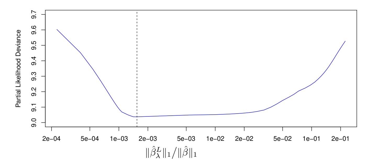
**FIGURE 11.7.** *For the* Publication *data described in Section 11.5.4, cross-validation results for the lasso-penalized Cox model are shown. The y-axis displays the partial likelihood deviance, which plays the role of the cross-validation error. The x-axis displays the* ℓ1 *norm (that is, the sum of the absolute values) of the coeffcients of the lasso-penalized Cox model with tuning parameter* λ*, divided by the* ℓ1 *norm of the coeffcients of the unpenalized Cox model. The dashed line indicates the minimum cross-validation error.*
plays the role of the cross-validation error.15 Note the "U-shape" of the partial likelihood deviance: just as we saw in previous chapters, the crossvalidation error is minimized for an intermediate level of model complexity. Specifcally, this occurs when just two predictors, budget and impact, have non-zero estimated coeffcients.
Now, how do we apply this model to the test set? This brings up an important conceptual point: in essence, there is no simple way to compare predicted survival times and true survival times on the test set. The frst problem is that some of the observations are censored, and so the true survival times for those observations are unobserved. The second issue arises from the fact that in the Cox model, rather than predicting a single survival time given a covariate vector *x*, we instead estimate an entire survival curve, *S*(*t|x*), as a function of *t*.
Therefore, to assess the model ft, we must take a diferent approach, which involves stratifying the observations using the coeffcient estimates. In particular, for each test observation, we compute the "risk" score
$$
budget_{i} \cdot \hat{\beta}_{budget} + impact_{i} \cdot \hat{\beta}_{impact},
$$
where βˆbudget and βˆimpact are the coeffcient estimates for these two features from the training set. We then use these risk scores to categorize the observations based on their "risk". For instance, the high risk group consists of
1 15Cross-validation for the Cox model is more involved than for linear or logistic regression, because the objective function is not a sum over the observations.
480 11. Survival Analysis and Censored Data
**FIGURE 11.8.** *For the* Publication *data introduced in Section* 11.5.4, *we compute tertiles of "risk" in the test set using coefficients estimated on the training set. There is clear separation between the resulting survival curves.*
the observations for which $budget_i \cdot \hat{\beta}_{budget} + impact_i \cdot \hat{\beta}_{impact}$ is largest; by [\(11.14\)](#11.14), we see that these are the observations for which the instantaneous probability of being published at any moment in time is largest. In other words, the high risk group consists of the trials that are likely to be published sooner. On the *Publication* data, we stratify the observations into tertiles of low, medium, and high risk. The resulting survival curves for each of the three strata are displayed in Figure 11.8. We see that there is clear separation between the three strata, and that the strata are correctly ordered in terms of low, medium, and high risk of publication.
11.7 Additional Topics
### *11.7.1 Area Under the Curve for Survival Analysis*
In Chapter 4, we introduced the area under the ROC curve — often referred to as the "AUC" — as a way to quantify the performance of a two-class classifier. Define the *score* for the *i*th observation to be the classifier's estimate of $Pr(Y = 1|X = x_i)$ . It turns out that if we consider all pairs consisting of one observation in Class 1 and one observation in Class 2, then the AUC is the fraction of pairs for which the score for the observation in Class 1 exceeds the score for the observation in Class 2.
This suggests a way to generalize the notion of AUC to survival analysis. We calculate an estimated risk score, $\hat{\eta}_i = \hat{\beta}_1 x_{i1} + \dots + \hat{\beta}_p x_{ip}$ , for $i = 1, \dots, n$ , using the Cox model coefficients. If $\hat{\eta}_{i'} > \hat{\eta}_i$ , then the model predicts that the $i'$ th observation has a larger hazard than the $i$ th observation, and thus that the survival time $t_i$ will be *greater* than $t_{i'}$ . Thus, it is tempting to try to generalize AUC by computing the proportion of ob-
11.7 Additional Topics 481
servations for which $t_i > t_{i'}$ and $\hat{\eta}_{i'} > \hat{\eta}_i$ . However, things are not quite so easy, because recall that we do not observe $t_1, \dots, t_n$ ; instead, we observe the (possibly-censored) times $y_1, \dots, y_n$ , as well as the censoring indicators $\delta_1, \dots, \delta_n$ .
Therefore, *Harrell's concordance index* (or *C-index*) computes the pro- Harrell's portion of observation pairs for which ηˆ*i*′ *>* ηˆ*i* and *yi > yi*′ :
concordance index
$$
C = \frac{\sum_{i,i':y_i>y_{i'}} I(\hat{\eta}_{i'} > \hat{\eta}_i)\delta_{i'}}{\sum_{i,i':y_i>y_{i'}} \delta_{i'}},
$$
where the indicator variable $I(\hat{\eta}_{i'} > \hat{\eta}_i)$ equals one if $\hat{\eta}_{i'} > \hat{\eta}_i$ , and equals zero otherwise. The numerator and denominator are multiplied by the status indicator $\delta_{i'}$ , since if the $i'$ th observation is uncensored (i.e. if $\delta_{i'} = 1$ ), then $y_i > y_{i'}$ implies that $t_i > t_{i'}$ . By contrast, if $\delta_{i'} = 0$ , then $y_i > y_{i'}$ does not imply that $t_i > t_{i'}$ .
We fit a Cox proportional hazards model on the training set of the Publication data, and computed the $C$ -index on the test set. This yielded $C = 0.733$ . Roughly speaking, given two random papers from the test set, the model can predict with 73.3% accuracy which will be published first.
### *11.7.2 Choice of Time Scale*
In the examples considered thus far in this chapter, it has been fairly clear how to defne *time*. For example, in the Publication example, *time zero* for each paper was defned to be the calendar time at the end of the study, and the failure time was defned to be the number of months that elapsed from the end of the study until the paper was published.
However, in other settings, the defnitions of time zero and failure time may be more subtle. For example, when examining the association between risk factors and disease occurrence in an epidemiological study, one might use the patient's age to defne time, so that time zero is the patient's date of birth. With this choice, the association between age and survival cannot be measured; however, there is no need to adjust for age in the analysis. When examining covariates associated with disease-free survival (i.e. the amount of time elapsed between treatment and disease recurrence), one might use the date of treatment as time zero.
### *11.7.3 Time-Dependent Covariates*
A powerful feature of the proportional hazards model is its ability to handle *time-dependent covariates*, predictors whose value may change over time. For example, suppose we measure a patient's blood pressure every week over the course of a medical study. In this case, we can think of the blood pressure for the *i*th observation not as *xi*, but rather as *xi*(*t*) at time *t*.
### 11. Survival Analysis and Censored Data
Because the partial likelihood in (11.16) is constructed sequentially in time, dealing with time-dependent covariates is straightforward. In particular, we simply replace $x_{ij}$ and $x_{i'j}$ in (11.16) with $x_{ij}(y_i)$ and $x_{i'j}(y_i)$ , respectively; these are the current values of the predictors at time $y_i$ . By contrast, time-dependent covariates would pose a much greater challenge within the context of a traditional parametric approach, such as (11.13).
One example of time-dependent covariates appears in the analysis of data from the Stanford Heart Transplant Program. Patients in need of a heart transplant were put on a waiting list. Some patients received a transplant, but others died while still on the waiting list. The primary objective of the analysis was to determine whether a transplant was associated with longer patient survival.
A naïve approach would use a fixed covariate to represent transplant status: that is, $x_i = 1$ if the $i$ th patient ever received a transplant, and $x_i = 0$ otherwise. But this approach overlooks the fact that patients had to live long enough to get a transplant, and hence, on average, healthier patients received transplants. This problem can be solved by using a time-dependent covariate for transplant: $x_i(t) = 1$ if the patient received a transplant by time $t$ , and $x_i(t) = 0$ otherwise.
### *11.7.4 Checking the Proportional Hazards Assumption*
We have seen that Cox's proportional hazards model relies on the proportional hazards assumption (11.14). While results from the Cox model tend to be fairly robust to violations of this assumption, it is still a good idea to check whether it holds. In the case of a qualitative feature, we can plot the log hazard function for each level of the feature. If (11.14) holds, then the log hazard functions should just difer by a constant, as seen in the top-left panel of Figure 11.4. In the case of a quantitative feature, we can take a similar approach by stratifying the feature.
### *11.7.5 Survival Trees*
In Chapter 8, we discussed fexible and adaptive learning procedures such as trees, random forests, and boosting, which we applied in both the regression and classifcation settings. Most of these approaches can be generalized to the survival analysis setting. For example, *survival trees* are a modifcation survival trees of classifcation and regression trees that use a split criterion that maximizes the diference between the survival curves in the resulting daughter nodes. Survival trees can then be used to create random survival forests.
survival
trees
11.8 Lab: Survival Analysis 483
# 11.8 Lab: Survival Analysis
In this lab, we perform survival analyses on three separate data sets. In Section 11.8.1 we analyze the BrainCancer data that was frst described in Section 11.3. In Section 11.8.2, we examine the Publication data from Section 11.5.4. Finally, Section 11.8.3 explores a simulated call center data set.
### *11.8.1 Brain Cancer Data*
We begin with the BrainCancer data set, which is part of the ISLR2 package.
```
> library(ISLR2)
```
The rows index the 88 patients, while the columns contain the 8 predictors.
```
> names(BrainCancer)
[1] "sex" "diagnosis" "loc" "ki" "gtv" "stereo"
[7] "status" "time"
```
We frst briefy examine the data.
```
> attach(BrainCancer)
> table(sex)
sex
Female Male
45 43
> table(diagnosis)
Meningioma LG glioma HG glioma Other
42 9 22 14
> table(status)
status
0 1
53 35
```
Before beginning an analysis, it is important to know how the status variable has been coded. Most software, including R, uses the convention that status = 1 indicates an uncensored observation, and status = 0 indicates a censored observation. But some scientists might use the opposite coding. For the BrainCancer data set 35 patients died before the end of the study.
To begin the analysis, we re-create the Kaplan-Meier survival curve shown in Figure 11.2, using the survfit() function within the R survival survfit() library. Here time corresponds to *yi*, the time to the *i*th event (either censoring or death).
```
> library(survival)
> fit.surv <- survfit(Surv(time, status) ∼ 1)
> plot(fit.surv, xlab = "Months",
ylab = "Estimated Probability of Survival")
```
Next we create Kaplan-Meier survival curves that are stratifed by sex, in order to reproduce Figure 11.3.
survfit()
484 11. Survival Analysis and Censored Data
```
> fit.sex <- survfit(Surv(time, status) ∼ sex)
> plot(fit.sex, xlab = "Months",
ylab = "Estimated Probability of Survival", col = c(2,4))
> legend("bottomleft", levels(sex), col = c(2,4), lty = 1)
```
As discussed in Section 11.4, we can perform a log-rank test to compare the survival of males to females, using the survdiff() function. survdiff()
```
> logrank.test <- survdiff(Surv(time, status) ∼ sex)
> logrank.test
Call:
survdiff(formula = Surv(time, status) ∼ sex)
N Observed Expected (O-E)^2/E (O-E)^2/V
sex=Female 45 15 18.5 0.676 1.44
sex=Male 43 20 16.5 0.761 1.44
Chisq= 1.4 on 1 degrees of freedom, p= 0.23
```
The resulting *p*-value is 0*.*23, indicating no evidence of a diference in survival between the two sexes.
Next, we ft Cox proportional hazards models using the coxph() function. coxph() To begin, we consider a model that uses sex as the only predictor.
```
> fit.cox <- coxph(Surv(time, status) ∼ sex)
> summary(fit.cox)
Call:
coxph(formula = Surv(time, status) ∼ sex)
n= 88, number of events= 35
coef exp(coef) se(coef) z Pr(>|z|)
sexMale 0.4077 1.5033 0.3420 1.192 0.233
exp(coef) exp(-coef) lower .95 upper .95
sexMale 1.503 0.6652 0.769 2.939
Concordance= 0.565 (se = 0.045 )
Likelihood ratio test= 1.44 on 1 df, p=0.23
Wald test = 1.42 on 1 df, p=0.233
Score (logrank) test = 1.44 on 1 df, p=0.23
```
Note that the values of the likelihood ratio, Wald, and score tests have been rounded. It is possible to display additional digits.
```
> summary(fit.cox)$logtest[1]
test
1.4388222
> summary(fit.cox)$waldtest[1]
test
1.4200000
> summary(fit.cox)$sctest[1]
test
1.44049511
```
Regardless of which test we use, we see that there is no clear evidence for a diference in survival between males and females.
xph()
11.8 Lab: Survival Analysis 485
```
> logrank.test$chisq
[1] 1.44049511
```
As we learned in this chapter, the score test from the Cox model is exactly equal to the log rank test statistic!
Now we ft a model that makes use of additional predictors.
```
> fit.all <- coxph(
Surv(time, status) ∼ sex + diagnosis + loc + ki + gtv +
stereo)
> fit.all
Call:
coxph(formula = Surv(time, status) ∼ sex + diagnosis + loc +
ki + gtv + stereo)
coef exp(coef) se(coef) z p
sexMale 0.1837 1.2017 0.3604 0.51 0.6101
diagnosisLG glioma 0.9150 2.4968 0.6382 1.43 0.1516
diagnosisHG glioma 2.1546 8.6241 0.4505 4.78 1.7e-06
diagnosisOther 0.8857 2.4247 0.6579 1.35 0.1782
locSupratentorial 0.4412 1.5546 0.7037 0.63 0.5307
ki -0.0550 0.9465 0.0183 -3.00 0.0027
gtv 0.0343 1.0349 0.0223 1.54 0.1247
stereoSRT 0.1778 1.1946 0.6016 0.30 0.7676
Likelihood ratio test=41.4 on 8 df, p=1.78e-06
n= 87, number of events= 35
(1 observation deleted due to missingness)
```
The diagnosis variable has been coded so that the baseline corresponds to meningioma. The results indicate that the risk associated with HG glioma is more than eight times (i.e. *e*2*.*15 = 8*.*62) the risk associated with meningioma. In other words, after adjusting for the other predictors, patients with HG glioma have much worse survival compared to those with meningioma. In addition, larger values of the Karnofsky index, ki, are associated with lower risk, i.e. longer survival.
Finally, we plot survival curves for each diagnosis category, adjusting for the other predictors. To make these plots, we set the values of the other predictors equal to the mean for quantitative variables, and the modal value for factors. We frst create a data frame with four rows, one for each level of diagnosis. The survfit() function will produce a curve for each of the rows in this data frame, and one call to plot() will display them all in the same plot.
```
> modaldata <- data.frame(
diagnosis = levels(diagnosis),
sex = rep("Female", 4),
loc = rep("Supratentorial", 4),
ki = rep(mean(ki), 4),
gtv = rep(mean(gtv), 4),
stereo = rep("SRT", 4)
)
```
486 11. Survival Analysis and Censored Data
```
> survplots <- survfit(fit.all, newdata = modaldata)
> plot(survplots, xlab = "Months",
ylab = "Survival Probability", col = 2:5)
> legend("bottomleft", levels(diagnosis), col = 2:5, lty = 1)
```
### *11.8.2 Publication Data*
The Publication data presented in Section 11.5.4 can be found in the ISLR2 library. We frst reproduce Figure 11.5 by plotting the Kaplan-Meier curves stratifed on the posres variable, which records whether the study had a positive or negative result.
```
> fit.posres <- survfit(
Surv(time, status) ∼ posres, data = Publication
)
> plot(fit.posres, xlab = "Months",
ylab = "Probability of Not Being Published", col = 3:4)
> legend("topright", c("Negative Result", "Positive Result"),
col = 3:4, lty = 1)
```
As discussed previously, the *p*-values from ftting Cox's proportional hazards model to the posres variable are quite large, providing no evidence of a diference in time-to-publication between studies with positive versus negative results.
```
> fit.pub <- coxph(Surv(time, status) ∼ posres,
data = Publication)
> fit.pub
Call:
coxph(formula = Surv(time, status) ∼ posres, data = Publication)
coef exp(coef) se(coef) z p
posres 0.148 1.160 0.162 0.92 0.36
Likelihood ratio test=0.83 on 1 df, p=0.361
n= 244, number of events= 156
```
As expected, the log-rank test provides an identical conclusion.
```
> logrank.test <- survdiff(Surv(time, status) ∼ posres,
data = Publication)
> logrank.test
Call:
survdiff(formula = Surv(time, status) ∼ posres,data=Publication)
N Observed Expected (O-E)^2/E (O-E)^2/V
posres=0 146 87 92.6 0.341 0.844
posres=1 98 69 63.4 0.498 0.844
Chisq= 0.8 on 1 degrees of freedom, p= 0.358
```
However, the results change dramatically when we include other predictors in the model. Here we have excluded the funding mechanism variable.
11.8 Lab: Survival Analysis 487
```
> fit.pub2 <- coxph(Surv(time, status) ∼ . - mech,
data = Publication)
> fit.pub2
Call:
coxph(formula = Surv(time, status) ∼ . - mech, data=Publication)
coef exp(coef) se(coef) z p
posres 0.571 1.770 0.176 3.24 0.0012
multi -0.041 0.960 0.251 -0.16 0.8708
clinend 0.546 1.727 0.262 2.08 0.0371
sampsize 0.000 1.000 0.000 0.32 0.7507
budget 0.004 1.004 0.002 1.78 0.0752
impact 0.058 1.060 0.007 8.74 <2e-16
Likelihood ratio test=149 on 6 df, p=0
n= 244, number of events= 156
```
We see that there are a number of statistically signifcant variables, including whether the trial focused on a clinical endpoint, the impact of the study, and whether the study had positive or negative results.
### *11.8.3 Call Center Data*
In this section, we will simulate survival data using the sim.survdata() sim.survdata() function, which is part of the coxed library. Our simulated data will represent the observed wait times (in seconds) for 2,000 customers who have phoned a call center. In this context, censoring occurs if a customer hangs up before his or her call is answered.
There are three covariates: Operators (the number of call center operators available at the time of the call, which can range from 5 to 15), Center (either A, B, or C), and Time of day (Morning, Afternoon, or Evening). We generate data for these covariates so that all possibilities are equally likely: for instance, morning, afternoon and evening calls are equally likely, and any number of operators from 5 to 15 is equally likely.
```
> set.seed(4)
> N <- 2000
> Operators <- sample(5:15, N, replace = T)
> Center <- sample(c("A", "B", "C"), N, replace = T)
> Time <- sample(c("Morn.", "After.", "Even."), N, replace = T)
> X <- model.matrix( ∼ Operators + Center + Time)[, -1]
```
It is worthwhile to take a peek at the design matrix X, so that we can be sure that we understand how the variables have been coded.
| | Operators | CenterB | CenterC | TimeEven. | TimeMorn. |
|---|-----------|---------|---------|-----------|-----------|
| 1 | 12 | 1 | 0 | 0 | 1 |
| 2 | 15 | 0 | 0 | 0 | 0 |
| 3 | 7 | 0 | 1 | 1 | 0 |
| 4 | 7 | 0 | 0 | 0 | 0 |
| 5 | 11 | 0 | 1 | 0 | 1 |
im.survdata()
488 11. Survival Analysis and Censored Data
Next, we specify the coeffcients and the hazard function.
```
> true.beta <- c(0.04, -0.3, 0, 0.2, -0.2)
> h.fn <- function(x) return(0.00001 * x)
```
Here, we have set the coeffcient associated with Operators to equal 0*.*04; in other words, each additional operator leads to a *e*0*.*04 = 1*.*041-fold increase in the "risk" that the call will be answered, given the Center and Time covariates. This makes sense: the greater the number of operators at hand, the shorter the wait time! The coeffcient associated with Center = B is −0*.*3, and Center = A is treated as the baseline. This means that the risk of a call being answered at Center B is 0*.*74 times the risk that it will be answered at Center A; in other words, the wait times are a bit longer at Center B.
We are now ready to generate data under the Cox proportional hazards model. The sim.survdata() function allows us to specify the maximum possible failure time, which in this case corresponds to the longest possible wait time for a customer; we set this to equal 1*,*000 seconds.
```
> library(coxed)
> queuing <- sim.survdata(N = N, T = 1000, X = X,
beta = true.beta, hazard.fun = h.fn)
> names(queuing)
[1] "data" "xdata" "baseline"
[4] "xb" "exp.xb" "betas"
[7] "ind.survive" "marg.effect" "marg.effect.data"
```
The "observed" data is stored in queuing\$data, with y corresponding to the event time and failed an indicator of whether the call was answered (failed = T) or the customer hung up before the call was answered (failed = F). We see that almost 90% of calls were answered.
```
> head(queuing$data)
Operators CenterB CenterC TimeEven. TimeMorn. y failed
1 12 1 0 0 1 344 TRUE
2 15 0 0 0 0 241 TRUE
3 7 0 1 1 0 187 TRUE
4 7 0 0 0 0 279 TRUE
5 11 0 1 0 1 954 TRUE
6 7 1 0 0 1 455 TRUE
> mean(queuing$data$failed)
[1] 0.89
```
We now plot Kaplan-Meier survival curves. First, we stratify by Center.
```
> par(mfrow = c(1, 2))
> fit.Center <- survfit(Surv(y, failed) ∼ Center,
data = queuing$data)
> plot(fit.Center, xlab = "Seconds",
ylab = "Probability of Still Being on Hold",
col = c(2, 4, 5))
> legend("topright",
c("Call Center A", "Call Center B", "Call Center C"),
col = c(2, 4, 5), lty = 1)
```
11.8 Lab: Survival Analysis 489
Next, we stratify by Time.
```
> fit.Time <- survfit(Surv(y, failed) ∼ Time,
data = queuing$data)
> plot(fit.Time, xlab = "Seconds",
ylab = "Probability of Still Being on Hold",
col = c(2, 4, 5))
> legend("topright", c("Morning", "Afternoon", "Evening"),
col = c(5, 2, 4), lty = 1)
```
It seems that calls at Call Center B take longer to be answered than calls at Centers A and C. Similarly, it appears that wait times are longest in the morning and shortest in the evening hours. We can use a log-rank test to determine whether these diferences are statistically signifcant.
```
> survdiff(Surv(y, failed) ∼ Center, data = queuing$data)
Call:
survdiff(formula = Surv(y, failed)∼Center,data = queuing$data)
N Observed Expected (O-E)^2/E (O-E)^2/V
Center=A 683 603 579 0.971 1.45
Center=B 667 600 701 14.641 24.64
Center=C 650 577 499 12.062 17.05
Chisq= 28.3 on 2 degrees of freedom, p= 7e-07
> survdiff(Surv(y, failed) ∼ Time, data = queuing$data)
Call:
survdiff(formula = Surv(y, failed) ∼ Time, data = queuing$data)
N Observed Expected (O-E)^2/E (O-E)^2/V
Time=After. 688 616 619 0.0135 0.021
Time=Even. 653 582 468 27.6353 38.353
Time=Morn. 659 582 693 17.7381 29.893
```
```
Chisq= 46.8 on 2 degrees of freedom, p= 7e-11
```
We fnd that diferences between centers are highly signifcant, as are diferences between times of day.
Finally, we ft Cox's proportional hazards model to the data.
```
> fit.queuing <- coxph(Surv(y, failed) ∼ .,
data = queuing$data)
> fit.queuing
Call:
coxph(formula = Surv(y, failed) ∼ ., data = queuing$data)
coef exp(coef) se(coef) z p
Operators 0.04174 1.04263 0.00759 5.500 3.8e-08
CenterB -0.21879 0.80349 0.05793 -3.777 0.000159
CenterC 0.07930 1.08253 0.05850 1.356 0.175256
TimeEven. 0.20904 1.23249 0.05820 3.592 0.000328
TimeMorn. -0.17352 0.84070 0.05811 -2.986 0.002828
Likelihood ratio test=102.8 on 5 df, p=< 2.2e-16
n= 2000, number of events= 1780
```
490 11. Survival Analysis and Censored Data
The *p*-values for Center = B, Time = Even. and Time = Morn. are very small. It is also clear that the hazard — that is, the instantaneous risk that a call will be answered — increases with the number of operators. Since we generated the data ourselves, we know that the true coeffcients for Operators, Center = B, Center = C, Time = Even. and Time = Morn. are 0*.*04, −0*.*3, 0, 0*.*2, and −0*.*2, respectively. The coeffcient estimates resulting from the Cox model are fairly accurate.
# 11.9 Exercises
### *Conceptual*
- 1. For each example, state whether or not the censoring mechanism is independent. Justify your answer.
- (a) In a study of disease relapse, due to a careless research scientist, all patients whose phone numbers begin with the number "2" are lost to follow up.
- (b) In a study of longevity, a formatting error causes all patient ages that exceed 99 years to be lost (i.e. we know that those patients are more than 99 years old, but we do not know their exact ages).
- (c) Hospital A conducts a study of longevity. However, very sick patients tend to be transferred to Hospital B, and are lost to follow up.
- (d) In a study of unemployment duration, the people who fnd work earlier are less motivated to stay in touch with study investigators, and therefore are more likely to be lost to follow up.
- (e) In a study of pregnancy duration, women who deliver their babies pre-term are more likely to do so away from their usual hospital, and thus are more likely to be censored, relative to women who deliver full-term babies.
- (f) A researcher wishes to model the number of years of education of the residents of a small town. Residents who enroll in college out of town are more likely to be lost to follow up, and are also more likely to attend graduate school, relative to those who attend college in town.
- (g) Researchers conduct a study of disease-free survival (i.e. time until disease relapse following treatment). Patients who have not relapsed within fve years are considered to be cured, and thus their survival time is censored at fve years.
11.9 Exercises 491
- (h) We wish to model the failure time for some electrical component. This component can be manufactured in Iowa or in Pittsburgh, with no diference in quality. The Iowa factory opened fve years ago, and so components manufactured in Iowa are censored at fve years. The Pittsburgh factory opened two years ago, so those components are censored at two years.
- (i) We wish to model the failure time of an electrical component made in two diferent factories, one of which opened before the other. We have reason to believe that the components manufactured in the factory that opened earlier are of higher quality.
- 2. We conduct a study with *n* = 4 participants who have just purchased cell phones, in order to model the time until phone replacement. The frst participant replaces her phone after 1.2 years. The second participant still has not replaced her phone at the end of the two-year study period. The third participant changes her phone number and is lost to follow up (but has not yet replaced her phone) 1.5 years into the study. The fourth participant replaces her phone after 0.2 years.
For each of the four participants ( $i = 1, \dots, 4$ ), answer the following questions using the notation introduced in Section 11.1:
- (a) Is the participant's cell phone replacement time censored?
- (b) Is the value of *ci* known, and if so, then what is it?
- (c) Is the value of *ti* known, and if so, then what is it?
- (d) Is the value of *yi* known, and if so, then what is it?
- (e) Is the value of δ*i* known, and if so, then what is it?
- 3. For the example in Exercise 2, report the values of *K*, *d*1*,...,dK*, *r*1*,...,rK*, and *q*1*,...,qK*, where this notation was defned in Section 11.3.
- 4. This problem makes use of the Kaplan-Meier survival curve displayed in Figure 11.9. The raw data that went into plotting this survival curve is given in Table 11.4. The covariate column of that table is not needed for this problem.
- (a) What is the estimated probability of survival past 50 days?
- (b) Write out an analytical expression for the estimated survival function. For instance, your answer might be something along the lines of
$$
\widehat{S}(t) = \begin{cases} 0.8 & \text{if } t < 31 \\ 0.5 & \text{if } 31 \le t < 77 \\ 0.22 & \text{if } 77 \le t. \end{cases}
$$
(The previous equation is for illustration only: it is not the correct answer!)
| Observation (Y) | Censoring Indicator (δ) | Covariate (X) |
|-----------------|-------------------------|---------------|
| 26.5 | 1 | 0.1 |
| 37.2 | 1 | 11 |
| 57.3 | 1 | -0.3 |
| 90.8 | 0 | 2.8 |
| 20.2 | 0 | 1.8 |
| 89.8 | 0 | 0.4 |
492 11. Survival Analysis and Censored Data
**TABLE 11.4.** *Data used in Exercise 4.*
5. Sketch the survival function given by the equation
$$
\widehat{S}(t) = \begin{cases} 0.8 & \text{if } t < 31 \\ 0.5 & \text{if } 31 \le t < 77 \\ 0.22 & \text{if } 77 \le t. \end{cases}
$$
Your answer should look something like Figure 11.9.
**FIGURE 11.9.** *A Kaplan-Meier survival curve used in Exercise 4.*
- 6. This problem makes use of the data displayed in Figure 11.1. In completing this problem, you can refer to the observation times as *y*1*,...,y*4. The ordering of these observation times can be seen from Figure 11.1; their exact values are not required.
- (a) Report the values of δ1*,...,* δ4, *K*, *d*1*,...,dK*, *r*1*,...,rK*, and *q*1*,...,qK*. The relevant notation is defned in Sections 11.1 and 11.3.
- (b) Sketch the Kaplan-Meier survival curve corresponding to this data set. (You do not need to use any software to do this — you can sketch it by hand using the results obtained in (a).)
11.9 Exercises 493
- (c) Based on the survival curve estimated in (b), what is the probability that the event occurs within 200 days? What is the probability that the event does not occur within 310 days?
- (d) Write out an expression for the estimated survival curve from (b).
- 7. In this problem, we will derive (11.5) and (11.6), which are needed for the construction of the log-rank test statistic (11.8). Recall the notation in Table 11.1.
- (a) Assume that there is no diference between the survival functions of the two groups. Then we can think of *q*1*k* as the number of failures if we draw *r*1*k* observations, without replacement, from a risk set of *rk* observations that contains a total of *qk* failures. Argue that *q*1*k* follows a *hypergeometric distribution*. Write the hypergeometric distribution parameters of this distribution in terms of *r*1*k*, *rk*, and *qk*.
- (b) Given your previous answer, and the properties of the hypergeometric distribution, what are the mean and variance of *q*1*k*? Compare your answer to (11.5) and (11.6).
- 8. Recall that the survival function *S*(*t*), the hazard function *h*(*t*), and the density function *f*(*t*) are defned in (11.2), (11.9), and (11.11), respectively. Furthermore, defne *F*(*t*)=1 − *S*(*t*). Show that the following relationships hold:
$$
f(t) = \frac{dF(t)}{dt}
$$
$$
S(t) = \exp\left(-\int_0^t h(u)du\right).
$$
- 9. In this exercise, we will explore the consequences of assuming that the survival times follow an exponential distribution.
- (a) Suppose that a survival time follows an Exp(λ) distribution, so that its density function is *f*(*t*) = λ exp(−λ*t*). Using the relationships provided in Exercise 8, show that *S*(*t*) = exp(−λ*t*).
- (b) Now suppose that each of *n* independent survival times follows an Exp(λ) distribution. Write out an expression for the likelihood function (11.13).
- (c) Show that the maximum likelihood estimator for λ is
$$
\hat{\lambda} = \frac{\sum_{i=1}^{n} \delta_i}{\sum_{i=1}^{n} y_i}
$$
hypergeometric
distribution
- 494 11. Survival Analysis and Censored Data
- (d) Use your answer to (c) to derive an estimator of the mean survival time.
*Hint: For (d), recall that the mean of an Exp*(λ) *random variable is* 1*/*λ*.*
### *Applied*
- 10. This exercise focuses on the brain tumor data, which is included in the ISLR2 R library.
- (a) Plot the Kaplan-Meier survival curve with *±*1 standard error bands, using the survfit() function in the survival package.
- (b) Draw a bootstrap sample of size *n* = 88 from the pairs (*yi,* δ*i*), and compute the resulting Kaplan-Meier survival curve. Repeat this process *B* = 200 times. Use the results to obtain an estimate of the standard error of the Kaplan-Meier survival curve at each timepoint. Compare this to the standard errors obtained in (a).
- (c) Fit a Cox proportional hazards model that uses all of the predictors to predict survival. Summarize the main fndings.
- (d) Stratify the data by the value of ki. (Since only one observation has ki=40, you can group that observation together with the observations that have ki=60.) Plot Kaplan-Meier survival curves for each of the fve strata, adjusted for the other predictors.
- 11. This example makes use of the data in Table 11.4.
- (a) Create two groups of observations. In Group 1, *X <* 2, whereas in Group 2, *X* ≥ 2. Plot the Kaplan-Meier survival curves corresponding to the two groups. Be sure to label the curves so that it is clear which curve corresponds to which group. By eye, does there appear to be a diference between the two groups' survival curves?
- (b) Fit Cox's proportional hazards model, using the group indicator as a covariate. What is the estimated coeffcient? Write a sentence providing the interpretation of this coeffcient, in terms of the hazard or the instantaneous probability of the event. Is there evidence that the true coeffcient value is non-zero?
- (c) Recall from Section 11.5.2 that in the case of a single binary covariate, the log-rank test statistic should be identical to the score statistic for the Cox model. Conduct a log-rank test to determine whether there is a diference between the survival curves for the two groups. How does the *p*-value for the log-rank test statistic compare to the *p*-value for the score statistic for the Cox model from (b)?
# 12 Unsupervised Learning
Most of this book concerns *supervised learning* methods such as regression and classification. In the supervised learning setting, we typically have access to a set of $p$ features $X_1, X_2, \dots, X_p$ , measured on $n$ observations, and a response $Y$ also measured on those same $n$ observations. The goal is then to predict $Y$ using $X_1, X_2, \dots, X_p$ .
This chapter will instead focus on *unsupervised learning*, a set of statistical tools intended for the setting in which we have only a set of features *X*1*, X*2*,...,Xp* measured on *n* observations. We are not interested in prediction, because we do not have an associated response variable *Y* . Rather, the goal is to discover interesting things about the measurements on *X*1*, X*2*,...,Xp*. Is there an informative way to visualize the data? Can we discover subgroups among the variables or among the observations? Unsupervised learning refers to a diverse set of techniques for answering questions such as these. In this chapter, we will focus on two particular types of unsupervised learning: *principal components analysis*, a tool used for data visualization or data pre-processing before supervised techniques are applied, and *clustering*, a broad class of methods for discovering unknown subgroups in data.
# 12.1 The Challenge of Unsupervised Learning
Supervised learning is a well-understood area. In fact, if you have read the preceding chapters in this book, then you should by now have a good 496 12. Unsupervised Learning
grasp of supervised learning. For instance, if you are asked to predict a binary outcome from a data set, you have a very well developed set of tools at your disposal (such as logistic regression, linear discriminant analysis, classifcation trees, support vector machines, and more) as well as a clear understanding of how to assess the quality of the results obtained (using cross-validation, validation on an independent test set, and so forth).
In contrast, unsupervised learning is often much more challenging. The exercise tends to be more subjective, and there is no simple goal for the analysis, such as prediction of a response. Unsupervised learning is often performed as part of an *exploratory data analysis*. Furthermore, it can be exploratory hard to assess the results obtained from unsupervised learning methods, since there is no universally accepted mechanism for performing crossvalidation or validating results on an independent data set. The reason for this diference is simple. If we ft a predictive model using a supervised learning technique, then it is possible to *check our work* by seeing how well our model predicts the response *Y* on observations not used in ftting the model. However, in unsupervised learning, there is no way to check our work because we don't know the true answer—the problem is unsupervised.
Techniques for unsupervised learning are of growing importance in a number of felds. A cancer researcher might assay gene expression levels in 100 patients with breast cancer. He or she might then look for subgroups among the breast cancer samples, or among the genes, in order to obtain a better understanding of the disease. An online shopping site might try to identify groups of shoppers with similar browsing and purchase histories, as well as items that are of particular interest to the shoppers within each group. Then an individual shopper can be preferentially shown the items in which he or she is particularly likely to be interested, based on the purchase histories of similar shoppers. A search engine might choose which search results to display to a particular individual based on the click histories of other individuals with similar search patterns. These statistical learning tasks, and many more, can be performed via unsupervised learning techniques.
# 12.2 Principal Components Analysis
*Principal components* are discussed in Section 6.3.1 in the context of principal components regression. When faced with a large set of correlated variables, principal components allow us to summarize this set with a smaller number of representative variables that collectively explain most of the variability in the original set. The principal component directions are presented in Section 6.3.1 as directions in feature space along which the original data are *highly variable*. These directions also defne lines and subspaces that are *as close as possible* to the data cloud. To perform
data analysis 12.2 Principal Components Analysis 497
principal components regression, we simply use principal components as predictors in a regression model in place of the original larger set of variables.
*Principal components analysis* (PCA) refers to the process by which prin- principal cipal components are computed, and the subsequent use of these components in understanding the data. PCA is an unsupervised approach, since it involves only a set of features *X*1*, X*2*,...,Xp*, and no associated response *Y* . Apart from producing derived variables for use in supervised learning problems, PCA also serves as a tool for data visualization (visualization of the observations or visualization of the variables). It can also be used as a tool for data imputation — that is, for flling in missing values in a data matrix.
We now discuss PCA in greater detail, focusing on the use of PCA as a tool for unsupervised data exploration, in keeping with the topic of this chapter.
### *12.2.1 What Are Principal Components?*
Suppose that we wish to visualize *n* observations with measurements on a set of *p* features, $X_1, X_2, \dots, X_p$ , as part of an exploratory data analysis. We could do this by examining two-dimensional scatterplots of the data, each of which contains the *n* observations' measurements on two of the features. However, there are $\binom{p}{2} = p(p-1)/2$ such scatterplots; for example, with $p = 10$ there are 45 plots! If *p* is large, then it will certainly not be possible to look at all of them; moreover, most likely none of them will be informative since they each contain just a small fraction of the total information present in the data set. Clearly, a better method is required to visualize the *n* observations when *p* is large. In particular, we would like to find a low-dimensional representation of the data that captures as much of the information as possible. For instance, if we can obtain a two-dimensional representation of the data that captures most of the information, then we can plot the observations in this low-dimensional space.
PCA provides a tool to do just this. It fnds a low-dimensional representation of a data set that contains as much as possible of the variation. The idea is that each of the *n* observations lives in *p*-dimensional space, but not all of these dimensions are equally interesting. PCA seeks a small number of dimensions that are as interesting as possible, where the concept of *interesting* is measured by the amount that the observations vary along each dimension. Each of the dimensions found by PCA is a linear combination of the *p* features. We now explain the manner in which these dimensions, or *principal components*, are found.
The *frst principal component* of a set of features *X*1*, X*2*,...,Xp* is the normalized linear combination of the features
$$
Z_1 = \phi_{11} X_1 + \phi_{21} X_2 + \dots + \phi_{p1} X_p \quad (12.1)
$$
components analysis
### 12. Unsupervised Learning
that has the largest variance. By *normalized*, we mean that $\sum_{j=1}^{p} \phi_{j1}^{2} = 1$ . We refer to the elements $\phi_{11}, \dots, \phi_{p1}$ as the *loadings* of the first principal component; together, the loadings make up the principal component loading vector, $\phi_{1} = (\phi_{11} \phi_{21} \dots \phi_{p1})^{T}$ . We constrain the loadings so that their sum of squares is equal to one, since otherwise setting these elements to be arbitrarily large in absolute value could result in an arbitrarily large variance.
Given an $n \times p$ data set $\mathbf{X}$ , how do we compute the first principal component? Since we are only interested in variance, we assume that each of the variables in $\mathbf{X}$ has been centered to have mean zero (that is, the column means of $\mathbf{X}$ are zero). We then look for the linear combination of the sample feature values of the form
$$
z_{i1} = \phi_{11}x_{i1} + \phi_{21}x_{i2} + \dots + \phi_{p1}x_{ip} \tag{12.2}
$$
that has largest sample variance, subject to the constraint that $\sum_{j=1}^{p} \phi_{j1}^{2}=1$ . In other words, the first principal component loading vector solves the optimization problem
$$
\underset{\phi_{11},\dots,\phi_{p1}}{\text{maximize}} \left\{ \frac{1}{n} \sum_{i=1}^{n} \left( \sum_{j=1}^{p} \phi_{j1}x_{ij} \right)^2 \right\} \text{ subject to } \sum_{j=1}^{p} \phi_{j1}^2 = 1. \quad (12.3)
$$
From (12.2) we can write the objective in (12.3) as $\frac{1}{n} \sum_{i=1}^{n} z_{i1}^2$ . Since $\frac{1}{n} \sum_{i=1}^{n} x_{ij} = 0$ , the average of the $z_{11}, \dots, z_{n1}$ will be zero as well. Hence the objective that we are maximizing in (12.3) is just the sample variance of the $n$ values of $z_{i1}$ . We refer to $z_{11}, \dots, z_{n1}$ as the *scores* of the first principal component. Problem (12.3) can be solved via an *eigen decomposition*, a standard technique in linear algebra, but the details are outside of the scope of this book.1
score
eigen decomposition
There is a nice geometric interpretation of the first principal component. The loading vector $\phi_1$ with elements $\phi_{11}, \phi_{21}, \dots, \phi_{p1}$ defines a direction in feature space along which the data vary the most. If we project the $n$ data points $x_1, \dots, x_n$ onto this direction, the projected values are the principal component scores $z_{11}, \dots, z_{n1}$ themselves. For instance, Figure 6.14 on page 253 displays the first principal component loading vector (green solid line) on an advertising data set. In these data, there are only two features, and so the observations as well as the first principal component loading vector can be easily displayed. As can be seen from (6.19), in that data set $\phi_{11} = 0.839$ and $\phi_{21} = 0.544$ .
After the first principal component $Z_1$ of the features has been determined, we can find the second principal component $Z_2$ . The second princi-
1As an alternative to the eigen decomposition, a related technique called the singular value decomposition can be used. This will be explored in the lab at the end of this chapter.12.2 Principal Components Analysis 499
pal component is the linear combination of *X*1*,...,Xp* that has maximal variance out of all linear combinations that are *uncorrelated* with *Z*1. The second principal component scores *z*12*, z*22*,...,zn*2 take the form
$$
z_{i2} = \phi_{12}x_{i1} + \phi_{22}x_{i2} + \dots + \phi_{p2}x_{ip}, \qquad (12.4)
$$
where $\phi_2$ is the second principal component loading vector, with elements $\phi_{12}, \phi_{22}, \dots, \phi_{p2}$ . It turns out that constraining $Z_2$ to be uncorrelated with $Z_1$ is equivalent to constraining the direction $\phi_2$ to be orthogonal (perpendicular) to the direction $\phi_1$ . In the example in Figure 6.14, the observations lie in two-dimensional space (since $p = 2$ ), and so once we have found $\phi_1$ , there is only one possibility for $\phi_2$ , which is shown as a blue dashed line. (From Section 6.3.1, we know that $\phi_{12} = 0.544$ and $\phi_{22} = -0.839$ .) But in a larger data set with $p > 2$ variables, there are multiple distinct principal components, and they are defined in a similar manner. To find $\phi_2$ , we solve a problem similar to (12.3) with $\phi_2$ replacing $\phi_1$ , and with the additional constraint that $\phi_2$ is orthogonal to $\phi_1$ .2
Once we have computed the principal components, we can plot them against each other in order to produce low-dimensional views of the data. For instance, we can plot the score vector $Z_1$ against $Z_2$ , $Z_1$ against $Z_3$ , $Z_2$ against $Z_3$ , and so forth. Geometrically, this amounts to projecting the original data down onto the subspace spanned by $\phi_1$ , $\phi_2$ , and $\phi_3$ , and plotting the projected points.
We illustrate the use of PCA on the USArrests data set. For each of the 50 states in the United States, the data set contains the number of arrests per 100*,* 000 residents for each of three crimes: Assault, Murder, and Rape. We also record UrbanPop (the percent of the population in each state living in urban areas). The principal component score vectors have length *n* = 50, and the principal component loading vectors have length *p* = 4. PCA was performed after standardizing each variable to have mean zero and standard deviation one. Figure 12.1 plots the frst two principal components of these data. The fgure represents both the principal component scores and the loading vectors in a single *biplot* display. The loadings are also given in biplot Table 12.2.1.
biplot
In Figure 12.1, we see that the frst loading vector places approximately equal weight on Assault, Murder, and Rape, but with much less weight on UrbanPop. Hence this component roughly corresponds to a measure of overall rates of serious crimes. The second loading vector places most of its weight on UrbanPop and much less weight on the other three features. Hence, this component roughly corresponds to the level of urbanization of the state. Overall, we see that the crime-related variables (Murder, Assault, and Rape) are located close to each other, and that the UrbanPop variable is far from the
2On a technical note, the principal component directions φ1, φ2, φ3*,...* are given by the ordered sequence of eigenvectors of the matrix X*T* X, and the variances of the components are the eigenvalues. There are at most min(*n* − 1*, p*) principal components.
500 12. Unsupervised Learning
**FIGURE 12.1.** *The frst two principal components for the* USArrests *data. The blue state names represent the scores for the frst two principal components. The orange arrows indicate the frst two principal component loading vectors (with axes on the top and right). For example, the loading for* Rape *on the frst component is* 0*.*54*, and its loading on the second principal component* 0*.*17 *(the word* Rape *is centered at the point* (0*.*54*,* 0*.*17)*). This fgure is known as a biplot, because it displays both the principal component scores and the principal component loadings.*
other three. This indicates that the crime-related variables are correlated with each other—states with high murder rates tend to have high assault and rape rates—and that the UrbanPop variable is less correlated with the other three.
We can examine diferences between the states via the two principal component score vectors shown in Figure 12.1. Our discussion of the loading vectors suggests that states with large positive scores on the frst component, such as California, Nevada and Florida, have high crime rates, while states like North Dakota, with negative scores on the frst component, have
12.2 Principal Components Analysis 501
| | PC1 | PC2 |
|----------|-----------|------------|
| Murder | 0.5358995 | −0.4181809 |
| Assault | 0.5831836 | −0.1879856 |
| UrbanPop | 0.2781909 | 0.8728062 |
| Rape | 0.5434321 | 0.1673186 |
**TABLE 12.1.** *The principal component loading vectors,* φ1 *and* φ2*, for the* USArrests *data. These are also displayed in Figure 12.1.*
low crime rates. California also has a high score on the second component, indicating a high level of urbanization, while the opposite is true for states like Mississippi. States close to zero on both components, such as Indiana, have approximately average levels of both crime and urbanization.
### *12.2.2 Another Interpretation of Principal Components*
The frst two principal component loading vectors in a simulated threedimensional data set are shown in the left-hand panel of Figure 12.2; these two loading vectors span a plane along which the observations have the highest variance.
In the previous section, we describe the principal component loading vectors as the directions in feature space along which the data vary the most, and the principal component scores as projections along these directions. However, an alternative interpretation of principal components can also be useful: principal components provide low-dimensional linear surfaces that are *closest* to the observations. We expand upon that interpretation here.3
The frst principal component loading vector has a very special property: it is the line in *p*-dimensional space that is *closest* to the *n* observations (using average squared Euclidean distance as a measure of closeness). This interpretation can be seen in the left-hand panel of Figure 6.15; the dashed lines indicate the distance between each observation and the line defned by the frst principal component loading vector. The appeal of this interpretation is clear: we seek a single dimension of the data that lies as close as possible to all of the data points, since such a line will likely provide a good summary of the data.
The notion of principal components as the dimensions that are closest to the *n* observations extends beyond just the frst principal component. For instance, the frst two principal components of a data set span the plane that is closest to the *n* observations, in terms of average squared Euclidean distance. An example is shown in the left-hand panel of Figure 12.2. The frst three principal components of a data set span
3In this section, we continue to assume that each column of the data matrix X has been centered to have mean zero—that is, the column mean has been subtracted from each column.
502 12. Unsupervised Learning
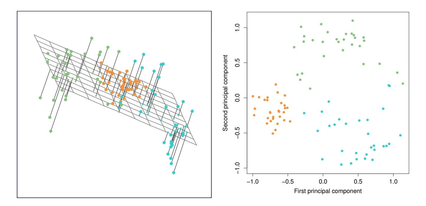
**FIGURE 12.2.** *Ninety observations simulated in three dimensions. The observations are displayed in color for ease of visualization. Left: the first two principal component directions span the plane that best fits the data. The plane is positioned to minimize the sum of squared distances to each point. Right: the first two principal component score vectors give the coordinates of the projection of the 90 observations onto the plane.*the three-dimensional hyperplane that is closest to the $n$ observations, and so forth.Using this interpretation, together the first $M$ principal component score vectors and the first $M$ principal component loading vectors provide the best $M$ -dimensional approximation (in terms of Euclidean distance) to the $i$ th observation $x_{ij}$ . This representation can be written as
$$
x_{ij} \approx \sum_{m=1}^{M} z_{im} \phi_{jm} \quad (12.5)
$$
We can state this more formally by writing down an optimization problem. Suppose the data matrix $\mathbf{X}$ is column-centered. Out of all approximations of the form $x_{ij} \approx \sum_{m=1}^{M} a_{im}b_{jm}$ , we could ask for the one with the smallest residual sum of squares:
$$
\underset{\mathbf{A}\in\mathbb{R}^{n\times M},\mathbf{B}\in\mathbb{R}^{p\times M}}{\text{minimize}} \left\{ \sum_{j=1}^{p} \sum_{i=1}^{n} \left( x_{ij} - \sum_{m=1}^{M} a_{im} b_{jm} \right)^2 \right\}. \quad (12.6)
$$
Here, $A$ is an $n \times M$ matrix whose $(i, m)$ element is $a_{im}$ , and $B$ is a $p \times M$ matrix whose $(j, m)$ element is $b_{jm}$ .
It can be shown that for any value of $M$ , the columns of the matrices $\hat{\mathbf{A}}$ and $\hat{\mathbf{B}}$ that solve (12.6) are in fact the first $M$ principal components score and loading vectors. In other words, if $\hat{\mathbf{A}}$ and $\hat{\mathbf{B}}$ solve (12.6), then12.2 Principal Components Analysis 503
$\hat{a}_{im} = z_{im}$ and $\hat{b}_{jm} = \phi_{jm}$ .4 This means that the smallest possible value of the objective in (12.6) is
$$
\sum_{j=1}^{p} \sum_{i=1}^{n} \left( x_{ij} - \sum_{m=1}^{M} z_{im} \phi_{jm} \right)^2 \quad (12.7)
$$
In summary, together the *M* principal component score vectors and *M* principal component loading vectors can give a good approximation to the data when *M* is sufficiently large. When $M = \min(n - 1, p)$ , then the representation is exact: $x_{ij} = \sum_{m=1}^{M} z_{im}\phi_{jm}$ .
### *12.2.3 The Proportion of Variance Explained*
In Figure 12.2, we performed PCA on a three-dimensional data set (lefthand panel) and projected the data onto the frst two principal component loading vectors in order to obtain a two-dimensional view of the data (i.e. the principal component score vectors; right-hand panel). We see that this two-dimensional representation of the three-dimensional data does successfully capture the major pattern in the data: the orange, green, and cyan observations that are near each other in three-dimensional space remain nearby in the two-dimensional representation. Similarly, we have seen on the USArrests data set that we can summarize the 50 observations and 4 variables using just the frst two principal component score vectors and the frst two principal component loading vectors.
We can now ask a natural question: how much of the information in a given data set is lost by projecting the observations onto the frst few principal components? That is, how much of the variance in the data is *not* contained in the frst few principal components? More generally, we are interested in knowing the *proportion of variance explained* (PVE) by each proportion principal component. The *total variance* present in a data set (assuming that the variables have been centered to have mean zero) is defned as
of variance explained
$$
\sum_{j=1}^{p} \text{Var}(X_j) = \sum_{j=1}^{p} \frac{1}{n} \sum_{i=1}^{n} x_{ij}^2, \quad (12.8)
$$
and the variance explained by the *m*th principal component is
$$
\frac{1}{n}\sum_{i=1}^{n}z_{im}^{2} = \frac{1}{n}\sum_{i=1}^{n}\left(\sum_{j=1}^{p}\phi_{jm}x_{ij}\right)^{2} \quad (12.9)
$$
4Technically, the solution to (12.6) is not unique. Thus, it is more precise to state that any solution to (12.6) can be easily transformed to yield the principal components.
504 12. Unsupervised Learning
Therefore, the PVE of the *m*th principal component is given by
$$
\frac{\sum_{i=1}^{n} z_{im}^2}{\sum_{j=1}^{p} \sum_{i=1}^{n} x_{ij}^2} = \frac{\sum_{i=1}^{n} \left(\sum_{j=1}^{p} \phi_{jm} x_{ij}\right)^2}{\sum_{j=1}^{p} \sum_{i=1}^{n} x_{ij}^2} \quad (12.10)
$$
The PVE of each principal component is a positive quantity. In order to compute the cumulative PVE of the frst *M* principal components, we can simply sum (12.10) over each of the frst *M* PVEs. In total, there are min(*n* − 1*, p*) principal components, and their PVEs sum to one.
In Section 12.2.2, we showed that the frst *M* principal component loading and score vectors can be interpreted as the best *M*-dimensional approximation to the data, in terms of residual sum of squares. It turns out that the variance of the data can be decomposed into the variance of the frst *M* principal components plus the mean squared error of this *M*-dimensional approximation, as follows:
$$
\underbrace{\sum_{j=1}^{p} \frac{1}{n} \sum_{i=1}^{n} x_{ij}^{2}}_{\text{Var. of data}} = \underbrace{\sum_{m=1}^{M} \frac{1}{n} \sum_{i=1}^{n} z_{im}^{2}}_{\text{Var. of first } M \text{ PCs}} + \underbrace{\frac{1}{n} \sum_{j=1}^{p} \sum_{i=1}^{n} \left( x_{ij} - \sum_{m=1}^{M} z_{im} \phi_{jm} \right)^{2}}_{\text{MSE of } M\text{-dimensional approximation}} \quad (12.11)
$$
The three terms in this decomposition are discussed in (12.8), (12.9), and (12.7), respectively. Since the first term is fixed, we see that by maximizing the variance of the first $M$ principal components, we minimize the mean squared error of the $M$ -dimensional approximation, and vice versa. This explains why principal components can be equivalently viewed as minimizing the approximation error (as in Section 12.2.2) or maximizing the variance (as in Section 12.2.1).
Moreover, we can use $(12.11)$ to see that the PVE defined in $(12.10)$ equals
$$
1 - \frac{\sum_{j=1}^{p} \sum_{i=1}^{n} (x_{ij} - \sum_{m=1}^{M} z_{im} \phi_{jm})^2}{\sum_{j=1}^{p} \sum_{i=1}^{n} x_{ij}^2} = 1 - \frac{\text{RSS}}{\text{TSS}},
$$
where TSS represents the total sum of squared elements of $X$ , and RSS represents the residual sum of squares of the $M$ -dimensional approximation given by the principal components. Recalling the definition of $R^2$ from (3.17), this means that we can interpret the PVE as the $R^2$ of the approximation for $X$ given by the first $M$ principal components.In the USArrests data, the frst principal component explains 62.0 % of the variance in the data, and the next principal component explains 24.7 % of the variance. Together, the frst two principal components explain almost 87 % of the variance in the data, and the last two principal components explain only 13 % of the variance. This means that Figure 12.1 provides a pretty accurate summary of the data using just two dimensions. The PVE of each principal component, as well as the cumulative PVE, is shown in Figure 12.3. The left-hand panel is known as a *scree plot*, and will be scree plot discussed later in this chapter.
scree plot
12.2 Principal Components Analysis 505
**FIGURE 12.3.** Left: *a scree plot depicting the proportion of variance explained by each of the four principal components in the* USArrests *data.* Right: *the cumulative proportion of variance explained by the four principal components in the* USArrests *data.*
### *12.2.4 More on PCA*
#### Scaling the Variables
We have already mentioned that before PCA is performed, the variables should be centered to have mean zero. Furthermore, *the results obtained when we perform PCA will also depend on whether the variables have been individually scaled* (each multiplied by a diferent constant). This is in contrast to some other supervised and unsupervised learning techniques, such as linear regression, in which scaling the variables has no efect. (In linear regression, multiplying a variable by a factor of *c* will simply lead to multiplication of the corresponding coeffcient estimate by a factor of 1*/c*, and thus will have no substantive efect on the model obtained.)
For instance, Figure 12.1 was obtained after scaling each of the variables to have standard deviation one. This is reproduced in the left-hand plot in Figure 12.4. Why does it matter that we scaled the variables? In these data, the variables are measured in diferent units; Murder, Rape, and Assault are reported as the number of occurrences per 100*,* 000 people, and UrbanPop is the percentage of the state's population that lives in an urban area. These four variables have variances of 18*.*97, 87*.*73, 6945*.*16, and 209*.*5, respectively. Consequently, if we perform PCA on the unscaled variables, then the frst principal component loading vector will have a very large loading for Assault, since that variable has by far the highest variance. The righthand plot in Figure 12.4 displays the frst two principal components for the USArrests data set, without scaling the variables to have standard deviation one. As predicted, the frst principal component loading vector places almost all of its weight on Assault, while the second principal component
506 12. Unsupervised Learning
**FIGURE 12.4.** *Two principal component biplots for the* USArrests *data.* Left: *the same as Figure 12.1, with the variables scaled to have unit standard deviations.* Right: *principal components using unscaled data.* Assault *has by far the largest loading on the frst principal component because it has the highest variance among the four variables. In general, scaling the variables to have standard deviation one is recommended.*
loading vector places almost all of its weight on UrbanPop. Comparing this to the left-hand plot, we see that scaling does indeed have a substantial efect on the results obtained.
However, this result is simply a consequence of the scales on which the variables were measured. For instance, if Assault were measured in units of the number of occurrences per 100 people (rather than number of occurrences per 100*,* 000 people), then this would amount to dividing all of the elements of that variable by 1*,* 000. Then the variance of the variable would be tiny, and so the frst principal component loading vector would have a very small value for that variable. Because it is undesirable for the principal components obtained to depend on an arbitrary choice of scaling, we typically scale each variable to have standard deviation one before we perform PCA.
In certain settings, however, the variables may be measured in the same units. In this case, we might not wish to scale the variables to have standard deviation one before performing PCA. For instance, suppose that the variables in a given data set correspond to expression levels for *p* genes. Then since expression is measured in the same "units" for each gene, we might choose not to scale the genes to each have standard deviation one.
12.2 Principal Components Analysis 507
#### Uniqueness of the Principal Components
While in theory the principal components need not be unique, in almost all practical settings they are (up to sign fips). This means that two diferent software packages will yield the same principal component loading vectors, although the signs of those loading vectors may difer. The signs may difer because each principal component loading vector specifes a direction in *p*dimensional space: fipping the sign has no efect as the direction does not change. (Consider Figure 6.14—the principal component loading vector is a line that extends in either direction, and fipping its sign would have no efect.) Similarly, the score vectors are unique up to a sign fip, since the variance of *Z* is the same as the variance of −*Z*. It is worth noting that when we use (12.5) to approximate *xij* we multiply *zim* by φ*jm*. Hence, if the sign is fipped on both the loading and score vectors, the fnal product of the two quantities is unchanged.
#### Deciding How Many Principal Components to Use
In general, an *n* × *p* data matrix X has min(*n* − 1*, p*) distinct principal components. However, we usually are not interested in all of them; rather, we would like to use just the frst few principal components in order to visualize or interpret the data. In fact, we would like to use the smallest number of principal components required to get a *good* understanding of the data. How many principal components are needed? Unfortunately, there is no single (or simple!) answer to this question.
We typically decide on the number of principal components required to visualize the data by examining a *scree plot*, such as the one shown in the left-hand panel of Figure 12.3. We choose the smallest number of principal components that are required in order to explain a sizable amount of the variation in the data. This is done by eyeballing the scree plot, and looking for a point at which the proportion of variance explained by each subsequent principal component drops of. This drop is often referred to as an *elbow* in the scree plot. For instance, by inspection of Figure 12.3, one might conclude that a fair amount of variance is explained by the frst two principal components, and that there is an elbow after the second component. After all, the third principal component explains less than ten percent of the variance in the data, and the fourth principal component explains less than half that and so is essentially worthless.
However, this type of visual analysis is inherently *ad hoc*. Unfortunately, there is no well-accepted objective way to decide how many principal components are *enough*. In fact, the question of how many principal components are enough is inherently ill-defned, and will depend on the specifc area of application and the specifc data set. In practice, we tend to look at the frst few principal components in order to fnd interesting patterns in the data. If no interesting patterns are found in the frst few principal components, then further principal components are unlikely to be of inter508 12. Unsupervised Learning
est. Conversely, if the frst few principal components are interesting, then we typically continue to look at subsequent principal components until no further interesting patterns are found. This is admittedly a subjective approach, and is refective of the fact that PCA is generally used as a tool for exploratory data analysis.
On the other hand, if we compute principal components for use in a supervised analysis, such as the principal components regression presented in Section 6.3.1, then there is a simple and objective way to determine how many principal components to use: we can treat the number of principal component score vectors to be used in the regression as a tuning parameter to be selected via cross-validation or a related approach. The comparative simplicity of selecting the number of principal components for a supervised analysis is one manifestation of the fact that supervised analyses tend to be more clearly defned and more objectively evaluated than unsupervised analyses.
### *12.2.5 Other Uses for Principal Components*
We saw in Section 6.3.1 that we can perform regression using the principal component score vectors as features. In fact, many statistical techniques, such as regression, classifcation, and clustering, can be easily adapted to use the *n* × *M* matrix whose columns are the frst *M* ≪ *p* principal component score vectors, rather than using the full *n* × *p* data matrix. This can lead to *less noisy* results, since it is often the case that the signal (as opposed to the noise) in a data set is concentrated in its frst few principal components.
# 12.3 Missing Values and Matrix Completion
Often datasets have missing values, which can be a nuisance. For example, suppose that we wish to analyze the USArrests data, and discover that 20 of the 200 values have been randomly corrupted and marked as missing. Unfortunately, the statistical learning methods that we have seen in this book cannot handle missing values. How should we proceed?
We could remove the rows that contain missing observations and perform our data analysis on the complete rows. But this seems wasteful, and depending on the fraction missing, unrealistic. Alternatively, if *xij* is missing, then we could replace it by the mean of the *j*th column (using the non-missing entries to compute the mean). Although this is a common and convenient strategy, often we can do better by exploiting the correlation between the variables.
In this section we show how principal components can be used to *impute* impute imputation the missing values, through a process known as *matrix completion*. The
matrix completion 12.3 Missing Values and Matrix Completion 509
completed matrix can then be used in a statistical learning method, such as linear regression or LDA.
This approach for imputing missing data is appropriate if the missingness is random. For example, it is suitable if a patient's weight is missing because missing at the battery of the electronic scale was fat at the time of his exam. By random contrast, if the weight is missing because the patient was too heavy to climb on the scale, then this is not missing at random; the missingness is informative, and the approach described here for handling missing data is not suitable.
Sometimes data is missing by necessity. For example, if we form a matrix of the ratings (on a scale from 1 to 5) that *n* customers have given to the entire Netfix catalog of *p* movies, then most of the matrix will be missing, since no customer will have seen and rated more than a tiny fraction of the catalog. If we can impute the missing values well, then we will have an idea of what each customer will think of movies they have not yet seen. Hence matrix completion can be used to power *recommender systems*. recommender
systems
#### Principal Components with Missing Values
In Section 12.2.2, we showed that the frst *M* principal component score and loading vectors provide the "best" approximation to the data matrix X, in the sense of (12.6). Suppose that some of the observations *xij* are missing. We now show how one can both impute the missing values and solve the principal component problem at the same time. We return to a modifed form of the optimization problem (12.6),
$$
\underset{\mathbf{A}\in\mathbb{R}^{n\times M},\mathbf{B}\in\mathbb{R}^{p\times M}}{\text{minimize}} \left\{ \sum_{(i,j)\in\mathcal{O}} \left( x_{ij} - \sum_{m=1}^{M} a_{im}b_{jm} \right)^{2} \right\}, \quad (12.12)
$$
where *O* is the set of all *observed* pairs of indices (*i, j*), a subset of the possible *n* × *p* pairs.
Once we solve this problem:
- we can estimate a missing observation *xij* using *x*ˆ*ij* = )*M m*=1 *a*ˆ*im*ˆ*bjm*, where *a*ˆ*im* and ˆ*bjm* are the (*i, m*) and (*j, m*) elements, respectively, of the matrices Aˆ and Bˆ that solve (12.12); and
- we can (approximately) recover the *M* principal component scores and loadings, as we did when the data were complete.
It turns out that solving (12.12) exactly is diffcult, unlike in the case of complete data: the eigen decomposition no longer applies. But the sim-
issing at
random
### 12. Unsupervised Learning
**Algorithm 12.1** *Iterative Algorithm for Matrix Completion*
1. Create a complete data matrix X˜ of dimension *n* × *p* of which the (*i, j*) element equals
$$
\tilde{x}_{ij} = \begin{cases}\n x_{ij} & \text{if } (i,j) \in \mathcal{O} \\
\bar{x}_j & \text{if } (i,j) \notin \mathcal{O},\n\end{cases}
$$
where *x*¯*j* is the average of the observed values for the *j*th variable in the incomplete data matrix X. Here, *O* indexes the observations that are observed in X.
- 2. Repeat steps (a)–(c) until the objective (12.14) fails to decrease:
- (a) Solve
$$
\underset{\mathbf{A}\in\mathbb{R}^{n\times M},\mathbf{B}\in\mathbb{R}^{p\times M}}{\text{minimize}} \left\{ \sum_{j=1}^{p} \sum_{i=1}^{n} \left( \tilde{x}_{ij} - \sum_{m=1}^{M} a_{im} b_{jm} \right)^2 \right\} (12.13)
$$
by computing the principal components of X˜ .
- (b) For each element (*i, j*) ∈*/ O*, set *x*˜*ij* ← )*M m*=1 *a*ˆ*im*ˆ*bjm*.
- (c) Compute the objective
$$
\sum_{(i,j)\in\mathcal{O}}\left(x_{ij}-\sum_{m=1}^M\hat{a}_{im}\hat{b}_{jm}\right)^2 \tag{12.14}
$$
3. Return the estimated missing entries *x*˜*ij ,* (*i, j*) ∈*/ O*.
ple iterative approach in Algorithm 12.1, which is demonstrated in Section 12.5.2, typically provides a good solution.56
We illustrate Algorithm 12.1 on the USArrests data. There are *p* = 4 variables and *n* = 50 observations (states). We frst standardized the data so each variable has mean zero and standard deviation one. We then randomly selected 20 of the 50 states, and then for each of these we randomly set one of the four variables to be missing. Thus, 10% of the elements of the data matrix were missing. We applied Algorithm 12.1 with *M* = 1 principal component. Figure 12.5 shows that the recovery of the missing elements
5This algorithm is referred to as "Hard-Impute" in Mazumder, Hastie, and Tibshirani (2010) "Spectral regularization algorithms for learning large incomplete matrices", published in *Journal of Machine Learning Research*, pages 2287–2322.
6Each iteration of Step 2 of this algorithm decreases the objective (12.14). However, the algorithm is not guaranteed to achieve the global optimum of (12.12).
12.3 Missing Values and Matrix Completion 511
**FIGURE 12.5.** *Missing value imputation on the* USArrests *data. Twenty values (10% of the total number of matrix elements) were artifcially set to be missing, and then imputed via Algorithm 12.1 with M* = 1*. The fgure displays the true value xij and the imputed value x*ˆ*ij for all twenty missing values. For each of the twenty missing values, the color indicates the variable, and the label indicates the state. The correlation between the true and imputed values is around* 0*.*63*.*
is pretty accurate. Over 100 random runs of this experiment, the average correlation between the true and imputed values of the missing elements is 0.63, with a standard deviation of 0.11. Is this good performance? To answer this question, we can compare this correlation to what we would have gotten if we had estimated these 20 values using the *complete* data — that is, if we had simply computed $\hat{x}_{ij} = z_{i1}\phi_{j1}$ , where $z_{i1}$ and $\phi_{j1}$ are elements of the first principal component score and loading vectors of the complete data.[7](#7) Using the complete data in this way results in an average correlation of 0.79 between the true and estimated values for these 20 elements, with a standard deviation of 0.08. Thus, our imputation method does worse than the method that uses all of the data ( $0.63 \pm 0.11$ versus $0.79 \pm 0.08$ ), but its performance is still pretty good. (And of course, the
7This is an unattainable gold standard, in the sense that with missing data, we of course cannot compute the principal components of the complete data.
512 12. Unsupervised Learning
**FIGURE 12.6.** *As described in the text, in each of 100 trials, we left out 20 elements of the* USArrests *dataset. In each trial, we applied Algorithm 12.1 with M* = 1 *to impute the missing elements and compute the principal components.* Left: *For each of the 50 states, the imputed frst principal component scores (averaged over 100 trials, and displayed with a standard deviation bar) are plotted against the frst principal component scores computed using all the data.* Right: *The imputed principal component loadings (averaged over 100 trials, and displayed with a standard deviation bar) are plotted against the true principal component loadings.*
method that uses all of the data cannot be applied in a real-world setting with missing data.)
Figure 12.6 further indicates that Algorithm 12.1 performs fairly well on this dataset.
We close with a few observations:
- The USArrests data has only four variables, which is on the low end for methods like Algorithm 12.1 to work well. For this reason, for this demonstration we randomly set at most one variable per state to be missing, and only used *M* = 1 principal component.
- In general, in order to apply Algorithm 12.1, we must select *M*, the number of principal components to use for the imputation. One approach is to randomly leave out a few additional elements from the matrix, and select *M* based on how well those known values are recovered. This is closely related to the validation-set approach seen in Chapter 5.
#### Recommender Systems
Digital streaming services like Netfix and Amazon use data about the content that a customer has viewed in the past, as well as data from other
12.3 Missing Values and Matrix Completion 513
**TABLE 12.2.** *Excerpt of the Netfix movie rating data. The movies are rated from 1 (worst) to 5 (best). The symbol • represents a missing value: a movie that was not rated by the corresponding customer.*
customers, to suggest other content for the customer. As a concrete example, some years back, Netfix had customers rate each movie that they had seen with a score from 1–5. This resulted in a very big *n* × *p* matrix for which the (*i, j*) element is the rating given by the *i*th customer to the *j*th movie. One specifc early example of this matrix had *n* = 480*,*189 customers and *p* = 17*,*770 movies. However, on average each customer had seen around 200 movies, so 99% of the matrix had missing elements. Table 12.2 illustrates the setup.
In order to suggest a movie that a particular customer might like, Netfix needed a way to impute the missing values of this data matrix. The key idea is as follows: the set of movies that the *i*th customer has seen will overlap with those that other customers have seen. Furthermore, some of those other customers will have similar movie preferences to the *i*th customer. Thus, it should be possible to use similar customers' ratings of movies that the *i*th customer has not seen to predict whether the *i*th customer will like those movies.
More concretely, by applying Algorithm 12.1, we can predict the *i*th customer's rating for the *j*th movie using $\hat{x}_{ij} = \sum_{m=1}^{M} \hat{a}_{im}\hat{b}_{jm}$ . Furthermore, we can interpret the *M* components in terms of "cliques" and "genres":
- *a*ˆ*im* represents the strength with which the *i*th user belongs to the *m*th clique, where a *clique* is a group of customers that enjoys movies of the *m*th genre;
- ˆ*bjm* represents the strength with which the *j*th movie belongs to the *m*th *genre*.
### 12. Unsupervised Learning
Examples of genres include Romance, Western, and Action.
Principal component models similar to Algorithm 12.1 are at the heart of many recommender systems. Although the data matrices involved are typically massive, algorithms have been developed that can exploit the high level of missingness in order to perform effcient computations.
# 12.4 Clustering Methods
*Clustering* refers to a very broad set of techniques for fnding *subgroups*, or clustering *clusters*, in a data set. When we cluster the observations of a data set, we seek to partition them into distinct groups so that the observations within each group are quite similar to each other, while observations in diferent groups are quite diferent from each other. Of course, to make this concrete, we must defne what it means for two or more observations to be *similar* or *diferent*. Indeed, this is often a domain-specifc consideration that must be made based on knowledge of the data being studied.
For instance, suppose that we have a set of *n* observations, each with *p* features. The *n* observations could correspond to tissue samples for patients with breast cancer, and the *p* features could correspond to measurements collected for each tissue sample; these could be clinical measurements, such as tumor stage or grade, or they could be gene expression measurements. We may have a reason to believe that there is some heterogeneity among the *n* tissue samples; for instance, perhaps there are a few diferent *unknown* subtypes of breast cancer. Clustering could be used to fnd these subgroups. This is an unsupervised problem because we are trying to discover structure—in this case, distinct clusters—on the basis of a data set. The goal in supervised problems, on the other hand, is to try to predict some outcome vector such as survival time or response to drug treatment.
Both clustering and PCA seek to simplify the data via a small number of summaries, but their mechanisms are diferent:
- PCA looks to fnd a low-dimensional representation of the observations that explain a good fraction of the variance;
- Clustering looks to fnd homogeneous subgroups among the observations.
Another application of clustering arises in marketing. We may have access to a large number of measurements (e.g. median household income, occupation, distance from nearest urban area, and so forth) for a large number of people. Our goal is to perform *market segmentation* by identifying subgroups of people who might be more receptive to a particular form of advertising, or more likely to purchase a particular product. The task of performing market segmentation amounts to clustering the people in the data set.
last swin
12.4 Clustering Methods 515
Since clustering is popular in many felds, there exist a great number of clustering methods. In this section we focus on perhaps the two best-known clustering approaches: *K-means clustering* and *hierarchical K*-means clustering *clustering*. In *K*-means clustering, we seek to partition the observations into a pre-specifed number of clusters. On the other hand, in hierarchical clustering, we do not know in advance how many clusters we want; in fact, we end up with a tree-like visual representation of the observations, called a *dendrogram*, that allows us to view at once the clusterings obtained for dendrogram each possible number of clusters, from 1 to *n*. There are advantages and disadvantages to each of these clustering approaches, which we highlight in this chapter.
In general, we can cluster observations on the basis of the features in order to identify subgroups among the observations, or we can cluster features on the basis of the observations in order to discover subgroups among the features. In what follows, for simplicity we will discuss clustering observations on the basis of the features, though the converse can be performed by simply transposing the data matrix.
### *12.4.1 K-Means Clustering*
*K*-means clustering is a simple and elegant approach for partitioning a data set into *K* distinct, non-overlapping clusters. To perform *K*-means clustering, we must frst specify the desired number of clusters *K*; then the *K*-means algorithm will assign each observation to exactly one of the *K* clusters. Figure 12.7 shows the results obtained from performing *K*-means clustering on a simulated example consisting of 150 observations in two dimensions, using three diferent values of *K*.
The $K$ -means clustering procedure results from a simple and intuitive mathematical problem. We begin by defining some notation. Let $C_1, \dots, C_K$ denote sets containing the indices of the observations in each cluster. These sets satisfy two properties:
- 1. *C*1 ∪ *C*2 ∪ *···* ∪ *CK* = *{*1*,...,n}*. In other words, each observation belongs to at least one of the *K* clusters.
- 2. *Ck* ∩ *Ck*′ = ∅ for all *k* ̸= *k*′ . In other words, the clusters are nonoverlapping: no observation belongs to more than one cluster.
For instance, if the $i$ th observation is in the $k$ th cluster, then $i ∈ C_k$ . The idea behind $K$ -means clustering is that a *good* clustering is one for which the *within-cluster variation* is as small as possible. The within-cluster variation for cluster $C_k$ is a measure $W(C_k)$ of the amount by which the observations within a cluster differ from each other. Hence we want to solve the problem
$$
\underset{C_1,\ldots,C_K}{\text{minimize}} \left\{ \sum_{k=1}^K W(C_k) \right\} \tag{12.15}
$$
hierarchical clustering
endrogram
516 12. Unsupervised Learning
**FIGURE 12.7.** *A simulated data set with 150 observations in two-dimensional space. Panels show the results of applying K-means clustering with diferent values of K, the number of clusters. The color of each observation indicates the cluster to which it was assigned using the K-means clustering algorithm. Note that there is no ordering of the clusters, so the cluster coloring is arbitrary. These cluster labels were not used in clustering; instead, they are the outputs of the clustering procedure.*
In words, this formula says that we want to partition the observations into *K* clusters such that the total within-cluster variation, summed over all *K* clusters, is as small as possible.
Solving (12.15) seems like a reasonable idea, but in order to make it actionable we need to defne the within-cluster variation. There are many possible ways to defne this concept, but by far the most common choice involves *squared Euclidean distance*. That is, we defne
$$
W(C_k) = \frac{1}{|C_k|} \sum_{i,i' \in C_k} \sum_{j=1}^p (x_{ij} - x_{i'j})^2, \quad (12.16)
$$
where *|Ck|* denotes the number of observations in the *k*th cluster. In other words, the within-cluster variation for the *k*th cluster is the sum of all of the pairwise squared Euclidean distances between the observations in the *k*th cluster, divided by the total number of observations in the *k*th cluster. Combining (12.15) and (12.16) gives the optimization problem that defnes *K*-means clustering,
$$
\underset{C_{1},\dots,C_{K}}{\text{minimize}} \left\{ \sum_{k=1}^{K} \frac{1}{|C_{k}|} \sum_{i,i' \in C_{k}} \sum_{j=1}^{p} (x_{ij} - x_{i'j})^{2} \right\}. \quad (12.17)
$$
Now, we would like to fnd an algorithm to solve (12.17)—that is, a method to partition the observations into *K* clusters such that the objective 12.4 Clustering Methods 517
of (12.17) is minimized. This is in fact a very diffcult problem to solve precisely, since there are almost *Kn* ways to partition *n* observations into *K* clusters. This is a huge number unless *K* and *n* are tiny! Fortunately, a very simple algorithm can be shown to provide a local optimum—a *pretty good solution*—to the *K*-means optimization problem (12.17). This approach is laid out in Algorithm 12.2.
**Algorithm 12.2** *K-Means Clustering*
- 1. Randomly assign a number, from 1 to *K*, to each of the observations. These serve as initial cluster assignments for the observations.
- 2. Iterate until the cluster assignments stop changing:
- (a) For each of the *K* clusters, compute the cluster *centroid*. The *k*th cluster centroid is the vector of the *p* feature means for the observations in the *k*th cluster.
- (b) Assign each observation to the cluster whose centroid is closest (where *closest* is defned using Euclidean distance).
Algorithm 12.2 is guaranteed to decrease the value of the objective (12.17) at each step. To understand why, the following identity is illuminating:
$$
\frac{1}{|C_k|} \sum_{i,i' \in C_k} \sum_{j=1}^p (x_{ij} - x_{i'j})^2 = 2 \sum_{i \in C_k} \sum_{j=1}^p (x_{ij} - \bar{x}_{kj})^2
$$
(12.18)
where $\bar{x}_{kj} = \frac{1}{|C_k|} \sum_{i \in C_k} x_{ij}$ is the mean for feature *j* in cluster *C**k*. In Step 2(a) the cluster means for each feature are the constants that minimize the sum-of-squared deviations, and in Step 2(b), reallocating the observations can only improve (12.18). This means that as the algorithm is run, the clustering obtained will continually improve until the result no longer changes; the objective of (12.17) will never increase. When the result no longer changes, a *local optimum* has been reached. Figure 12.8 shows the progression of the algorithm on the toy example from Figure 12.7. *K*-means clustering derives its name from the fact that in Step 2(a), the cluster centroids are computed as the mean of the observations assigned to each cluster.
Because the *K*-means algorithm fnds a local rather than a global optimum, the results obtained will depend on the initial (random) cluster assignment of each observation in Step 1 of Algorithm 12.2. For this reason, it is important to run the algorithm multiple times from diferent random initial confgurations. Then one selects the *best* solution, i.e. that for which the objective (12.17) is smallest. Figure 12.9 shows the local optima obtained by running *K*-means clustering six times using six diferent initial
518 12. Unsupervised Learning
**FIGURE 12.8.** *The progress of the K-means algorithm on the example of Figure 12.7 with K=3.* Top left: *the observations are shown.* Top center: *in Step 1 of the algorithm, each observation is randomly assigned to a cluster.* Top right: *in Step 2(a), the cluster centroids are computed. These are shown as large colored disks. Initially the centroids are almost completely overlapping because the initial cluster assignments were chosen at random.* Bottom left: *in Step 2(b), each observation is assigned to the nearest centroid.* Bottom center: *Step 2(a) is once again performed, leading to new cluster centroids.* Bottom right: *the results obtained after ten iterations.*
cluster assignments, using the toy data from Figure 12.7. In this case, the best clustering is the one with an objective value of 235.8.
As we have seen, to perform *K*-means clustering, we must decide how many clusters we expect in the data. The problem of selecting *K* is far from simple. This issue, along with other practical considerations that arise in performing *K*-means clustering, is addressed in Section 12.4.3.
12.4 Clustering Methods 519
**FIGURE 12.9.** *K-means clustering performed six times on the data from Figure 12.7 with K* = 3*, each time with a diferent random assignment of the observations in Step 1 of the K-means algorithm. Above each plot is the value of the objective (12.17). Three diferent local optima were obtained, one of which resulted in a smaller value of the objective and provides better separation between the clusters. Those labeled in red all achieved the same best solution, with an objective value of 235.8.*
### *12.4.2 Hierarchical Clustering*
One potential disadvantage of *K*-means clustering is that it requires us to pre-specify the number of clusters *K*. *Hierarchical clustering* is an alternative approach which does not require that we commit to a particular choice of *K*. Hierarchical clustering has an added advantage over *K*-means clustering in that it results in an attractive tree-based representation of the observations, called a *dendrogram*.
In this section, we describe *bottom-up* or *agglomerative* clustering. bottom-up agglomerative This is the most common type of hierarchical clustering, and refers to
bottom-up
agglomerative
520 12. Unsupervised Learning
**FIGURE 12.10.** *Forty-fve observations generated in two-dimensional space. In reality there are three distinct classes, shown in separate colors. However, we will treat these class labels as unknown and will seek to cluster the observations in order to discover the classes from the data.*
the fact that a dendrogram (generally depicted as an upside-down tree; see Figure 12.11) is built starting from the leaves and combining clusters up to the trunk. We will begin with a discussion of how to interpret a dendrogram and then discuss how hierarchical clustering is actually performed—that is, how the dendrogram is built.
#### Interpreting a Dendrogram
We begin with the simulated data set shown in Figure 12.10, consisting of 45 observations in two-dimensional space. The data were generated from a three-class model; the true class labels for each observation are shown in distinct colors. However, suppose that the data were observed without the class labels, and that we wanted to perform hierarchical clustering of the data. Hierarchical clustering (with complete linkage, to be discussed later) yields the result shown in the left-hand panel of Figure 12.11. How can we interpret this dendrogram?
In the left-hand panel of Figure 12.11, each *leaf* of the dendrogram represents one of the 45 observations in Figure 12.10. However, as we move up the tree, some leaves begin to *fuse* into branches. These correspond to observations that are similar to each other. As we move higher up the tree, branches themselves fuse, either with leaves or other branches. The earlier (lower in the tree) fusions occur, the more similar the groups of observations are to each other. On the other hand, observations that fuse later (near the top of the tree) can be quite diferent. In fact, this statement can be made precise: for any two observations, we can look for the point in
12.4 Clustering Methods 521
**FIGURE 12.11.** Left: *dendrogram obtained from hierarchically clustering the data from Figure 12.10 with complete linkage and Euclidean distance.* Center: *the dendrogram from the left-hand panel, cut at a height of nine (indicated by the dashed line). This cut results in two distinct clusters, shown in diferent colors.* Right: *the dendrogram from the left-hand panel, now cut at a height of fve. This cut results in three distinct clusters, shown in diferent colors. Note that the colors were not used in clustering, but are simply used for display purposes in this fgure.*
the tree where branches containing those two observations are frst fused. The height of this fusion, as measured on the vertical axis, indicates how diferent the two observations are. Thus, observations that fuse at the very bottom of the tree are quite similar to each other, whereas observations that fuse close to the top of the tree will tend to be quite diferent.
This highlights a very important point in interpreting dendrograms that is often misunderstood. Consider the left-hand panel of Figure 12.12, which shows a simple dendrogram obtained from hierarchically clustering nine observations. One can see that observations 5 and 7 are quite similar to each other, since they fuse at the lowest point on the dendrogram. Observations 1 and 6 are also quite similar to each other. However, it is tempting but incorrect to conclude from the figure that observations 9 and 2 are quite similar to each other on the basis that they are located near each other on the dendrogram. In fact, based on the information contained in the dendrogram, observation 9 is no more similar to observation 2 than it is to observations 8, 5, and 7. (This can be seen from the right-hand panel of Figure 12.12, in which the raw data are displayed.) To put it mathematically, there are $2^{n-1}$ possible reorderings of the dendrogram, where $n$ is the number of leaves. This is because at each of the $n - 1$ points where fusions occur, the positions of the two fused branches could be swapped without affecting the meaning of the dendrogram. Therefore, we cannot draw conclusions about the similarity of two observations based on their proximity along the *horizontal axis*. Rather, we draw conclusions about
522 12. Unsupervised Learning
**FIGURE 12.12.** *An illustration of how to properly interpret a dendrogram with nine observations in two-dimensional space.* Left: *a dendrogram generated using Euclidean distance and complete linkage. Observations* 5 *and* 7 *are quite similar to each other, as are observations* 1 *and* 6*. However, observation* 9 *is* no more similar to *observation* 2 *than it is to observations* 8*,* 5*, and* 7*, even though observations* 9 *and* 2 *are close together in terms of horizontal distance. This is because observations* 2*,* 8*,* 5*, and* 7 *all fuse with observation* 9 *at the same height, approximately* 1*.*8*.* Right: *the raw data used to generate the dendrogram can be used to confrm that indeed, observation* 9 *is no more similar to observation* 2 *than it is to observations* 8*,* 5*, and* 7*.*
the similarity of two observations based on the location on the *vertical axis* where branches containing those two observations frst are fused.
Now that we understand how to interpret the left-hand panel of Figure 12.11, we can move on to the issue of identifying clusters on the basis of a dendrogram. In order to do this, we make a horizontal cut across the dendrogram, as shown in the center and right-hand panels of Figure 12.11. The distinct sets of observations beneath the cut can be interpreted as clusters. In the center panel of Figure 12.11, cutting the dendrogram at a height of nine results in two clusters, shown in distinct colors. In the right-hand panel, cutting the dendrogram at a height of fve results in three clusters. Further cuts can be made as one descends the dendrogram in order to obtain any number of clusters, between 1 (corresponding to no cut) and *n* (corresponding to a cut at height 0, so that each observation is in its own cluster). In other words, the height of the cut to the dendrogram serves the same role as the *K* in *K*-means clustering: it controls the number of clusters obtained.
Figure 12.11 therefore highlights a very attractive aspect of hierarchical clustering: one single dendrogram can be used to obtain any number of clusters. In practice, people often look at the dendrogram and select by eye a sensible number of clusters, based on the heights of the fusion and the number of clusters desired. In the case of Figure 12.11, one might choose 12.4 Clustering Methods 523
to select either two or three clusters. However, often the choice of where to cut the dendrogram is not so clear.
The term *hierarchical* refers to the fact that clusters obtained by cutting the dendrogram at a given height are necessarily nested within the clusters obtained by cutting the dendrogram at any greater height. However, on an arbitrary data set, this assumption of hierarchical structure might be unrealistic. For instance, suppose that our observations correspond to a group of men and women, evenly split among Americans, Japanese, and French. We can imagine a scenario in which the best division into two groups might split these people by gender, and the best division into three groups might split them by nationality. In this case, the true clusters are not nested, in the sense that the best division into three groups does not result from taking the best division into two groups and splitting up one of those groups. Consequently, this situation could not be well-represented by hierarchical clustering. Due to situations such as this one, hierarchical clustering can sometimes yield *worse* (i.e. less accurate) results than *K*means clustering for a given number of clusters.
#### The Hierarchical Clustering Algorithm
The hierarchical clustering dendrogram is obtained via an extremely simple algorithm. We begin by defning some sort of *dissimilarity* measure between each pair of observations. Most often, Euclidean distance is used; we will discuss the choice of dissimilarity measure later in this chapter. The algorithm proceeds iteratively. Starting out at the bottom of the dendrogram, each of the *n* observations is treated as its own cluster. The two clusters that are most similar to each other are then *fused* so that there now are *n*−1 clusters. Next the two clusters that are most similar to each other are fused again, so that there now are *n* − 2 clusters. The algorithm proceeds in this fashion until all of the observations belong to one single cluster, and the dendrogram is complete. Figure 12.13 depicts the frst few steps of the algorithm, for the data from Figure 12.12. To summarize, the hierarchical clustering algorithm is given in Algorithm 12.3.
This algorithm seems simple enough, but one issue has not been addressed. Consider the bottom right panel in Figure 12.13. How did we determine that the cluster *{*5*,* 7*}* should be fused with the cluster *{*8*}*? We have a concept of the dissimilarity between pairs of observations, but how do we defne the dissimilarity between two clusters if one or both of the clusters contains multiple observations? The concept of dissimilarity between a pair of observations needs to be extended to a pair of *groups of observations*. This extension is achieved by developing the notion of *linkage*, which defnes the dissimilarity between two groups of observa- linkage tions. The four most common types of linkage—*complete*, *average*, *single*, and *centroid*—are briefy described in Table 12.3. Average, complete, and
linkage
### 12. Unsupervised Learning
#### **Algorithm 12.3** *Hierarchical Clustering*
- 1. Begin with *n* observations and a measure (such as Euclidean distance) of all the '*n* 2 ( = *n*(*n* − 1)*/*2 pairwise dissimilarities. Treat each observation as its own cluster.
- 2. For *i* = *n, n* − 1*,...,* 2:
- (a) Examine all pairwise inter-cluster dissimilarities among the *i* clusters and identify the pair of clusters that are least dissimilar (that is, most similar). Fuse these two clusters. The dissimilarity between these two clusters indicates the height in the dendrogram at which the fusion should be placed.
- (b) Compute the new pairwise inter-cluster dissimilarities among the *i* − 1 remaining clusters.
| Linkage | Description |
|----------------|---------------------------------------------------------------------------------------------------------------------------------------------------------------------------------------------------------------------------------------------------------------------------------------------------------------------------|
| Complete | Maximal intercluster dissimilarity. Compute all pairwise dissimilarities between the observations in cluster A and the observations in cluster B, and record the largest of these dissimilarities. |
| Single | Minimal intercluster dissimilarity. Compute all pairwise dissimilarities between the observations in cluster A and the observations in cluster B, and record the smallest of these dissimilarities. Single linkage can result in extended, trailing clusters in which single observations are fused one-at-a-time. |
| Average | Mean intercluster dissimilarity. Compute all pairwise dissimilarities between the observations in cluster A and the observations in cluster B, and record the average of these dissimilarities. |
| Centroid | Dissimilarity between the centroid for cluster A (a mean vector of length $p$ ) and the centroid for cluster B. Centroid linkage can result in undesirable inversions . |
**TABLE 12.3.** *A summary of the four most commonly-used types of linkage in hierarchical clustering.*
single linkage are most popular among statisticians. Average and complete linkage are generally preferred over single linkage, as they tend to yield more balanced dendrograms. Centroid linkage is often used in genomics, but sufers from a major drawback in that an *inversion* can occur, whereby inversion two clusters are fused at a height *below* either of the individual clusters in the dendrogram. This can lead to diffculties in visualization as well as in interpretation of the dendrogram. The dissimilarities computed in Step 2(b) of the hierarchical clustering algorithm will depend on the type of linkage
12.4 Clustering Methods 525
**FIGURE 12.13.** *An illustration of the frst few steps of the hierarchical clustering algorithm, using the data from Figure 12.12, with complete linkage and Euclidean distance.* Top Left: *initially, there are nine distinct clusters, {*1*}, {*2*},..., {*9*}.* Top Right: *the two clusters that are closest together, {*5*} and {*7*}, are fused into a single cluster.* Bottom Left: *the two clusters that are closest together, {*6*} and {*1*}, are fused into a single cluster.* Bottom Right: *the two clusters that are closest together using* complete linkage*, {*8*} and the cluster {*5*,* 7*}, are fused into a single cluster.*
used, as well as on the choice of dissimilarity measure. Hence, the resulting dendrogram typically depends quite strongly on the type of linkage used, as is shown in Figure 12.14.
#### Choice of Dissimilarity Measure
Thus far, the examples in this chapter have used Euclidean distance as the dissimilarity measure. But sometimes other dissimilarity measures might be preferred. For example, *correlation-based distance* considers two observations to be similar if their features are highly correlated, even though the
### 12. Unsupervised Learning
**FIGURE 12.14.** *Average, complete, and single linkage applied to an example data set. Average and complete linkage tend to yield more balanced clusters.*
observed values may be far apart in terms of Euclidean distance. This is an unusual use of correlation, which is normally computed between variables; here it is computed between the observation profles for each pair of observations. Figure 12.15 illustrates the diference between Euclidean and correlation-based distance. Correlation-based distance focuses on the shapes of observation profles rather than their magnitudes.
The choice of dissimilarity measure is very important, as it has a strong efect on the resulting dendrogram. In general, careful attention should be paid to the type of data being clustered and the scientifc question at hand. These considerations should determine what type of dissimilarity measure is used for hierarchical clustering.
For instance, consider an online retailer interested in clustering shoppers based on their past shopping histories. The goal is to identify subgroups of *similar* shoppers, so that shoppers within each subgroup can be shown items and advertisements that are particularly likely to interest them. Suppose the data takes the form of a matrix where the rows are the shoppers and the columns are the items available for purchase; the elements of the data matrix indicate the number of times a given shopper has purchased a given item (i.e. a 0 if the shopper has never purchased this item, a 1 if the shopper has purchased it once, etc.) What type of dissimilarity measure should be used to cluster the shoppers? If Euclidean distance is used, then shoppers who have bought very few items overall (i.e. infrequent users of the online shopping site) will be clustered together. This may not be desirable. On the other hand, if correlation-based distance is used, then shoppers
12.4 Clustering Methods 527
**FIGURE 12.15.** *Three observations with measurements on 20 variables are shown. Observations 1 and 3 have similar values for each variable and so there is a small Euclidean distance between them. But they are very weakly correlated, so they have a large correlation-based distance. On the other hand, observations 1 and 2 have quite diferent values for each variable, and so there is a large Euclidean distance between them. But they are highly correlated, so there is a small correlation-based distance between them.*
with similar preferences (e.g. shoppers who have bought items A and B but never items C or D) will be clustered together, even if some shoppers with these preferences are higher-volume shoppers than others. Therefore, for this application, correlation-based distance may be a better choice.
In addition to carefully selecting the dissimilarity measure used, one must also consider whether or not the variables should be scaled to have standard deviation one before the dissimilarity between the observations is computed. To illustrate this point, we continue with the online shopping example just described. Some items may be purchased more frequently than others; for instance, a shopper might buy ten pairs of socks a year, but a computer very rarely. High-frequency purchases like socks therefore tend to have a much larger efect on the inter-shopper dissimilarities, and hence on the clustering ultimately obtained, than rare purchases like computers. This may not be desirable. If the variables are scaled to have standard deviation one before the inter-observation dissimilarities are computed, then each variable will in efect be given equal importance in the hierarchical clustering performed. We might also want to scale the variables to have standard deviation one if they are measured on diferent scales; otherwise, the choice of units (e.g. centimeters versus kilometers) for a particular variable will greatly afect the dissimilarity measure obtained. It should come as no surprise that whether or not it is a good decision to scale the variables before computing the dissimilarity measure depends on the application at
528 12. Unsupervised Learning
**FIGURE 12.16.** *An eclectic online retailer sells two items: socks and computers.* Left: *the number of pairs of socks, and computers, purchased by eight online shoppers is displayed. Each shopper is shown in a diferent color. If inter-observation dissimilarities are computed using Euclidean distance on the raw variables, then the number of socks purchased by an individual will drive the dissimilarities obtained, and the number of computers purchased will have little efect. This might be undesirable, since (1) computers are more expensive than socks and so the online retailer may be more interested in encouraging shoppers to buy computers than socks, and (2) a large diference in the number of socks purchased by two shoppers may be less informative about the shoppers' overall shopping preferences than a small diference in the number of computers purchased.* Center: *the same data are shown, after scaling each variable by its standard deviation. Now the two products will have a comparable efect on the inter-observation dissimilarities obtained.* Right: *the same data are displayed, but now the y-axis represents the number of dollars spent by each online shopper on socks and on computers. Since computers are much more expensive than socks, now computer purchase history will drive the inter-observation dissimilarities obtained.*
hand. An example is shown in Figure 12.16. We note that the issue of whether or not to scale the variables before performing clustering applies to *K*-means clustering as well.
### *12.4.3 Practical Issues in Clustering*
Clustering can be a very useful tool for data analysis in the unsupervised setting. However, there are a number of issues that arise in performing clustering. We describe some of these issues here.
### Small Decisions with Big Consequences
In order to perform clustering, some decisions must be made.
12.4 Clustering Methods 529
- Should the observations or features frst be standardized in some way? For instance, maybe the variables should be scaled to have standard deviation one.
- In the case of hierarchical clustering,
- **–** What dissimilarity measure should be used?
- **–** What type of linkage should be used?
- **–** Where should we cut the dendrogram in order to obtain clusters?
- In the case of *K*-means clustering, how many clusters should we look for in the data?
Each of these decisions can have a strong impact on the results obtained. In practice, we try several diferent choices, and look for the one with the most useful or interpretable solution. With these methods, there is no single right answer—any solution that exposes some interesting aspects of the data should be considered.
### Validating the Clusters Obtained
Any time clustering is performed on a data set we will fnd clusters. But we really want to know whether the clusters that have been found represent true subgroups in the data, or whether they are simply a result of *clustering the noise*. For instance, if we were to obtain an independent set of observations, then would those observations also display the same set of clusters? This is a hard question to answer. There exist a number of techniques for assigning a p-value to a cluster in order to assess whether there is more evidence for the cluster than one would expect due to chance. However, there has been no consensus on a single best approach. More details can be found in ESL.8
### Other Considerations in Clustering
Both *K*-means and hierarchical clustering will assign each observation to a cluster. However, sometimes this might not be appropriate. For instance, suppose that most of the observations truly belong to a small number of (unknown) subgroups, and a small subset of the observations are quite diferent from each other and from all other observations. Then since *K*means and hierarchical clustering force *every* observation into a cluster, the clusters found may be heavily distorted due to the presence of outliers that do not belong to any cluster. Mixture models are an attractive approach for accommodating the presence of such outliers. These amount to a *soft* version of *K*-means clustering, and are described in ESL.
8ESL: *The Elements of Statistical Learning* by Hastie, Tibshirani and Friedman.
### 12. Unsupervised Learning
In addition, clustering methods generally are not very robust to perturbations to the data. For instance, suppose that we cluster *n* observations, and then cluster the observations again after removing a subset of the *n* observations at random. One would hope that the two sets of clusters obtained would be quite similar, but often this is not the case!
### A Tempered Approach to Interpreting the Results of Clustering
We have described some of the issues associated with clustering. However, clustering can be a very useful and valid statistical tool if used properly. We mentioned that small decisions in how clustering is performed, such as how the data are standardized and what type of linkage is used, can have a large efect on the results. Therefore, we recommend performing clustering with diferent choices of these parameters, and looking at the full set of results in order to see what patterns consistently emerge. Since clustering can be non-robust, we recommend clustering subsets of the data in order to get a sense of the robustness of the clusters obtained. Most importantly, we must be careful about how the results of a clustering analysis are reported. These results should not be taken as the absolute truth about a data set. Rather, they should constitute a starting point for the development of a scientifc hypothesis and further study, preferably on an independent data set.
# 12.5 Lab: Unsupervised Learning
### *12.5.1 Principal Components Analysis*
In this lab, we perform PCA on the USArrests data set, which is part of the base R package. The rows of the data set contain the 50 states, in alphabetical order.
```
> states <- row.names(USArrests)
> states
```
The columns of the data set contain the four variables.
```
> names(USArrests)
[1] "Murder" "Assault" "UrbanPop" "Rape"
```
We frst briefy examine the data. We notice that the variables have vastly diferent means.
```
> apply(USArrests, 2, mean)
Murder Assault UrbanPop Rape
7.79 170.76 65.54 21.23
```
Note that the apply() function allows us to apply a function—in this case, the mean() function—to each row or column of the data set. The second input here denotes whether we wish to compute the mean of the rows, 1, or the columns, 2. We see that there are on average three times as many 12.5 Lab: Unsupervised Learning 531
rapes as murders, and more than eight times as many assaults as rapes. We can also examine the variances of the four variables using the apply() function.
```
> apply(USArrests, 2, var)
Murder Assault UrbanPop Rape
19.0 6945.2 209.5 87.7
```
Not surprisingly, the variables also have vastly diferent variances: the UrbanPop variable measures the percentage of the population in each state living in an urban area, which is not a comparable number to the number of rapes in each state per 100,000 individuals. If we failed to scale the variables before performing PCA, then most of the principal components that we observed would be driven by the Assault variable, since it has by far the largest mean and variance. Thus, it is important to standardize the variables to have mean zero and standard deviation one before performing PCA.
We now perform principal components analysis using the prcomp() func- prcomp() tion, which is one of several functions in R that perform PCA.
```
> pr.out <- prcomp(USArrests, scale = TRUE)
```
By default, the prcomp() function centers the variables to have mean zero. By using the option scale = TRUE, we scale the variables to have standard deviation one. The output from prcomp() contains a number of useful quantities.
```
> names(pr.out)
[1] "sdev" "rotation" "center" "scale" "x"
```
The center and scale components correspond to the means and standard deviations of the variables that were used for scaling prior to implementing PCA.
```
> pr.out$center
Murder Assault UrbanPop Rape
7.79 170.76 65.54 21.23
> pr.out$scale
Murder Assault UrbanPop Rape
4.36 83.34 14.47 9.37
```
The rotation matrix provides the principal component loadings; each column of pr.out\$rotation contains the corresponding principal component loading vector.9
```
> pr.out$rotation
PC1 PC2 PC3 PC4
Murder -0.536 0.418 -0.341 0.649
```
9This function names it the rotation matrix, because when we matrix-multiply the X matrix by pr.out\$rotation, it gives us the coordinates of the data in the rotated coordinate system. These coordinates are the principal component scores.
532 12. Unsupervised Learning
```
Assault -0.583 0.188 -0.268 -0.743
UrbanPop -0.278 -0.873 -0.378 0.134
Rape -0.543 -0.167 0.818 0.089
```
We see that there are four distinct principal components. This is to be expected because there are in general min(*n* − 1*, p*) informative principal components in a data set with *n* observations and *p* variables.
Using the prcomp() function, we do not need to explicitly multiply the data by the principal component loading vectors in order to obtain the principal component score vectors. Rather the 50 × 4 matrix x has as its columns the principal component score vectors. That is, the *k*th column is the *k*th principal component score vector.
> dim(pr.out\$x)
[1] 50 4
We can plot the frst two principal components as follows:
```
> biplot(pr.out, scale = 0)
```
The scale = 0 argument to biplot() ensures that the arrows are scaled to biplot() represent the loadings; other values for scale give slightly diferent biplots with diferent interpretations.
Notice that this fgure is a mirror image of Figure 12.1. Recall that the principal components are only unique up to a sign change, so we can reproduce Figure 12.1 by making a few small changes:
```
> pr.out$rotation = -pr.out$rotation
> pr.out$x = -pr.out$x
> biplot(pr.out, scale = 0)
```
The prcomp() function also outputs the standard deviation of each principal component. For instance, on the USArrests data set, we can access these standard deviations as follows:
```
> pr.out$sdev
[1] 1.575 0.995 0.597 0.416
```
The variance explained by each principal component is obtained by squaring these:
```
> pr.var <- pr.out$sdev^2
> pr.var
[1] 2.480 0.990 0.357 0.173
```
To compute the proportion of variance explained by each principal component, we simply divide the variance explained by each principal component by the total variance explained by all four principal components:
```
> pve <- pr.var / sum(pr.var)
> pve
[1] 0.6201 0.2474 0.0891 0.0434
```
We see that the frst principal component explains 62*.*0 % of the variance in the data, the next principal component explains 24*.*7 % of the variance, 12.5 Lab: Unsupervised Learning 533
and so forth. We can plot the PVE explained by each component, as well as the cumulative PVE, as follows:
```
> par(mfrow = c(1, 2))
> plot(pve, xlab = "Principal Component",
ylab = "Proportion of Variance Explained", ylim = c(0, 1),
type = "b")
> plot(cumsum(pve), xlab = "Principal Component",
ylab = "Cumulative Proportion of Variance Explained",
ylim = c(0, 1), type = "b")
```
The result is shown in Figure 12.3. Note that the function cumsum() com- cumsum() putes the cumulative sum of the elements of a numeric vector. For instance:
cumsum()
```
> a <- c(1, 2, 8, -3)
> cumsum(a)
[1] 1 3 11 8
```
### *12.5.2 Matrix Completion*
We now re-create the analysis carried out on the USArrests data in Section 12.3. We turn the data frame into a matrix, after centering and scaling each column to have mean zero and variance one.
```
> X <- data.matrix(scale(USArrests))
> pcob <- prcomp(X)
> summary(pcob)
Importance of components:
PC1 PC2 PC3 PC4
Standard deviation 1.5749 0.9949 0.59713 0.41645
Proportion of Variance 0.6201 0.2474 0.08914 0.04336
Cumulative Proportion 0.6201 0.8675 0.95664 1.00000
```
We see that the frst principal component explains 62% of the variance.
We saw in Section 12.2.2 that solving the optimization problem (12.6) on a centered data matrix X is equivalent to computing the frst *M* principal components of the data. The *singular value decomposition* (SVD) is singular a general algorithm for solving (12.6).
value decomposition
```
> sX <- svd(X)
> names(sX)
[1] "d" "u" "v"
> round(sX$v, 3)
[,1] [,2] [,3] [,4]
[1,] -0.536 0.418 -0.341 0.649
[2,] -0.583 0.188 -0.268 -0.743
[3,] -0.278 -0.873 -0.378 0.134
[4,] -0.543 -0.167 0.818 0.089
```
The svd() function returns three components, u, d, and v. The matrix v svd() is equivalent to the loading matrix from principal components (up to an unimportant sign fip).
534 12. Unsupervised Learning
```
> pcob$rotation
PC1 PC2 PC3 PC4
Murder -0.536 0.418 -0.341 0.649
Assault -0.583 0.188 -0.268 -0.743
UrbanPop -0.278 -0.873 -0.378 0.134
Rape -0.543 -0.167 0.818 0.089
```
The matrix u is equivalent to the matrix of *standardized* scores, and the standard deviations are in the vector d. We can recover the score vectors using the output of svd(). They are identical to the score vectors output by prcomp().
| > t(sX\$d * t(sX\$u)) | | | | | | | | | | | | | | | | | | | | | | | | | | | | | | |
|-------------------------------------------------------------------------------------------------------------------------------------------------------------------|--|--|--|--|--|--|--|--|--|--|--|--|--|--|--|--|--|--|--|--|--|--|--|--|--|--|--|--|--|--|
| [,1][,2][,3][,4][1,]-0.9761.122-0.4400.155[2,]-1.9311.0622.020-0.434[3,]-1.745-0.7380.054-0.826[4,]0.1401.1090.113-0.182[5,]-2.499-1.5270.593-0.339 | | | | | | | | | | | | | | | | | | | | | | | | | | | | | | |
| ... | | | | | | | | | | | | | | | | | | | | | | | | | | | | | | |
| > pcob\$x | | | | | | | | | | | | | | | | | | | | | | | | | | | | | | |
| PC1PC2PC3PC4Alabama-0.9761.122-0.4400.155Alaska-1.9311.0622.020-0.434Arizona-1.745-0.7380.054-0.826Arkansas0.1401.1090.113-0.182California-2.499-1.5270.593-0.339 | | | | | | | | | | | | | | | | | | | | | | | | | | | | | | |
| ... | | | | | | | | | | | | | | | | | | | | | | | | | | | | | | |
While it would be possible to carry out this lab using the prcomp() function, here we use the svd() function in order to illustrate its use.
We now omit 20 entries in the 50 × 4 data matrix at random. We do so by frst selecting 20 rows (states) at random, and then selecting one of the four entries in each row at random. This ensures that every row has at least three observed values.
```
> nomit <- 20
> set.seed(15)
> ina <- sample(seq(50), nomit)
> inb <- sample(1:4, nomit, replace = TRUE)
> Xna <- X
> index.na <- cbind(ina, inb)
> Xna[index.na] <- NA
```
Here, ina contains 20 integers from 1 to 50; this represents the states that are selected to contain missing values. And inb contains 20 integers from 1 to 4, representing the features that contain the missing values for each of the selected states. To perform the fnal indexing, we create index.na, a two-column matrix whose columns are ina and inb. We have indexed a matrix with a matrix of indices!
We now write some code to implement Algorithm 12.1. We frst write a function that takes in a matrix, and returns an approximation to the matrix 12.5 Lab: Unsupervised Learning 535
using the svd() function. This will be needed in Step 2 of Algorithm 12.1. As mentioned earlier, we could do this using the prcomp() function, but instead we use the svd() function for illustration.
```
> fit.svd <- function(X, M = 1) {
+ svdob <- svd(X)
+ with(svdob,
u[, 1:M, drop = FALSE] %*%
(d[1:M] * t(v[, 1:M, drop = FALSE]))
)
+ }
```
Here, we did not bother to explicitly call the return() function to return a value from fit.svd(); however, the computed quantity is automatically returned by R. We use the with() function to make it a little easier to index the elements of svdob. As an alternative to using with(), we could have written
```
svdob$u[, 1:M, drop = FALSE] %*%
(svdob$d[1:M]*t(svdob$v[, 1:M, drop = FALSE]))
```
inside the fit.svd() function.
To conduct Step 1 of the algorithm, we initialize Xhat — this is X˜ in Algorithm 12.1 — by replacing the missing values with the column means of the non-missing entries.
```
> Xhat <- Xna
> xbar <- colMeans(Xna, na.rm = TRUE)
> Xhat[index.na] <- xbar[inb]
```
Before we begin Step 2, we set ourselves up to measure the progress of our iterations:
```
> thresh <- 1e-7
> rel_err <- 1
> iter <- 0
> ismiss <- is.na(Xna)
> mssold <- mean((scale(Xna, xbar, FALSE)[!ismiss])^2)
> mss0 <- mean(Xna[!ismiss]^2)
```
Here $ismiss$ is a new logical matrix with the same dimensions as $Xna$ ; a given element equals $TRUE$ if the corresponding matrix element is missing. This is useful because it allows us to access both the missing and non-missing entries. We store the mean of the squared non-missing elements in $mss0$ . We store the mean squared error of the non-missing elements of the old version of $Xhat$ in $mssold$ . We plan to store the mean squared error of the non-missing elements of the current version of $Xhat$ in $mss$ , and will then iterate Step 2 of Algorithm 12.1 until the *relative error*, defined as $(mssold - mss) / mss0$ , falls below $thresh = 1e-7$ .10
10Algorithm 12.1 tells us to iterate Step 2 until (12.14) is no longer decreasing. Determining whether (12.14) is decreasing requires us only to keep track of mssold - mss.
536 12. Unsupervised Learning
In Step 2(a) of Algorithm 12.1, we approximate Xhat using fit.svd(); we call this Xapp. In Step 2(b), we use Xapp to update the estimates for elements in Xhat that are missing in Xna. Finally, in Step 2(c), we compute the relative error. These three steps are contained in this while() loop:
```
> while(rel_err > thresh) {
+ iter <- iter + 1
+ # Step 2(a)
+ Xapp <- fit.svd(Xhat, M = 1)
+ # Step 2(b)
+ Xhat[ismiss] <- Xapp[ismiss]
+ # Step 2(c)
+ mss <- mean(((Xna - Xapp)[!ismiss])^2)
+ rel_err <- (mssold - mss) / mss0
+ mssold <- mss
+ cat("Iter:", iter, "MSS:", mss,
+ "Rel. Err:", rel_err, "\n")
+ }
Iter: 1 MSS: 0.3822 Rel. Err: 0.6194
Iter: 2 MSS: 0.3705 Rel. Err: 0.0116
Iter: 3 MSS: 0.3693 Rel. Err: 0.0012
Iter: 4 MSS: 0.3691 Rel. Err: 0.0002
Iter: 5 MSS: 0.3691 Rel. Err: 2.1992e-05
Iter: 6 MSS: 0.3691 Rel. Err: 3.3760e-06
Iter: 7 MSS: 0.3691 Rel. Err: 5.4651e-07
Iter: 8 MSS: 0.3691 Rel. Err: 9.2531e-08
```
We see that after eight iterations, the relative error has fallen below thresh = 1e-7, and so the algorithm terminates. When this happens, the mean squared error of the non-missing elements equals 0*.*369.
Finally, we compute the correlation between the 20 imputed values and the actual values:
$> cor(Xapp[ismiss], X[ismiss])$
[1] 0.6535
In this lab, we implemented Algorithm 12.1 ourselves for didactic purposes. However, a reader who wishes to apply matrix completion to their data should use the softImpute package on CRAN, which provides a very softImpute effcient implementation of a generalization of this algorithm.
softImpute
### *12.5.3 Clustering*
#### *K*-Means Clustering
The function kmeans() performs *K*-means clustering in R. We begin with kmeans() a simple simulated example in which there truly are two clusters in the
However, in practice, we keep track of (mssold - mss) / mss0 instead: this makes it so that the number of iterations required for Algorithm 12.1 to converge does not depend on whether we multiplied the raw data X by a constant factor.
12.5 Lab: Unsupervised Learning 537
data: the frst 25 observations have a mean shift relative to the next 25 observations.
```
> set.seed(2)
> x <- matrix(rnorm(50 * 2), ncol = 2)
> x[1:25, 1] <- x[1:25, 1] + 3
> x[1:25, 2] <- x[1:25, 2] - 4
```
We now perform *K*-means clustering with *K* = 2.
```
> km.out <- kmeans(x, 2, nstart = 20)
```
The cluster assignments of the 50 observations are contained in km.out\$cluster.
```
> km.out$cluster
[1] 1 1 1 1 1 1 1 1 1 1 1 1 1 1 1 1 1 1 1 1 1 1 1 1 1 2 2 2
[29] 2 2 2 2 2 2 2 2 2 2 2 2 2 2 2 2 2 2 2 2 2 2
```
The *K*-means clustering perfectly separated the observations into two clusters even though we did not supply any group information to kmeans(). We can plot the data, with each observation colored according to its cluster assignment.
```
> par(mfrow = c(1, 2))
> plot(x, col = (km.out$cluster + 1),
main = "K-Means Clustering Results with K = 2",
xlab = "", ylab = "", pch = 20, cex = 2)
```
Here the observations can be easily plotted because they are two-dimensional. If there were more than two variables then we could instead perform PCA and plot the frst two principal components score vectors.
In this example, we knew that there really were two clusters because we generated the data. However, for real data, in general we do not know the true number of clusters. We could instead have performed *K*-means clustering on this example with *K* = 3.
```
> set.seed(4)
> km.out <- kmeans(x, 3, nstart = 20)
> km.out
K-means clustering with 3 clusters of sizes 17, 23, 10
Cluster means:
[,1] [,2]
1 3.7790 -4.5620
2 -0.3820 -0.0874
3 2.3002 -2.6962
Clustering vector:
[1] 1 3 1 3 1 1 1 3 1 3 1 3 1 3 1 3 1 1 1 1 1 3 1 1 1 2 2 2
[29] 2 2 2 2 2 2 2 2 2 2 2 2 2 2 2 3 2 3 2 2 2 2
Within cluster sum of squares by cluster:
[1] 25.7409 52.6770 19.5614
(between_SS / total_SS = 79.3 %)
```
Available components:
538 12. Unsupervised Learning
```
[1] "cluster" "centers" "totss"
[4] "withinss" "tot.withinss" "betweenss"
[7] "size" "iter" "ifault"
> plot(x, col = (km.out$cluster + 1),
main = "K-Means Clustering Results with K = 3",
xlab = "", ylab = "", pch = 20, cex = 2)
```
When *K* = 3, *K*-means clustering splits up the two clusters.
To run the kmeans() function in R with multiple initial cluster assignments, we use the nstart argument. If a value of nstart greater than one is used, then *K*-means clustering will be performed using multiple random assignments in Step 1 of Algorithm 12.2, and the kmeans() function will report only the best results. Here we compare using nstart = 1 to nstart = 20.
```
> set.seed(4)
> km.out <- kmeans(x, 3, nstart = 1)
> km.out$tot.withinss
[1] 104.3319
> km.out <- kmeans(x, 3, nstart = 20)
> km.out$tot.withinss
[1] 97.9793
```
Note that km.out\$tot.withinss is the total within-cluster sum of squares, which we seek to minimize by performing *K*-means clustering (Equation 12.17). The individual within-cluster sum-of-squares are contained in the vector km.out\$withinss.
We *strongly* recommend always running *K*-means clustering with a large value of nstart, such as 20 or 50, since otherwise an undesirable local optimum may be obtained.
When performing *K*-means clustering, in addition to using multiple initial cluster assignments, it is also important to set a random seed using the set.seed() function. This way, the initial cluster assignments in Step 1 can be replicated, and the *K*-means output will be fully reproducible.
#### Hierarchical Clustering
The hclust() function implements hierarchical clustering in R. In the fol- hclust() lowing example we use the data from the previous lab to plot the hierarchical clustering dendrogram using complete, single, and average linkage clustering, with Euclidean distance as the dissimilarity measure. We begin by clustering observations using complete linkage. The dist() function is dist() used to compute the 50 × 50 inter-observation Euclidean distance matrix.
ist()
```
> hc.complete <- hclust(dist(x), method = "complete")
```
We could just as easily perform hierarchical clustering with average or single linkage instead:
```
> hc.average <- hclust(dist(x), method = "average")
> hc.single <- hclust(dist(x), method = "single")
```
We can now plot the dendrograms obtained using the usual plot() function. The numbers at the bottom of the plot identify each observation.
12.5 Lab: Unsupervised Learning 539
```
> par(mfrow = c(1, 3))
> plot(hc.complete, main = "Complete Linkage",
xlab = "", sub = "", cex = .9)
> plot(hc.average, main = "Average Linkage",
xlab = "", sub = "", cex = .9)
> plot(hc.single, main = "Single Linkage",
xlab = "", sub = "", cex = .9)
```
To determine the cluster labels for each observation associated with a given cut of the dendrogram, we can use the cutree() function: cutree()
```
> cutree(hc.complete, 2)
[1] 1 1 1 1 1 1 1 1 1 1 1 1 1 1 1 1 1 1 1 1 1 1 1 1 1 2 2 2 2
[30] 2 2 2 2 2 2 2 2 2 2 2 2 2 2 2 2 2 2 2 2 2
> cutree(hc.average, 2)
[1] 1 1 1 1 1 1 1 1 1 1 1 1 1 1 1 1 1 1 1 1 1 1 1 1 1 2 2 2 2
[30] 2 2 2 1 2 2 2 2 2 2 2 2 2 2 1 2 1 2 2 2 2
> cutree(hc.single, 2)
[1] 1 1 1 1 1 1 1 1 1 1 1 1 1 1 1 2 1 1 1 1 1 1 1 1 1 1 1 1 1
[30] 1 1 1 1 1 1 1 1 1 1 1 1 1 1 1 1 1 1 1 1 1
```
The second argument to cutree() is the number of clusters we wish to obtain. For this data, complete and average linkage generally separate the observations into their correct groups. However, single linkage identifes one point as belonging to its own cluster. A more sensible answer is obtained when four clusters are selected, although there are still two singletons.
```
> cutree(hc.single, 4)
[1] 1 1 1 1 1 1 1 1 1 1 1 1 1 1 1 2 1 1 1 1 1 1 1 1 1 3 3 3 3
[30] 3 3 3 3 3 3 3 3 3 3 3 3 4 3 3 3 3 3 3 3 3
```
To scale the variables before performing hierarchical clustering of the observations, we use the scale() function: scale()
```
> xsc <- scale(x)
> plot(hclust(dist(xsc), method = "complete"),
main = "Hierarchical Clustering with Scaled Features")
```
Correlation-based distance can be computed using the as.dist() func- as.dist() tion, which converts an arbitrary square symmetric matrix into a form that the hclust() function recognizes as a distance matrix. However, this only makes sense for data with at least three features since the absolute correlation between any two observations with measurements on two features is always 1. Hence, we will cluster a three-dimensional data set. This data set does not contain any true clusters.
```
> x <- matrix(rnorm(30 * 3), ncol = 3)
> dd <- as.dist(1 - cor(t(x)))
> plot(hclust(dd, method = "complete"),
main = "Complete Linkage with Correlation -Based Distance",
xlab = "", sub = "")
```
### **1. Introduction**
This document outlines the standard operating procedures for the new laboratory equipment. All personnel must read and understand these guidelines before attempting to operate the machinery.
### **2. Equipment Specifications**
| Labels | Values |
|------------------------------------|---------|
| Model Number | XJ-9000 |
| Power Rating | 500W |
| Operating Voltage | 220V AC |
| Weight | 15.5 kg |
### **3. Safety Precautions**
- Always wear protective eyewear.
- Ensure the workspace is clear of debris.
- Do not operate if the power cord is damaged.
For further assistance, please contact the technical support team at `support@labtech.com`.
### 12. Unsupervised Learning
### *12.5.4 NCI60 Data Example*
Unsupervised techniques are often used in the analysis of genomic data. In particular, PCA and hierarchical clustering are popular tools. We illustrate these techniques on the NCI60 cancer cell line microarray data, which consists of 6*,*830 gene expression measurements on 64 cancer cell lines.
```
> library(ISLR2)
> nci.labs <- NCI60$labs
> nci.data <- NCI60$data
```
Each cell line is labeled with a cancer type, given in nci.labs. We do not make use of the cancer types in performing PCA and clustering, as these are unsupervised techniques. But after performing PCA and clustering, we will check to see the extent to which these cancer types agree with the results of these unsupervised techniques.
The data has 64 rows and 6*,*830 columns.
> dim(nci.data)
[1] 64 6830
We begin by examining the cancer types for the cell lines.
```
> nci.labs[1:4]
[1] "CNS" "CNS" "CNS" "RENAL"
> table(nci.labs)
nci.labs
BREAST CNS COLON K562A-repro K562B-repro
7 5 7 1 1
LEUKEMIA MCF7A-repro MCF7D-repro MELANOMA NSCLC
6 1 1 8 9
OVARIAN PROSTATE RENAL UNKNOWN
6 2 9 1
```
### PCA on the NCI60 Data
We frst perform PCA on the data after scaling the variables (genes) to have standard deviation one, although one could reasonably argue that it is better not to scale the genes.
> pr.out <- prcomp(nci.data, **scale** = TRUE)
We now plot the frst few principal component score vectors, in order to visualize the data. The observations (cell lines) corresponding to a given cancer type will be plotted in the same color, so that we can see to what extent the observations within a cancer type are similar to each other. We frst create a simple function that assigns a distinct color to each element of a numeric vector. The function will be used to assign a color to each of the 64 cell lines, based on the cancer type to which it corresponds.
```
> Cols <- function(vec) {
+ cols <- rainbow(length(unique(vec)))
+ return(cols[as.numeric(as.factor(vec))])
+ }
```
12.5 Lab: Unsupervised Learning 541
**FIGURE 12.17.** *Projections of the* NCI60 *cancer cell lines onto the frst three principal components (in other words, the scores for the frst three principal components). On the whole, observations belonging to a single cancer type tend to lie near each other in this low-dimensional space. It would not have been possible to visualize the data without using a dimension reduction method such as PCA, since based on the full data set there are* .6*,*830 2 / *possible scatterplots, none of which would have been particularly informative.*
Note that the rainbow() function takes as its argument a positive integer, rainbow() and returns a vector containing that number of distinct colors. We now can plot the principal component score vectors.
```
> par(mfrow = c(1, 2))
> plot(pr.out$x[, 1:2], col = Cols(nci.labs), pch = 19,
xlab = "Z1", ylab = "Z2")
> plot(pr.out$x[, c(1, 3)], col = Cols(nci.labs), pch = 19,
xlab = "Z1", ylab = "Z3")
```
The resulting plots are shown in Figure 12.17. On the whole, cell lines corresponding to a single cancer type do tend to have similar values on the frst few principal component score vectors. This indicates that cell lines from the same cancer type tend to have pretty similar gene expression levels.
We can obtain a summary of the proportion of variance explained (PVE) of the frst few principal components using the summary() method for a prcomp object (we have truncated the printout):
```
> summary(pr.out)
Importance of components:
PC1 PC2 PC3 PC4 PC5
Standard deviation 27.853 21.4814 19.8205 17.0326 15.9718
Proportion of Variance 0.114 0.0676 0.0575 0.0425 0.0374
Cumulative Proportion 0.114 0.1812 0.2387 0.2812 0.3185
```
Using the plot() function, we can also plot the variance explained by the frst few principal components.
```
> plot(pr.out)
```
542 12. Unsupervised Learning
**FIGURE 12.18.** *The PVE of the principal components of the* NCI60 *cancer cell line microarray data set.* Left: *the PVE of each principal component is shown.* Right: *the cumulative PVE of the principal components is shown. Together, all principal components explain* 100 % *of the variance.*
Note that the height of each bar in the bar plot is given by squaring the corresponding element of pr.out\$sdev. However, it is more informative to plot the PVE of each principal component (i.e. a scree plot) and the cumulative PVE of each principal component. This can be done with just a little work.
```
> pve <- 100 * pr.out$sdev^2 / sum(pr.out$sdev^2)
> par(mfrow = c(1, 2))
> plot(pve, type = "o", ylab = "PVE",
xlab = "Principal Component", col = "blue")
> plot(cumsum(pve), type = "o", ylab = "Cumulative PVE",
xlab = "Principal Component", col = "brown3")
```
(Note that the elements of pve can also be computed directly from the summary, summary(pr.out)\$importance[2, ], and the elements of cumsum(pve) are given by summary(pr.out)\$importance[3, ].) The resulting plots are shown in Figure 12.18. We see that together, the frst seven principal components explain around 40 % of the variance in the data. This is not a huge amount of the variance. However, looking at the scree plot, we see that while each of the frst seven principal components explain a substantial amount of variance, there is a marked decrease in the variance explained by further principal components. That is, there is an *elbow* in the plot after approximately the seventh principal component. This suggests that there may be little beneft to examining more than seven or so principal components (though even examining seven principal components may be diffcult).
#### Clustering the Observations of the NCI60 Data
We now proceed to hierarchically cluster the cell lines in the NCI60 data, with the goal of fnding out whether or not the observations cluster into distinct types of cancer. To begin, we standardize the variables to have 12.5 Lab: Unsupervised Learning 543
mean zero and standard deviation one. As mentioned earlier, this step is optional and should be performed only if we want each gene to be on the same *scale*.
```
> sd.data <- scale(nci.data)
```
We now perform hierarchical clustering of the observations using complete, single, and average linkage. Euclidean distance is used as the dissimilarity measure.
```
> par(mfrow = c(1, 3))
> data.dist <- dist(sd.data)
> plot(hclust(data.dist), xlab = "", sub = "", ylab = "",
labels = nci.labs, main = "Complete Linkage")
> plot(hclust(data.dist, method = "average"),
labels = nci.labs, main = "Average Linkage",
xlab = "", sub = "", ylab = "")
> plot(hclust(data.dist, method = "single"),
labels = nci.labs, main = "Single Linkage",
xlab = "", sub = "", ylab = "")
```
The results are shown in Figure 12.19. We see that the choice of linkage certainly does afect the results obtained. Typically, single linkage will tend to yield *trailing* clusters: very large clusters onto which individual observations attach one-by-one. On the other hand, complete and average linkage tend to yield more balanced, attractive clusters. For this reason, complete and average linkage are generally preferred to single linkage. Clearly cell lines within a single cancer type do tend to cluster together, although the clustering is not perfect. We will use complete linkage hierarchical clustering for the analysis that follows.
We can cut the dendrogram at the height that will yield a particular number of clusters, say four:
```
> hc.out <- hclust(dist(sd.data))
> hc.clusters <- cutree(hc.out, 4)
> table(hc.clusters, nci.labs)
```
There are some clear patterns. All the leukemia cell lines fall in cluster 3, while the breast cancer cell lines are spread out over three diferent clusters. We can plot the cut on the dendrogram that produces these four clusters:
```
> par(mfrow = c(1, 1))
> plot(hc.out, labels = nci.labs)
> abline(h = 139, col = "red")
```
The abline() function draws a straight line on top of any existing plot in R. The argument h = 139 plots a horizontal line at height 139 on the dendrogram; this is the height that results in four distinct clusters. It is easy to verify that the resulting clusters are the same as the ones we obtained using cutree(hc.out, 4).
544 12. Unsupervised Learning
**FIGURE 12.19.** *The* NCI60 *cancer cell line microarray data, clustered with average, complete, and single linkage, and using Euclidean distance as the dissimilarity measure. Complete and average linkage tend to yield evenly sized clusters whereas single linkage tends to yield extended clusters to which single leaves are fused one by one.*
12.5 Lab: Unsupervised Learning 545
Printing the output of hclust gives a useful brief summary of the object:
```
> hc.out
Call:
hclust(d = dist(sd.data))
Cluster method : complete
Distance : euclidean
Number of objects: 64
```
We claimed earlier in Section 12.4.2 that *K*-means clustering and hierarchical clustering with the dendrogram cut to obtain the same number of clusters can yield very diferent results. How do these NCI60 hierarchical clustering results compare to what we get if we perform *K*-means clustering with *K* = 4?
```
> set.seed(2)
> km.out <- kmeans(sd.data, 4, nstart = 20)
> km.clusters <- km.out$cluster
> table(km.clusters, hc.clusters)
hc.clusters
km.clusters 1 2 3 4
1 11 0 0 9
2 20 7 0 0
39000
40080
```
We see that the four clusters obtained using hierarchical clustering and *K*means clustering are somewhat diferent. Cluster 4 in *K*-means clustering is identical to cluster 3 in hierarchical clustering. However, the other clusters difer: for instance, cluster 2 in *K*-means clustering contains a portion of the observations assigned to cluster 1 by hierarchical clustering, as well as all of the observations assigned to cluster 2 by hierarchical clustering.
Rather than performing hierarchical clustering on the entire data matrix, we can simply perform hierarchical clustering on the frst few principal component score vectors, as follows:
```
> hc.out <- hclust(dist(pr.out$x[, 1:5]))
> plot(hc.out, labels = nci.labs,
main = "Hier. Clust. on First Five Score Vectors")
> table(cutree(hc.out, 4), nci.labs)
```
Not surprisingly, these results are diferent from the ones that we obtained when we performed hierarchical clustering on the full data set. Sometimes performing clustering on the frst few principal component score vectors can give better results than performing clustering on the full data. In this situation, we might view the principal component step as one of denoising the data. We could also perform *K*-means clustering on the frst few principal component score vectors rather than the full data set.
### 12. Unsupervised Learning
# 12.6 Exercises
### *Conceptual*
- 1. This problem involves the *K*-means clustering algorithm.
- (a) Prove (12.18).
- (b) On the basis of this identity, argue that the *K*-means clustering algorithm (Algorithm 12.2) decreases the objective (12.17) at each iteration.
- 2. Suppose that we have four observations, for which we compute a dissimilarity matrix, given by
| | 0.3 | 0.4 | 0.7 |
|-----|-----|------|------|
| 0.3 | | 0.5 | 0.8 |
| 0.4 | 0.5 | | 0.45 |
| 0.7 | 0.8 | 0.45 | |
For instance, the dissimilarity between the frst and second observations is 0.3, and the dissimilarity between the second and fourth observations is 0.8.
- (a) On the basis of this dissimilarity matrix, sketch the dendrogram that results from hierarchically clustering these four observations using complete linkage. Be sure to indicate on the plot the height at which each fusion occurs, as well as the observations corresponding to each leaf in the dendrogram.
- (b) Repeat (a), this time using single linkage clustering.
- (c) Suppose that we cut the dendrogram obtained in (a) such that two clusters result. Which observations are in each cluster?
- (d) Suppose that we cut the dendrogram obtained in (b) such that two clusters result. Which observations are in each cluster?
- (e) It is mentioned in the chapter that at each fusion in the dendrogram, the position of the two clusters being fused can be swapped without changing the meaning of the dendrogram. Draw a dendrogram that is equivalent to the dendrogram in (a), for which two or more of the leaves are repositioned, but for which the meaning of the dendrogram is the same.
- 3. In this problem, you will perform *K*-means clustering manually, with *K* = 2, on a small example with *n* = 6 observations and *p* = 2 features. The observations are as follows.
12.6 Exercises 547
| Obs. | X1 | X2 |
|------|----|----|
| 1 | 1 | 4 |
| 2 | 1 | 3 |
| 3 | 0 | 4 |
| 4 | 5 | 1 |
| 5 | 6 | 2 |
| 6 | 4 | 0 |
- (a) Plot the observations.
- (b) Randomly assign a cluster label to each observation. You can use the sample() command in R to do this. Report the cluster labels for each observation.
- (c) Compute the centroid for each cluster.
- (d) Assign each observation to the centroid to which it is closest, in terms of Euclidean distance. Report the cluster labels for each observation.
- (e) Repeat (c) and (d) until the answers obtained stop changing.
- (f) In your plot from (a), color the observations according to the cluster labels obtained.
- 4. Suppose that for a particular data set, we perform hierarchical clustering using single linkage and using complete linkage. We obtain two dendrograms.
- (a) At a certain point on the single linkage dendrogram, the clusters *{*1*,* 2*,* 3*}* and *{*4*,* 5*}* fuse. On the complete linkage dendrogram, the clusters *{*1*,* 2*,* 3*}* and *{*4*,* 5*}* also fuse at a certain point. Which fusion will occur higher on the tree, or will they fuse at the same height, or is there not enough information to tell?
- (b) At a certain point on the single linkage dendrogram, the clusters *{*5*}* and *{*6*}* fuse. On the complete linkage dendrogram, the clusters *{*5*}* and *{*6*}* also fuse at a certain point. Which fusion will occur higher on the tree, or will they fuse at the same height, or is there not enough information to tell?
- 5. In words, describe the results that you would expect if you performed *K*-means clustering of the eight shoppers in Figure 12.16, on the basis of their sock and computer purchases, with *K* = 2. Give three answers, one for each of the variable scalings displayed. Explain.
- 6. We saw in Section 12.2.2 that the principal component loading and score vectors provide an approximation to a matrix, in the sense of (12.5). Specifcally, the principal component score and loading vectors solve the optimization problem given in (12.6).
### 12. Unsupervised Learning
Now, suppose that the *M* principal component score vectors $z_{im}$ , $m = 1, \dots, M$ , are known. Using (12.6), explain that each of the first *M* principal component loading vectors $\phi_{jm}$ , $m = 1, \dots, M$ , can be obtained by performing *p* separate least squares linear regressions. In each regression, the principal component score vectors are the predictors, and one of the features of the data matrix is the response.
### *Applied*
7. In the chapter, we mentioned the use of correlation-based distance and Euclidean distance as dissimilarity measures for hierarchical clustering. It turns out that these two measures are almost equivalent: if each observation has been centered to have mean zero and standard deviation one, and if we let *rij* denote the correlation between the *i*th and *j*th observations, then the quantity 1 − *rij* is proportional to the squared Euclidean distance between the *i*th and *j*th observations.
On the USArrests data, show that this proportionality holds.
*Hint: The Euclidean distance can be calculated using the* dist() *function, and correlations can be calculated using the* cor() *function.*
8. In Section 12.2.3, a formula for calculating PVE was given in Equation 12.10. We also saw that the PVE can be obtained using the sdev output of the prcomp() function.
On the USArrests data, calculate PVE in two ways:
- (a) Using the sdev output of the prcomp() function, as was done in Section 12.2.3.
- (b) By applying Equation 12.10 directly. That is, use the prcomp() function to compute the principal component loadings. Then, use those loadings in Equation 12.10 to obtain the PVE.
These two approaches should give the same results.
*Hint: You will only obtain the same results in (a) and (b) if the same data is used in both cases. For instance, if in (a) you performed* prcomp() *using centered and scaled variables, then you must center and scale the variables before applying Equation 12.10 in (b).*
- 9. Consider the USArrests data. We will now perform hierarchical clustering on the states.
- (a) Using hierarchical clustering with complete linkage and Euclidean distance, cluster the states.
- (b) Cut the dendrogram at a height that results in three distinct clusters. Which states belong to which clusters?
12.6 Exercises 549
- (c) Hierarchically cluster the states using complete linkage and Euclidean distance, *after scaling the variables to have standard deviation one*.
- (d) What efect does scaling the variables have on the hierarchical clustering obtained? In your opinion, should the variables be scaled before the inter-observation dissimilarities are computed? Provide a justifcation for your answer.
- 10. In this problem, you will generate simulated data, and then perform PCA and *K*-means clustering on the data.
- (a) Generate a simulated data set with 20 observations in each of three classes (i.e. 60 observations total), and 50 variables. *Hint: There are a number of functions in* R *that you can use to generate data. One example is the* rnorm() *function;* runif() *is another option. Be sure to add a mean shift to the observations in each class so that there are three distinct classes.*
- (b) Perform PCA on the 60 observations and plot the frst two principal component score vectors. Use a diferent color to indicate the observations in each of the three classes. If the three classes appear separated in this plot, then continue on to part (c). If not, then return to part (a) and modify the simulation so that there is greater separation between the three classes. Do not continue to part (c) until the three classes show at least some separation in the frst two principal component score vectors.
- (c) Perform *K*-means clustering of the observations with *K* = 3. How well do the clusters that you obtained in *K*-means clustering compare to the true class labels?
*Hint: You can use the* table() *function in* R *to compare the true class labels to the class labels obtained by clustering. Be careful how you interpret the results: K-means clustering will arbitrarily number the clusters, so you cannot simply check whether the true class labels and clustering labels are the same.*
- (d) Perform *K*-means clustering with *K* = 2. Describe your results.
- (e) Now perform *K*-means clustering with *K* = 4, and describe your results.
- (f) Now perform *K*-means clustering with *K* = 3 on the frst two principal component score vectors, rather than on the raw data. That is, perform *K*-means clustering on the 60 × 2 matrix of which the frst column is the frst principal component score vector, and the second column is the second principal component score vector. Comment on the results.
### 12. Unsupervised Learning
- (g) Using the scale() function, perform *K*-means clustering with *K* = 3 on the data *after scaling each variable to have standard deviation one*. How do these results compare to those obtained in (b)? Explain.
- 11. Write an R function to perform matrix completion as in Algorithm 12.1, and as outlined in Section 12.5.2. In each iteration, the function should keep track of the relative error, as well as the iteration count. Iterations should continue until the relative error is small enough or until some maximum number of iterations is reached (set a default value for this maximum number). Furthermore, there should be an option to print out the progress in each iteration.
Test your function on the Boston data. First, standardize the features to have mean zero and standard deviation one using the scale() function. Run an experiment where you randomly leave out an increasing (and nested) number of observations from 5% to 30%, in steps of 5%. Apply Algorithm 12.1 with *M* = 1*,* 2*,...,* 8. Display the approximation error as a function of the fraction of observations that are missing, and the value of *M*, averaged over 10 repetitions of the experiment.
12. In Section 12.5.2, Algorithm 12.1 was implemented using the svd() function. However, given the connection between the svd() function and the prcomp() function highlighted in the lab, we could have instead implemented the algorithm using prcomp().
Write a function to implement Algorithm 12.1 that makes use of prcomp() rather than svd().
- 13. On the book website, www.statlearning.com, there is a gene expression data set (Ch12Ex13.csv) that consists of 40 tissue samples with measurements on 1,000 genes. The frst 20 samples are from healthy patients, while the second 20 are from a diseased group.
- (a) Load in the data using read.csv(). You will need to select header = F.
- (b) Apply hierarchical clustering to the samples using correlationbased distance, and plot the dendrogram. Do the genes separate the samples into the two groups? Do your results depend on the type of linkage used?
- (c) Your collaborator wants to know which genes difer the most across the two groups. Suggest a way to answer this question, and apply it here.
# 13 Multiple Testing
Thus far, this textbook has mostly focused on *estimation* and its close cousin, *prediction*. In this chapter, we instead focus on hypothesis testing, which is key to conducting *inference*. We remind the reader that inference was briefy discussed in Chapter 2.
While Section 13.1 provides a brief review of null hypotheses, *p*-values, test statistics, and other key ideas in hypothesis testing, this chapter assumes that the reader has had previous exposure to these topics. In particular, we will not focus on *why* or *how* to conduct a hypothesis test — a topic on which entire books can be (and have been) written! Instead, we will assume that the reader is interested in testing some particular set of null hypotheses, and has a specifc plan in mind for how to conduct the tests and obtain *p*-values.
Much of the emphasis in classical statistics focuses on testing a single null hypothesis, such as *H*0*: the expected blood pressure of mice in the control group equals the expected blood pressure of mice in the treatment group*. Of course, we would probably like to discover that there *is* a diference between the mean blood pressure in the two groups. But for reasons that will become clear, we construct a null hypothesis corresponding to no diference.
In contemporary settings, we are often faced with huge amounts of data, and consequently may wish to test a great many null hypotheses. For instance, rather than simply testing $H_0$ , we might want to test $m$ null hypotheses, $H_{01}, \dots, H_{0m}$ , where $H_{0j}$ : *the expected value of the jth biomarker among mice in the control group equals the expected value of the jth biomarker among mice in the treatment group*. When conducting mul-
552 13. Multiple Testing
*tiple testing*, we need to be very careful about how we interpret the results, in order to avoid erroneously rejecting far too many null hypotheses.
This chapter discusses classical as well as more contemporary ways to conduct multiple testing in a big-data setting. In Section 13.2, we highlight the challenges associated with multiple testing. Classical solutions to these challenges are presented in Section 13.3, and more contemporary solutions in Sections 13.4 and 13.5.
In particular, Section 13.4 focuses on the false discovery rate. The notion of the false discovery rate dates back to the 1990s. It quickly rose in popularity in the early 2000s, when large-scale data sets began to come out of genomics. These datasets were unique not only because of their large size,1 but also because they were typically collected for *exploratory* purposes: researchers collected these datasets in order to test a huge number of null hypotheses, rather than just a very small number of pre-specifed null hypotheses. Today, of course, huge datasets are collected without a pre-specifed null hypothesis across virtually all felds. As we will see, the false discovery rate is perfectly-suited for this modern-day reality.
This chapter naturally centers upon the classical statistical technique of *p*-values, used to quantify the results of hypothesis tests. At the time of writing of this book (2020), *p*-values have recently been the topic of extensive commentary in the social science research community, to the extent that some social science journals have gone so far as to ban the use of *p*-values altogether! We will simply comment that when properly understood and applied, *p*-values provide a powerful tool for drawing inferential conclusions from our data.
# 13.1 A Quick Review of Hypothesis Testing
Hypothesis tests provide a rigorous statistical framework for answering simple "yes-or-no" questions about data, such as the following:
- 1. Is the true coeffcient β*j* in a linear regression of *Y* onto *X*1*,...,Xp* equal to zero?2
- 2. Is there a diference in the expected blood pressure of laboratory mice in the control group and laboratory mice in the treatment group?3
1Microarray data was viewed as "big data" at the time, although by today's standards, this label seems quaint: a microarray dataset can be (and typically was) stored in a Microsoft Excel spreadsheet!
2This hypothesis test was discussed on page 67 of Chapter 3.
3The "treatment group" refers to the set of mice that receive an experimental treatment, and the "control group" refers to those that do not.
13.1 A Quick Review of Hypothesis Testing 553
In Section 13.1.1, we briefy review the steps involved in hypothesis testing. Section 13.1.2 discusses the diferent types of mistakes, or errors, that can occur in hypothesis testing.
### *13.1.1 Testing a Hypothesis*
Conducting a hypothesis test typically proceeds in four steps. First, we defne the null and alternative hypotheses. Next, we construct a test statistic that summarizes the strength of evidence against the null hypothesis. We then compute a *p*-value that quantifes the probability of having obtained a comparable or more extreme value of the test statistic under the null hypothesis. Finally, based on the *p*-value, we decide whether to reject the null hypothesis. We now briefy discuss each of these steps in turn.
#### Step 1: Defne the Null and Alternative Hypotheses
In hypothesis testing, we divide the world into two possibilities: the *null hypothesis* and the *alternative hypothesis*. The null hypothesis, denoted *H*0, null is the default state of belief about the world.4 For instance, null hypotheses associated with the two questions posed earlier in this chapter are as follows:
hypothesis alternative hypothesis
- 1. The true coeffcient β*j* in a linear regression of *Y* onto *X*1*,...,Xp* equals zero.
- 2. There is no diference between the expected blood pressure of mice in the control and treatment groups.
The null hypothesis is boring by construction: it may well be true, but we might hope that our data will tell us otherwise.
The alternative hypothesis, denoted *Ha*, represents something diferent and unexpected: for instance, that there *is* a diference between the expected blood pressure of the mice in the two groups. Typically, the alternative hypothesis simply posits that the null hypothesis does not hold: if the null hypothesis states that *there is no diference between A and B*, then the alternative hypothesis states that *there is a diference between A and B*.
It is important to note that the treatment of $H_0$ and $H_a$ is asymmetric. $H_0$ is treated as the default state of the world, and we focus on using data to reject $H_0$ . If we reject $H_0$ , then this provides evidence in favor of $H_a$ . We can think of rejecting $H_0$ as making a *discovery* about our data: namely, we are discovering that $H_0$ does not hold! By contrast, if we fail to reject $H_0$ , then our findings are more nebulous: we will not know whether we failed to reject $H_0$ because our sample size was too small (in which case testing $H_0$ again on a larger or higher-quality dataset might lead to rejection), or whether we failed to reject $H_0$ because $H_0$ really holds.
4*H*0 is pronounced "H naught" or "H zero".
### 13. Multiple Testing
#### Step 2: Construct the Test Statistic
Next, we wish to use our data in order to fnd evidence for or against the null hypothesis. In order to do this, we must compute a *test statistic*, test statistic denoted *T*, which summarizes the extent to which our data are consistent with *H*0. The way in which we construct *T* depends on the nature of the null hypothesis that we are testing.
To make things concrete, let $x_1^t, \dots, x_{n_t}^t$ denote the blood pressure measurements for the $n_t$ mice in the treatment group, and let $x_1^c, \dots, x_{n_c}^c$ denote the blood pressure measurements for the $n_c$ mice in the control group, and $\mu_t = E(X^t), \mu_c = E(X^c)$ . To test $H_0 : \mu_t = \mu_c$ , we make use of a *two-sample t-statistic*,[5](#5) defined as
$$
T = \frac{\hat{\mu}_t - \hat{\mu}_c}{s\sqrt{\frac{1}{n_t} + \frac{1}{n_c}}} \quad (13.1) \quad \text{t-statistic}
$$
where *µ*ˆ*t* = 1 *nt* )*nt i*=1 *xt i*, *µ*ˆ*c* = 1 *nc* )*nc i*=1 *xc i* , and
$$
s = \sqrt{\frac{(n_t - 1)s_t^2 + (n_c - 1)s_c^2}{n_t + n_c - 2}} \quad (13.2)
$$
is an estimator of the pooled standard deviation of the two samples.6 Here, $s_t^2$ and $s_c^2$ are unbiased estimators of the variance of the blood pressure in the treatment and control groups, respectively. A large (absolute) value of $T$ provides evidence against $H_0 : \mu_t = \mu_c$ , and hence evidence in support of $H_a : \mu_t \neq \mu_c$ .
#### Step 3: Compute the *p*-Value
In the previous section, we noted that a large (absolute) value of a twosample *t*-statistic provides evidence against *H*0. This begs the question: *how large is large?* In other words, how much evidence against *H*0 is provided by a given value of the test statistic?
The notion of a *p-value* provides us with a way to formalize as well as *p*-value answer this question. The *p*-value is defned as the probability of observing a test statistic equal to or more extreme than the observed statistic, *under the assumption that H*0 *is in fact true*. Therefore, a small *p*-value provides evidence *against H*0.
To make this concrete, suppose that $T = 2.33$ for the test statistic in $(13.1)$ . Then, we can ask: what is the probability of having observed such a large value of $T$ , if indeed $H_0$ holds? It turns out that under $H_0$ , the
test statistic
*p*-value
5The *t*-statistic derives its name from the fact that, under *H*0, it follows a *t*distribution.
6Note that (13.2) assumes that the control and treatment groups have equal variance. Without this assumption, (13.2) would take a slightly diferent form.
13.1 A Quick Review of Hypothesis Testing 555
**FIGURE 13.1.** *The density function for the N*(0*,* 1) *distribution, with the vertical line indicating a value of* 2*.*33*. 1% of the area under the curve falls to the right of the vertical line, so there is only a 2% chance of observing a N*(0*,* 1) *value that is greater than* 2*.*33 *or less than* −2*.*33*. Therefore, if a test statistic has a N*(0*,* 1) *null distribution, then an observed test statistic of T* = 2*.*33 *leads to a p-value of 0.02.*
distribution of $T$ in (13.1) follows approximately a $N(0, 1)$ distribution7 — that is, a normal distribution with mean 0 and variance 1. This distribution is displayed in Figure 13.1. We see that the vast majority — 98% — of the $N(0, 1)$ distribution falls between $-2.33$ and $2.33$ . This means that under $H_0$ , we would expect to see such a large value of $|T|$ only 2% of the time. Therefore, the $p$ -value corresponding to $T = 2.33$ is $0.02$ .The distribution of the test statistic under *H*0 (also known as the test statistic's *null distribution*) will depend on the details of what type of null distribution null hypothesis is being tested, and what type of test statistic is used. In general, most commonly-used test statistics follow a well-known statistical distribution under the null hypothesis — such as a normal distribution, a *t*-distribution, a χ2-distribution, or an *F*-distribution — provided that the sample size is suffciently large and that some other assumptions hold. Typically, the R function that is used to compute a test statistic will make use of this null distribution in order to output a *p*-value. In Section 13.5, we will see an approach to estimate the null distribution of a test statistic using re-sampling; in many contemporary settings, this is a very attractive option, as it exploits the availability of fast computers in order to avoid having to make potentially problematic assumptions about the data.
7More precisely, assuming that the observations are drawn from a normal distribution, then *T* follows a *t*-distribution with *nt* + *nc* − 2 degrees of freedom. Provided that *nt* + *nc* − 2 is larger than around 40, this is very well-approximated by a *N*(0*,* 1) distribution. In Section 13.5, we will see an alternative and often more attractive way to approximate the null distribution of *T*, which avoids making stringent assumptions about the data.
556 13. Multiple Testing
The *p*-value is perhaps one of the most used and abused notions in all of statistics. In particular, it is sometimes said that the *p*-value is the probability that *H*0 holds, i.e., that the null hypothesis is true. This is not correct! The one and only correct interpretation of the *p*-value is as the fraction of the time that we would expect to see such an extreme value of the test statistic8 if we repeated the experiment many many times, *provided H*0 *holds*.
In Step 2 we computed a test statistic, and noted that a large (absolute) value of the test statistic provides evidence against *H*0. In Step 3 the test statistic was converted to a *p*-value, with small *p*-values providing evidence against *H*0. What, then, did we accomplish by converting the test statistic from Step 2 into a *p*-value in Step 3? To answer this question, suppose a data analyst conducts a statistical test, and reports a test statistic of *T* = 17*.*3. Does this provide strong evidence against *H*0? It's impossible to know, without more information: in particular, we would need to know what value of the test statistic should be expected, under *H*0. This is exactly what a *p*-value gives us. In other words, a *p*-value allows us to transform our test statistic, which is measured on some arbitrary and uninterpretable scale, into a number between 0 and 1 that can be more easily interpreted.
#### Step 4: Decide Whether to Reject the Null Hypothesis
Once we have computed a $p$ -value corresponding to $H_0$ , it remains for us to decide whether or not to reject $H_0$ . (We do not usually talk about "accepting" $H_0$ : instead, we talk about "failing to reject" $H_0$ .) A small $p$ -value indicates that such a large value of the test statistic is unlikely to occur under $H_0$ , and thereby provides evidence against $H_0$ . If the $p$ -value is sufficiently small, then we will want to reject $H_0$ (and, therefore, make a "discovery"). But how small is small enough to reject $H_0$ ?
It turns out that the answer to this question is very much in the eyes of the beholder, or more specifcally, the data analyst. The smaller the *p*value, the stronger the evidence against *H*0. In some felds, it is typical to reject *H*0 if the *p*-value is below 0*.*05; this means that, if *H*0 holds, we would expect to see such a small *p*-value no more than 5% of the time.9 However,
8A *one-sided p*-value is the probability of seeing such an extreme value of the test statistic; e.g. the probability of seeing a test statistic greater than or equal to *T* = 2*.*33. A *two-sided p*-value is the probability of seeing such an extreme value of the *absolute* test statistic; e.g. the probability of seeing a test statistic greater than or equal to 2*.*33 or less than or equal to −2*.*33. The default recommendation is to report a two-sided *p*-value rather than a one-sided *p*-value, unless there is a clear and compelling reason that only one direction of the test statistic is of scientifc interest.
9Though a threshold of 0*.*05 to reject *H*0 is ubiquitous in some areas of science, we advise against blind adherence to this arbitrary choice. Furthermore, a data analyst should typically report the *p*-value itself, rather than just whether or not it exceeds a specifed threshold value.
13.1 A Quick Review of Hypothesis Testing 557
**TABLE 13.1.** *A summary of the possible scenarios associated with testing the null hypothesis H*0*. Type I errors are also known as false positives, and Type II errors as false negatives.*
in other felds, a much higher burden of proof is required: for example, in some areas of physics, it is typical to reject *H*0 only if the *p*-value is below 10−9!
In the example displayed in Figure 13.1, if we use a threshold of 0*.*05 as our cut-of for rejecting the null hypothesis, then we will reject the null. By contrast, if we use a threshold of 0*.*01, then we will fail to reject the null. These ideas are formalized in the next section.
### *13.1.2 Type I and Type II Errors*
If the null hypothesis holds, then we say that it is a *true null hypothesis*; true null hypothesis otherwise, it is a *false null hypothesis*. For instance, if we test *H*0 : *µt* = *µc* as in Section 13.1.1, and there is indeed no diference in the *population* mean blood pressure for mice in the treatment group and mice in the control group, then *H*0 is true; otherwise, it is false. Of course, we do not know *a priori* whether *H*0 is true or whether it is false: this is why we need to conduct a hypothesis test!
Table 13.1 summarizes the possible scenarios associated with testing the null hypothesis *H*0. 10 Once the hypothesis test is performed, the *row* of the table is known (based on whether or not we have rejected *H*0); however, it is impossible for us to know which *column* we are in. If we reject *H*0 when *H*0 is false (i.e., when *Ha* is true), or if we do not reject *H*0 when it is true, then we arrived at the correct result. However, if we erroneously reject *H*0 when *H*0 is in fact true, then we have committed a *Type I error*. The *Type I* Type I error *error rate* is defned as the probability of making a Type I error given that Type I error *H* rate 0 holds, i.e., the probability of incorrectly rejecting *H*0. Alternatively, if we do not reject *H*0 when *H*0 is in fact false, then we have committed a *Type II error*. The *power* of the hypothesis test is defned as the probability Type II of not making a Type II error given that *Ha* holds, i.e., the probability of correctly rejecting *H*0.
false null hypothesis
Type I error
Type I error
rate
error power
10There are parallels between Table 13.1 and Table 4.6, which has to do with the output of a binary classifer. In particular, recall from Table 4.6 that a false positive results from predicting a positive (non-null) label when the true label is in fact negative (null). This is closely related to a Type I error, which results from rejecting the null hypothesis when in fact the null hypothesis holds.
### 13. Multiple Testing
Ideally we would like both the Type I and Type II error rates to be small. But in practice, this is hard to achieve! There typically is a trade-off: we can make the Type I error small by only rejecting $H_0$ if we are quite sure that it doesn't hold; however, this will result in an increase in the Type II error. Alternatively, we can make the Type II error small by rejecting $H_0$ in the presence of even modest evidence that it does not hold, but this will cause the Type I error to be large. In practice, we typically view Type I errors as more "serious" than Type II errors, because the former involves declaring a scientific finding that is not correct. Hence, when we perform hypothesis testing, we typically require a low Type I error rate — e.g., at most $\alpha = 0.05$ — while trying to make the Type II error small (or, equivalently, the power large).
It turns out that there is a direct correspondence between the $p$ -value threshold that causes us to reject $H_0$ , and the Type I error rate. By only rejecting $H_0$ when the $p$ -value is below $α$ , we ensure that the Type I error rate will be less than or equal to $α$ .
## 13.2 The Challenge of Multiple Testing
In the previous section, we saw that rejecting $H_0$ if the $p$ -value is below (say) 0.01 provides us with a simple way to control the Type I error for $H_0$ at level 0.01: if $H_0$ is true, then there is no more than a 1% probability that we will reject it. But now suppose that we wish to test $m$ null hypotheses, $H_{01}, \dots, H_{0m}$ . Will it do to simply reject all null hypotheses for which the corresponding $p$ -value falls below (say) 0.01? Stated another way, if we reject all null hypotheses for which the $p$ -value falls below 0.01, then how many Type I errors should we expect to make?
As a first step towards answering this question, consider a stockbroker who wishes to drum up new clients by convincing them of her trading acumen. She tells 1,024 ( $1,024 = 2^{10}$ ) potential new clients that she can correctly predict whether Apple's stock price will increase or decrease for 10 days running. There are $2^{10}$ possibilities for how Apple's stock price might change over the course of these 10 days. Therefore, she emails each client one of these $2^{10}$ possibilities. The vast majority of her potential clients will find that the stockbroker's predictions are no better than chance (and many will find them to be even worse than chance). But a broken clock is right twice a day, and one of her potential clients will be really impressed to find that her predictions were correct for all 10 of the days! And so the stockbroker gains a new client.
What happened here? Does the stockbroker have any actual insight into whether Apple's stock price will increase or decrease? No. How, then, did she manage to predict Apple's stock price perfectly for 10 days running?
13.3 The Family-Wise Error Rate 559
The answer is that she made a lot of guesses, and one of them happened to be exactly right.
How does this relate to multiple testing? Suppose that we fip 1,024 fair coins11 ten times each. Then we would expect (on average) one coin to come up all tails. (There's a 1*/*210 = 1*/*1*,*024 chance that any single coin will come up all tails. So if we fip 1*,*024 coins, then we expect one coin to come up all tails, on average.) If one of our coins comes up all tails, then we might therefore conclude that this particular coin is not fair. In fact, a standard hypothesis test for the null hypothesis that this particular coin is fair would lead to a *p*-value below 0*.*002! 12 But it would be incorrect to conclude that the coin is not fair: in fact, the null hypothesis holds, and we just happen to have gotten ten tails in a row by chance.
These examples illustrate the main challenge of *multiple testing*: when multiple testing testing a huge number of null hypotheses, we are bound to get some very small *p*-values by chance. If we make a decision about whether to reject each null hypothesis without accounting for the fact that we have performed a very large number of tests, then we may end up rejecting a great number of true null hypotheses — that is, making a large number of Type I errors.
How severe is the problem? Recall from the previous section that if we reject a single null hypothesis, $H_0$ , if its $p$ -value is less than, say, $\alpha = 0.01$ , then there is a 1% chance of making a false rejection if $H_0$ is in fact true. Now what if we test $m$ null hypotheses, $H_{01}, \dots, H_{0m}$ , all of which are true? There's a 1% chance of rejecting any individual null hypothesis; therefore, we expect to falsely reject approximately $0.01 \times m$ null hypotheses. If $m = 10,000$ , then that means that we expect to falsely reject 100 null hypotheses by chance! That is a *lot* of Type I errors.
The crux of the issue is as follows: rejecting a null hypothesis if the *p*-value is below α controls the probability of falsely rejecting *that null hypothesis* at level α. However, if we do this for *m* null hypotheses, then the chance of falsely rejecting *at least one of the m null hypotheses* is quite a bit higher! We will investigate this issue in greater detail, and pose a solution to it, in Section 13.3.
# 13.3 The Family-Wise Error Rate
In the following sections, we will discuss testing multiple hypotheses while controlling the probability of making at least one Type I error.
ultiple
esting
11A *fair coin* is one that has an equal chance of landing heads or tails.
12Recall that the *p*-value is the probability of observing data at least this extreme, under the null hypothesis. If the coin is fair, then the probability of observing at least ten tails is (1*/*2)10 = 1*/*1*,*024 *<* 0*.*001. The *p*-value is therefore 2*/*1*,*024 *<* 0*.*002, since this is the probability of observing ten heads or ten tails.
560 13. Multiple Testing
| | $H_0$ is True | $H_0$ is False | Total |
|---------------------|---------------|----------------|---------|
| Reject $H_0$ | $V$ | $S$ | $R$ |
| Do Not Reject $H_0$ | $U$ | $W$ | $m - R$ |
| Total | $m_0$ | $m - m_0$ | $m$ |
**TABLE 13.2.** *A summary of the results of testing $m$ null hypotheses. A given null hypothesis is either true or false, and a test of that null hypothesis can either reject or fail to reject it. In practice, the individual values of $V$ , $S$ , $U$ , and $W$ are unknown. However, we do have access to $V + S = R$ and $U + W = m - R$ , which are the numbers of null hypotheses rejected and not rejected, respectively.*
### *13.3.1 What is the Family-Wise Error Rate?*
Recall that the Type I error rate is the probability of rejecting $H_0$ if $H_0$ is true. The *family-wise error rate* (FWER) generalizes this notion to the setting of $m$ null hypotheses, $H_{01}, \dots, H_{0m}$ , and is defined as the probability of making *at least one* Type I error. To state this idea more formally, consider Table 13.2, which summarizes the possible outcomes when performing $m$ hypothesis tests. Here, $V$ represents the number of Type I errors (also known as false positives or false discoveries), $S$ the number of true positives, $U$ the number of true negatives, and $W$ the number of Type II errors (also known as false negatives). Then the family-wise error rate is given by
family-wise
error rate
$$
\text{FWER} = \Pr(V \ge 1). \tag{13.3}
$$
A strategy of rejecting any null hypothesis for which the $p$ -value is below $\alpha$ (i.e. controlling the Type I error for each null hypothesis at level $\alpha$ ) leads to a $FWER$ of
$$
\begin{array}{rcl} \text{FWER}(\alpha) & = & 1 - \Pr(V = 0) \\ & = & 1 - \Pr(\text{do not falsely reject any null hypotheses}) \\ & = & 1 - \Pr\left(\bigcap_{j=1}^{m} \{\text{do not falsely reject } H_{0j}\}\right). \quad (13.4) \end{array}
$$
Recall from basic probability that if two events $A$ and $B$ are independent, then $Pr(A \cap B) = Pr(A) Pr(B)$ . Therefore, if we make the additional rather strong assumptions that the $m$ tests are independent and that all $m$ null hypotheses are true, then
$$
FWER(\alpha) = 1 - \prod_{j=1}^{m} (1 - \alpha) = 1 - (1 - \alpha)^m \tag{13.5}
$$
Hence, if we test only one null hypothesis, then $FWER(\alpha) = 1 - (1 - \alpha)^1 = \alpha$ , so the Type I error rate and the FWER are equal. However, if we perform $m = 100$ independent tests, then $FWER(\alpha) = 1 - (1 - \alpha)^{100}$ . For instance, taking $\alpha = 0.05$ leads to a FWER of $1 - (1 - 0.05)^{100} = 0.994$ . In other words, we are virtually guaranteed to make at least one Type I error!13.3 The Family-Wise Error Rate 561
**FIGURE 13.2.** The family-wise error rate, as a function of the number of hypotheses tested (displayed on the log scale), for three values of $\alpha$ : $\alpha = 0.05$ (orange), $\alpha = 0.01$ (blue), and $\alpha = 0.001$ (purple). The dashed line indicates $0.05$ . For example, in order to control the FWER at $0.05$ when testing $m = 50$ null hypotheses, we must control the Type I error for each null hypothesis at level $\alpha = 0.001$ .Figure 13.2 displays (13.5) for various values of $m$ , the number of hypotheses, and $\alpha$ , the Type I error. We see that setting $\alpha = 0.05$ results in a high FWER even for moderate $m$ . With $\alpha = 0.01$ , we can test no more than five null hypotheses before the FWER exceeds 0.05. Only for very small values, such as $\alpha = 0.001$ , do we manage to ensure a small FWER, at least for moderately-sized $m$ .
We now briefly return to the example in Section 13.1.1, in which we consider testing a single null hypothesis of the form $H_0 : \mu_t = \mu_c$ using a two-sample $t$ -statistic. Recall from Figure 13.1 that in order to guarantee that the Type I error does not exceed 0.02, we decide whether or not to reject $H_0$ using a cutpoint of 2.33 (i.e. we reject $H_0$ if $|T| \ge 2.33$ ). Now, what if we wish to test 10 null hypotheses using two-sample $t$ -statistics, instead of just one? We will see in Section 13.3.2 that we can guarantee that the FWER does not exceed 0.02 by rejecting only null hypotheses for which the $p$ -value falls below 0.002. This corresponds to a much more stringent cutpoint of 3.09 (i.e. we should reject $H_{0j}$ only if its test statistic $|T_j| \ge 3.09$ , for $j = 1, \dots, 10$ ). In other words, controlling the FWER at level $\alpha$ amounts to a much higher bar, in terms of evidence required to reject any given null hypothesis, than simply controlling the Type I error for each null hypothesis at level $\alpha$ .
562 13. Multiple Testing
| Manager | Mean, $\bar{x}$ | Standard Deviation, $s$ | $t$ -statistic | $p$ -value |
|---------|-----------------|-------------------------|----------------|------------|
| One | 3.0 | 7.4 | 2.86 | 0.006 |
| Two | -0.1 | 6.9 | -0.10 | 0.918 |
| Three | 2.8 | 7.5 | 2.62 | 0.012 |
| Four | 0.5 | 6.7 | 0.53 | 0.601 |
| Five | 0.3 | 6.8 | 0.31 | 0.756 |
**TABLE 13.3.** *The frst two columns correspond to the sample mean and sample standard deviation of the percentage excess return, over n* = 50 *months, for the frst fve managers in the* Fund *dataset. The last two columns provide the t-statistic (* √*n · X/S* ¯ *) and associated p-value for testing H*0*j* : *µj* = 0*, the null hypothesis that the (population) mean return for the jth hedge fund manager equals zero.*
### *13.3.2 Approaches to Control the Family-Wise Error Rate*
In this section, we briefy survey some approaches to control the FWER. We will illustrate these approaches on the Fund dataset, which records the monthly percentage excess returns for 2,000 fund managers over *n* = 50 months.13 Table 13.3 provides relevant summary statistics for the frst fve managers.
We frst present the Bonferroni method and Holm's step-down procedure, which are very general-purpose approaches for controlling the FWER that can be applied whenever *m p*-values have been computed, regardless of the form of the null hypotheses, the choice of test statistics, or the (in)dependence of the *p*-values. We then briefy discuss Tukey's method and Schefé's method in order to illustrate the fact that, in certain situations, more specialized approaches for controlling the FWER may be preferable.
#### The Bonferroni Method
As in the previous section, suppose we wish to test $H_{01}, \dots, H_{0m}$ . Let $A_j$ denote the event that we make a Type I error for the $j$ th null hypothesis, for $j = 1, \dots, m$ . Then
$$
\text{FWER} = \Pr(\text{falsely reject at least one null hypothesis}) = \Pr\left(\bigcup_{j=1}^{m} A_j\right) \le \sum_{j=1}^{m} \Pr(A_j)
$$
In (13.6), the inequality results from the fact that for any two events $A$ and $B$ , $\Pr(A \cup B) \le \Pr(A) + \Pr(B)$ , regardless of whether $A$ and $B$ are
13Excess returns correspond to the additional return the fund manager achieves beyond the market's overall return. So if the market increases by 5% during a given period and the fund manager achieves a 7% return, their *excess return* would be 7% − 5% = 2%.
13.3 The Family-Wise Error Rate 563
independent. The *Bonferroni method*, or *Bonferroni correction*, sets the threshold for rejecting each hypothesis test to $\alpha/m$ , so that $Pr(A_j) \le \alpha/m$ . Equation 13.6 implies that
$$
\text{FWER}(\alpha/m) \le m \times \frac{\alpha}{m} = \alpha,
$$
so this procedure controls the FWER at level $\alpha$ . For instance, in order to control the FWER at level $0.1$ while testing $m = 100$ null hypotheses, the Bonferroni procedure requires us to control the Type I error for each null hypothesis at level $0.1/100 = 0.001$ , i.e. to reject all null hypotheses for which the $p$ -value is below $0.001$ .
We now consider the Fund dataset in Table 13.3. If we control the Type I error at level $\alpha = 0.05$ for each fund manager separately, then we will conclude that the first and third managers have significantly non-zero excess returns; in other words, we will reject $H_{01} : \mu_1 = 0$ and $H_{03} : \mu_3 = 0$ . However, as discussed in previous sections, this procedure does not account for the fact that we have tested multiple hypotheses, and therefore it will lead to a FWER greater than 0.05. If we instead wish to control the FWER at level 0.05, then, using a Bonferroni correction, we must control the Type I error for each individual manager at level $\alpha/m = 0.05/5 = 0.01$ . Consequently, we will reject the null hypothesis only for the first manager, since the *p*-values for all other managers exceed 0.01. The Bonferroni correction gives us peace of mind that we have not falsely rejected too many null hypotheses, but for a price: we reject few null hypotheses, and thus will typically make quite a few Type II errors.
The Bonferroni correction is by far the best-known and most commonly used multiplicity correction in all of statistics. Its ubiquity is due in large part to the fact that it is very easy to understand and simple to implement, and also from the fact that it successfully controls Type I error regardless of whether the $m$ hypothesis tests are independent. However, as we will see, it is typically neither the most powerful nor the best approach for multiple testing correction. In particular, the Bonferroni correction can be quite conservative, in the sense that the true FWER is often quite a bit lower than the nominal (or target) FWER; this results from the inequality in (13.6). By contrast, a less conservative procedure might allow us to control the FWER while rejecting more null hypotheses, and therefore making fewer Type II errors.
#### Holm's Step-Down Procedure
*Holm's method*, also known as Holm's step-down procedure or the Holm–Bonferroni method, is an alternative to the Bonferroni procedure. Holm's method controls the FWER, but it is less conservative than Bonferroni, in the sense that it will reject more null hypotheses, typically resulting in fewer Type II errors and hence greater power. The procedure is summarized in Algorithm 13.1. The proof that this method controls the FWER is similar
Holm's method
564 13. Multiple Testing
**Algorithm 13.1** *Holm's Step-Down Procedure to Control the FWER*
- 1. Specify α, the level at which to control the FWER.
- 2. Compute *p*-values, *p*1*,...,pm*, for the *m* null hypotheses *H*01*,...,H*0*m*.
- 3. Order the *m p*-values so that *p*(1) ≤ *p*(2) ≤ *···* ≤ *p*(*m*).
- 4. Defne
$$
L = \min \left\{ j : p_{(j)} > \frac{\alpha}{m + 1 - j} \right\}. (13.7)
$$
5. Reject all null hypotheses $H_{0j}$ for which $p_j < p_{(L)}$ .
to, but slightly more complicated than, the argument in (13.6) that the Bonferroni method controls the FWER. It is worth noting that in Holm's procedure, the threshold that we use to reject each null hypothesis — $p_{(L)}$ in Step 5 — actually depends on the values of all $m$ of the $p$ -values. (See the definition of $L$ in (13.7).) This is in contrast to the Bonferroni procedure, in which to control the FWER at level $\alpha$ , we reject any null hypotheses for which the $p$ -value is below $\alpha/m$ , regardless of the other $p$ -values. Holm's method makes no independence assumptions about the $m$ hypothesis tests, and is uniformly more powerful than the Bonferroni method — it will always reject at least as many null hypotheses as Bonferroni — and so it should always be preferred.
We now consider applying Holm's method to the first five fund managers in the Fund dataset in Table 13.3, while controlling the FWER at level $0.05$ . The ordered $p$ -values are $p_{(1)} = 0.006$ , $p_{(2)} = 0.012$ , $p_{(3)} = 0.601$ , $p_{(4)} = 0.756$ and $p_{(5)} = 0.918$ . The Holm procedure rejects the first two null hypotheses, because $p_{(1)} = 0.006 < 0.05/(5 + 1 - 1) = 0.01$ and $p_{(2)} = 0.012 < 0.05/(5 + 1 - 2) = 0.0125$ , but $p_{(3)} = 0.601 > 0.05/(5 + 1 - 3) = 0.0167$ , which implies that $L = 3$ . We note that, in this setting, Holm is more powerful than Bonferroni: the former rejects the null hypotheses for the first and second managers, whereas the latter rejects the null hypothesis only for the first manager.
Figure 13.3 provides an illustration of the Bonferroni and Holm methods on three simulated data sets in a setting involving $m = 10$ hypothesis tests, of which $m_0 = 2$ of the null hypotheses are true. Each panel displays the ten corresponding $p$ -values, ordered from smallest to largest, and plotted on a log scale. The eight red points represent the false null hypotheses, and the two black points represent the true null hypotheses. We wish to control the FWER at level $0.05$ . The Bonferroni procedure requires us to reject all null hypotheses for which the $p$ -value is below $0.005$ ; this is represented by the black horizontal line. The Holm procedure requires us to reject all null
13.3 The Family-Wise Error Rate 565
**FIGURE 13.3.** *Each panel displays, for a separate simulation, the sorted p-values for tests of m* = 10 *null hypotheses. The p-values corresponding to the m*0 = 2 *true null hypotheses are displayed in black, and the rest are in red. When controlling the FWER at level* 0*.*05*, the Bonferroni procedure rejects all null hypotheses that fall below the black line, and the Holm procedure rejects all null hypotheses that fall below the blue line. The region between the blue and black lines indicates null hypotheses that are rejected using the Holm procedure but not using the Bonferroni procedure. In the center panel, the Holm procedure rejects one more null hypothesis than the Bonferroni procedure. In the right-hand panel, it rejects fve more null hypotheses.*
hypotheses that fall below the blue line. The blue line always lies above the black line, so Holm will always reject more tests than Bonferroni; the region between the two lines corresponds to the hypotheses that are only rejected by Holm. In the left-hand panel, both Bonferroni and Holm successfully reject seven of the eight false null hypotheses. In the center panel, Holm successfully rejects all eight of the false null hypotheses, while Bonferroni fails to reject one. In the right-hand panel, Bonferroni only rejects three of the false null hypotheses, while Holm rejects all eight. Neither Bonferroni nor Holm makes any Type I errors in these examples.
#### Two Special Cases: Tukey's Method and Schefé's Method

Bonferroni's method and Holm's method can be used in virtually any setting in which we wish to control the FWER for *m* null hypotheses: they make no assumptions about the nature of the null hypotheses, the type of test statistic used, or the (in)dependence of the *p*-values. However, in certain very specifc settings, we can achieve higher power by controlling the FWER using approaches that are more tailored to the task at hand. Tukey's method and Schefé's method provide two such examples.
Table 13.3 indicates that for the Fund dataset, Managers One and Two have the greatest diference in their sample mean returns. This fnding might motivate us to test the null hypothesis *H*0 : *µ*1 = *µ*2, where *µj* is the 566 13. Multiple Testing
(population) mean return for the $j$ th fund manager. A two-sample $t$ -test (13.1) for $H_0$ yields a $p$ -value of 0.0349, suggesting modest evidence against $H_0$ . However, this $p$ -value is misleading, since we decided to compare the average returns of Managers One and Two only after having examined the returns for all five managers; this essentially amounts to having performed $m = 5 \times (5 - 1)/2 = 10$ hypothesis tests, and selecting the one with the smallest $p$ -value. This suggests that in order to control the FWER at level 0.05, we should make a Bonferroni correction for $m = 10$ hypothesis tests, and therefore should only reject a null hypothesis for which the $p$ -value is below 0.005. If we do this, then we will be unable to reject the null hypothesis that Managers One and Two have identical performance.
However, in this setting, a Bonferroni correction is actually a bit too stringent, since it fails to consider the fact that the $m = 10$ hypothesis tests are all somewhat related: for instance, Managers Two and Five have similar mean returns, as do Managers Two and Four; this guarantees that the mean returns of Managers Four and Five are similar. Stated another way, the $m$ *p*-values for the $m$ pairwise comparisons are *not* independent. Therefore, it should be possible to control the FWER in a way that is less conservative. This is exactly the idea behind *Tukey's method*: when performing $m = G(G - 1)/2$ pairwise comparisons of $G$ means, it allows us to control the FWER at level $\alpha$ while rejecting all null hypotheses for which the *p*-value falls below $\alpha_T$ , for some $\alpha_T > \alpha/m$ .
*Tukey's method*
Tukey's
method
Figure 13.4 illustrates Tukey's method on three simulated data sets in a setting with $G = 6$ means, with $\mu_1 = \mu_2 = \mu_3 = \mu_4 = \mu_5 \neq \mu_6$ . Therefore, of the $m = G(G - 1)/2 = 15$ null hypotheses of the form $H_0 : \mu_j = \mu_k$ , ten are true and five are false. In each panel, the true null hypotheses are displayed in black, and the false ones are in red. The horizontal lines indicate that Tukey's method always results in at least as many rejections as Bonferroni's method. In the left-hand panel, Tukey correctly rejects two more null hypotheses than Bonferroni.
Now, suppose that we once again examine the data in Table 13.3, and notice that Managers One and Three have higher mean returns than Managers Two, Four, and Five. This might motivate us to test the null hypothesis
$$
H_0: \frac{1}{2}(\mu_1 + \mu_3) = \frac{1}{3}(\mu_2 + \mu_4 + \mu_5) \quad (13.8)
$$
(Recall that $\mu_j$ is the population mean return for the $j$ th hedge fund manager.) It turns out that we could test (13.8) using a variant of the two-sample $t$ -test presented in (13.1), leading to a $p$ -value of 0.004. This suggests strong evidence of a difference between Managers One and Three compared to Managers Two, Four, and Five. However, there is a problem: we decided to test the null hypothesis in (13.8) only after peeking at the data in Table 13.3. In a sense, this means that we have conducted multiple testing. In this setting, using Bonferroni to control the FWER at level $\alpha$
13.3 The Family-Wise Error Rate 567
**FIGURE 13.4.** *Each panel displays, for a separate simulation, the sorted p-values for tests of m* = 15 *hypotheses, corresponding to pairwise tests for the equality of G* = 6 *means. The m*0 = 10 *true null hypotheses are displayed in black, and the rest are in red. When controlling the FWER at level* 0*.*05*, the Bonferroni procedure rejects all null hypotheses that fall below the black line, whereas Tukey rejects all those that fall below the blue line. Thus, Tukey's method has slightly higher power than Bonferroni's method. Controlling the Type I error* without *adjusting for multiple testing involves rejecting all those that fall below the green line.*
would require a *p*-value threshold of α*/m*, for an extremely large value of *m*14.
*Scheffé's method* is designed for exactly this setting. It allows us to compute a value $\alpha_S$ such that rejecting the null hypothesis $H_0$ in (13.8) if the *p*-value is below $\alpha_S$ will control the Type I error at level $\alpha$ . It turns out that for the Fund example, in order to control the Type I error at level $\alpha = 0.05$ , we must set $\alpha_S = 0.002$ . Therefore, we are unable to reject $H_0$ in (13.8), despite the apparently very small *p*-value of 0.004. An important advantage of Scheffé's method is that we can use this same threshold of $\alpha_S = 0.002$ in order to perform a pairwise comparison of any split of the managers into two groups: for instance, we could also test $H_0 : \frac{1}{3}(\mu_1 + \mu_2 + \mu_3) = \frac{1}{2}(\mu_4 + \mu_5)$ and $H_0 : \frac{1}{4}(\mu_1 + \mu_2 + \mu_3 + \mu_4) = \mu_5$ using the same threshold of 0.002, without needing to further adjust for multiple testing.
To summarize, Holm's procedure and Bonferroni's procedure are very general approaches for multiple testing correction that can be applied under all circumstances. However, in certain special cases, more powerful procedures for multiple testing correction may be available, in order to control the FWER while achieving higher power (i.e. committing fewer Type II
14In fact, calculating the "correct" value of *m* is quite technical, and outside the scope of this book.
568 13. Multiple Testing
**FIGURE 13.5.** *In a simulation setting in which 90% of the m null hypotheses are true, we display the power (the fraction of false null hypotheses that we successfully reject) as a function of the family-wise error rate. The curves correspond to m* = 10 (orange)*, m* = 100 (blue)*, and m* = 500 (purple)*. As the value of m increases, the power decreases. The vertical dashed line indicates a FWER of* 0*.*05*.*
errors) than would be possible using Holm or Bonferroni. In this section, we have illustrated two such examples.
### *13.3.3 Trade-Of Between the FWER and Power*
In general, there is a trade-off between the FWER threshold that we choose, and our *power* to reject the null hypotheses. Recall that power is defined as the number of false null hypotheses that we reject divided by the total number of false null hypotheses, i.e. $S/(m - m_0)$ using the notation of Table 13.2. Figure 13.5 illustrates the results of a simulation setting involving $m$ null hypotheses, of which 90% are true and the remaining 10% are false; power is displayed as a function of the FWER. In this particular simulation setting, when $m = 10$ , a FWER of $0.05$ corresponds to power of approximately 60%. However, as $m$ increases, the power decreases. With $m = 500$ , the power is below $0.2$ at a FWER of $0.05$ , so that we successfully reject only 20% of the false null hypotheses.
Figure 13.5 indicates that it is reasonable to control the FWER when *m* takes on a small value, like 5 or 10. However, for *m* = 100 or *m* = 1*,*000, attempting to control the FWER will make it almost impossible to reject any of the false null hypotheses. In other words, the power will be extremely low.
13.4 The False Discovery Rate 569
Why is this the case? Recall that, using the notation in Table 13.2, the FWER is defined as $Pr(V \ge 1)$ (13.3). In other words, controlling the FWER at level $\alpha$ guarantees that the data analyst is *very unlikely* (with probability no more than $\alpha$ ) to reject *any* true null hypotheses, i.e. to have any false positives. In order to make good on this guarantee when $m$ is large, the data analyst may be forced to reject very few null hypotheses, or perhaps even none at all (since if $R = 0$ then also $V = 0$ ; see Table 13.2). This is scientifically uninteresting, and typically results in very low power, as in Figure 13.5.
In practice, when *m* is large, we may be willing to tolerate a few false positives, in the interest of making more discoveries, i.e. more rejections of the null hypothesis. This is the motivation behind the false discovery rate, which we present next.
# 13.4 The False Discovery Rate
### *13.4.1 Intuition for the False Discovery Rate*
As we just discussed, when $m$ is large, then trying to prevent *any* false positives (as in FWER control) is simply too stringent. Instead, we might try to make sure that the ratio of false positives ( $V$ ) to total positives ( $V + S = R$ ) is sufficiently low, so that most of the rejected null hypotheses are not false positives. The ratio $V/R$ is known as the *false discovery proportion* (FDP).
discovery proportion
It might be tempting to ask the data analyst to control the FDP: to make sure that no more than, say, 20% of the rejected null hypotheses are false positives. However, in practice, controlling the FDP is an impossible task for the data analyst, since she has no way to be certain, on any particular dataset, which hypotheses are true and which are false. This is very similar to the fact that the data analyst can control the FWER, i.e. she can guarantee that Pr(*V* ≥ 1) ≤ α for any pre-specifed α, but she cannot guarantee that *V* = 0 on any particular dataset (short of failing to reject any null hypotheses, i.e. setting *R* = 0).
Therefore, we instead control the *false discovery rate* (FDR)15, defned false as
discovery rate
$$
\text{FDR} = \text{E}(\text{FDP}) = \text{E}(V/R). \quad (13.9) \text{ rate}
$$
When we control the FDR at (say) level $q = 20%$ , we are rejecting as many null hypotheses as possible while guaranteeing that no more than $20%$ of those rejected null hypotheses are false positives, *on average*.
15If *R* = 0, then we replace the ratio *V /R* with 0, to avoid computing 0*/*0. Formally, FDR = E(*V /R|R >* 0) Pr(*R >* 0).
570 13. Multiple Testing
In the definition of the FDR in (13.9), the expectation is taken over the population from which the data are generated. For instance, suppose we control the FDR for $m$ null hypotheses at $q = 0.2$ . This means that if we repeat this experiment a huge number of times, and each time control the FDR at $q = 0.2$ , then we should expect that, on average, 20% of the rejected null hypotheses will be false positives. On a given dataset, the fraction of false positives among the rejected hypotheses may be greater than or less than 20%.
Thus far, we have motivated the use of the FDR from a pragmatic perspective, by arguing that when *m* is large, controlling the FWER is simply too stringent, and will not lead to "enough" discoveries. An additional motivation for the use of the FDR is that it aligns well with the way that data are often collected in contemporary applications. As datasets continue to grow in size across a variety of felds, it is increasingly common to conduct a huge number of hypothesis tests for exploratory, rather than confrmatory, purposes. For instance, a genomic researcher might sequence the genomes of individuals with and without some particular medical condition, and then, for each of 20,000 genes, test whether sequence variants in that gene are associated with the medical condition of interest. This amounts to performing *m* = 20*,*000 hypothesis tests. The analysis is exploratory in nature, in the sense that the researcher does not have any particular hypothesis in mind; instead she wishes to see whether there is modest evidence for the association between each gene and the disease, with a plan to further investigate any genes for which there is such evidence. She is likely willing to tolerate some number of false positives in the set of genes that she will investigate further; thus, the FWER is not an appropriate choice. However, some correction for multiple testing is required: it would not be a good idea for her to simply investigate *all* genes with *p*-values less than (say) 0.05, since we would expect 1,000 genes to have such small *p*-values simply by chance, even if no genes are associated with the disease (since 0*.*05 × 20*,*000 = 1*,*000). Controlling the FDR for her exploratory analysis at 20% guarantees that — on average — no more than 20% of the genes that she investigates further are false positives.
It is worth noting that unlike *p*-values, for which a threshold of 0.05 is typically viewed as the minimum standard of evidence for a "positive" result, and a threshold of 0.01 or even 0.001 is viewed as much more compelling, there is no standard accepted threshold for FDR control. Instead, the choice of FDR threshold is typically context-dependent, or even datasetdependent. For instance, the genomic researcher in the previous example might seek to control the FDR at a threshold of 10% if the planned followup analysis is time-consuming or expensive. Alternatively, a much larger threshold of 30% might be suitable if she plans an inexpensive follow-up analysis.
13.4 The False Discovery Rate 571
### *13.4.2 The Benjamini–Hochberg Procedure*
We now focus on the task of controlling the FDR: that is, deciding which null hypotheses to reject while guaranteeing that the FDR, E(*V /R*), is less than or equal to some pre-specifed value *q*. In order to do this, we need some way to connect the *p*-values, *p*1*,...,pm*, from the *m* null hypotheses to the desired FDR value, *q*. It turns out that a very simple procedure, outlined in Algorithm 13.2, can be used to control the FDR.
**Algorithm 13.2** *Benjamini–Hochberg Procedure to Control the FDR*
- 1. Specify *q*, the level at which to control the FDR.
- 2. Compute *p*-values, *p*1*,...,pm*, for the *m* null hypotheses *H*01*,...,H*0*m*.
- 3. Order the *m p*-values so that *p*(1) ≤ *p*(2) ≤ *···* ≤ *p*(*m*).
- 4. Defne
$$
L = \max\{j : p_{(j)} < qj/m\} \tag{13.10}
$$
Hochberg procedure
5. Reject all null hypotheses *H*0*j* for which *pj* ≤ *p*(*L*).
Algorithm 13.2 is known as the *Benjamini–Hochberg procedure*. The crux of this procedure lies in (13.10). For example, consider again the first five managers in the Fund dataset, presented in Table 13.3. (In this example, $m = 5$ , although typically we control the FDR in settings involving a much greater number of null hypotheses.) We see that $p_{(1)} = 0.006 < 0.05 \times 1/5$ , $p_{(2)} = 0.012 < 0.05 \times 2/5$ , $p_{(3)} = 0.601 > 0.05 \times 3/5$ , $p_{(4)} = 0.756 > 0.05 \times 4/5$ , and $p_{(5)} = 0.918 > 0.05 \times 5/5$ . Therefore, to control the FDR at 5%, we reject the null hypotheses that the first and third fund managers perform no better than chance.
As long as the *m p*-values are independent or only mildly dependent, then the Benjamini–Hochberg procedure guarantees16 that
#### FDR ≤ *q.*
In other words, this procedure ensures that, on average, no more than a fraction *q* of the rejected null hypotheses are false positives. Remarkably, this holds regardless of how many null hypotheses are true, and regardless of the distribution of the *p*-values for the null hypotheses that are false. Therefore, the Benjamini–Hochberg procedure gives us a very easy way to determine, given a set of *m p*-values, which null hypotheses to reject in order to control the FDR at any pre-specifed level *q*.
16However, the proof is well beyond the scope of this book.
572 13. Multiple Testing
**FIGURE 13.6.** *Each panel displays the same set of m* = 2*,*000 *ordered p-values for the* Fund *data. The green lines indicate the p-value thresholds corresponding to FWER control, via the Bonferroni procedure, at levels* α = 0*.*05 (left)*,* α = 0*.*1 (center)*, and* α = 0*.*3 (right)*. The orange lines indicate the p-value thresholds corresponding to FDR control, via Benjamini–Hochberg, at levels q* = 0*.*05 (left)*, q* = 0*.*1 (center)*, and q* = 0*.*3 (right)*. When the FDR is controlled at level q* = 0*.*1*, 146 null hypotheses are rejected* (center)*; the corresponding p-values are shown in blue. When the FDR is controlled at level q* = 0*.*3*, 279 null hypotheses are rejected* (right)*; the corresponding p-values are shown in blue.*
There is a fundamental difference between the Bonferroni procedure of Section 13.3.2 and the Benjamini–Hochberg procedure. In the Bonferroni procedure, in order to control the FWER for $m$ null hypotheses at level $\alpha$ , we must simply reject null hypotheses for which the $p$ -value is below $\alpha/m$ . This threshold of $\alpha/m$ does not depend on anything about the data (beyond the value of $m$ ), and certainly does not depend on the $p$ -values themselves. By contrast, the rejection threshold used in the Benjamini–Hochberg procedure is more complicated: we reject all null hypotheses for which the $p$ -value is less than or equal to the $L$ th smallest $p$ -value, where $L$ is itself a function of all $m$ $p$ -values, as in (13.10). Therefore, when conducting the Benjamini–Hochberg procedure, we cannot plan out in advance what threshold we will use to reject $p$ -values; we need to first see our data. For instance, in the abstract, there is no way to know whether we will reject a null hypothesis corresponding to a $p$ -value of 0.01 when using an FDR threshold of 0.1 with $m = 100$ ; the answer depends on the values of the other $m - 1$ $p$ -values. This property of the Benjamini–Hochberg procedure is shared by the Holm procedure, which also involves a data-dependent $p$ -value threshold.
Figure 13.6 displays the results of applying the Bonferroni and Benjamini– Hochberg procedures on the Fund data set, using the full set of *m* = 2*,*000
13.5 A Re-Sampling Approach to *p*-Values and False Discovery Rates 573
fund managers, of which the frst fve were displayed in Table 13.3. When the FWER is controlled at level 0*.*3 using Bonferroni, only one null hypothesis is rejected; that is, we can conclude only that a single fund manager is beating the market. This is despite the fact that a substantial portion of the *m* = 2*,*000 fund managers appear to have beaten the market without performing correction for multiple testing — for instance, 13 of them have *p*-values below 0*.*001. By contrast, when the FDR is controlled at level 0*.*3, we can conclude that 279 fund managers are beating the market: we expect that no more than around 279×0*.*3 = 83*.*7 of these fund managers had good performance only due to chance. Thus, we see that FDR control is much milder — and more powerful — than FWER control, in the sense that it allows us to reject many more null hypotheses, with a cost of substantially more false positives.
The Benjamini–Hochberg procedure has been around since the mid-1990s. While a great many papers have been published since then proposing alternative approaches for FDR control that can perform better in particular scenarios, the Benjamini–Hochberg procedure remains a very useful and widely-applicable approach.
# 13.5 A Re-Sampling Approach to *p*-Values and False Discovery Rates
Thus far, the discussion in this chapter has assumed that we are interested in testing a particular null hypothesis *H*0 using a test statistic *T*, which has some known (or assumed) distribution under *H*0, such as a normal distribution, a *t*-distribution, a χ2-distribution, or an *F*-distribution. This is referred to as the *theoretical null distribution*. We typically rely upon theoretical the availability of a theoretical null distribution in order to obtain a *p*value associated with our test statistic. Indeed, for most of the types of null hypotheses that we might be interested in testing, a theoretical null distribution is available, provided that we are willing to make stringent assumptions about our data.
null distribution
However, if our null hypothesis *H*0 or test statistic *T* is somewhat unusual, then it may be the case that no theoretical null distribution is available. Alternatively, even if a theoretical null distribution exists, then we may be wary of relying upon it, perhaps because some assumption that is required for it to hold is violated. For instance, maybe the sample size is too small.
In this section, we present a framework for performing inference in this setting, which exploits the availability of fast computers in order to approximate the null distribution of *T*, and thereby to obtain a *p*-value. While this framework is very general, it must be carefully instantiated for a specifc problem of interest. Therefore, in what follows, we consider a specifc ex574 13. Multiple Testing
example in which we wish to test whether the means of two random variables are equal, using a two-sample *t*-test.
The discussion in this section is more challenging than the preceding sections in this chapter, and can be safely skipped by a reader who is content to use the theoretical null distribution to compute *p*-values for his or her test statistics.
### 13.5.1 A Re-Sampling Approach to the *p*-Value
We return to the example of Section 13.1.1, in which we wish to test whether the mean of a random variable $X$ equals the mean of a random variable $Y$ , i.e. $H_0 : E(X) = E(Y)$ , against the alternative $H_a : E(X)
eq E(Y)$ . Given $n_X$ independent observations from $X$ and $n_Y$ independent observations from $Y$ , the two-sample $t$ -statistic takes the form
$$
T = \frac{\hat{\mu}_X - \hat{\mu}_Y}{s\sqrt{\frac{1}{n_X} + \frac{1}{n_Y}}} \quad (13.11)
$$
where *µ*ˆ*X* = 1 *nX* )*nX i*=1 *xi*, *µ*ˆ*Y* = 1 *nY* )*nY i*=1 *yi*, *s* = G(*nX*−1)*s*2 *X*+(*nY* −1)*s*2 *Y nX*+*nY* −2 , and *s*2 *X* and *s*2 *Y* are unbiased estimators of the variances in the two groups. A large (absolute) value of *T* provides evidence against *H*0.
If $n_X$ and $n_Y$ are large, then $T$ in (13.11) approximately follows a $N(0, 1)$ distribution. But if $n_X$ and $n_Y$ are small, then in the absence of a strong assumption about the distribution of $X$ and $Y$ , we do not know the theoretical null distribution of $T$ .[17](#17) In this case, it turns out that we can approximate the null distribution of $T$ using a *re-sampling* approach, or more specifically, a *permutation* approach.
To do this, we conduct a thought experiment. If $H_0$ holds, so that $E(X) =$
re-sampling
permutation
To do this, we conduct a thought experiment. If $H_0$ holds, so that $E(X) = E(Y)$ , and we make the stronger assumption that the distributions of $X$ and $Y$ are the same, then the distribution of $T$ is invariant under swapping observations of $X$ with observations of $Y$ . That is, if we randomly swap some of the observations in $X$ with the observations in $Y$ , then *the test statistic $T$ in $(13.11)$ computed based on this swapped data has the same distribution as $T$ based on the original data.* This is true only if $H_0$ holds, and the distributions of $X$ and $Y$ are the same.
This suggests that in order to approximate the null distribution of $T$ , we can take the following approach. We randomly permute the $n_X + n_Y$ observations $B$ times, for some large value of $B$ , and each time we compute
17If we assume that $X$ and $Y$ are normally distributed, then $T$ in (13.11) follows a $t$ -distribution with $n_X + n_Y - 2$ degrees of freedom under $H_0$ . However, in practice, the distribution of random variables is rarely known, and so it can be preferable to perform a re-sampling approach instead of making strong and unjustified assumptions. If the results of the re-sampling approach disagree with the results of assuming a theoretical null distribution, then the results of the re-sampling approach are more trustworthy.13.5 A Re-Sampling Approach to *p*-Values and False Discovery Rates 575
(13.11). We let $T^{*1}, \dots, T^{*B}$ denote the values of (13.11) on the permuted data. These can be viewed as an approximation of the null distribution of $T$ under $H_0$ . Recall that by definition, a $p$ -value is the probability of observing a test statistic at least this extreme under $H_0$ . Therefore, to compute a $p$ -value for $T$ , we can simply compute
$$
p ext{-value} = �rac{\sum_{b=1}^{B} 1_{(|T^{*b}| \ge |T|)}}{B} \quad (13.12)
$$
the fraction of permuted datasets for which the value of the test statistic is at least as extreme as the value observed on the original data. This procedure is summarized in Algorithm 13.3.
- 1. Compute *T*, defned in (13.11), on the original data *x*1*,...,xnX* and *y*1*,...,ynY* .
- 2. For *b* = 1*,...,B*, where *B* is a large number (e.g. *B* = 10*,*000):
- (a) Permute the *nX* + *nY* observations at random. Call the frst *nX* permuted observations *x*∗ 1*,...,x*∗ *nX* , and call the remaining *nY* observations *y*∗ 1*,...,y*∗ *nY* .
- (b) Compute (13.11) on the permuted data *x*∗ 1*,...,x*∗ *nX* and *y*∗ 1*,...,y*∗ *nY* , and call the result *T* ∗*b*.
- 3. The *p*-value is given by !*B b*=1 1(*|T* ∗*b|*≥*|T |*) *B* .
We try out this procedure on the Khan dataset, which consists of expression measurements for 2,308 genes in four sub-types of small round blood cell tumors, a type of cancer typically seen in children. This dataset is part of the ISLR2 package. We restrict our attention to the two sub-types for which the most observations are available: rhabdomyosarcoma ( $n_X = 29$ ) and Burkitt's lymphoma ( $n_Y = 25$ ).
A two-sample $t$ -test for the null hypothesis that the 11th gene's mean expression values are equal in the two groups yields $T = -2.09$ . Using the theoretical null distribution, which is a $t_{52}$ distribution (since $n_X + n_Y - 2 = 52$ ), we obtain a $p$ -value of 0.041. (Note that a $t_{52}$ distribution is virtually indistinguishable from a $N(0, 1)$ distribution.) If we instead apply Algorithm 13.3 with $B = 10,000$ , then we obtain a $p$ -value of 0.042. Figure 13.7 displays the theoretical null distribution, the re-sampling null distribution, and the actual value of the test statistic ( $T = -2.09$ ) for this gene. In this example, we see very little difference between the $p$ -values obtained using the theoretical null distribution and the re-sampling null distribution.
576 13. Multiple Testing

By contrast, Figure 13.8 shows an analogous set of results for the 877th gene. In this case, there is a substantial diference between the theoretical and re-sampling null distributions, which results in a diference between their *p*-values.
In general, in settings with a smaller sample size or a more skewed data distribution (so that the theoretical null distribution is less accurate), the diference between the re-sampling and theoretical *p*-values will tend to be more pronounced. In fact, the substantial diference between the resampling and theoretical null distributions in Figure 13.8 is due to the fact that a single observation in the 877th gene is very far from the other observations, leading to a very skewed distribution.
### *13.5.2 A Re-Sampling Approach to the False Discovery Rate*
Now, suppose that we wish to control the FDR for $m$ null hypotheses, $H_{01}, \dots, H_{0m}$ , in a setting in which either no theoretical null distribution is available, or else we simply prefer to avoid the use of a theoretical null distribution. As in Section 13.5.1, we make use of a two-sample $t$ -statistic for each hypothesis, leading to the test statistics $T_1, \dots, T_m$ . We could simply compute a $p$ -value for each of the $m$ null hypotheses, as in Section 13.5.1, and then apply the Benjamini–Hochberg procedure of Section 13.4.2 to these $p$ -values. However, it turns out that we can do this in a more direct way, without even needing to compute $p$ -values.
Recall from Section 13.4 that the FDR is defned as E(*V /R*), using the notation in Table 13.2. In order to estimate the FDR via re-sampling, we frst make the following approximation:
$$
\text{FDR} = E\left(\frac{V}{R}\right) \approx \frac{E(V)}{R} \quad (13.13)
$$
13.5 A Re-Sampling Approach to *p*-Values and False Discovery Rates 577
**FIGURE 13.8.** The 877th gene in the Khan dataset has a test statistic of $T = -0.57$ . Its theoretical and re-sampling null distributions are quite different. The theoretical $p$ -value equals 0.571, and the re-sampling $p$ -value equals 0.673.
Now suppose we reject any null hypothesis for which the test statistic exceeds $c$ in absolute value. Then computing $R$ in the denominator on the right-hand side of (13.13) is straightforward: $R = \sum_{j=1}^{m} 1_{(|T_j| \ge c)}$ .
However, the numerator $E(V)$ on the right-hand side of (13.13) is more challenging. This is the expected number of false positives associated with rejecting any null hypothesis for which the test statistic exceeds $c$ in absolute value. At the risk of stating the obvious, estimating $V$ is challenging because we do not know which of $H_{01}, \dots, H_{0m}$ are really true, and so we do not know which rejected hypotheses are false positives. To overcome this problem, we take a re-sampling approach, in which we simulate data under $H_{01}, \dots, H_{0m}$ , and then compute the resulting test statistics. The number of re-sampled test statistics that exceed $c$ provides an estimate of $V$ .
In greater detail, in the case of a two-sample $t$ -statistic (13.11) for each of the null hypotheses $H_{01}, \dots, H_{0m}$ , we can estimate $E(V)$ as follows. Let $x_1^{(j)}, \dots, x_{n_X}^{(j)}$ and $y_1^{(j)}, \dots, y_{n_Y}^{(j)}$ denote the data associated with the $j$ th null hypothesis, $j = 1, \dots, m$ . We permute these $n_X + n_Y$ observations at random, and then compute the $t$ -statistic on the permuted data. For this permuted data, we know that all of the null hypotheses $H_{01}, \dots, H_{0m}$ hold; therefore, the number of permuted $t$ -statistics that exceed the threshold $c$ in absolute value provides an estimate for $E(V)$ . This estimate can be further improved by repeating the permutation process $B$ times, for a large value of $B$ , and averaging the results.
Algorithm 13.4 details this procedure.18 It provides what is known as a *plug-in estimate* of the FDR, because the approximation in $(13.13)$ allows us $18$ To implement Algorithm $13.4$ efficiently, the same set of permutations in Step $2(b)i$ should be used for all $m$ null hypotheses.
578 13. Multiple Testing
**Algorithm 13.4** *Plug-In FDR for a Two-Sample T-Test*
- 1. Select a threshold *c*, where *c >* 0.
- 2. For *j* = 1*,...,m*:
- (a) Compute *T*(*j*) , the two-sample *t*-statistic (13.11) for the null hypothesis *H*0*j* on the basis of the original data, *x*(*j*) 1 *,...,x*(*j*) *nX* and *y*(*j*) 1 *,...,y*(*j*) *nY* .
- (b) For *b* = 1*,...,B*, where *B* is a large number (e.g. *B* = 10*,*000):
- i. Permute the *nX* +*nY* observations at random. Call the frst *nX* observations *x*∗(*j*) 1 *,...,x*∗(*j*) *nX* , and call the remaining observations *y*∗(*j*) 1 *,...,y*∗(*j*) *nY* .
- ii. Compute (13.11) on the permuted data *x*∗(*j*) 1 *,...,x*∗(*j*) *nX* and *y*∗(*j*) 1 *,...,y*∗(*j*) *nY* , and call the result *T*(*j*)*,*∗*b*.
3. Compute $R = \sum_{j=1}^{m} 1_{(|T^{(j)}| \ge c)}$ .
4. Compute $\widehat{V} = \frac{\sum_{b=1}^{B} \sum_{j=1}^{m} 1_{(|T^{(j), *b}| \geq c)}}{B}$ .
5. The estimated FDR associated with the threshold *c* is *V /R* W .
to estimate the FDR by plugging *R* into the denominator and an estimate for E(*V* ) into the numerator.
We apply the re-sampling approach to the FDR from Algorithm 13.4, as well as the Benjamini–Hochberg approach from Algorithm 13.2 using theoretical *p*-values, to the *m* = 2*,*308 genes in the Khan dataset. Results are shown in Figure 13.9. We see that for a given number of rejected hypotheses, the estimated FDRs are almost identical for the two methods.
We began this section by noting that in order to control the FDR for *m* hypothesis tests using a re-sampling approach, we could simply compute *m* re-sampling *p*-values as in Section 13.5.1, and then apply the Benjamini– Hochberg procedure of Section 13.4.2 to these *p*-values. It turns out that if we defne the *j*th re-sampling *p*-value as
$$
p_j = \frac{\sum_{j'=1}^{m} \sum_{b=1}^{B} 1_{(|T_{j'}^{*b}| \ge |T_j|)}}{Bm}
$$
(13.14)
for *j* = 1*,...,m*, instead of as in (13.12), then applying the Benjamini– Hochberg procedure to these re-sampled *p*-values is *exactly* equivalent to Algorithm 13.4. Note that (13.14) is an alternative to (13.12) that pools the information across all *m* hypothesis tests in approximating the null distribution.
13.5 A Re-Sampling Approach to *p*-Values and False Discovery Rates 579
**FIGURE 13.9.** *For j* = 1*,...,m* = 2*,*308*, we tested the null hypothesis that for the jth gene in the* Khan *dataset, the mean expression in Burkitt's lymphoma equals the mean expression in rhabdomyosarcoma. For each value of k from* 1 *to* 2*,*308*, the y-axis displays the estimated FDR associated with rejecting the null hypotheses corresponding to the k smallest p-values. The orange dashed curve shows the FDR obtained using the Benjamini–Hochberg procedure, whereas the blue solid curve shows the FDR obtained using the re-sampling approach of Algorithm 13.4, with B* = 10*,*000*. There is very little diference between the two FDR estimates. According to either estimate, rejecting the null hypothesis for the 500 genes with the smallest p-values corresponds to an FDR of around 17.7%.*
### *13.5.3 When Are Re-Sampling Approaches Useful?*
In Sections 13.5.1 and 13.5.2, we considered testing null hypotheses of the form $H_0 : E(X) = E(Y)$ using a two-sample $t$ -statistic (13.11), for which we approximated the null distribution via a re-sampling approach. We saw that using the re-sampling approach gave us substantially different results from using the theoretical $p$ -value approach in Figure 13.8, but not in Figure 13.7.In general, there are two settings in which a re-sampling approach is particularly useful:
- 1. Perhaps no theoretical null distribution is available. This may be the case if you are testing an unusual null hypothesis *H*0, or using an unsual test statistic *T*.
- 2. Perhaps a theoretical null distribution *is* available, but the assumptions required for its validity do not hold. For instance, the twosample *t*-statistic in (13.11) follows a *tnX*+*nY* −2 distribution only if the observations are normally distributed. Furthermore, it follows a *N*(0*,* 1) distribution only if *nX* and *nY* are quite large. If the data are non-normal and *nX* and *nY* are small, then *p*-values that make use of the theoretical null distribution will not be valid (i.e. they will not properly control the Type I error).
In general, if you can come up with a way to re-sample or permute your observations in order to generate data that follow the null distribu580 13. Multiple Testing
tion, then you can compute *p*-values or estimate the FDR using variants of Algorithms 13.3 and 13.4. In many real-world settings, this provides a powerful tool for hypothesis testing when no out-of-box hypothesis tests are available, or when the key assumptions underlying those out-of-box tests are violated.
# 13.6 Lab: Multiple Testing
### *13.6.1 Review of Hypothesis Tests*
We begin by performing some one-sample *t*-tests using the t.test() func- t.test() tion. First we create 100 variables, each consisting of 10 observations. The frst 50 variables have mean 0*.*5 and variance 1, while the others have mean 0 and variance 1.
```
> set.seed(6)
> x <- matrix(rnorm(10 * 100), 10, 100)
> x[, 1:50] <- x[, 1:50] + 0.5
```
The t.test() function can perform a one-sample or a two-sample *t*-test. By default, a one-sample test is performed. To begin, we test $H_0 : \mu_1 = 0$ , the null hypothesis that the first variable has mean zero.
```
> t.test(x[, 1], mu = 0)
One Sample t-test
data: x[, 1]
t = 2.08, df = 9, p-value = 0.067
alternative hypothesis: true mean is not equal to 0
95 percent confidence interval:
-0.05171 1.26243
sample estimates:
mean of x
0.6054
```
The *p*-value comes out to 0*.*067, which is not quite low enough to reject the null hypothesis at level α = 0*.*05. In this case, *µ*1 = 0*.*5, so the null hypothesis is false. Therefore, we have made a Type II error by failing to reject the null hypothesis when the null hypothesis is false.
We now test $H_{0j} : \mu_j = 0$ for $j = 1, \dots, 100$ . We compute the 100 $p$ -values, and then construct a vector recording whether the $j$ th $p$ -value is less than or equal to 0.05, in which case we reject $H_{0j}$ , or greater than 0.05, in which case we do not reject $H_{0j}$ , for $j = 1, \dots, 100$ .
```
> p.values <- rep(0, 100)
> for (i in 1:100)
+ p.values[i] <- t.test(x[, i], mu = 0)$p.value
> decision <- rep("Do not reject H0", 100)
> decision[p.values <= .05] <- "Reject H0"
```
Since this is a simulated data set, we can create a 2 × 2 table similar to Table 13.2.
13.6 Lab: Multiple Testing 581
```
> table(decision,
c(rep("H0 is False", 50), rep("H0 is True", 50))
)
decision H0 is False H0 is True
Do not reject H0 40 47
Reject H0 10 3
```
Therefore, at level $\alpha = 0.05$ , we reject just 10 of the 50 false null hypotheses, and we incorrectly reject 3 of the true null hypotheses. Using the notation from Section 13.3, we have $W = 40$ , $U = 47$ , $S = 10$ , and $V = 3$ . Note that the rows and columns of this table are reversed relative to Table 13.2. We have set $\alpha = 0.05$ , which means that we expect to reject around 5% of the true null hypotheses. This is in line with the $2 \times 2$ table above, which indicates that we rejected $V = 3$ of the 50 true null hypotheses.In the simulation above, for the false null hypotheses, the ratio of the mean to the standard deviation was only $0.5/1 = 0.5$ . This amounts to quite a weak signal, and it resulted in a high number of Type II errors. If we instead simulate data with a stronger signal, so that the ratio of the mean to the standard deviation for the false null hypotheses equals 1, then we make only 9 Type II errors.
```
> x <- matrix(rnorm(10 * 100), 10, 100)
> x[, 1:50] <- x[, 1:50] + 1
> for (i in 1:100)
+ p.values[i] <- t.test(x[, i], mu = 0)$p.value
> decision <- rep("Do not reject H0", 100)
> decision[p.values <= .05] <- "Reject H0"
> table(decision,
c(rep("H0 is False", 50), rep("H0 is True", 50))
)
decision H0 is False H0 is True
Do not reject H0 9 49
Reject H0 41 1
```
### 13.6.2 The Family-Wise Error Rate
Recall from [\(13.5\)](#13.5) that if the null hypothesis is true for each of $m$ independent hypothesis tests, then the FWER is equal to $1 - (1 - \alpha)^m$ . We can use this expression to compute the FWER for $m = 1, \dots, 500$ and $\alpha = 0.05, 0.01, \text{ and } 0.001$ . $m <- 1:500$
$fwe1 <- 1 - (1 - 0.05)^m$
$fwe2 <- 1 - (1 - 0.01)^m$
$fwe3 <- 1 - (1 - 0.001)^m$ We plot these three vectors in order to reproduce Figure 13.2. The red, blue, and green lines correspond to $\alpha = 0.05$ , $0.01$ , and $0.001$ , respectively.
```
> par(mfrow = c(1, 1))
> plot(m, fwe1, type = "l", log = "x", ylim = c(0, 1), col = 2,
```
582 13. Multiple Testing
```
ylab = "Family - Wise Error Rate",
xlab = "Number of Hypotheses")
> lines(m, fwe2, col = 4)
> lines(m, fwe3, col = 3)
> abline(h = 0.05, lty = 2)
```
As discussed previously, even for moderate values of *m* such as 50, the FWER exceeds 0*.*05 unless α is set to a very low value, such as 0*.*001. Of course, the problem with setting α to such a low value is that we are likely to make a number of Type II errors: in other words, our power is very low.
We now conduct a one-sample $t$ -test for each of the first five managers in the Fund dataset, in order to test the null hypothesis that the $j$ th fund manager's mean return equals zero, $H_{0j} : \mu_j = 0$ .
```
> library(ISLR2)
> fund.mini <- Fund[, 1:5]
> t.test(fund.mini[, 1], mu = 0)
One Sample t-test
data: fund.mini[, 1]
t = 2.86, df = 49, p-value = 0.006
alternative hypothesis: true mean is not equal to 0
95 percent confidence interval:
0.8923 5.1077
sample estimates:
mean of x
3
> fund.pvalue <- rep(0, 5)
> for (i in 1:5)
+ fund.pvalue[i] <- t.test(fund.mini[, i], mu = 0)$p.value
> fund.pvalue
[1] 0.00620 0.91827 0.01160 0.60054 0.75578
```
The *p*-values are low for Managers One and Three, and high for the other three managers. However, we cannot simply reject *H*01 and *H*03, since this would fail to account for the multiple testing that we have performed. Instead, we will conduct Bonferroni's method and Holm's method to control the FWER.
To do this, we use the p.adjust() function. Given the *p*-values, the func- p.adjust() tion outputs *adjusted p-values*, which can be thought of as a new set of adjusted *p*-values *p*-values that have been corrected for multiple testing. If the adjusted *p*value for a given hypothesis is less than or equal to α, then that hypothesis can be rejected while maintaining a FWER of no more than α. In other words, the adjusted *p*-values resulting from the p.adjust() function can simply be compared to the desired FWER in order to determine whether or not to reject each hypothesis.
For example, in the case of Bonferroni's method, the raw *p*-values are multiplied by the total number of hypotheses, *m*, in order to obtain the adjusted *p*-values. (However, adjusted *p*-values are not allowed to exceed 1.)
p.adjust()`
adjusted $p$ -values
13.6 Lab: Multiple Testing 583
```
> p.adjust(fund.pvalue, method = "bonferroni")
[1] 0.03101 1.00000 0.05800 1.00000 1.00000
> pmin(fund.pvalue * 5, 1)
[1] 0.03101 1.00000 0.05800 1.00000 1.00000
```
Therefore, using Bonferroni's method, we are able to reject the null hypothesis only for Manager One while controlling the FWER at 0*.*05.
By contrast, using Holm's method, the adjusted *p*-values indicate that we can reject the null hypotheses for Managers One and Three at a FWER of 0*.*05.
```
> p.adjust(fund.pvalue, method = "holm")
[1] 0.03101 1.00000 0.04640 1.00000 1.00000
```
As discussed previously, Manager One seems to perform particularly well, whereas Manager Two has poor performance.
```
> apply(fund.mini, 2, mean)
Manager1 Manager2 Manager3 Manager4 Manager5
3.0 -0.1 2.8 0.5 0.3
```
Is there evidence of a meaningful diference in performance between these two managers? Performing a *paired t-test* using the t.test() function re- paired *t*-test sults in a *p*-value of 0*.*038, suggesting a statistically signifcant diference.
```
> t.test(fund.mini[, 1], fund.mini[, 2], paired = T)
Paired t-test
data: fund.mini[, 1] and fund.mini[, 2]
t = 2.13, df = 49, p-value = 0.038
alternative hypothesis: true difference in means is not equal to 0
95 percent confidence interval:
0.1725 6.0275
sample estimates:
mean of the differences
3.1
```
```
However, we decided to perform this test only after examining the data
and noting that Managers One and Two had the highest and lowest mean
performances. In a sense, this means that we have implicitly performed
'5
2
(
= 5(5 − 1)/2 = 10 hypothesis tests, rather than just one, as discussed
in Section 13.3.2. Hence, we use the TukeyHSD() function to apply Tukey's TukeyHSD() method in order to adjust for multiple testing. This function takes as input
the output of an ANOVA regression model, which is essentially just a linear ANOVA regression in which all of the predictors are qualitative. In this case, the
response consists of the monthly excess returns achieved by each manager,
and the predictor indicates the manager to which each return corresponds.
```
```
> returns <- as.vector(as.matrix(fund.mini))
> manager <- rep(c("1", "2", "3", "4", "5"), rep(50, 5))
> a1 <- aov(returns ∼ manager)
> TukeyHSD(x = a1)
Tukey multiple comparisons of means
95% family-wise confidence level
```
paired *t*-test
TukeyHSD()
ANOVA
584 13. Multiple Testing **95% family−wise confidence level**
Differences in mean levels of manager **FIGURE 13.10.** 95% *confdence intervals comparing each pair of managers on the* Fund *data, using Tukey's method to adjust for multiple testing. All of the confdence intervals overlap zero, so none of the diferences among managers are statistically signifcant when controlling the FWER at level* 0*.*05*.*
```
Fit: aov(formula = returns ∼ manager)
$manager
diff lwr upr p adj
2-1 -3.1 -6.9865 0.7865 0.1862
3-1 -0.2 -4.0865 3.6865 0.9999
4-1 -2.5 -6.3865 1.3865 0.3948
5-1 -2.7 -6.5865 1.1865 0.3152
3-2 2.9 -0.9865 6.7865 0.2453
4-2 0.6 -3.2865 4.4865 0.9932
5-2 0.4 -3.4865 4.2865 0.9986
4-3 -2.3 -6.1865 1.5865 0.4820
5-3 -2.5 -6.3865 1.3865 0.3948
5-4 -0.2 -4.0865 3.6865 0.9999
```
The TukeyHSD() function provides confdence intervals for the diference between each pair of managers (lwr and upr), as well as a *p*-value. All of these quantities have been adjusted for multiple testing. Notice that the *p*-value for the diference between Managers One and Two has increased from 0*.*038 to 0*.*186, so there is no longer clear evidence of a diference between the managers' performances. We can plot the confdence intervals for the pairwise comparisons using the plot() function.
`> plot(TukeyHSD(x = a1))`
The result can be seen in Figure 13.10.
13.6 Lab: Multiple Testing 585
### *13.6.3 The False Discovery Rate*
Now we perform hypothesis tests for all 2,000 fund managers in the Fund dataset. We perform a one-sample $t$ -test of $H_{0j} : \mu_j = 0$ , which states that the $j$ th fund manager's mean return is zero.
```
> fund.pvalues <- rep(0, 2000)
> for (i in 1:2000)
+ fund.pvalues[i] <- t.test(Fund[, i], mu = 0)$p.value
```
There are far too many managers to consider trying to control the FWER. Instead, we focus on controlling the FDR: that is, the expected fraction of rejected null hypotheses that are actually false positives. The `p.adjust()` function can be used to carry out the Benjamini-Hochberg procedure.
```
> q.values.BH <- p.adjust(fund.pvalues, method = "BH")
> q.values.BH[1:10]
[1] 0.08989 0.99149 0.12212 0.92343 0.95604 0.07514 0.07670
[8] 0.07514 0.07514 0.07514
```
The *q-values* output by the Benjamini-Hochberg procedure can be interpreted as the smallest FDR threshold at which we would reject a particular null hypothesis. For instance, a *q*-value of $0.1$ indicates that we can reject the corresponding null hypothesis at an FDR of 10% or greater, but that we cannot reject the null hypothesis at an FDR below 10%.
If we control the FDR at 10%, then for how many of the fund managers can we reject $H_{0j} : \mu_j = 0$ ?> sum(q.values.BH <= .1)
[1] 146
We find that 146 of the 2,000 fund managers have a *q*-value below 0.1; therefore, we are able to conclude that 146 of the fund managers beat the market at an FDR of 10%. Only about 15 (10% of 146) of these fund managers are likely to be false discoveries. By contrast, if we had instead used Bonferroni's method to control the FWER at level $α = 0.1$ , then we would have failed to reject any null hypotheses!
```
> sum(fund.pvalues <= (0.1 / 2000))
[1] 0
```
Figure 13.6 displays the ordered *p*-values, $p_{(1)} \le p_{(2)} \le \dots \le p_{(2000)}$ , for the Fund dataset, as well as the threshold for rejection by the Benjamini-Hochberg procedure. Recall that the Benjamini-Hochberg procedure searches for the largest *p*-value such that $p_{(j)} < qj/m$ , and rejects all hypotheses for which the *p*-value is less than or equal to $p_{(j)}$ . In the code below, we implement the Benjamini-Hochberg procedure ourselves, in order to illustrate how it works. We first order the *p*-values. We then identify all *p*-values that satisfy $p_{(j)} < qj/m$ (wh.ps). Finally, wh indexes all *p*-values that are less than or equal to the largest *p*-value in wh.ps. Therefore, wh indexes the *p*-values rejected by the Benjamini-Hochberg procedure.
q-values
586 13. Multiple Testing
```
> ps <- sort(fund.pvalues)
> m <- length(fund.pvalues)
> q <- 0.1
> wh.ps <- which(ps < q * (1:m) / m)
> if (length(wh.ps) >0) {
+ wh <- 1:max(wh.ps)
+ } else {
+ wh <- numeric(0)
+ }
```
We now reproduce the middle panel of Figure 13.6.
```
> plot(ps, log = "xy", ylim = c(4e-6, 1), ylab = "P-Value",
xlab = "Index", main = "")
> points(wh, ps[wh], col = 4)
> abline(a = 0, b = (q / m), col = 2, untf = TRUE)
> abline(h = 0.1 / 2000, col = 3)
```
### *13.6.4 A Re-Sampling Approach*
Here, we implement the re-sampling approach to hypothesis testing using the Khan dataset, which we investigated in Section 13.5. First, we merge the training and testing data, which results in observations on 83 patients for 2*,*308 genes.
```
> attach(Khan)
> x <- rbind(xtrain, xtest)
> y <- c(as.numeric(ytrain), as.numeric(ytest))
> dim(x)
[1] 83 2308
> table(y)
y
1234
11 29 18 25
```
There are four classes of cancer. For each gene, we compare the mean expression in the second class (rhabdomyosarcoma) to the mean expression in the fourth class (Burkitt's lymphoma). Performing a standard two-sample *t*-test on the 11th gene produces a test-statistic of −2*.*09 and an associated *p*-value of 0*.*0412, suggesting modest evidence of a diference in mean expression levels between the two cancer types.
```
> x <- as.matrix(x)
> x1 <- x[which(y == 2), ]
> x2 <- x[which(y == 4), ]
> n1 <- nrow(x1)
> n2 <- nrow(x2)
> t.out <- t.test(x1[, 11], x2[, 11], var.equal = TRUE)
> TT <- t.out$statistic
> TT
t
-2.0936
```
13.6 Lab: Multiple Testing 587
##### > t.out\$p.value [1] 0.04118
However, this *p*-value relies on the assumption that under the null hypothesis of no diference between the two groups, the test statistic follows a *t*-distribution with 29 + 25 − 2 = 52 degrees of freedom. Instead of using this theoretical null distribution, we can randomly split the 54 patients into two groups of 29 and 25, and compute a new test statistic. Under the null hypothesis of no diference between the groups, this new test statistic should have the same distribution as our original one. Repeating this process 10,000 times allows us to approximate the null distribution of the test statistic. We compute the fraction of the time that our observed test statistic exceeds the test statistics obtained via re-sampling.
```
> set.seed(1)
> B <- 10000
> Tbs <- rep(NA, B)
> for (b in 1:B) {
+ dat <- sample(c(x1[, 11], x2[, 11]))
+ Tbs[b] <- t.test(dat[1:n1], dat[(n1 + 1):(n1 + n2)],
var.equal = TRUE
)$statistic
+ }
> mean((abs(Tbs) >= abs(TT)))
[1] 0.0416
```
This fraction, 0*.*0416, is our re-sampling-based *p*-value. It is almost identical to the *p*-value of 0*.*0412 obtained using the theoretical null distribution.
We can plot a histogram of the re-sampling-based test statistics in order to reproduce Figure 13.7.
```
> hist(Tbs, breaks = 100, xlim = c(-4.2, 4.2), main = "",
xlab = "Null Distribution of Test Statistic", col = 7)
> lines(seq(-4.2, 4.2, len = 1000),
dt(seq(-4.2, 4.2, len = 1000),
df = (n1 + n2 - 2)
) * 1000, col = 2, lwd = 3)
> abline(v = TT, col = 4, lwd = 2)
> text(TT + 0.5, 350, paste("T = ", round(TT, 4), sep = ""),
col = 4)
```
The re-sampling-based null distribution is almost identical to the theoretical null distribution, which is displayed in red.
Finally, we implement the plug-in re-sampling FDR approach outlined in Algorithm 13.4. Depending on the speed of your computer, calculating the FDR for all 2,308 genes in the Khan dataset may take a while. Hence, we will illustrate the approach on a random subset of 100 genes. For each gene, we frst compute the observed test statistic, and then produce 10*,*000 re-sampled test statistics. This may take a few minutes to run. If you are in a rush, then you could set B equal to a smaller value (e.g. B = 500).
588 13. Multiple Testing
```
> m <- 100
> set.seed(1)
> index <- sample(ncol(x1), m)
> Ts <- rep(NA, m)
> Ts.star <- matrix(NA, ncol = m, nrow = B)
> for (j in 1:m) {
+ k <- index[j]
+ Ts[j] <- t.test(x1[, k], x2[, k],
var.equal = TRUE
)$statistic
+ for (b in 1:B) {
+ dat <- sample(c(x1[, k], x2[, k]))
+ Ts.star[b, j] <- t.test(dat[1:n1],
dat[(n1 + 1):(n1 + n2)], var.equal = TRUE
)$statistic
+ }
+ }
```
Next, we compute the number of rejected null hypotheses *R*, the estimated number of false positives *V*W, and the estimated FDR, for a range of threshold values *c* in Algorithm 13.4. The threshold values are chosen using the absolute values of the test statistics from the 100 genes.
```
> cs <- sort(abs(Ts))
> FDRs <- Rs <- Vs <- rep(NA, m)
> for (j in 1:m) {
+ R <- sum(abs(Ts) >= cs[j])
+ V <- sum(abs(Ts.star) >= cs[j]) / B
+ Rs[j] <- R
+ Vs[j] <- V
+ FDRs[j] <- V / R
+ }
```
Now, for any given FDR, we can fnd the genes that will be rejected. For example, with the FDR controlled at 0.1, we reject 15 of the 100 null hypotheses. On average, we would expect about one or two of these genes (i.e. 10% of 15) to be false discoveries. At an FDR of 0*.*2, we can reject the null hypothesis for 28 genes, of which we expect around six to be false discoveries. The variable index is needed here since we restricted our analysis to just 100 randomly-selected genes.
```
> max(Rs[FDRs <= .1])
[1] 15
> sort(index[abs(Ts) >= min(cs[FDRs < .1])])
[1] 29 465 501 554 573 729 733 1301 1317 1640 1646
[12] 1706 1799 1942 2159
> max(Rs[FDRs <= .2])
[1] 28
> sort(index[abs(Ts) >= min(cs[FDRs < .2])])
[1] 29 40 287 361 369 465 501 554 573 679 729
[12] 733 990 1069 1073 1301 1317 1414 1639 1640 1646 1706
[23] 1799 1826 1942 1974 2087 2159
```
13.7 Exercises 589
**FIGURE 13.11.** *The estimated false discovery rate versus the number of rejected null hypotheses, for 100 genes randomly selected from the* Khan *dataset.*
The next line generates Figure 13.11, which is similar to Figure 13.9, except that it is based on only a subset of the genes.
```
> plot(Rs, FDRs, xlab = "Number of Rejections", type = "l",
ylab = "False Discovery Rate", col = 4, lwd = 3)
```
As noted in the chapter, much more effcient implementations of the resampling approach to FDR calculation are available, using e.g. the samr package in R.
# 13.7 Exercises
### *Conceptual*
- 1. Suppose we test *m* null hypotheses, all of which are true. We control the Type I error for each null hypothesis at level α. For each subproblem, justify your answer.
- (a) In total, how many Type I errors do we expect to make?
- (b) Suppose that the *m* tests that we perform are independent. What is the family-wise error rate associated with these *m* tests? *Hint: If two events A and B are independent, then* Pr(*A* ∩ *B*) = Pr(*A*) Pr(*B*)*.*
- (c) Suppose that *m* = 2, and that the *p*-values for the two tests are positively correlated, so that if one is small then the other will tend to be small as well, and if one is large then the other will tend to be large. How does the family-wise error rate associated
590 13. Multiple Testing
| Null Hypothesis | p-value |
|-----------------|---------|
| $H_{01}$ | 0.0011 |
| $H_{02}$ | 0.031 |
| $H_{03}$ | 0.017 |
| $H_{04}$ | 0.32 |
| $H_{05}$ | 0.11 |
| $H_{06}$ | 0.90 |
| $H_{07}$ | 0.07 |
| $H_{08}$ | 0.006 |
| $H_{09}$ | 0.004 |
| $H_{10}$ | 0.0009 |
**TABLE 13.4.** *p-values for Exercise 4.*
with these *m* = 2 tests qualitatively compare to the answer in (b) with *m* = 2?
*Hint: First, suppose that the two p-values are perfectly correlated.*
(d) Suppose again that *m* = 2, but that now the *p*-values for the two tests are negatively correlated, so that if one is large then the other will tend to be small. How does the family-wise error rate associated with these *m* = 2 tests qualitatively compare to the answer in (b) with *m* = 2?
*Hint: First, suppose that whenever one p-value is less than* α*, then the other will be greater than* α*. In other words, we can never reject both null hypotheses.*
- 2. Suppose that we test *m* hypotheses, and control the Type I error for each hypothesis at level α. Assume that all *m p*-values are independent, and that all null hypotheses are true.
- (a) Let the random variable *Aj* equal 1 if the *j*th null hypothesis is rejected, and 0 otherwise. What is the distribution of *Aj* ?
- (b) What is the distribution of )*m j*=1 *Aj* ?
- (c) What is the standard deviation of the number of Type I errors that we will make?
- 3. Suppose we test *m* null hypotheses, and control the Type I error for the *j*th null hypothesis at level α*j* , for *j* = 1*,...,m*. Argue that the family-wise error rate is no greater than )*m j*=1 α*j* .
- 4. Suppose we test *m* = 10 hypotheses, and obtain the *p*-values shown in Table 13.4.
- (a) Suppose that we wish to control the Type I error for each null hypothesis at level α = 0*.*05. Which null hypotheses will we reject?590 13. Multiple Testing
| Null Hypothesis | p-value |
|-----------------|---------|
| $H_{01}$ | 0.0011 |
| $H_{02}$ | 0.031 |
| $H_{03}$ | 0.017 |
| $H_{04}$ | 0.32 |
| $H_{05}$ | 0.11 |
| $H_{06}$ | 0.90 |
| $H_{07}$ | 0.07 |
| $H_{08}$ | 0.006 |
| $H_{09}$ | 0.004 |
| $H_{10}$ | 0.0009 |
**TABLE 13.4.** *p-values for Exercise 4.*
with these *m* = 2 tests qualitatively compare to the answer in (b) with *m* = 2?
*Hint: First, suppose that the two p-values are perfectly correlated.*
(d) Suppose again that *m* = 2, but that now the *p*-values for the two tests are negatively correlated, so that if one is large then the other will tend to be small. How does the family-wise error rate associated with these *m* = 2 tests qualitatively compare to the answer in (b) with *m* = 2?
*Hint: First, suppose that whenever one p-value is less than* α*, then the other will be greater than* α*. In other words, we can never reject both null hypotheses.*
- 2. Suppose that we test *m* hypotheses, and control the Type I error for each hypothesis at level α. Assume that all *m p*-values are independent, and that all null hypotheses are true.
- (a) Let the random variable *Aj* equal 1 if the *j*th null hypothesis is rejected, and 0 otherwise. What is the distribution of *Aj* ?
- (b) What is the distribution of )*m j*=1 *Aj* ?
- (c) What is the standard deviation of the number of Type I errors that we will make?
- 3. Suppose we test *m* null hypotheses, and control the Type I error for the *j*th null hypothesis at level α*j* , for *j* = 1*,...,m*. Argue that the family-wise error rate is no greater than )*m j*=1 α*j* .
- 4. Suppose we test *m* = 10 hypotheses, and obtain the *p*-values shown in Table 13.4.
- (a) Suppose that we wish to control the Type I error for each null hypothesis at level α = 0*.*05. Which null hypotheses will we reject?
13.7 Exercises 591
- (b) Now suppose that we wish to control the FWER at level α = 0*.*05. Which null hypotheses will we reject? Justify your answer.
- (c) Now suppose that we wish to control the FDR at level *q* = 0*.*05. Which null hypotheses will we reject? Justify your answer.
- (d) Now suppose that we wish to control the FDR at level *q* = 0*.*2. Which null hypotheses will we reject? Justify your answer.
- (e) Of the null hypotheses rejected at FDR level *q* = 0*.*2, approximately how many are false positives? Justify your answer.
- 5. For this problem, you will make up *p*-values that lead to a certain number of rejections using the Bonferroni and Holm procedures.
- (a) Give an example of fve *p*-values (i.e. fve numbers between 0 and 1 which, for the purpose of this problem, we will interpret as *p*values) for which both Bonferroni's method and Holm's method reject exactly one null hypothesis when controlling the FWER at level 0*.*1.
- (b) Now give an example of fve *p*-values for which Bonferroni rejects one null hypothesis and Holm rejects more than one null hypothesis at level 0*.*1.
- 6. For each of the three panels in Figure 13.3, answer the following questions:
- (a) How many false positives, false negatives, true positives, true negatives, Type I errors, and Type II errors result from applying the Bonferroni procedure to control the FWER at level α = 0*.*05?
- (b) How many false positives, false negatives, true positives, true negatives, Type I errors, and Type II errors result from applying the Holm procedure to control the FWER at level α = 0*.*05?
- (c) What is the false discovery proportion associated with using the Bonferroni procedure to control the FWER at level α = 0*.*05?
- (d) What is the false discovery proportion associated with using the Holm procedure to control the FWER at level α = 0*.*05?
- (e) How would the answers to (a) and (c) change if we instead used the Bonferroni procedure to control the FWER at level α = 0*.*001?
### *Applied*
7. This problem makes use of the Carseats dataset in the ISLR2 package.
# 592 13. Multiple Testing
- (a) For each quantitative variable in the dataset besides Sales, ft a linear model to predict Sales using that quantitative variable. Report the *p*-values associated with the coeffcients for the variables. That is, for each model of the form *Y* = β0 + β1*X* + ϵ, report the *p*-value associated with the coeffcient β1. Here, *Y* represents Sales and *X* represents one of the other quantitative variables.
- (b) Suppose we control the Type I error at level α = 0*.*05 for the *p*-values obtained in (a). Which null hypotheses do we reject?
- (c) Now suppose we control the FWER at level 0*.*05 for the *p*-values. Which null hypotheses do we reject?
- (d) Finally, suppose we control the FDR at level 0*.*2 for the *p*-values. Which null hypotheses do we reject?
- 8. In this problem, we will simulate data from *m* = 100 fund managers.
```
> set.seed(1)
> n <- 20
> m <- 100
> X <- matrix(rnorm(n * m), ncol = m)
```
These data represent each fund manager's percentage returns for each of *n* = 20 months. We wish to test the null hypothesis that each fund manager's percentage returns have population mean equal to zero. Notice that we simulated the data in such a way that each fund manager's percentage returns do have population mean zero; in other words, all *m* null hypotheses are true.
- (a) Conduct a one-sample *t*-test for each fund manager, and plot a histogram of the *p*-values obtained.
- (b) If we control Type I error for each null hypothesis at level α = 0*.*05, then how many null hypotheses do we reject?
- (c) If we control the FWER at level 0*.*05, then how many null hypotheses do we reject?
- (d) If we control the FDR at level 0*.*05, then how many null hypotheses do we reject?
- (e) Now suppose we "cherry-pick" the 10 fund managers who perform the best in our data. If we control the FWER for just these 10 fund managers at level 0*.*05, then how many null hypotheses do we reject? If we control the FDR for just these 10 fund managers at level 0*.*05, then how many null hypotheses do we reject?
- (f) Explain why the analysis in (e) is misleading. *Hint: The standard approaches for controlling the FWER and*
13.7 Exercises 593
*FDR assume that* all *tested null hypotheses are adjusted for multiplicity, and that no "cherry-picking" of the smallest p-values has occurred. What goes wrong if we cherry-pick?*
# Index
GloVe, 425 word2vec, 425 accuracy, 421 activation, 404 activation function, 404 additive, 12, 87–91, 105 additivity, 307 adjusted *p*-values, 582 adjusted *R*2, 79, 227, 228, 233– 235 Advertising data set, 15, 16, 20, 59, 61–63, 68, 69, 71–76, 79–82, 87, 89, 103–105 agglomerative clustering, 519 Akaike information criterion, 79, 227, 228, 233–235 alternative hypothesis, 67, 553 analysis of variance, 314 ANOVA, 583 area under the curve, 151, 480– 481 argument, 43 AUC, 151
Auto data set, 14, 48, 50, 56, 91– 94, 123, 124, 193, 198– 200, 202, 204, 213, 215– 217, 324, 401 auto-correlation, 427 autoregression, 430 backftting, 309, 325 backpropagation, 436 backward stepwise selection, 79, 231–232, 270 bag-of-*n*-grams, 421 bag-of-words, 419 bagging, 12, 26, 327, 340–343, 351, 357–359 BART, 340, 348, 351, 351, 360– 361 baseline, 86, 140, 158 basis function, 294, 297 Bayes classifer, 37–41, 142, 143 decision boundary, 143, 144 error, 37–41 Bayes' theorem, 141, 142, 249 Bayesian, 249–250, 350
Index 595
Bayesian additive regression trees, 327, 340, 348, 348, 351, 351, 360–361 Bayesian information criterion, 79, 227, 228, 233–235 Benjamini–Hochberg procedure, 571– 573 Bernoulli distribution, 170 best subset selection, 227, 244, 267– 270 bias, 33–36, 65, 82, 155, 409 bias-variance decomposition, 34 trade-of, 33–37, 42, 106, 153, 155, 160, 161, 240, 252, 262, 266, 302, 331, 377, 386 bidirectional, 431 Bikeshare data set, 14, 164–170, 185, 187 binary, 28, 132 biplot, 499, 500 Bonferroni method, 571–573, 582 Boolean, 175 boosting, 12, 25, 26, 327, 340, 345– 348, 351, 359–360 bootstrap, 12, 197, 209–212, 340 Boston data set, 14, 57, 111, 115, 128, 195, 223, 288, 324, 356, 357, 359, 360, 363, 550 bottom-up clustering, 519 boxplot, 50 BrainCancer data set, 14, 464, 466–468, 475, 483 branch, 329 burn-in, 350 C-index, 481 Caravan data set, 14, 182, 364 Carseats data set, 14, 119, 124, 353, 363 categorical, 3, 28 censored data, 461–494 censoring
independent, 463 interval, 464 left, 463 mechanism, 463 non-informative, 463 right, 463 time, 462 chain rule, 436 channel, 411 CIFAR100 data set, 411, 414–417, 449 classifcation, 3, 12, 28–29, 37–42, 129–195, 367–383 error rate, 335 tree, 335–338, 353–356 classifer, 129 cluster analysis, 26–28 clustering, 4, 26–28, 514–530 agglomerative, 519 bottom-up, 519 hierarchical, 515, 519–530 *K*-means, 12, 515–518 Cochran–Mantel–Haenszel test, 467 coeffcient, 61 College data set, 14, 54, 287, 324 collinearity, 100–104 conditional probability, 37 confdence interval, 66–67, 82, 104, 292 confounding, 139 confusion matrix, 148, 174 continuous, 3 contour, 244 contour plot, 46 contrast, 87 convolution flter, 412 convolution layer, 412 convolutional neural network, 411– 419 correlation, 71, 73–75, 525 count data, 164, 167 Cox's proportional hazards model, 473, 476, 478–480 *Cp*, 79, 227, 228, 233–235
596 Index
Credit data set, 14, 83–85, 87, 90, 91, 100–103 cross-entropy, 410 cross-validation, 12, 33, 36, 197– 208, 227, 250, 271–274 *k*-fold, 203–206 leave-one-out, 200–203 curse of dimensionality, 110, 189, 265–266 data augmentation, 417 data frame, 48 Data sets Advertising, 15, 16, 20, 59, 61–63, 68, 69, 71–76, 79– 82, 87, 89, 103–105 Auto, 14, 48, 50, 56, 91–94, 123, 124, 193, 198–200, 202, 204, 213, 215–217, 324, 401 Bikeshare, 14, 164–170, 185, 187 Boston, 14, 57, 111, 115, 128, 195, 223, 288, 324, 356, 357, 359, 360, 363, 550 BrainCancer, 14, 464, 466– 468, 475, 483 Caravan, 14, 182, 364 Carseats, 14, 119, 124, 353, 363 CIFAR100, 411, 414–417, 449 College, 14, 54, 287, 324 Credit, 14, 83–85, 87, 90, 91, 100–103 Default, 14, 130, 131, 133, 134, 136–139, 147, 148, 150–152, 156, 157, 220, 221, 459 Fund, 14, 562–565, 567, 571, 572, 582, 584, 585 Heart, 336, 337, 341–345, 350, 352, 383–385 Hitters, 14, 267, 275, 278, 279, 328, 329, 333–335, 364, 432, 433
IMDb, 419–421, 423, 424, 426, 452, 454, 460 Income, 16–18, 22–24 Khan, 14, 396, 575–579, 586, 589 MNIST, 407, 409, 410, 437, 439, 446, 449 NCI60, 4, 5, 14, 540–542, 544, 545 NYSE, 14, 429, 430, 460 OJ, 14, 363, 401 Portfolio, 14, 216 Publication, 14, 475–481, 483, 486 Smarket, 3, 14, 171, 177, 179, 180, 182, 192 USArrests, 14, 499–501, 503– 506, 508, 510–512, 533 Wage, 1–3, 9, 10, 14, 291, 293, 295, 296, 298–301, 304, 306–308, 310, 311, 323, 324 Weekly, 14, 192, 222 decision tree, 12, 327–340 deep learning, 403–458 Default data set, 14, 130, 131, 133, 134, 136–139, 147, 148, 150–152, 156, 157, 220, 221, 459 degrees of freedom, 31, 265, 295, 296, 302 dendrogram, 515, 519–525 density function, 142 dependent variable, 15 derivative, 296, 302 detector layer, 415 deviance, 228 dimension reduction, 226, 252–261 discriminant function, 145 discriminant method, 141–158 dissimilarity, 525–528 distance correlation-based, 525–528, 548 Euclidean, 501, 502, 516, 517, 523, 525–528
Index 597
double descent, 439–443 double-exponential distribution, 250 dropout, 411, 438 dummy variable, 83–87, 132, 137, 293 early stopping, 438 efective degrees of freedom, 302 eigen decomposition, 498, 509 elbow, 542 embedding, 424 embedding layer, 425 ensemble, 340–352 entropy, 335–336, 353, 361 epochs, 438 error irreducible, 18, 32 rate, 37 reducible, 18 term, 16 Euclidean distance, 501, 502, 516, 517, 523, 525–528, 548 event time, 462 expected value, 19 exploratory data analysis, 496 exponential, 170 exponential family, 170 F-statistic, 76 factor, 83 factorial, 167 failure time, 462 false discovery proportion, 151, 569 discovery rate, 552, 569–573, 576–578, 580 negative, 151, 557 positive, 151, 557 positive rate, 151, 152, 384 family-wise error rate, 559–569, 573 feature, 15 feature map, 411 feature selection, 226 featurize, 419 feed-forward neural network, 404
ft, 21 ftted value, 93 fattening, 430 fexible, 22 for loop, 215 forward stepwise selection, 78, 79, 229–231, 270–271 function, 43 Fund data set, 14, 562–565, 567, 571, 572, 582, 584, 585 Gamma, 170 Gaussian (normal) distribution, 141, 143, 145–146, 170, 555 generalized additive model, 6, 25, 159, 289, 290, 306–311, 318 generalized linear model, 6, 129, 164–172, 214 generative model, 141–158 Gini index, 335–336, 343, 361 global minimum, 434 gradient, 435
Harrell's concordance index, 481 hazard function, 469–471 baseline, 471 hazard rate, 469 Heart data set, 336, 337, 341–345, 350, 352, 383–385 heatmap, 47 heteroscedasticity, 95–97, 166 hidden layer, 405 hidden units, 404 hierarchical clustering, 519–525 dendrogram, 519–523 inversion, 524 linkage, 523–525 hierarchical principle, 89 high-dimensional, 78, 231, 262 hinge loss, 387 histogram, 51
gradient descent, 434
598 Index
Hitters data set, 14, 267, 275, 278, 279, 328, 329, 333– 335, 364, 432, 433 hold-out set, 198 Holm's method, 563, 572, 582 hypergeometric distribution, 493 hyperplane, 368–373 hypothesis test, 67–68, 76, 95, 552– 580 IMDb data set, 419–421, 423, 424, 426, 452, 454, 460 imputation, 508 Income data set, 16–18, 22–24 independent variable, 15 indicator function, 292 inference, 17, 19 inner product, 380, 381 input layer, 404 input variable, 15 integral, 302 interaction, 60, 81, 87–91, 105, 310 intercept, 61, 63 interpolate, 439 interpretability, 225 inversion, 524 irreducible error, 18, 39, 82, 104 joint distribution, 155 K-means clustering, 12, 515–518 K-nearest neighbors, 129, 160–164 classifer, 12, 38–41 regression, 105–110 Kaplan–Meier survival curve, 464– 466, 476 kernel, 380–383, 386, 397 linear, 382 non-linear, 379–383 polynomial, 382, 383 radial, 382–384, 393 kernel density estimator, 156 Khan data set, 14, 396, 575–579, 586, 589 knot, 290, 295, 297–299
ℓ1 norm, 242 ℓ2 norm, 239 lag, 427, 428 Laplace distribution, 250 lasso, 12, 25, 241–250, 264–265, 333, 387, 478 leaf, 329, 520 learning rate, 436 least squares, 6, 21, 61–63, 135, 225 line, 64 weighted, 97 level, 83 leverage, 98–100 likelihood function, 135 linear, 2, 59–110 linear combination, 123, 226, 252, 497 linear discriminant analysis, 6, 12, 129, 132, 142–151, 161– 164, 377, 383 linear kernel, 382 linear model, 20, 21, 59–110 linear regression, 6, 12, 59–110, 170–171 multiple, 71–83 simple, 61–71 link function, 170 linkage, 523–525, 543 average, 523–525 centroid, 523–525 complete, 520, 523–525 single, 523–525 local minimum, 434 local regression, 290, 318 log odds, 140 log-rank test, 466–469, 476 logistic function, 134 logistic regression, 6, 12, 26, 129, 133–139, 161–164, 170– 171, 310–311, 378, 386– 387 multinomial, 140, 160 multiple, 137–139 logit, 135, 315
Index 599
loss function, 302, 386 low-dimensional, 261 LSTM RNN, 426 main efects, 89 majority vote, 341 Mallow's *Cp*, 79, 227, 228, 233– 235 Mantel–Haenszel test, 467 margin, 371, 387 marginal distribution, 155 Markov chain Monte Carlo, 350 matrix completion, 508 matrix multiplication, 11 maximal margin classifer, 367–373 hyperplane, 371 maximum likelihood, 134–137, 168 mean squared error, 29 minibatch, 436 misclassifcation error, 37 missing at random, 509 missing data, 50, 508–514 mixed selection, 79 MNIST data set, 407, 409, 410, 437, 439, 446, 449 model assessment, 197 model selection, 197 multicollinearity, 102, 266 multinomial logistic regression, 140, 160 multiple testing, 551–580 multi-task learning, 408 multivariate Gaussian, 145–146 multivariate normal, 145–146 naive Bayes, 129, 154–158, 161– 164 natural spline, 298, 302, 317 NCI60 data set, 4, 5, 14, 540–542, 544, 545 negative binomial, 170 negative predictive value, 151, 152 neural network, 6, 403–458 node
internal, 329 purity, 335–336 terminal, 329 noise, 22, 251 non-linear, 2, 12, 289–326 decision boundary, 379–383 kernel, 379–383 non-parametric, 21, 23–24, 105– 110, 189 normal (Gaussian) distribution, 141, 143, 145–146, 170, 468, 555 null, 148 distribution, 555, 574 hypothesis, 67, 553 model, 79, 227, 242 NYSE data set, 14, 429, 430, 460 Occam's razor, 432 odds, 134, 140, 191 OJ data set, 14, 363, 401 one-hot encoding, 83, 407, 446, 449, 452 one-standard-error rule, 237 one-versus-all, 385 one-versus-one, 385 one-versus-rest, 385 optimal separating hyperplane, 371 optimism of training error, 32 ordered categorical variable, 316 orthogonal, 256, 499 basis, 312 out-of-bag, 342–343 outlier, 97–98 output variable, 15 over-parametrized, 459 overdispersion, 169 overftting, 22, 24, 26, 32, 80, 148, 229, 371 p-value, 68, 73, 554–556, 574–576 adjusted, 582, 583 parameter, 61 parametric, 21–23, 105–110
partial least squares, 253, 260–261, 281, 282 partial likelihood, 473 path algorithm, 247 permutation, 574 permutation approach, 573–580 perpendicular, 256 pipe, 444 Poisson distribution, 167, 170 Poisson regression, 129, 164–171 polynomial kernel, 382, 383 regression, 91–93, 289–292, 295 pooling, 415 population regression line, 63 Portfolio data set, 14, 216 positive predictive value, 151, 152 posterior distribution, 249 mode, 249 probability, 142 power, 102, 151, 557 precision, 151 prediction, 17 interval, 82, 104 predictor, 15 principal components, 497 analysis, 12, 253–260, 496–508 loading vector, 498 missing values, 508–514 proportion of variance explained, 503–508, 541 regression, 12, 253–260, 279– 281, 496–497, 508 score vector, 498 scree plot, 507–508 prior distribution, 249 probability, 142 probability density function, 469, 470 projection, 226 proportional hazards assumption, 471 pruning, 331–333
600 Index
cost complexity, 331–333 weakest link, 331–333 Publication data set, 14, 475– 481, 483, 486 Python objects and functions %>%, 444 abline(), 113, 124, 326, 543 all.equal(), 187 anova(), 117, 118, 314, 315 apply(), 274, 530, 531 as.dist(), 539 as.factor(), 50 as.raster(), 449 attach(), 50 BART, 360 biplot(), 532 boot(), 216–218, 221 bs(), 317, 324 c(), 43 cbind(), 181, 313 coef(), 112, 173, 270, 275 compile(), 445 confint(), 113 contour(), 46, 47 contrasts(), 120, 174 cor(), 45, 124, 172, 548 coxph(), 484 cumsum(), 533 cut(), 316 cutree(), 539 cv.glm(), 214, 215, 222 cv.glmnet(), 278 cv.tree(), 355, 357, 364 data.frame(), 193, 223, 286, 353 dataset\_mnist(), 446 dev.off(), 46 dim(), 48, 50 dist(), 538, 548 for(), 215 gam(), 309, 318, 320 gbart(), 360 gbm(), 359 glm(), 172, 177, 214, 221, 315 Index 601
glmnet(), 274, 275, 277, 278, 453 hatvalues(), 114 hclust(), 538, 539 head(), 49 hist(), 51, 56 I(), 117, 313, 315, 321 identify(), 51 ifelse(), 353 image(), 47 importance(), 358, 363 is.na(), 267 jitter(), 316 jpeg, 449 jpeg(), 46 keras\_model\_sequential(), 444 kmeans(), 536–538 knn(), 181 layer\_conv\_2D(), 450 layer\_dense(), 447 layer\_dropout(), 447 lbart(), 360 lda(), 177, 179, 180 legend(), 127 length(), 43 library(), 110, 111 lines(), 113 lm(), 111, 114, 116–118, 123, 124, 172, 177, 213, 214, 277, 280, 312, 318, 353, 444, 456 lo(), 320 loadhistory(), 52 loess(), 318 ls(), 43 matrix(), 44 mean(), 45, 174, 213, 530 median(), 193 mfrow(), 114 model.matrix(), 272, 275, 444 na.omit(), 50, 268 naiveBayes(), 180 names(), 50, 112 ns(), 317
p.adjust(), 582 pairs(), 51, 56 par(), 114, 313 pbart(), 360 pcr(), 279–281 pdf(), 46 persp(), 47 plot(), 45, 46, 50, 56, 113, 114, 124, 269, 319, 354, 389, 390, 401, 448, 538, 541 plot.Gam(), 319 plsr(), 281 points(), 269 poly(), 118, 213, 312–314, 324 prcomp(), 531, 532, 548 predict(), 113, 174, 177–181, 213, 272, 273, 276, 277, 313, 315, 316, 320, 354, 355, 391, 394, 395 prune.misclass(), 355 prune.tree(), 357 q(), 52 qda(), 179, 180 quantile(), 223 rainbow(), 541 randomForest(), 357, 358 range(), 56 read.csv(), 49, 55, 550 read.table(), 48, 49 regsubsets(), 268–270, 272, 273, 286 residuals(), 114 return(), 194 rm(), 43 rnorm(), 45, 126, 286, 549 rstudent(), 114 runif(), 549 s(), 318 sample(), 213, 216, 547 savehistory(), 52 scale(), 183, 444, 539, 550 sd(), 45 seq(), 46 set.seed(), 45, 213, 538
602 Index
```
sim.survdata(), 487
smooth.spline(), 317, 318
softImpute, 536
sqrt(), 44, 45
sum(), 268
summary(), 51, 55, 56, 114,
123, 124, 173, 218, 221,
268, 269, 280, 319, 353,
356, 359, 363, 390, 391,
393, 402, 541
survdiff(), 484
survfit(), 483
svd(), 533
svm(), 389, 390, 392, 393, 395,
396
t.test(), 580
table(), 174, 549
text(), 354
title(), 313
tree(), 353
TukeyHSD(), 583
tune(), 390, 391, 394, 402
update(), 116
validationplot(), 280
var(), 45
varImpPlot(), 359
View(), 49, 55
vif(), 115
which.max(), 114, 269
which.min(), 270
with(), 444
write.table(), 48
q-value, 585
quadratic, 91
quadratic discriminant analysis, 4,
129, 152–153, 161–164
qualitative, 3, 28, 83, 129, 164,
198
variable, 83–87
```
radial kernel, 382–384, 393
198
quantitative, 3, 28, 83, 129, 164,
random forest, 12, 327, 340, 343– 345, 351, 357–359 re-sampling, 573–580 recall, 151 receiver operating characteristic (ROC), 150, 383–384 recommender systems, 509 rectifed linear unit, 405 recurrent neural network, 421–433 recursive binary splitting, 330, 333, 335 reducible error, 18, 82 regression, 3, 12, 28–29 local, 289, 290, 304–306 piecewise polynomial, 295 polynomial, 289–292, 300 spline, 290, 294, 317 tree, 328–334, 356–357 regularization, 226, 237, 411, 478– 480 ReLU, 405 resampling, 197–212 residual, 62, 73 plot, 93 standard error, 66, 69–70, 80– 81, 103 studentized, 98 sum of squares, 62, 70, 73 residuals, 263, 346 response, 15 ridge regression, 12, 237–241, 387, 478 risk set, 465 robust, 374, 377, 530 ROC curve, 150, 383–384, 480– 481 *R*2, 69–71, 80, 103, 234 rug plot, 316 scale equivariant, 239 scatterplot, 50 Schefé's method, 567 scree plot, 504, 507–508, 542 elbow, 507
```
seed, 213
```
Index 603
semi-supervised learning, 28 sensitivity, 149, 151, 152 separating hyperplane, 368–373 Seq2Seq, 431 shrinkage, 226, 237, 478–480 penalty, 238 sigmoid, 405 signal, 251 singular value decomposition, 533 slack variable, 376 slope, 61, 63 Smarket data set, 3, 14, 171, 177, 179, 180, 182, 192 smoother, 310 smoothing spline, 290, 301–304, 317 soft margin classifer, 373–375 soft-thresholding, 248 softmax, 141, 410 sparse, 242, 251 sparse matrix format, 420 sparsity, 242 specifcity, 149, 151, 152 spline, 289, 295–304 cubic, 297 linear, 297 natural, 298, 302 regression, 290, 295–300 smoothing, 31, 290, 301–304 thin-plate, 23 standard error, 65, 94 standardize, 183 statistical model, 1 step function, 106, 289, 292–294 stepwise model selection, 12, 227, 229 stochastic gradient descent, 437 stump, 347 subset selection, 226–237 subtree, 331 supervised learning, 26–28, 260 support vector, 371, 377, 387 classifer, 367, 373–378 machine, 6, 12, 26, 379–388 regression, 388
survival analysis, 461–494 curve, 464, 477 function, 464 time, 462 synergy, 60, 81, 87–91, 105 systematic, 16 t-distribution, 68, 162 t-statistic, 67 t-test one-sample, 580, 585 paired, 583 two-sample, 554, 566, 574–578, 580, 586 test error, 37, 41, 175 MSE, 29–34 observations, 30 set, 32 statistic, 554 theoretical null distribution, 573 time series, 95 total sum of squares, 70 tracking, 95 train, 21 training data, 21 error, 37, 41, 175 MSE, 29–33 tree, 327–340 tree-based method, 327 true negative, 151 true positive, 151 true positive rate, 151, 152, 384 truncated power basis, 297 Tukey's method, 566, 582, 583 tuning parameter, 237, 478 two-sample *t*-test, 466 Type I error, 151, 557–559 Type I error rate, 557 Type II error, 151, 557, 563, 580 unsupervised learning, 26–28, 253, 260, 495–545
604 Index
USArrests data set, 14, 499–501, 503–506, 508, 510–512, 533 validation set, 198 approach, 198–200 variable, 15 dependent, 15 dummy, 83–87, 90–91 importance, 343, 358 independent, 15 indicator, 37 input, 15 output, 15 qualitative, 83–87, 90–91 selection, 78, 226, 242 variance, 19, 33–36, 155 infation factor, 102–104, 116 varying coeffcient model, 306 vector, 43 Wage data set, 1–3, 9, 10, 14, 291, 293, 295, 296, 298–301, 304, 306–308, 310, 311, 323, 324 weak learner, 340 weakest link pruning, 332 Weekly data set, 14, 192, 222 weight freezing, 419, 425 weight sharing, 423 weighted least squares, 96, 306 weights, 408 with replacement, 211 within class covariance, 146 workspace, 52 wrapper, 313